SlideMagic Blog

Frequent updates about all things presentations since 2008. Subscribe to never miss a post.

RSS
all posts

Category Presentation design

·Colors

PPT 2011 for Mac color bug

Microsoft PowerPoint 2011 for Mac has an annoying bug: when you apply a colour to a font, it comes out slightly differently than when you apply the exact same colour to a shape. One: it looks bad on slides, two: it gives surprises when you open a PowerPoint file created on a Mac on a Windows machine (which does not have the same issue).

When I posted about this somewhere on a Microsoft forum I got the response that this was done on purpose; to make text readable against a coloured background. This does not make sense, if I want to make the text readable, I will put in a different colour myself, and definitely not the one that Microsoft is using. See below, the letter colour is a completely different type of blue than the background.

(Geek alert). There is a complicated way to get around it. Type some text, change it to the desired colour. Now select the desired text (not the entire sentence) and bold it: the right colour appears… But, as soon as you do anything else to your text box, the wrong colour gets put in. Annoying…

·Colors

Lighten up

It can be tempting to splash on the colours in a slide design, especially if you have a colour palette with 3 or more colours. The result: highly colourful slides that still look very “PowerPoint”.  Why does the work of a professional designer not look like PowerPoint?

The secret: only use colour or highly contrasting greys (dark on a white background, light on a dark background) when you want an object to pop out. Use one base colour frequently, and reserve all the others for accents. Use light shades of grey, rather than filling a big slide object with a very dark grey. Consider using dark grey for your font colour instead of pitch black.

·Delivery

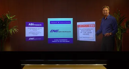
Minority report screen

See this presentation screen by DVE Telepresence (auto-play alert), it allows you to move PowerPoint slide objects in the style of the film Minority Report. What do you think? I am afraid that more sophisticated screen technology will not turn humans into better story tellers.

What would be useful though is to have a technology that allows you to write on a transparent whiteboard in front of an audience where technology takes care of mirroring your writing, so it becomes readable by both you and the audience.

Secondly, having a camera hidden inside a screen is great for creating natural eye contact.

·Investor presentation

Conference vs. investor audience

If a conference audience loves your presentation, it probably means that you are trying to achieve something that resonates with consumers. An investor presentations though, needs more: OK, you checked the consumer box, but is this a profitable business opportunity? Different question, different audience, different presentation slides.

·Investor presentation

Big architecture slides

Almost every presentation by a tech company has a big architecture slide in it, lots of boxes that are connected to the cloud. This slide does not explain what your products are, let alone how these products help solve your customer’s problems. It does show that though that your product is a master piece of engineering. If you want to say the latter, use the big architecture slide, but probably not on page 2.

·Investor presentation

Financial anchors

In financial presentations aimed at financial analysts you need to establish a financial framework, anchor before throwing in North American sales growth, leverage ratios, and the cash flow of last year. While a boring table with a top level profit and loss account and a balance sheet might not be the most exciting charts in the world, it prepares the accountants and bankers among us to digest the information in the slides that are coming.

·Investor presentation

The year in Kickstarter

Kickstarter has posted its 2013 overview here. What I like about it: done in HTML, adjusts for different screen widths, beautiful typography, and very nice use of video.

However, the opening slides with the stats are actually not that powerful. Rounding up numbers, using a simple data chart here and there, and maybe use maps would have driven the points home much stronger.

Still, it would be good if more people try to find a different format to publish their annual report.

·Keynote

Some people do not mind

I had been discussing three versions of a presentation that uses custom fonts with a client, and every time I started the conversation with the question whether they installed the font. Three times, the answer was: “Not yet”.

I already feel uncomfortable when I see a small line break issue due to font compatibility on a slide. Other people can focus on the content of a slide, and consider fixing the fonts as a small todo at the end of a presentation.

·PowerPoint

Hidden megabytes

PowerPoint files can be very large, especially if you use high resolution images, or even videos. In the near future, all of us will have moved to a cloud-based storage solution, where we no longer email actual documents to each other, just a link. In the mean time, we need to try to keep our PowerPoint files below 10MB, the email architecture limit that was invented in the 1990s.

In the format pictures menu of PowerPoint is an option to compress images to save space, I usually go down to 150DPI. After compressing, always check what happened to the images in your presentation, the compression tool can do funny things (ruffle transparency borders, undo re-colouring, etc.)

If your files are still big after compression, or even when you do not use any images at all, have a look in the slide master (view, slide master view). There might be templates for title pages and/or separators there with full-size images. These get saved with the entire presentation. You can delete the template slides if you do not need them.

·Investor presentation

The investment banker

Investment bankers use presentations that are documents for reading, they are even denser than the slides a management consultant typically produces. And whereas a management consultant usually can be convinced easily to change a presentation approach, investment bankers stick to their traditional approach. I have been thinking why this is the case, because I believe that a more visual presentation approach also works in the world of finance. Possible reasons:

  • Finance is a conservative industry, and a different looking presentation might give the impression that you are not serious.
  • Bankers are actually good sales people and do most of their sales pitches verbally, they put up the confusing and dense slide with all the facts, but when you listen to the audio track, the story is quite clear. The slides are for reading after the meeting, the presentation is for listening only
  • Bankers work under very strict time pressure, so there is simply no other practical way than to produce a deck by writing bullet after bullet.
  • Bankers usually do not get very deep in to the strategy of a company (like a management consultant does), a company is a company with sales, growth, margins, PE multiples, and leverage. As a result, the presentation will look more generic.
  • Bankers are used to reading/interpreting financial ratios: a EV/adjusted EBITDA ratio of 6.8 instantly rings a bell. A less financially savvy audience might need more than a bullet point to be impressed by this.

In most of my projects with a conservative investment banker, I try to negotiate a highly visual summary deck that goes in front of the dense appendix. Over time, we iterate the summary deck more and more, and the appendix gets used less.

Continue reading →