PowerPoint Ninja is essential reading for improving your technical PowerPoint skills.
The most recent post is about embedding non-standard or custom fonts inside a PowerPoint presentation so that you can be 100% sure your presentation will come out as you intended it when using on another computer.
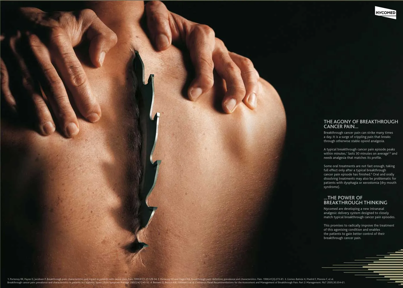
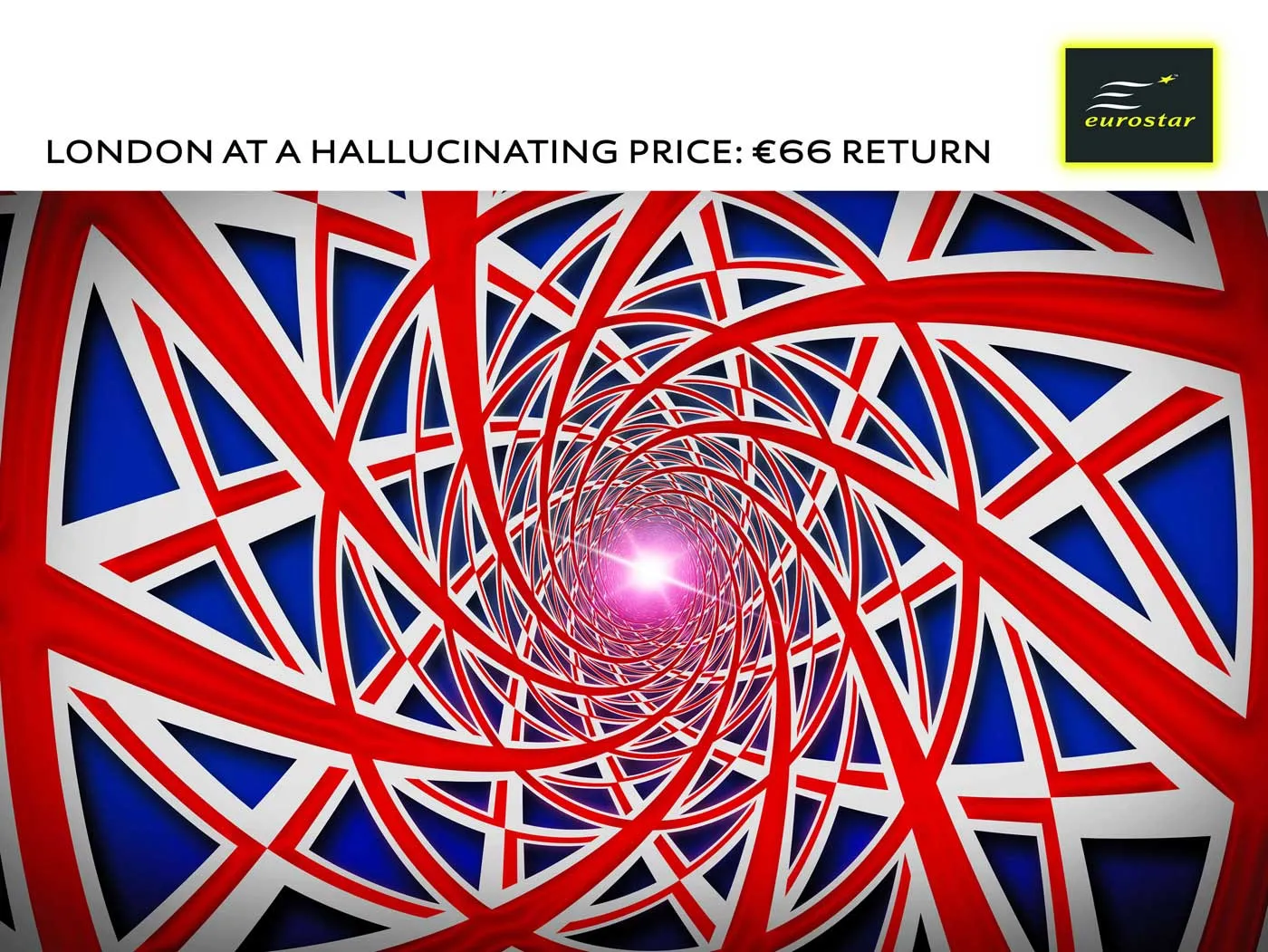
Custom fonts are a major untapped designer resource for PowerPoint presentations. Over the past years people started using a number of graphical tools in PowerPoint. First enabled by technology, then “abused”, after which a “Zen-oriented” tribe of people developed the common wisdom about how to use each of them correctly, elegantly, and most importantly in such a way that it helped the purpose of the presentation
Bullet points
Colors (my pre-2002 presentations were almost all B&W)
An example of a “perfect pitch” by Santa according to Guy Kawasaki.
An overview (of more serious) web resources about writing pitch presentations to Venture Capital firms can be found here.
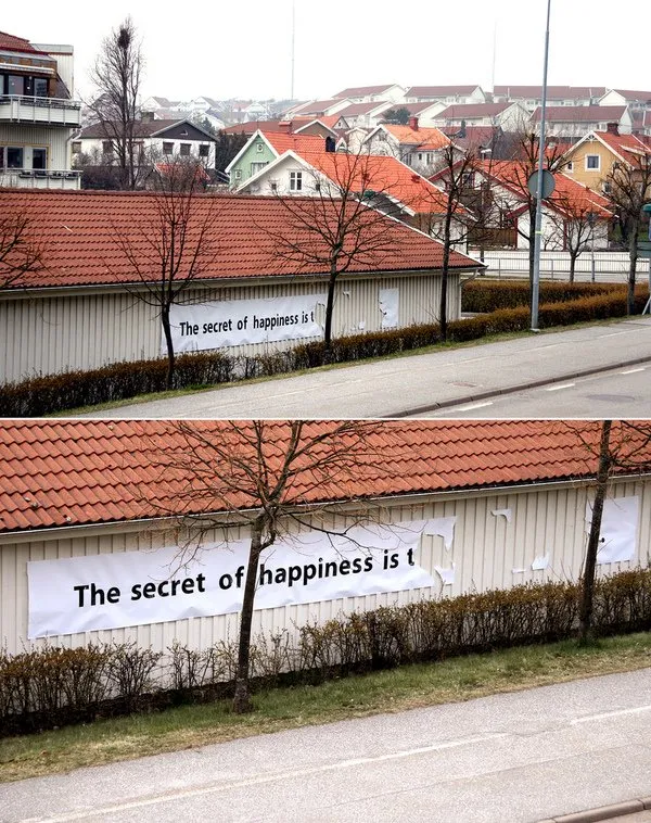
I stumbled on an interesting street art project (more about creator "Elay"and more images here).
In the spirit of the season: happy holidays to everyone, and hopefully you have found the secret already or will find the secret soon.
The image is an example of how leaving stuff out (of a PowerPoint presentation) can stimulate your audience to fill in the details themselves. Like (good) authors of novels, film directors, etc. try to do.
I have posted a number of PowerPoint how to posts over the past half year, but they disappear quickly to page 2. Here are some of them brought back to the front page:
Selection pane: how to edit multiple layers in complex animations
Aligning bullets: how to make sure the second line of a bullet point gets aligned with the first one.
Color overlay: how to change a color image to a black and white one using one of your color scheme colors
I rediscovered an old bookmark of an excellent post on copyblogger today: “12 tips for Psychological Selling”. The key idea here is that any purchase is an emotional decision, facts and logic come in second.
The blog post is written with an online copy writer in mind, but some of these 12 tips can provide useful guidelines for PowerPoint presentation design as well. Especially for sales presentations, or even VC pitches for funding a startup. Maybe not every presentation is about selling something (a product, a company), in the end all presentations are about selling an idea.
People make decisions emotionally.
People justify their decisions with facts. Combined with 1: the numbers and stats in your presentation are probably be used to post-rationalize an emotional decision. They are not the key decision driver
Peole are ego-centric: what’s in it for the PERSON you are presenting to (not just the company he is working for)
People look for value
People think in terms of people: real-life situations, social interactions, stories are better vehicles to get a point across than logic, data, and analysis
You can’t force people to do anything: convince them.
People love to buy, people love to be sold to: HELP THEM do what they want to do
People are naturally suspicious: add testimonials, maybe even a bit of hard data
People are always looking for something: love, wealth, glory, comfort. Your presentation needs to link these desires with what you are trying to sell
Not really relevant here
People like to see it, touch it, feel it, taste it, smell it: good pictures, good diagrams, good demo screens
Most people follow the crowd, again testimonials, your customer list, etc.
Weekend reading/viewing. I got to this video by Harvard Law scholar Elizabeth Warren via Twitter:
There are many “doom” videos and presentations out there at the moment, reinforcing the state of mind of the current economical crisis. This one stands out, and I sat through the entire 57 minutes (skipping the first introduction bits).
Elizabeth managed to make an exact like-for-like / inflation-adjusted comparison between the financial situation of families in the 1970s and the early 2000s. Her main conclusion: Americans haven’t taken out all that credit to finance blind purchases of consumption goods such as cars, gadgets, holidays, etc. Some of the messages:
Per person income hasn’t really increased over the past 30 years, women just started to enter the workforce, pushing household incomes up
Expenditure on items such as appliances, clothing, food (including restaurants) did not really go up
We did spend a lot more on housing (“parents are buying schools”), child care, healthcare, and college education
Risk has increased for the highly leveraged 2-kid family: illness, divorce, job loss
This blog is not about economics. But from a presentation perspective, this video is worth watching. The slides are strictly statistical, poorly formated, almost resembling a 1990s overhead sheet, the speaker does not move, still the story is truly captivating. Captivating because many, many people (me included) are looking for the answer to the issue Elizabeth is raising. We just want to stay until the end to find out.
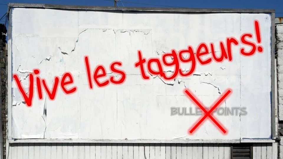
Crossing things out in an immaculate PowerPoint slide with a rough, red paint brush can make a point strongly: “with our technology you can skip buying that new server”
I use a simple PowerPoint 2007 “glow” to get a graffiti-style effect. In the image below, I selected the “Boopee” font (standard in PowerPoint 2007) to which I applied a red glow and a gradient text fill (bright red, with a darker red). The background image was purchased on iStockPhoto. Let me know in the comments if you need more detailed instructions.
The French are just so good in inventing words: “taggeur” for graffiti artist (or vandal). Brilliant.
Many logos of Web 2.0 companies are examples of how not to use these graphics capabilities: add a “bevel”, “reflection” and “drop shadow” and the result must look good. In graphics design, most of the time, less means more.
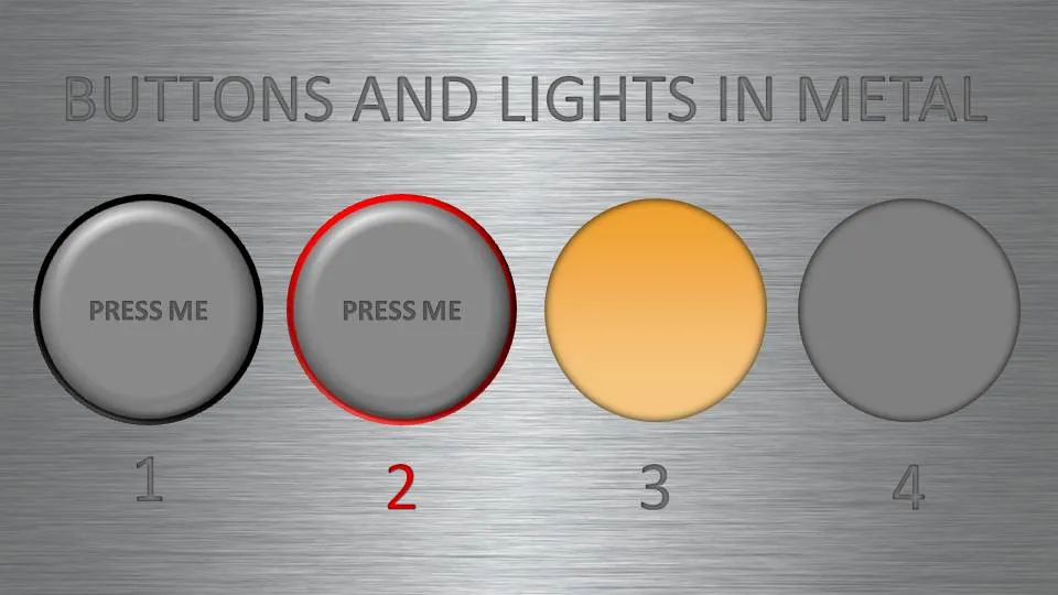
But sometimes these effects can help. In my case a client needing to explain software functionality. We decided to go for the metal “HiFi component” look with buttons that can easily activate functions. (Click image for a larger picture)
Metal text: a big font in a similar, but slightly darker color than the background with an interior shadow applied to it
Button 1 and 2: a circle with a heavy outline (red or black), a simple “bevel” applied to it, but in the tab “3D options” of the bevel functionality I increased the depth to 20.
Light 3 and 4: a circle without an outline, with an central interior shadow and a color gradient running from a full color to a slightly faded color.
Let me know in the comments if you are interested in the detailed instructions.