SlideMagic Blog

Frequent updates about all things presentations since 2008. Subscribe to never miss a post.

RSS
all posts

Category Presentation design

·Concepts

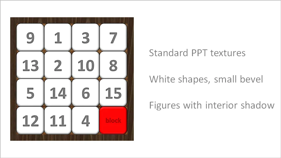
Stuck! - board games with simple PowerPoint shapes

The basic PowerPoint shapes and textures can be used to re-create realistic looking board games. Here is a concept I used for a client that needed to show how its potential customers are being hindered to move around their IT infrastructure freely.

·3D

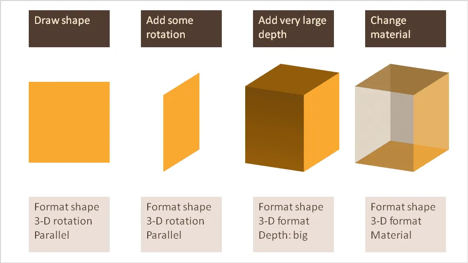
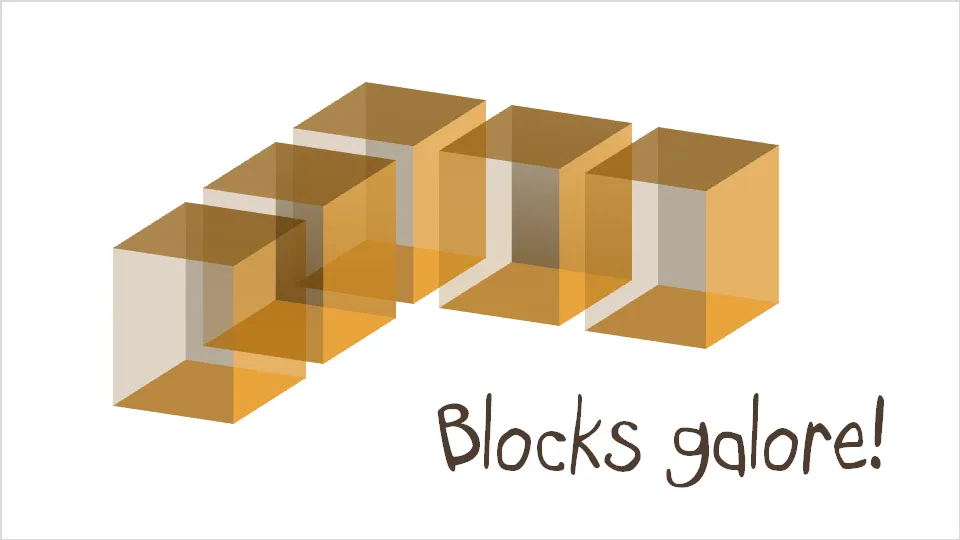
Drawing 3D boxes in PowerPoint

A while ago I discussed making translucent balls. Here is a similar trick for boxes that does not use the old PowerPoint shape with a simple cavalier perspective.

·Design

People get it - no need for SCREAMING emphasis

Sometimes you need to emphasize a very IMPORTANT !!! word in your slide (how to do underline in Blogger?).

Don’t use all the tools you can use. In dense text, use italic, in PowerPoint slides make it bold, or change the color of the word. People will get it.

·Advertising

Esthetics in everything you do

Another ad found on Ads of the World: Samsung wide-angle CCTV.

Very good Photoshop work. Still, the resulting image is not esthetically pleasing. My personal rule: never let an ugly chart or image enter my PowerPoint presentation, ever.

·Design

Design doubles newspaper circulation - presentation lessons

Newspapers are in trouble. This TED video highlights how clever design can do miracles to the circulation of a newspaper. (For details about the presenter, see the original TED post).

Insights (for me) that reach beyond the world of newspapers:

  • There is no reason why you cannot totally turn traditional visual design upside down. Many PowerPoint slides still resemble 1990s hand-written overhead projector transparencies
  • Technology enables small firms/individual designers without big budgets to out-design big established brand names. It is all about ideas and creativity now, technical execution is not a differentiator anymore
·Design

How to bring some order to a cluttered PowerPoint map

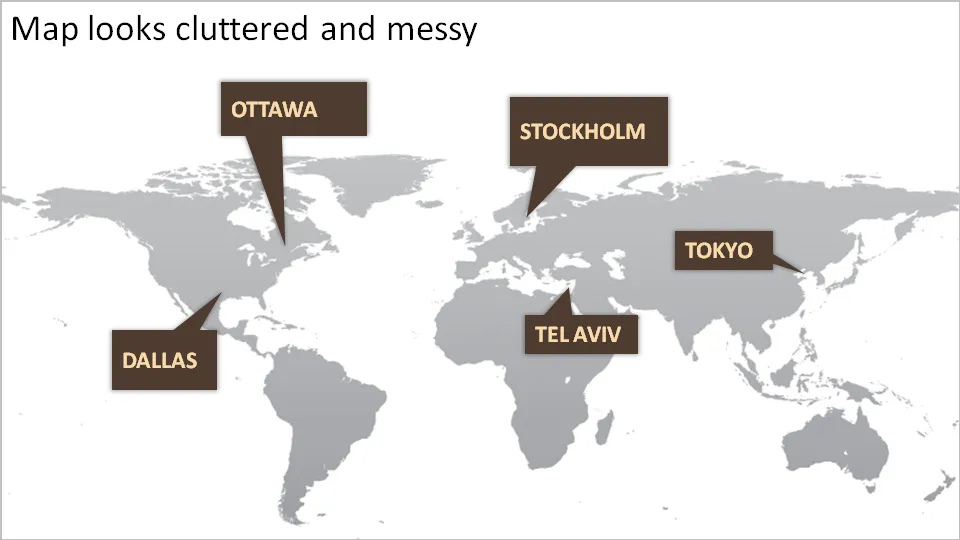
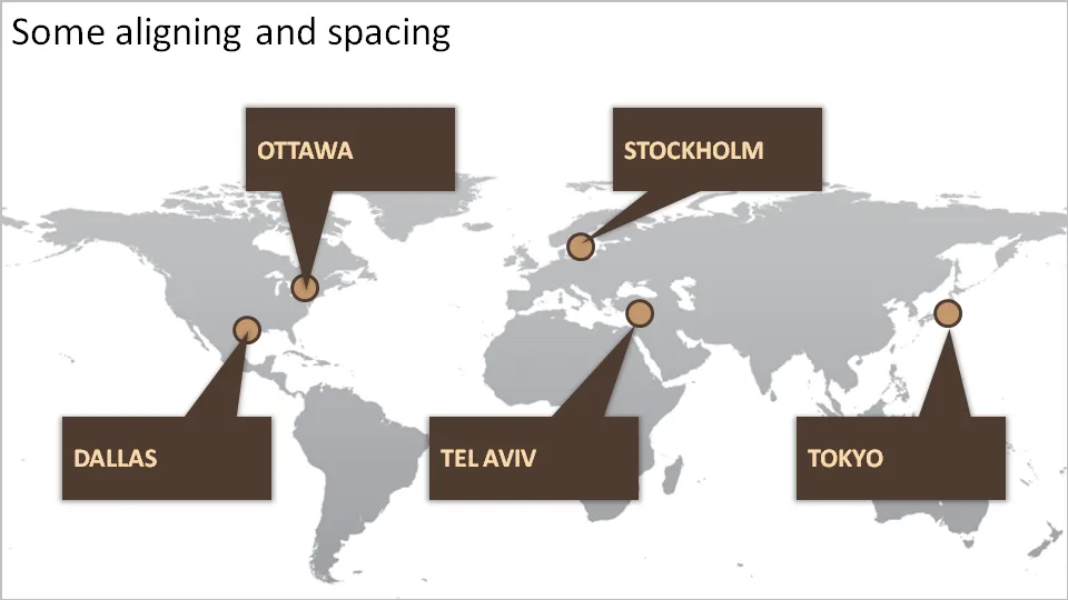
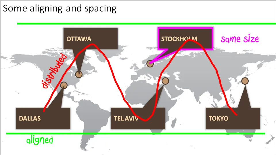
One of my clients is keen to show its new network of global support offices. Maps can look messy and random. Here are some simple things you can do to put things in order. We can not change the location of the planet’s cities, we have control over PowerPoint shapes…

·Design

#PPT - let's try to create a presentation-focussed Tweet Deck channel

During a conference I discovered the power of a hash tag in Twitter. A constant flow of relevant updates around a topic or an event either in Twitter search or on Tweet Deck.

Let’s use something for presentation design-related Tweets: #PPT? Short, memorable, relevant?

·Concepts

Chart concept - signs with a little humor

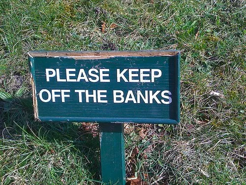
High-quality pictures of signs are great raw material for a presentation. They stand out by themselves, people are used to take a moment to read them and they could add some humor to your story:

  • Typos, or unusual text as an ice breaker for your audience
  • A correct message that is put out of context in a funny way in your presentation

The downside, they are very hard to find, but with a bit of creativity you can re-create them either by using a blank sign from a stock photography site, use a generator like AddLetters, or - even better - creating one of your own using PowerPoint shapes.

Here is a diffrent take on the credit crunch found on Noisy Decent Graphics:
·Delivery

Presentation lessons from watching a startup competition

I attended an Internet industry conference today and witnessed presenters in the final of a startup competition: a few minutes to present your company to a huge audience with a ruthless timer ticking away.

  • Putting your entire 30 minute story on 1 slide does not make it a 5 minute presentation
  • Accept that you cannot tell all: ruthlessly cut nuances, side tracks, feature lists.
  • “Waste” some time upfront in establishing a connection with the audience. Maybe a quick hand voting. In the first few seconds people are “trying to figure you out” and are not paying attention to the content. “Is that a Danish accent?” If you give the punch line during this time, It will not stick
  • Assume your audience has absolutely no clue (about your company), but also assume that they are very intelligent at the same time. No buzz words. Clear explanations.
  • Use facts, numbers. But use them only once. Five minutes is too short a time to repeat the succes of that major customer you won last week
  • 500-1000 people is a huge crowd. Leave memorable contact details. “Out booth is outside”, or a very simple email address.
  • Answer questions very, very briefly, don’t go off on a tangent, or repeat the presentation you just gave.
  • Don’t run out of time. Definitely don’t make your punch line when bells start ringing and the screen behind you starts flashing to remind you that your time is up. Again the punch line will not stick
·Design

No need to put that huge "message arrow" on you slide

An excellent post on the “Tekst en Communicatie” blog by communication expert Louise Cornelis. It’s in Dutch, so I will translate.

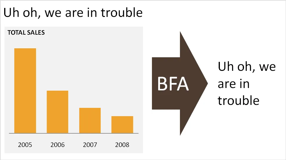
Louise discusses what she refers to as “the big f*cking arrow” or “BFA” (not all Dutch on her blog). A huge arrow in the middle of the slide, pointing at a block of text with the chart’s conclusion. Apparently “BFA” has become a well-known acronym among chart designers in The Netherlands.

Her (and my) recommendation: get rid of it and stick to a clear title headline.