SlideMagic Blog

Frequent updates about all things presentations since 2008. Subscribe to never miss a post.

RSS
all posts

Category Presentation design

·Design

Un-stretch those images

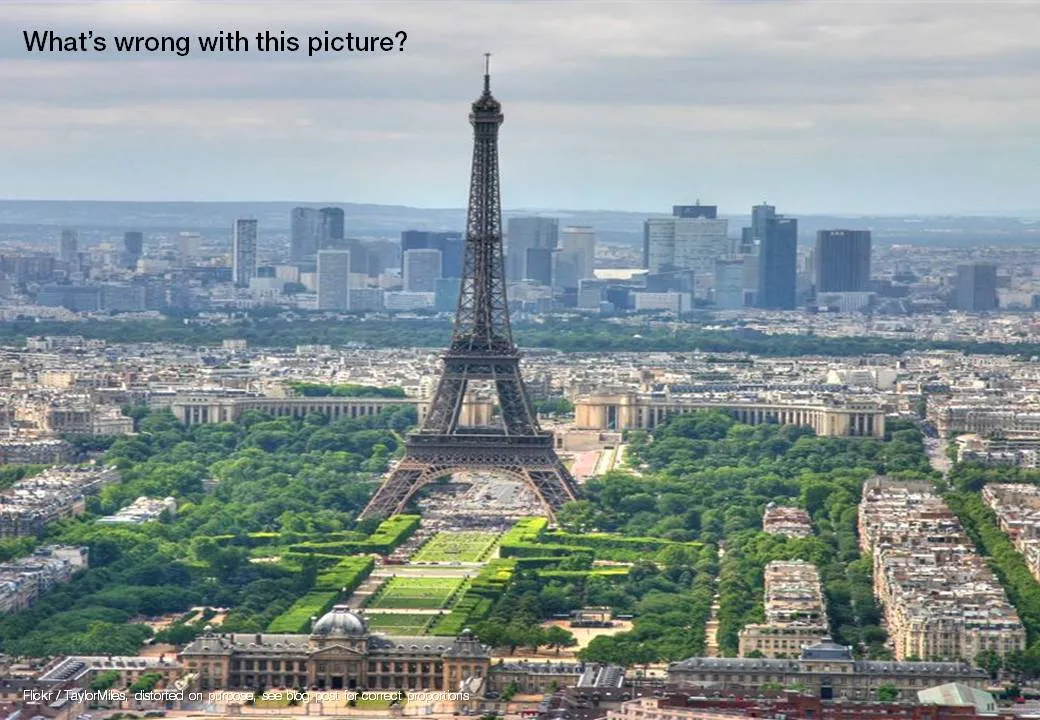
Many presentation images are distorted: the proportion between height and width got confused somewhere along the way. It is easy to correct this. In PowerPoint 2007: right click the image, format picture, reset picture, and you got your original image back. Now hold the shift key while resizing your image and the proportions will be preserved.

Here is an earlier post with a more advantaged tutorial how to scale images to a full page without distortion.

·Design

Credible customer testimonials in presentations

An excellent post on copy blogger: hardly anyone reads/believes a customer testimonial. They all sound the same, they use sugary language and buzz words, they are one sided. Most sales presentations have the customary slide with customer quotes in text bubbles inside:

  • Far too much text
  • Stuffed with generic adjectives
  • No specifics related to the customer situation
  • Not a specific source who said it
  • No facts, numbers

Do not send a blank piece of paper to your customer and ask “write something nice”, instead, interview the customer, write down a very specific story with facts and have her approve it. The “reverse testimonial” suggested by copy blogger is a powerful structuring technique.

UPDATE January 2018: we have now added customer testimonial presentation slides on the SlideMagic template store

·Cartoons

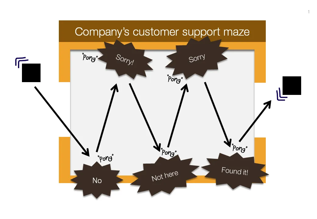
Chart concept: "Pong", "Pong", Pong"

Cartoons have a great way of adding movement to an image. Images can be static and without animations (easier to share online). All you need to do is use an informal font such as Boopee and add some arrows and loosely drawn lines.

The following chart example was inspired by the first “pong” video games that came out in the 80s.

While the style of the slide is informal, the content is serious enough that I would not hesitate to include it in presentation to the Board. I took out the specific customer example to maintain client confidentiality.

I am a big supporter of the global “ban comic sans movement”, try not to use that font.

·Design

A VC investment case in the public domain

The Internet opens up everything, including investment cases by venture capitalists. If you are working on a presentation to pitch your startup to a VC, read Mark Suster’s recent post on his investment in Burstly. Here is the full content on how he convinced his partners to back him with the investment. Valuable input when you design your pitch deck. Mark is not the only one, many VCs now run blogs, given very good transparency in how their mind works. Much better input than what their portfolio looks like and/or the standard blurb on the VC’s web site. Every VC is different, every VC pitch is different. Do your homework before opening PowerPoint.

·Art

I am jealous of this artist

Images are hardly ever exactly right. Changing reality, even with the most powerful software, is very hard (previous post). Artists and/or cartoonists can use their skill to their advantage. Adding contrasting characters to images. One example is Johan Thornqvist (more images on his site). I am jealous not to have these drawing abilities.

Found via unstage.

·Design

Slideshows: also in investigative journalism

The biggest worry of a presenter is to bore her audience. The biggest worry of the journalist is for readers to skip her article. Interesting visuals can be a solution for both challenges.

Investigative journalists are a special breed of news writers, they rely on their own original research (time consuming) and the end result is often a story with nuances that requires more words than the average newspaper article. There is pressure to summarize the article into something that does not do justice to the effort that was put in: news media budgets are under pressure, and the attention span of readers gets shorter and shorter.

Journalist Bill Dedman tried a slideshow on msnbc.com (here), read an interview about the project here on PoynterOnline. The text in his slideshow is 2,788 words, a typical article like this would get 600,000 readers for page one and 10% for the following pages. This report got almost 80m online views.

The use of slideware is no longer limited to supporting live presentations. It is a powerful and under-utilized alternative for web content/blog posts as well.

Thanks to communication consultant Surekha Pillai for pointing me to this.

·Design

You are better at line wrapping than PowerPoint

When you starting using fewer and fewer words on a slide (keep up the good work!), line wrapping becomes more important. Make sure that words that should be connected, stay connected, and enter a manual SHIFT+ENTER if you need to deviate with the automatic option.

·Design

Image sequences to set your audience's mood

Presentation designers can learn from film directors. Inserting a sequence of good (and real) images can take your audience from the conference hall to a different place. Beautiful and sad at the same time, click through some of these urban decay images to get the feeling: here, here, here, and here.

(Image by Yves Marchand & Romain Meffre)

·Design

Google Docs as an alternative to YouSendIt

File sizes are getting out of control. YouSendIt is a tool to overcome size limitations on email attachments, but it has one big drawbacks though: confidentiality. If you do not sign up for the premium version, anyone who gets her hands on the file link can download it.

One solution is Google Docs. Recently, Google updated the service and it is now possible to upload and download files that are not in Google’s propriety format. Plugins such as OffiSync create a seamless integration between Microsoft Office and Google Docs. The advantages:

  • Tighter security
  • The ability to maintain one master document that you iterate, rather than emailing multiple versions of the same presentation around.
·Design

Presentations versus spreadsheets in the cloud

I am making radical shifts to the way I work with my IT infrastructure. Over the past week, I have moved many of the software tools I use “in the cloud”.

  1. I stopped using Outlook and are now managing email through gmail with a custom domain (tagging, search, excellent spam management and the Outlook PST files simply became to big to manage locally)
  2. My client invoicing is now run via Freshbooks (affiliate link), enabling clients to log in directly into my system
  3. I am experimenting with Google Docs and Microsoft Office Live to set up shared workspaces with clients
  4. And last but not least, I started to experiment with spreadsheet and presentation software in the cloud.

I am learning a lot here, and get lots of inspiration for new blog posts, but let’s talk about one thing at a time: how likely is it that presentation software such as PowerPoint will move into the cloud. Unlike spreadsheets and databases, I am not that optimistic.

At first sight, it seems like the benefits of going into the cloud should apply to presentation software as well: access from anywhere, group collaboration, easy sharing, no more file size issues with storage and email.

There are two aspects to cloud processing: online storage and collaborating with shared files using online tools. Online storage is incredibly useful for presentations, files get increasingly big/harder to email. It is the online collaboration that is the problem.

  • Unlike a spreadsheet, the design and look and feel of a presentation are paramount. If the fonts are a bit off, if you cannot position the object exactly as you want it, if you cannot use all the colors you would like to use, you are in trouble. Moving back and forth between PowerPoint and online editing tools will drop a few formats here and there.
  • Collaboration on presentations is different than collaboration on a spreadsheet. Presentations are very personal. Having someone else edit my slide, add a bullet here and there, change the title disrupts the design process. I welcome input, but like to keep control of the pen. (To contradict myself: the one exception might be the slideument, where slideware is used as a vehicle to write a document rather than prepare graphics for a presentation.
  • The number of toolbars, shortcuts, functions you use in a presentation program is far greater than you use in a spreadsheet tool. At least, that’s the case for me. I have created incredibly large and complex Excel files basically using “+” “-” “*” “/”“sum” and some basic formating. A presentation design interface is more complex, and people will find it more difficult to migrate. This is why Prezi is having trouble taking off.
  • After a presentation, the slide document often starts to live its second life, becoming a source for “Frankensteined” follow-on presentations. 99.9% of people who Frankenstein use PowerPoint.
  • The sharing element is different for presentations and spreadsheets. Some presentations are aimed at getting the widest possible audience, just uploading them to a tool like SlideShare (without group editing capabilities) is enough, while this is almost never the case with a spreadsheet, that needs to be edited in a small group that can access the confidential data.

Continue reading →