SlideMagic Blog

Frequent updates about all things presentations since 2008. Subscribe to never miss a post.

RSS
all posts

Category PowerPoint

·Advertising

Should you conform?

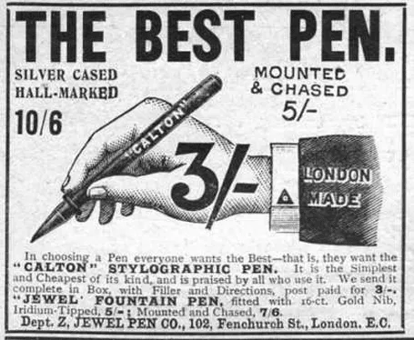
Early last century, there was a common practice in advertising: “This is what an ad should look like.”. Think about this when your boss tells you: “This is what a presentation should look like.” in response to your effort to do it in a different way.

For more of these wonderful vintage ads, visit vintageadbrowser.com

·Concepts

Look at these synergies!

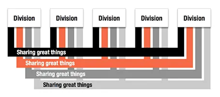
Here is an alternative to a circle-like composition of a holding company and its subsidiaries.

·Concepts

Billboards

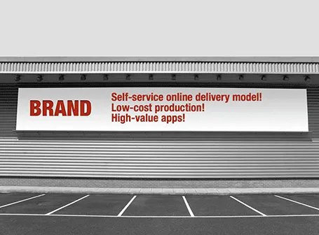
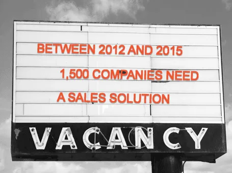
Maybe a bit overused, I still applied the billboard concept in a number of presentations recently.

·Art

Paper, an iPad drawing app

I would love to use hand drawn graphics in my presentation, but I never got to drawing and sketching on a computer. Any tools without a direct screen feedback loop (the mouse, drawing pads, and even the Wacom Inkling) simply do not work for me, and I think a screen like this are very expensive and generate additional clutter in my workspace.

The iPad could solve this, because it has a touch-sensitive screen. As a result, hundreds of drawing apps have popped up in the app store. Drawing apps are different from note take apps. The latter require wrist protection, a good way to organize notes. Drawing apps require brushes, color, pens. Like with writing apps, most drawing apps come loaded with features that just confuse me.

Hence, I was happy to discover Paper by 53, a minimalist drawing app (one of the readers pointed it out to me in a my recent review of iPad note taking apps). Paper just cut down the drawing tools to the bare essentials, and the result is actually good I think. The app is free, but this version comes with one drawing tool: the ink pencil, if you want to get a pencil, a marker, a pen and a paint brush (water colors) it will set you back $8 in in-app purchases.

The pencil is the tool I actually use most. There is a big drawing problem with the iPad screen: it is not pressure sensitive, and varying stroke width is the key feature what makes writing with an ink pen so great. Paper solved this with adjusting the stroke with depending on your speed as you move the pen over the screen. More confident, fast strokes, will appear bolder. (The pen tool works the other way around, moving it slowly creates heavy ink, moving it fast produces a thin line). I love the simple cartoon style sketches that this app produces, and I am looking out for a first client situation where I can try out a cartoon-style presentation (like the one below) for real.


Continue reading →
·Data visualization

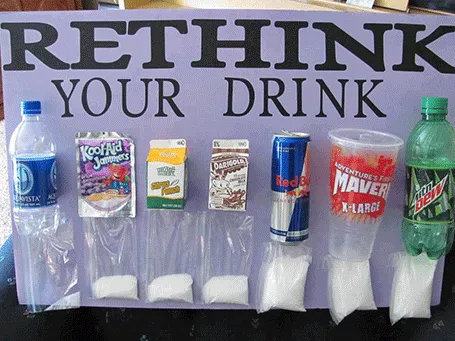
Sugary drinks

This photo posted by Carolyn McDowell is much more powerful than a bar charts with the sugar content of soft drinks

·PowerPoint

2 versions -> disaster

It always seems tempting to have 2 (or more) versions of a deck. One for sending, one for presenting live, one short one, one long one, one for printing. Ideally, this is the right solution, but in practice, you always forget to transfer changes from version to the next. I prefer to keep one master file with all slides inside, and chop out the ones I do not need right before I present, email, etc.

The exception is probably a high-profile keynote that merits a file on its own, but for day to day business presentations, keep one deck.

·Gadgets

Songza - music while working

If you work alone in a room (or are willing to use headphones) you can lighten up your design work with some nice music in the background. I have made a complete u-turn on this, starting off with requiring library-like silence to concentrate.

Not all music is suitable for work. Dominant lyrics, or tunes that stick in your head do not work. Music that is so slow that it puts you to sleep is also not ideal. Audio advertising make your office feel like a car repair shop. And the worst of all, repetition is annoying (“hey here is that same sone again for the fifth time”).

The repetition argument pretty much kills the traditional CD option, and even your personal iTunes library will be exhausted soon. Most of all, your personal music purchases of the past are unlikely to be suited for work music.

Internet streaming apps are the solution. Spotify is great, but it requires you to find the right (long) playlist that fits your work requirements. And that is difficult. Pandora is another solution. The genre or artist radio stations are good, but also here you run out of new music. After playing the cool jazz radio station for 2 days you start recognizing the songs.

So, the app I love is Songza. It has far less choice in terms of songs, but it has a treasure of playlists for any occasion you can think of, including work: acoustic, jazz, electronic. Unlike Pandora, the songs are curated by human experts rather than automatic algorithms.

Continue reading →
·PowerPoint

Smaller presentation, smaller budget?

I often get this question when discussing a new project with a client. Can we cut costs by cutting slides? For slide make-over, the answer is yes. Cost and the number of slides have a lineair relationship. For my bespoke presentation design work there is not that much correlation. Why? The hardest part of the presentation design work is coming up with the idea, the concept. Once you have got your head around that, it does not really matter if you need a few more slides or not. So, the answer you get for this question tells you something about the sort of designer you are talking to.

·Layout

Tables as grids for logo pages

Organizing a messy page full of logos into an neat grid can be a pain. Most of the time, I use a simple PowerPoint table to do this. Figure out the required number of rows and columns, draw a table, reformat to a white background with very thin grey separator lines. Now you can plop in the logos in the right position, and best of all, if you have to insert/delete rows/columns, the grid gets adjusted in a second.

(An earlier post about designing good logo pages)

·PowerPoint

Video in a webinar?

The big problem in webinars and web meetings is the upload bandwidth. If you are running the presentation live from your computer, then the speed at which attendees can download your high-res images, video, or animations is the speed of your upload connection which in most cases will not be much more than 1Mbps. Download speeds are much higher (I have gone up to 50Mbps recently).

 The solution for this would be to upload the bandwidth-heavy content beforehand to a server, and only use your live upload connection for the audiotrack. Some web meeting solutions such as SalesCrunch (disclosure, a client) allow you to upload presentations beforehand. But video does not work (yet). Do any of you know a solution or a workaround that allows me to use video in a live webinar?

P.S. An earlier post about how I use an iPad to log in as a participant to monitor what my audience is seeing during a webinar.