

SlideMagic Blog

Frequent updates about all things presentations since 2008. Subscribe to never miss a post.

RSS
all posts

Category PowerPoint

·Keynote

Keep it fresh

The beauty of a verbal story is that it forces you to stick to one sequential story line. In a direct dialogue you need to weave your big thoughts together on the spot, right there with the instant feedback of the eyes of your audience signalling “Uh oh, I am losing the plot here”.

When writing prose, this clean story line can go missing. You write a sentence, go back, edit it, add a buzzword, put in a tangent/exception, copy and paste the section somewhere else. Soon, the clear, instant, on the spot, story line is gone and replaced by a page out of a business school text book.

In visual slide design something similar happens. You start with an idea for some visual concept, but then things get added (ROI, customers, social engagement) and before you know it you have a diagram that is really useful for you, the designer, as an aide memoir of what your business is all about, but the audience is losing the plot.

When designing a presentation, try to stay as close as possible to that fresh, on the spot, story line with which you started out with. Stick to very basic visual compositions (a trade off, best of both worlds, elimination of a layer) and visualise your story around that. Add distractions and complications later, after the big idea has settled in.

·Images

Usage rights in Google images

In the search tools in Google Image Search is now an option to filter out images with a Creative Commons, or other usage rights. The details on the GOS blog. Very useful, but still: double check the image rights at the source and do not rely on Google solely. Via Gavin McMahon.

·Keynote

Nitty gritty

One of my clients has a technology that can save cost for a retail business. They did a pilot implementation at one retailer and have a lot of cost saving data as a result.

You can present this data to other potential clients (sanitised of course) in 2 ways. Approach one is the absolute number: we helped save $x,000 in costs. But this is hard to relate to for other retailers with different types of businesses. Better is to do it relatively: “we shaved 10% of the cost of item x.”, but it is still a bit generic, any startup with a cost saving technology has a sales pitch deck with these types of numbers. A credibility issue here.

Even better is to go into the nitty detail and highlight simple case examples of things that go wrong every day in a retail store, and how the solution helps to prevent it. It shows that you know what you are talking about, and lends instant credibility to your story.

At McKinsey we used to say: retail is detail.

·Colors

PPT 2011 for Mac color bug

Microsoft PowerPoint 2011 for Mac has an annoying bug: when you apply a colour to a font, it comes out slightly differently than when you apply the exact same colour to a shape. One: it looks bad on slides, two: it gives surprises when you open a PowerPoint file created on a Mac on a Windows machine (which does not have the same issue).

When I posted about this somewhere on a Microsoft forum I got the response that this was done on purpose; to make text readable against a coloured background. This does not make sense, if I want to make the text readable, I will put in a different colour myself, and definitely not the one that Microsoft is using. See below, the letter colour is a completely different type of blue than the background.

(Geek alert). There is a complicated way to get around it. Type some text, change it to the desired colour. Now select the desired text (not the entire sentence) and bold it: the right colour appears… But, as soon as you do anything else to your text box, the wrong colour gets put in. Annoying…

·Colors

Lighten up

It can be tempting to splash on the colours in a slide design, especially if you have a colour palette with 3 or more colours. The result: highly colourful slides that still look very “PowerPoint”.  Why does the work of a professional designer not look like PowerPoint?

The secret: only use colour or highly contrasting greys (dark on a white background, light on a dark background) when you want an object to pop out. Use one base colour frequently, and reserve all the others for accents. Use light shades of grey, rather than filling a big slide object with a very dark grey. Consider using dark grey for your font colour instead of pitch black.

·Delivery

Minority report screen

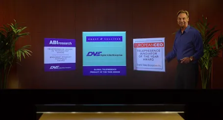
See this presentation screen by DVE Telepresence (auto-play alert), it allows you to move PowerPoint slide objects in the style of the film Minority Report. What do you think? I am afraid that more sophisticated screen technology will not turn humans into better story tellers.

What would be useful though is to have a technology that allows you to write on a transparent whiteboard in front of an audience where technology takes care of mirroring your writing, so it becomes readable by both you and the audience.

Secondly, having a camera hidden inside a screen is great for creating natural eye contact.

·Investor presentation

Conference vs. investor audience

If a conference audience loves your presentation, it probably means that you are trying to achieve something that resonates with consumers. An investor presentations though, needs more: OK, you checked the consumer box, but is this a profitable business opportunity? Different question, different audience, different presentation slides.

·Investor presentation

Big architecture slides

Almost every presentation by a tech company has a big architecture slide in it, lots of boxes that are connected to the cloud. This slide does not explain what your products are, let alone how these products help solve your customer’s problems. It does show that though that your product is a master piece of engineering. If you want to say the latter, use the big architecture slide, but probably not on page 2.

·Investor presentation

Financial anchors

In financial presentations aimed at financial analysts you need to establish a financial framework, anchor before throwing in North American sales growth, leverage ratios, and the cash flow of last year. While a boring table with a top level profit and loss account and a balance sheet might not be the most exciting charts in the world, it prepares the accountants and bankers among us to digest the information in the slides that are coming.

·Data visualization

Software needs design as well

I see many enterprise software application dashboards that look worse than the worst PowerPoint slides. My clients begin to ask me to give my input on them as well.

  • People have not thought about what information is important, and what is not
  • People have not thought about how to present the information: numbers are not rounded, column, bar, and pie charts are thrown in at random, colours are picked randomly

Consumer applications have gone through a big design revolution over the last couple of years, now is the turn for enterprise software.