SlideMagic Blog

Frequent updates about all things presentations since 2008. Subscribe to never miss a post.

RSS
all posts

Category Layout

·Design

Bleeding edges - you can use them both for images and text

A “bleed”, or “bleeding edge” is a page with a graphic extending over the edge of the page. I like to use them a lot in PowerPoint presentations.

Take the following example. When the elephant is positioned in the middle of the slide, the composition is not really interesting. Have him walk off the page and insert a bit more white space makes it a lot more interesting (our friend just stands there, ignoring all things around him).


Pushing things a bit further, you can use the same technique for words/typography as well. The brain does not always need clean typography to be able to read. You probably remember this text (I do not know who wrote it, or whether the research actually happened):

i cdnuolt blveiee taht I cluod aulaclty uesdnatnrd waht I was rdanieg. The phaonmneal pweor of the hmuan mnid, aoccdrnig to a rscheearch at Cmabrigde Uinervtisy, it dseno’t mtaetr in waht oerdr the ltteres in a wrod are, the olny iproamtnt tihng is taht the frsit and lsat ltteer be in the rghit pclae. The rset can be a taotl mses and you can sitll raed it whotuit a pboerlm. Tihs is bcuseae the huamn mnid deos not raed ervey lteter by istlef, but the wrod as a wlohe. Azanmig huh? yaeh and I awlyas tghuhot slpeling was ipmorantt!

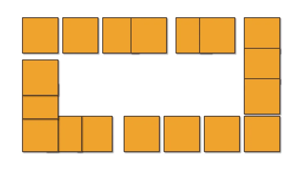
An example of letting words “bleed” off the page (I used to highlight problems with current solutions in the market for a client in the technology sector):

Continue reading →
·Design

Chart concept: the 2x2 matrix and other grouping techniques

McKinsey and other management consultants love 2x2 matrices (and obviously 3x3s). Personally, I think they are often overused (framework overload).

Not every categorization can be crammed into this framework.

  • The axes need to be logical
  • The groups needs to lead to 4 categories, i.e., leaving one or two boxes as “not applicable” does not make sense
  • They work particularly well when you want to show things moving from one category to the other
  • They are good to show that something stands out (from for example the competition) by popping up in the top-right corner

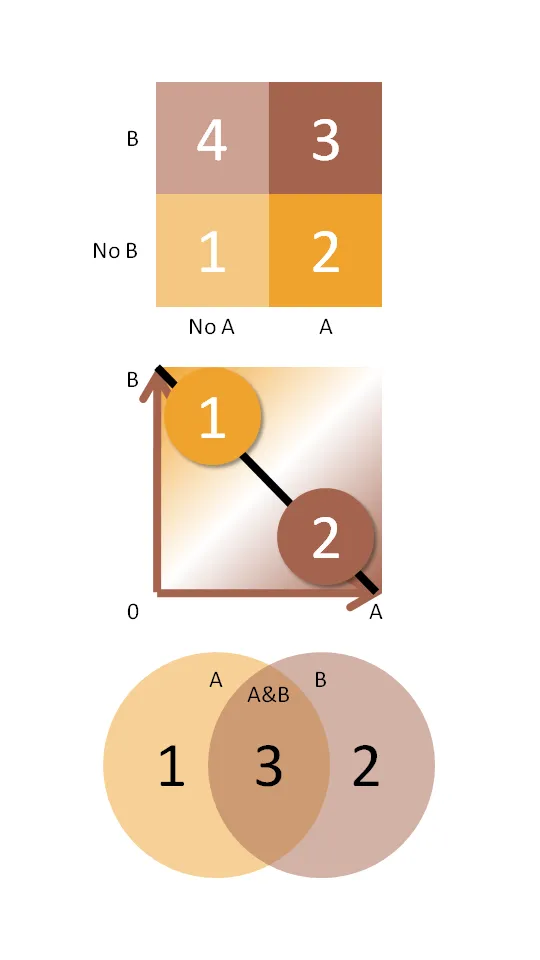
Here are some other techniques to group items on a PowerPoint slide using line and venn diagrams:

  • Diagram 2 - “you cannot have it both ways”
  • Diagram 3 - “the best of both worlds”
·Design

You don't have to be dyslexic to benefit from these presentation design guidelines

Reading through a web site with guidelines for designing web pages for dyslexic users, I realized how valuable these recommendations can be for any audience, not just people with this condition.

This is a PowerPoint presentation design guide 101:

  • Choose a big, san-serif font
  • Avoid capitalization
  • Apply a calm background, no watermarks
  • Don’t righ-justify text
  • Minimize use of italics
  • Keep things short, write in a simple style
  • Use bullets (if you have to), don’t write proze
  • Refer to the reader as “you”
  • Stick to narrow columns, text lines
  • Use pictures
·Design

Nokia E71 - great phone, screen graphics could be more "Zen"

My wife had to swap her mobile phone because my 2 year old son decided to empty a bottle of water on her previous one. These things happen. The new phone is a Nokia E71. Phone reviews are a bit out of the scope of this site (it is a great phone by the way), but I can comment on the graphics of the user interface.

Nokia could have done so much better:

  • Like almost all mobiles, there is a busy wall paper crowding the display
  • Overly sophisticated icons with random colors
  • Different font (sizes), poorly aligned.

Mobile phone screens can also benefit from a “Zen” make-over to transform them into calmer and more minimalist user interfaces

PowerPoint and mobile phone interfaces are the same: the fact that you can make that sophisticated watermark background does not mean you have to use it!

·Layout

Picking a background color for a PowerPoint presentation

Some observations on setting the background color for your presentation:

  • Whatever you choose, it should be a plain background without watermarks, logos or shapes. The audience is interested in the content of your slides, not the artwork in the background
  • You have a choice of something dark, or something light. Different presentation settings, benefit from different background colors, see a previous post. (The 2 extremes: a big-audience-keynote is usually dark, a small meeting usually light)
  • In principle, any dark or light color could work. But, watch out for light “pastel” colors that come out ugly on (poor) color printers or overhead projectors. Also think about working with stock images, there are plenty of images with white or black backgrounds that blend easily into the background, finding one with the perfect marine blue might be more challenging.
  • Especially with dark backgrounds, it can be elegant to add a tiny gradient to the color, making the bottomo of the screen 1 shide lighter. You create an effect similar to the color of the sky after the sun just went down.

·Layout

Copying PowerPoint objects and keeping alignment

Copying PowerPoint objects using CTRL-C / CTRL-V or “copy”/“paste” from the menu creates a new object to the bottom right of the original one. Often you want to copy objects horizontally, or vertically aligned.

Here is how to do it:

  1. Hold CTRL and SHIFT
  2. Use the mouse to drag a copy of the object (movement is locked horizontally or vertically)
  3. Release the mouse button

Thank you Titus Tielens (see his books on PowerPoint - in Dutch)

·Advertising

PowerPoint lessons from consumer advertising

I stumbled across this ad for a Mini. It contains useful lessons for designing a PowerPoint template.

·Design

Not all presentations are "Zen" - different formats for different settings

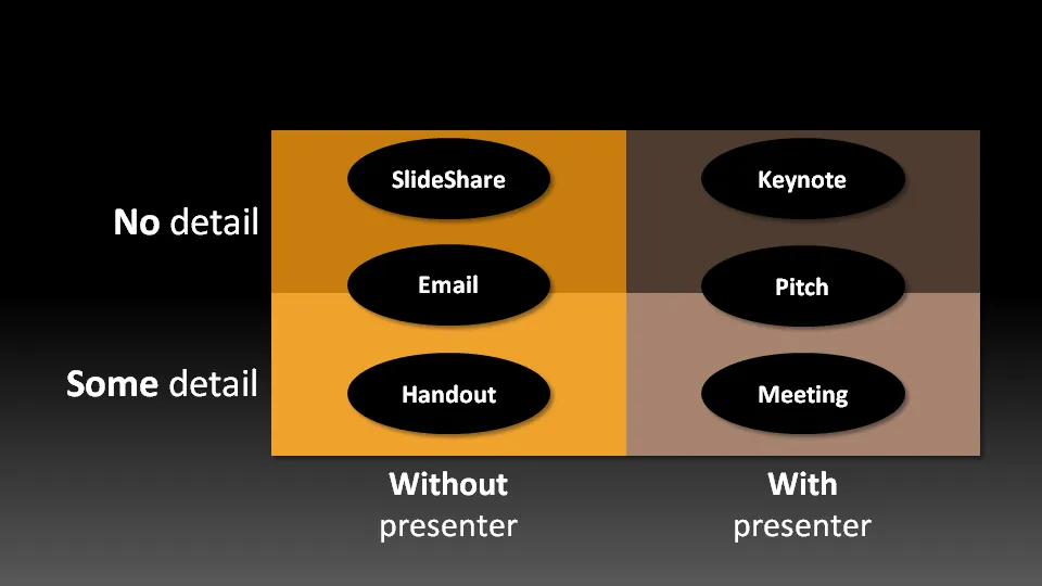
Not all presentation settings are the same. A “Presentation Zen” slide show with stunning images and the incidental word on a slide is great for a keynote, but might be a bit too much to discuss last quarter’s financial results. The 50 page deck with bullet point slides might be serve better as a printed business plan than the key communication tool for a 20 minute VC funding pitch. I have tried to describe 6 presentation scenarios and categorized them according to:

  • Whether the  presenter is present or not
  • The amount of detail/data inside the document

Here we go (click image for bigger picture):

  1. The key note is the classical “Zen” presentation. Huge fonts, dark background, few words, large images.
  2. The pitch is similar to the key note, with the difference that it might be shorter, and does contain some more data to answer questions from the much smaller audience.
  3. The meeting presentation is probably done on a light background, and contains much more facts and details. Over-simplified slides with beautiful pictures do not work in the small conference room with people ready to go through raw material. McKinsey and other consulting firm’s presentation often fit in this box.
  4. The slideshare (or online) presentation is something relatively new. People see it typically in small windows, i.e., fonts should be big, pictures should be nice. The audience of this presentation is highly impatient, clicking rapidly to reach the end, and aboning your presentation if it is not interesting enough. No animations here.
  5. The email attachment is similar to the key note presentatation with an important difference that it needs to stand on its own, titles need to explain the messages in the charts. Some animation could be used here (sparingly though). Detail is less than the handout.
  6. The handout contains the full detail, the full text. It should be prepared on a white background (people will often print it) and use no animation (again, does not come out in print). For VC pitch situations, the good handout makes the business plan “brick” obsolete (hardly anyone reads these anyway).
Continue reading →
·Layout

Critiquing a McKinsey exhibit - analysis charts are not presentation slides

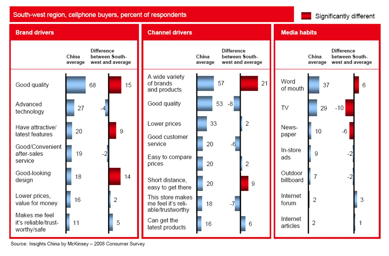
PowerPoint slides that are used to analyze data and solve problems inside a team are not always the best exhibits to be used in presentations. To illustrate the point, I am using a chart out of a publicly available McKinsey document: the 2008 Chinese Consumer Report published by McKinsey’s Insights China initiative.

The report itself is formated very nicely with beautiful pictures, the content of the report looks very interesting. I am just focusing on the cosmetics of one chart as an example. (Click image for a larger picture)

  • Overall, there is too much information on the slide, but given that this chart is used inside a long-hand document, that might not be too bad
  • Because of the red background, the title does not stand out clearly
  • The boxes around the chart are too heavy, to separate the 3 charts, it would be better to use a very light background shading
  • The box on the right is narrower than the other two.
  • Because there are so many bars in this slide, they become very narrow, and hence they almost stop helping the reader see the differences in size, maybe boxes with simple numbers work better
  • The gradient fill of the bar does not add to the understanding the chart
  • The legend in the top right looks slightly lost
  • The text labels are too long: “the store makes me feel reliable/trustworthy” is appropriate for a consumer questionnaire, but can be shortened in the chart
  • The text labels “dance”, they are not right aligned, some labels take 1 line, some 2 lines, some 3
  • The middle graph has 8 bars, the other two 7, disturbing the visual calm of the slide
Continue reading →
·Layout

PowerPoint slides - the only way is up!

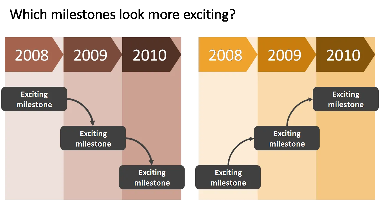
When designing a flow, always make sure that the direction of the eye is moving upwards to create a more positive feel of the slide. The horizontal orientation (left-right or right-left) is less important and depends in which part of the world you are living.

I use flow charts often when I help startups pitch to a venture capital firm for funding. One of the final slides in the deck talks about milestones and future plans. Without revealing too much detail (in a 25 minute presentation the actual/precise/detailed content of the milestones is strangely enough less relevant, they can be discussed later), the chart should show upward momentum.