SlideMagic Blog

Frequent updates about all things presentations since 2008. Subscribe to never miss a post.

RSS
all posts

Category Layout

·Layout

Pimp my poster - scientific conference billboards

I stumbled across this article in The Scientist today: life sciences scientist discussing posters that are used to present work in scientific conferences. It is worth a read, presentation design discussed from another angle. Also have a look in some of the links in the side bar with more related content. (Don’t click around too much as after trying to access too many pages the site requires subscription). Some points that are made (some more serious than others):

  • PowerPoint has killed the scientific conference poster, the program is not build for it, but people do not want to spend a lot of money on huge trial prints that in the end are not good
  • Color-coordinating the clothing of the presenter with those of the presenter (scientifically proven) improves communcation effectiveness
  • There is a bigger debate on the “death of the scientific paper” with ever increasing data sets and new presentation technologies available
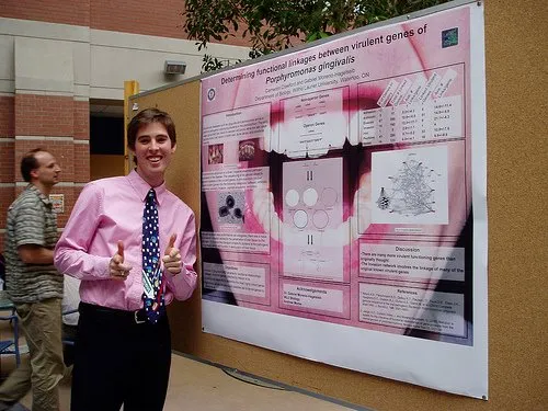
(Image source on Flickr) The article does not provide a hot link to the Flickr group “Pimp my poster”, you can find it here. I randomly clicked through some posters, here is an interesting one as an example of the sort of presentations scientists are preparing.
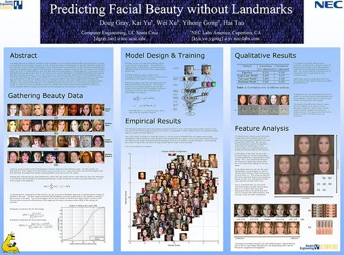
I learned about a new set of communication challenges today.
·Images

How to crop portrait pictures

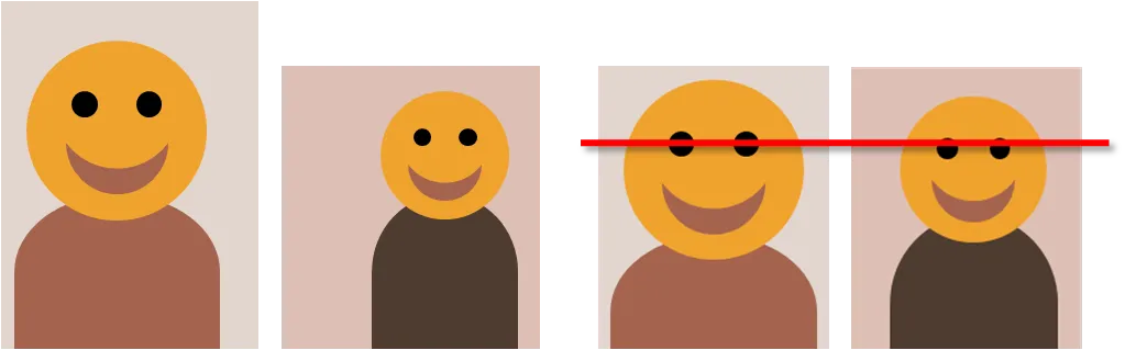
Portrait pictures always come in different sizes, different background colors, different poses. Ideally, you would make one consistent photo shot. The next best alternative is fixing things using the crop function.

If it not possible to resize/crop the pictures in such a way that faces have the exact same proportion, hold on to these guide lines:

  • Eye lines at the same hight
  • Eye lines close to the “golden proportion” of 62%
·Layout

Who said that PowerPoint shapes always have to fit inside the canvas?

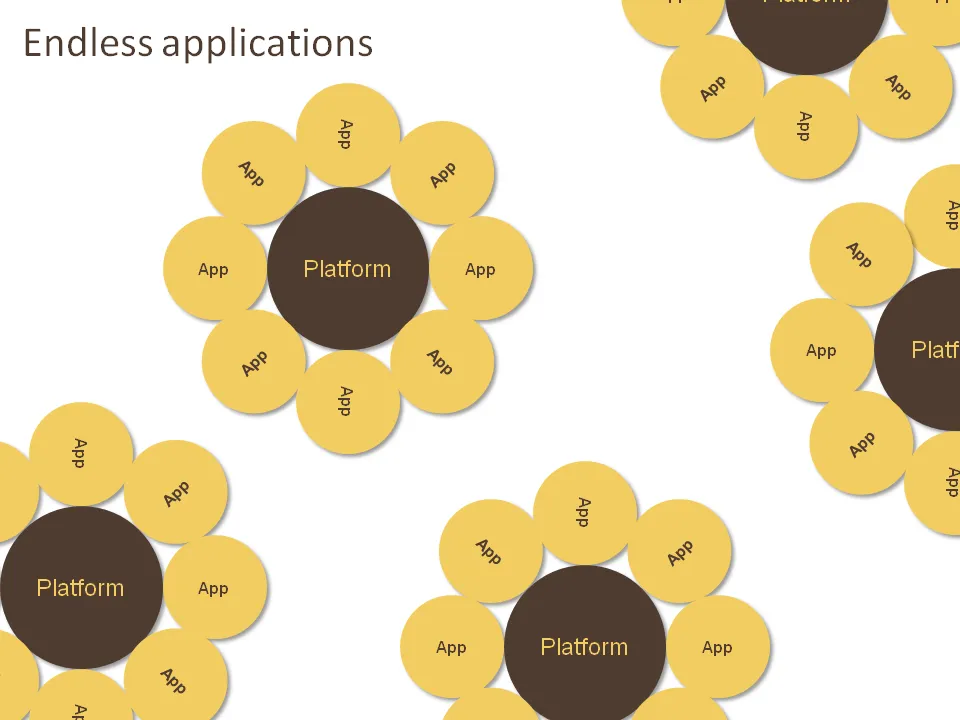
Like images, it can also look very nice to let PowerPoint shapes float off the page. Just position your object half off the canvas, PowerPoint will eliminate the content that’s not on it when in presentation mode.

The concept below was made for a company that has a technology platform that can be applied in an almost unlimited amount of applications. Yes, the chart was inspired by a field of sun flowers in southern France. Here is how to get all these circles lined up nicely.

·Layout

Word repetition - looking at text as shapes

Repeating text might not be the best writing style, but it can add expression to a chart. I often look for interesting patterns in text (or create them by changing words or re-grouping items).