SlideMagic Blog

Frequent updates about all things presentations since 2008. Subscribe to never miss a post.

RSS
all posts

Category Layout

·Layout

Wide screen <> wide columns

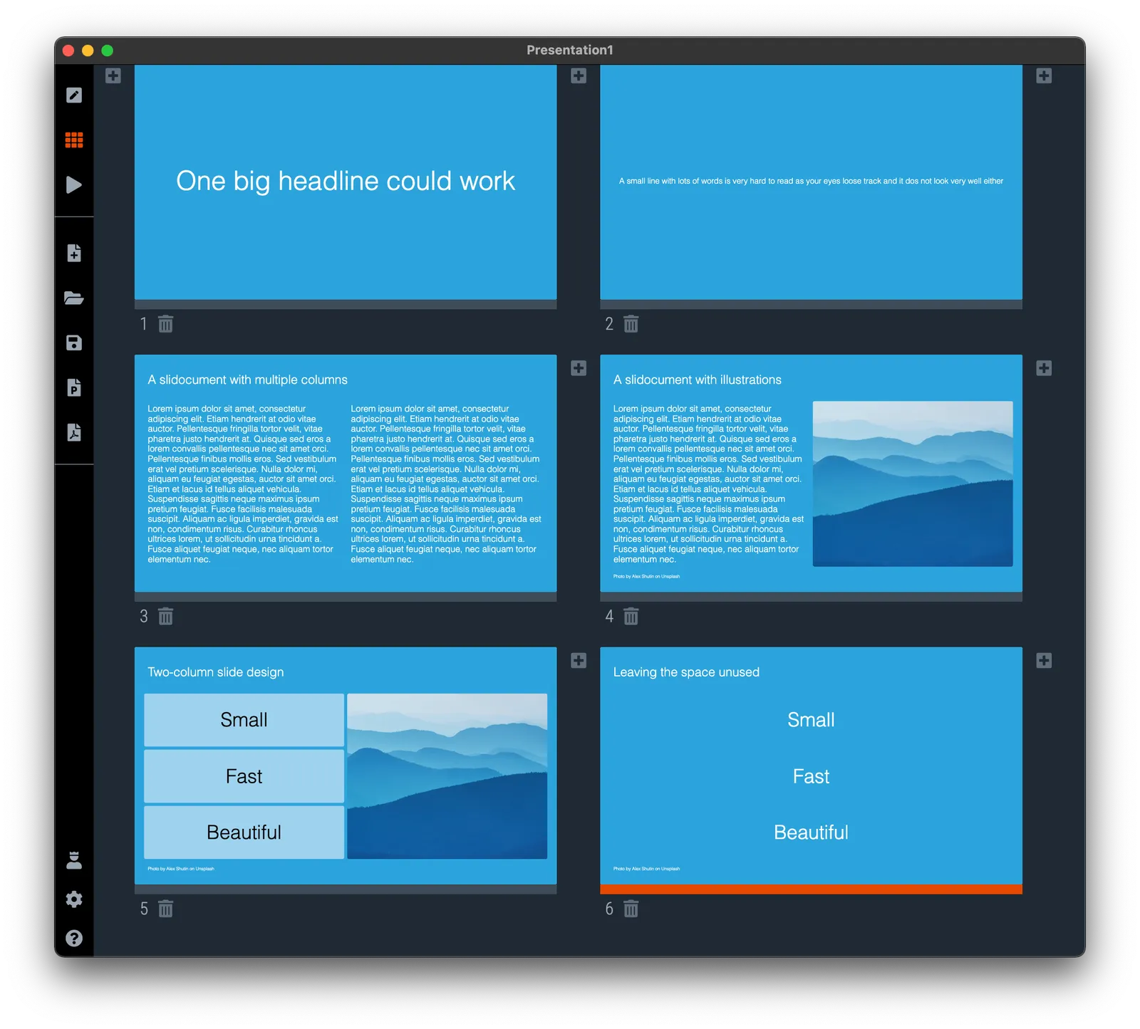
Wide-screen televisions are great for watching movies, but not for reading text. A line that spans across the screen is hard to read and does not look very pretty. There is a reason that print newspapers use columns to limit the number of words on one line.

Think about this when designing slides, switch to a multi-column grid, or simple leave space unused left and right of your text (something that many web pages do), see the examples below.
·Layout

Selective highlighting

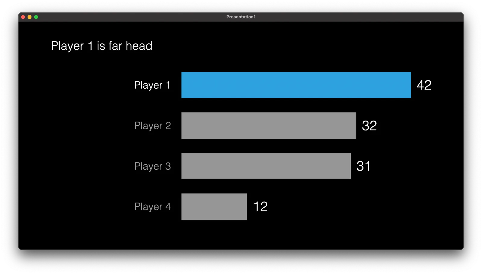
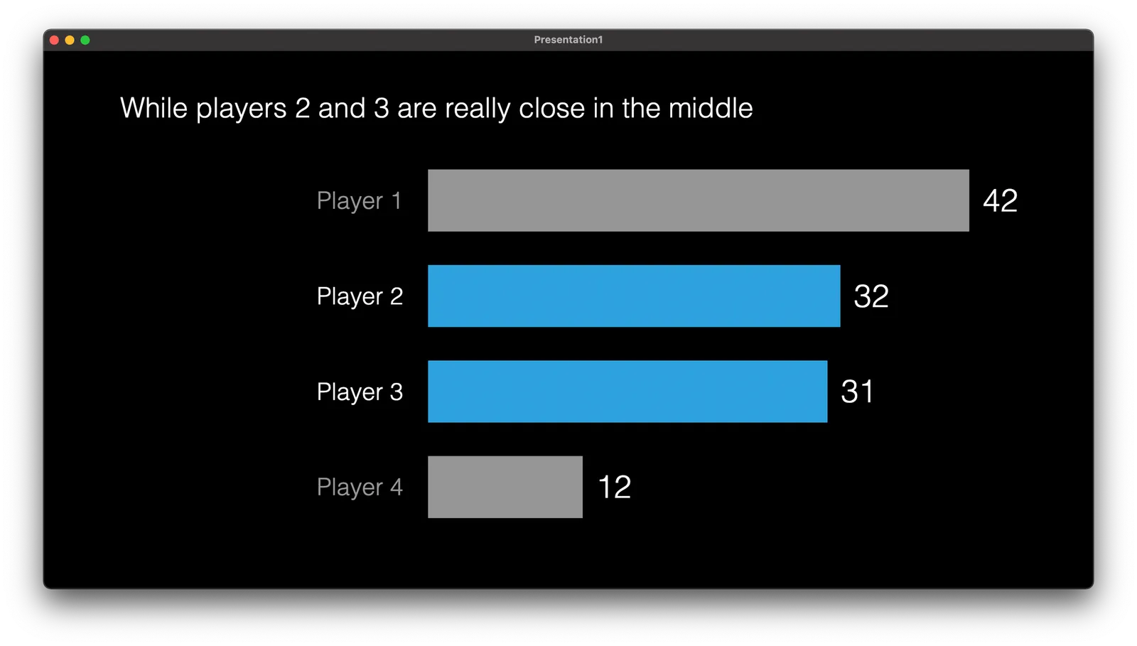
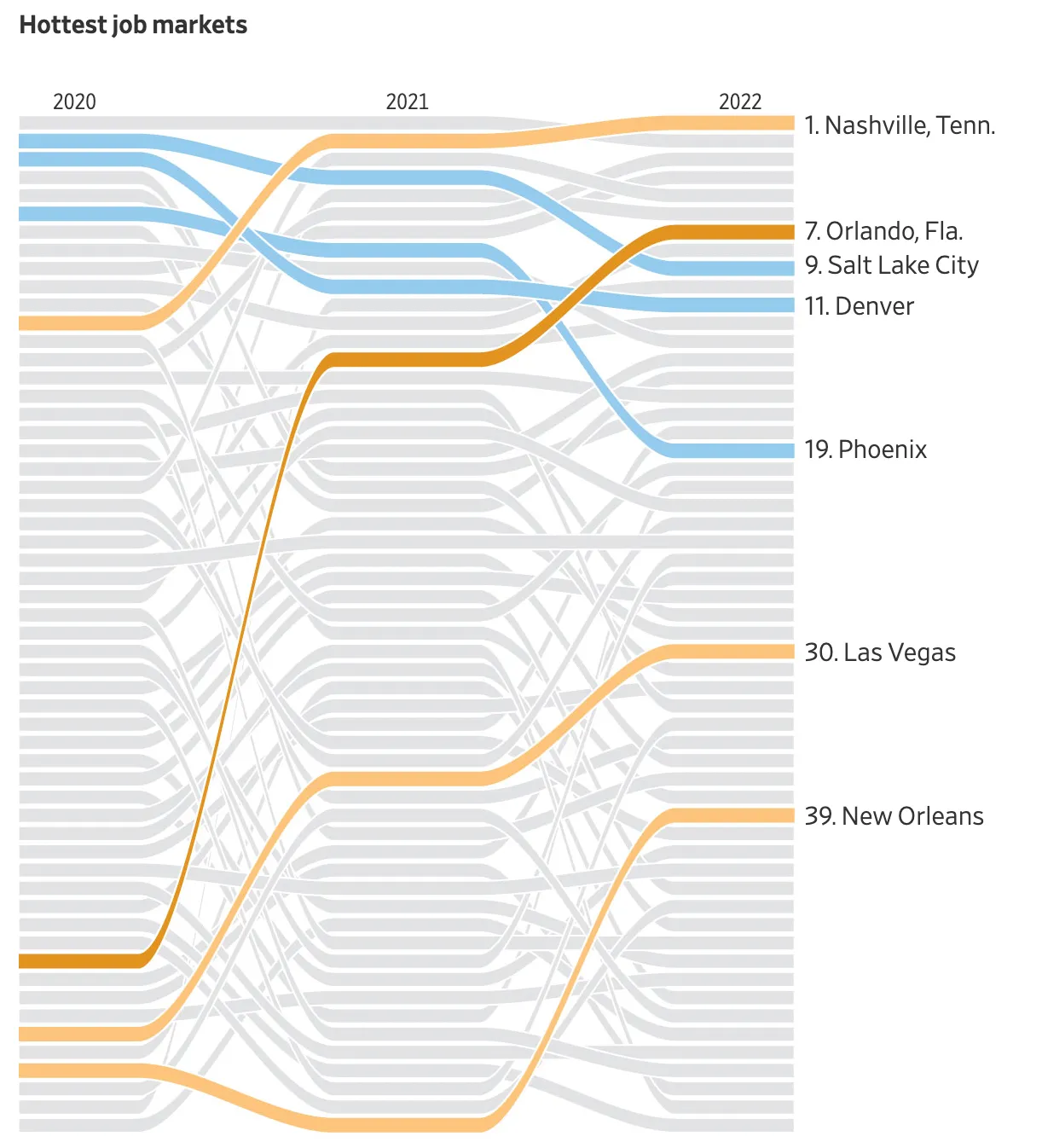
This chart in the WSJ shows how you can focus on data points that matter to your story, while literally ignoring other data points that are less relevant.

This slide is obviously super complex, but you can also apply this style with more mondaine, everyday slides.

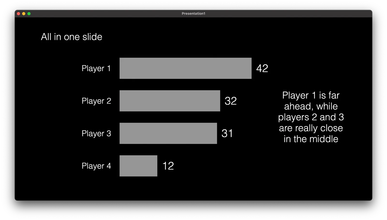
Instead of complex animations, it is easer to copy a version of your chart in consecutive slides, and adjust the coloring and messaging to highlight the points.

This approach also makes sure that your story is visible in environments without animations (PDF, mobile devices)

·Layout

Designing with actual data

There is a reason why many presentation templates and data dashboards look so bad: they have been designed without actual data.

Most corporate presentation templates are the result of the work of a designer who has been given a white page to add some stuff to. The resulting white template page might still look OK, but when it is filled up with typical slide content…

Information dashboards looked great in the mock up screens: dials, tables, buttons, graphs, until they are populated with typical data: text blocks are longer shorter than in the mockup, important data is actually not there, non-important data is, all graphs look flat, and all dials have more or less the same color because the values don’t change that much.

Presentation template designers, ask for an actual deck to start working on. Dashboard UI designers, ask for a real data set.

·Images

More logo cropping

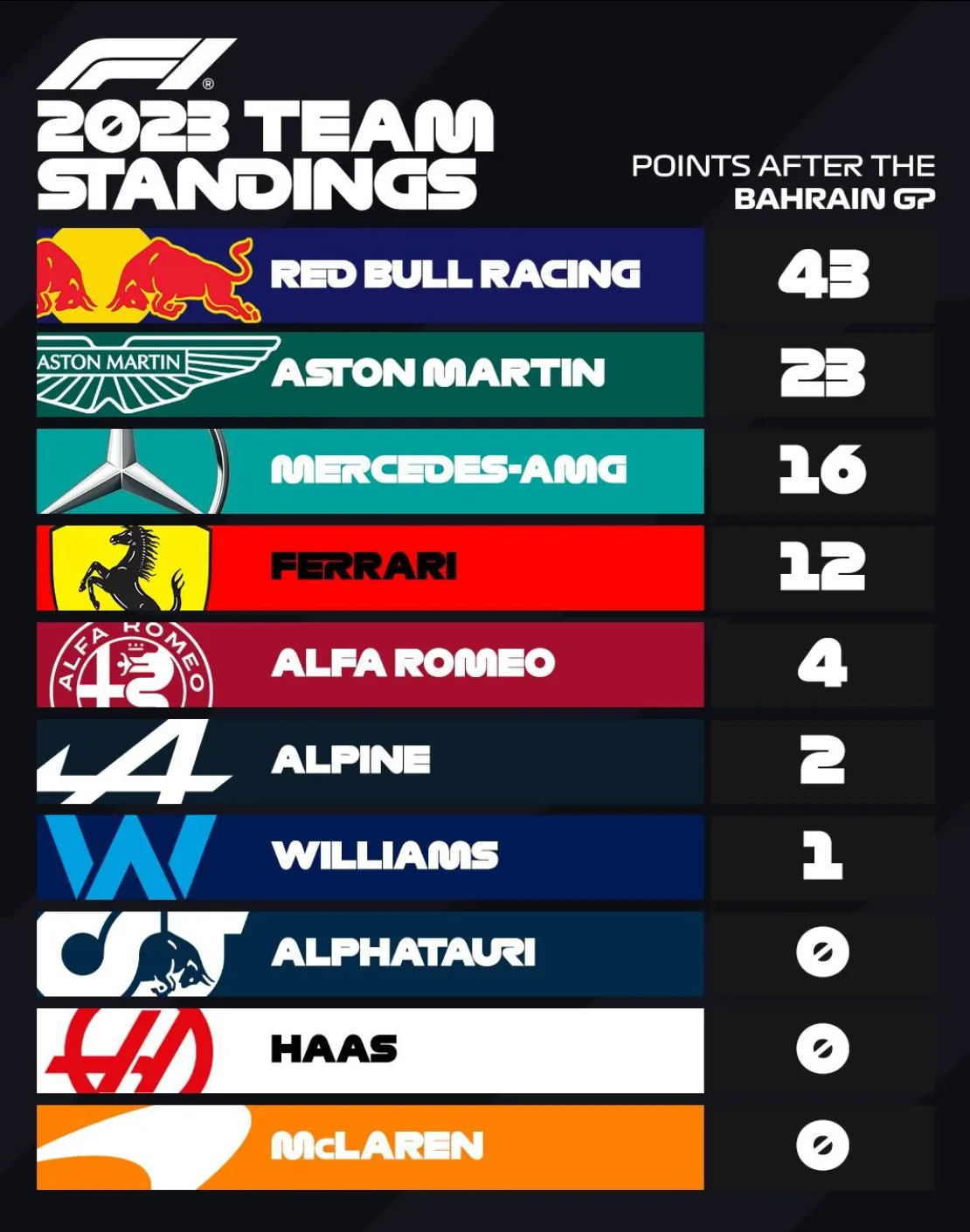
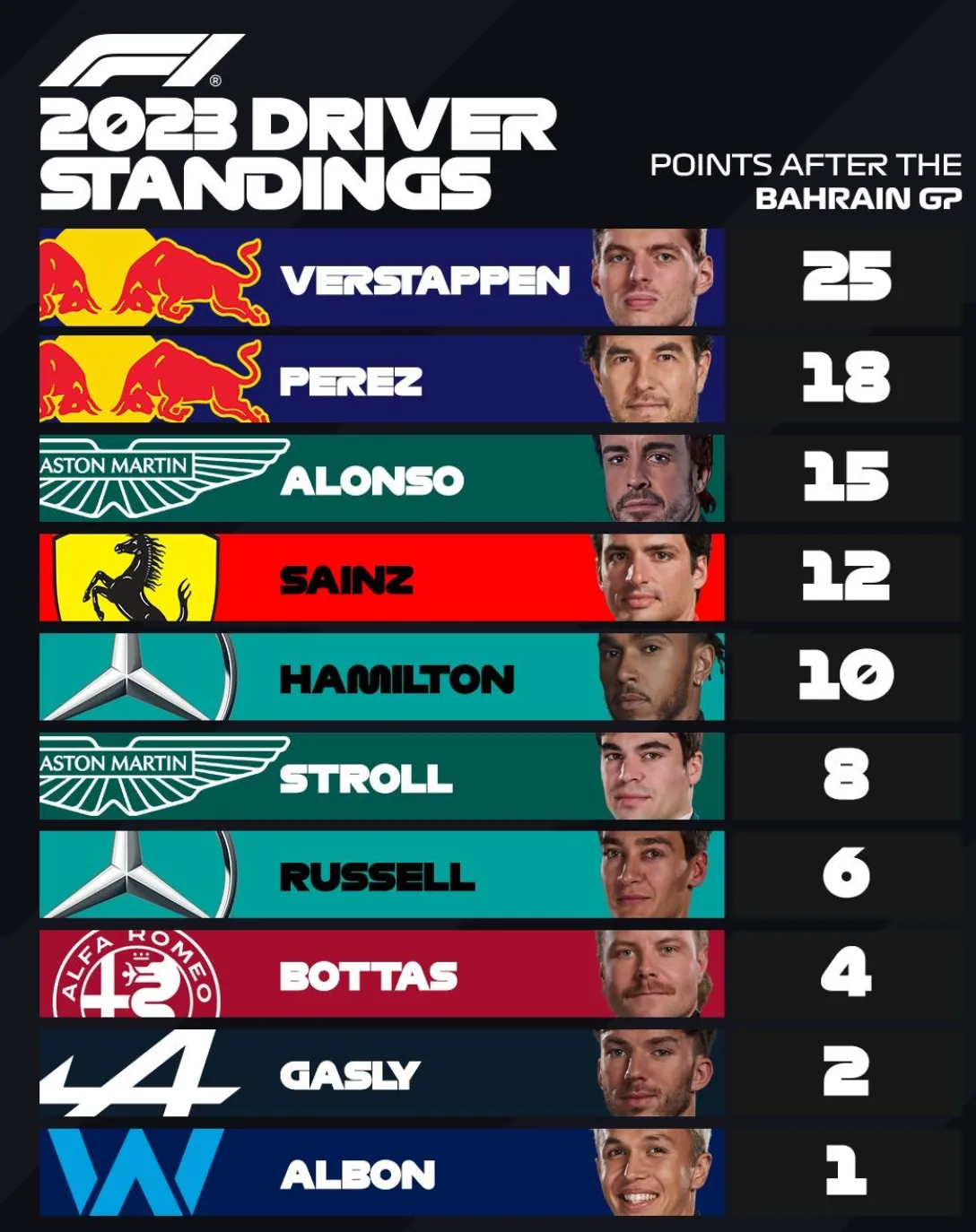
The F1 graphics designer has the same problem that we presentation designers face: how to deal with logos that have completely different aspect ratios. Very long ones vanish in a square tile, square and round ones don’t look good in a wide rectangular box.

Their solution: let go of the requirement that the entire logo should be visible. Carefully crop out parts of the logo while making sure that it can still be recognized and read. All this is supported by borrowing the dominant color of the logo in the text box.

·Layout

An alternative calendar

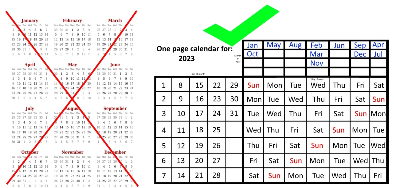
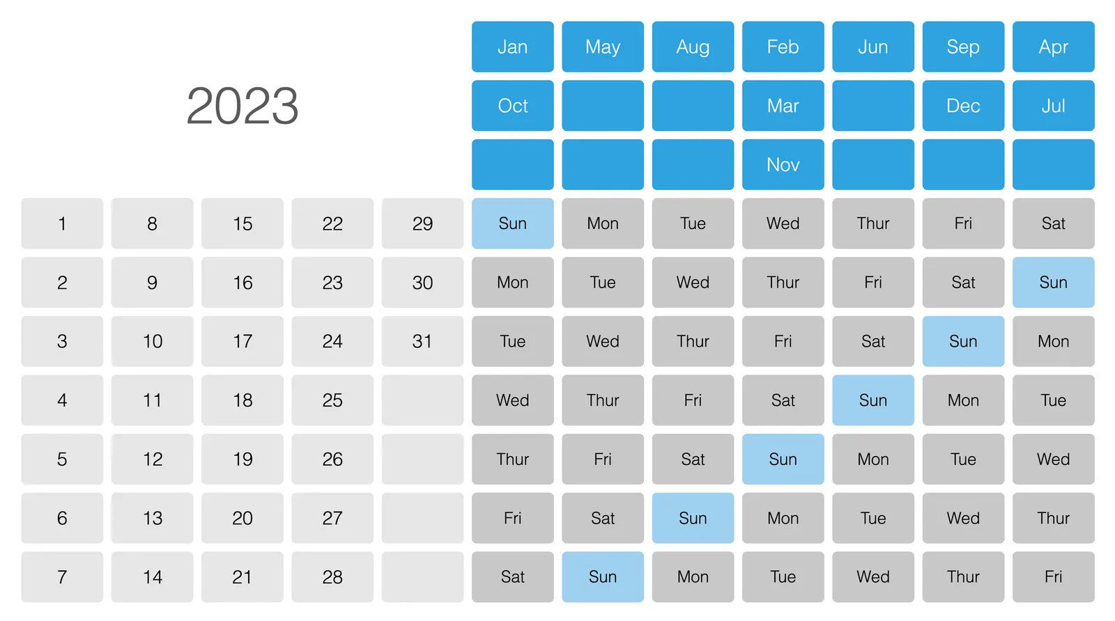
Here is an interesting twist on the traditional annual calendar:

 Image credit: https://bigthink.com/starts-with-a-bang/one-page-calendar/

Image credit: https://bigthink.com/starts-with-a-bang/one-page-calendar/

Yes, it is a lot more efficient when it comes to the amount of space it takes (or the required font size to fit a whole year on a page). But I think the point of the big, dense, calendar is to schedule and plan things across the year. Also, you need to do a few mental steps to get your head around looking at a specific month.

I added a template with this calendar to the SlideMagic template library, search for “calendar” in the SlideMagic app and it will show up.

You can read the full discussion of this alternative calendar format here.

·Delivery

Rehearsing the whiteboard

Adhoc brainstorm meetings are very hard to manage. If you have to discuss a complex issue, it might be worth to prepare and rehearse your white board sketch before entering the room.

On its own, a white board (or a black board at school) is not very meaningful. A bunch of words and drawings out of context. For the person who sat through the meeting, the board is very meaningful. Every scribble on a specific location on the board is a visual anchor for the entire rich discussion that was held about it.

So rather than prepare a big slide deck, maybe you should prepare your white board. Where do you put what. How do you connect elements. The whiteboard gives you the perfect excuse not to make perfect drawings. Try 3, 4, 5, or even more versions until you are left with one you like.

·Layout

Automated executive summaries

I am starting to think that in the not too distant future, pretty much everyone will toss any piece of business writing into some sort of ChatGPT bot with the question “what does he/she actually want?”, instead of reading the actual text. Too many bullet points, too many long-winded emails, too many lazy writers… Let’s use AI to cut to the chase.

With that, some new sort of SEO (search engine optimization) will emerge. The bots are available to anyone, so you can predict what the bots will say about your text, so people might actually start optimizing/writing text that will trigger the right kind of output by the ChatGPT bot.

But maybe that can be automated as well…

·Layout

Aligning logos in presentations

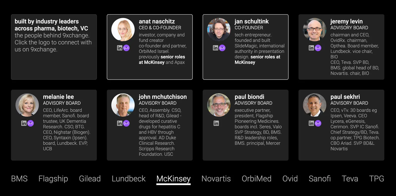
Getting logos to line up properly is one of the hardest things in slide design. I have not been able to come up with a set of rules to do it, every time I need to eye ball things to see whether things somehow look right. Below is an example from the 9xchange web site:

There are a number of (conflicting) inputs:

  • The middle of the image file
  • The typographical baseline of the text
  • The middle of the non-text part of the logo
  • Tag lines above or below the brand name

Always fine tune logo pages because any automated adjustment will for sure not get it right.

·Layout

Showing busy bios on a web site

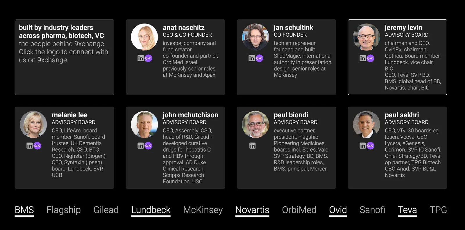
My venture 9xchange is new in the world of healthcare, wo we need to establish credibility by showing that we have significant experience and are backed by significant people. Here is what I came up with (see the 2 screenshots below).

I put up a dense grid with the bios of the people involved. Below this table, are a few recognizable brands from the world of healthcare. When you hover (or click on a tablet) over a person’s bio, a relevant subset of the brands light up.

Alternatively, when you hover over, or click the brands at the bottom, relevant people get highlighted, including the relevant small print in their CV.

You can check out the progress of the work on the 9xchange website.

·Design

How do people glance over a corporate web site?

There is a lot of science and analytics available for eCommerce web sites. Changes in layout, design, and content immediately translate into changes in clicks and sales. The story is a bit different for a corporate web site that is not transactional, it does not sell anything, it does not have a big signup button, but plays the role of a digital business card for a company. Let’s say the first web site of a startup aimed at investors and the first enterprise customers.

Some things to look at:

  • The most important aspect is probably the look and feel of the site, regardless of the content. Does it look professional and serious (as in of a serious company). If that funky or complex graphic somehow does not look quite right and you can’t put your finger on the spot why, take it out. A professional looking simple graphic is always better than a botched attempt at a complex one. Make sure that copyright year is the current one.
  • This seems obvious, but is often lacking, the site should actually state what it is you do. Try it on people that have no background at all in the market you work in, try it on people that love to put you in well known boxes (i.e., venture capitalists)
  • Different companies need to emphasize different things. For most companies, the founding team and its head shots will be buried in some ‘about’ section of the web site, for very early stage startups, it might need to feature prominently on the first page since it is basically the only asset it has.
  • No one reads a web site top to bottom like a newspaper article. Instead, people glance. Read a headline, look a the small text below a photo, read a random paragraph. Don’t arrange content in order of importance solely, but think about the visual hierarchy. A small picture might grab more attention than the big cliche headline.
  • It is tempting to lift stories from presentations and translate them to the web site. The founding story of how it all began to where you are now including that big pivot in 2020, the market gap analysis that is the start of your investor pitch deck. These stories need a place, but maybe not on the home page of your web page.
  • Avoid jargon. “Ah, this site is filled with blah blah” and people will stop reading. But do include language that is common in the industry you are working in.
  • Make sure that the site has the details that should be there: contact details, etc.