SlideMagic Blog

Frequent updates about all things presentations since 2008. Subscribe to never miss a post.

RSS
all posts

Category Layout

·Layout

Presentation design without the design

Most business presentations can be done perfectly without sophisticated and complex visual concepts. That image of an elephant balancing on a ball, or a 3 dimensional constellation of rotating database cylinders might not be necessary to get your point across.

Instead focus on the non-design challenges:

  • Finding nice full page images that can introduce the problem you are trying to solve
  • Recutting, regrouping, re-wording the key problems and your solution in a very clear and crisp table
  • Deciding what are the key statistics and data you want to use to show that your solution works and that the company is having momentum
  • Organising the more “boring” facts about your product/company in some decent looking tables in the back of the deck (team, product offering, pipeline, terms, etc.)

Full page images, tables, and simple graphs, that’s all  you need (and all you will find in my presentation app SlideMagic). Doing more complicated things is more risky:

  • A perfectly executed simple slide looks a lot better than an amateurish looking effort at something that is more than you can pull of.
  • You can hire an expensive graphics designer to do the concept for your, but her style will be dramatically different from the slides you want to add yourself to the deck last minute

Keep it simple, and do that really well.
·Layout

But it looks so simple!

Often when I produce a slide with simple rectangular boxes and just once accent colour plus a black and white image (hey that looks like a SlideMagic slide), I get the comment that “things look really simple, unsophisticated”.

No icons, no shadings, Helvetica, no drop shadows, no rounded corners, no gradients, no nothing.

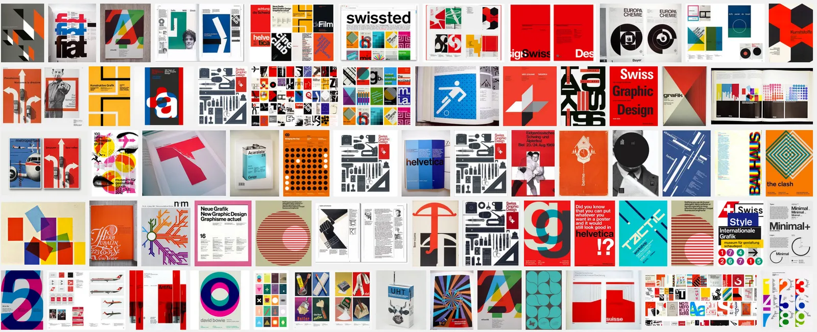
Here is the trick: it is the composition of the slide that makes things sophisticated. And that is the hard part to get right. Look at the work of the famous Swiss graphics designers of the 1960s. Most of them designed posters with the very same tools that you have in your hands when opening PowerPoint.

Look some of the simpler posters, look at your slide, look back at the poster, look at your slide. Spot the difference, and fix it!. It is layout, not fancy graphics.

And, my presentation app SlideMagic makes it a bit easier than PowerPoint or Keynote.

·Layout

A business card web site

I made a brief side step into web design last week, when a VC fund for which I created the fund raising presentation needed a web presence as well.

This fund (like many other businesses), needed a simple “business card”, a decent, professional-looking web presence that works on all types of browsing devices. It was not trying to sell a product to consumers, it was not giving access to a content library, it was not powering a market place.

Many of these business card web sites look poor:

  • People pick the wrong platform. A template that offers too many features, that can only be maintained by a web developer.
  • People let the design be driven by the menu structure that the template offers, rather than the content
  • People enthusiastically create active content sections (blog, news, links to social media pages) that then are not maintained.

For business card web sites, keep things very simple, but over-invest in the design of the web site. And design does not mean spectacular effects, video, and clever popups. Does the page look balanced and good (on both large and small screens). Pretty much like you would design paper/print work.

·Layout

Ponder charts

Not every PowerPoint slide is meant for presentations to a big audience. Some charts are meant for pondering behind a big screen. The one below is an example (made by FirstMark Capital).

Venture capitalists love these industry overviews full of logos and sectors. You could make this chart cleaner:

  • Replace logos with small text boxes
  • Perfectly line up all these tiny text boxes in a grid
  • Replace the rounded-corner shapes with shaded rectangles without a framing line

But that chart would be less fund to ponder…

·Layout

If things are busy, make a busy chart

Chart loaded with detail are usually not the best way to convey a message. Except, when your message is that things are actually very busy, complex, interrelated. Then by all means make a busy chart. When presenting, don’t feel tempted to go into the detail of its content though, the message stays “things are busy” and [click] you can go on to the next chart.

Art: The Fight Between Carnival and Lent, by Pieter Bruegel the Elder in 1559

·Layout

We say, but we don't do

Many people start of a presentation design project with “we want a presentation like Apple”. A great intention. But after you come back with a first version (black background, a few words per slide, no bullets, no agenda pages, no summaries, no logo, no page numbers), people feel that it looks too dark, the flow is not clear, they want to summarise upfront what they are going to say, it is hard to refer to pages, it needs some branding, and to make sure that a certain point comes across, you better spell it out word for word on the slide.

Image by Danny Lion

·Templates

A new way to organise my presentation templates

I am experimenting with a new way to organise SlideMagic presentation templates and started adding them to www.slidemagic.com/templates. I will be adding more over the coming days. Please let me know if you have request for specific slide concepts I should add and I will see whether I can help you.

·Layout

Counting the boxes

The first thing I do for almost any slide is “counting the boxes”: how many points does each argument have, how many people are there on the team, how many layers to the technology, how many steps in the process.

This drives the layout of the slide: 2 columns with options and 3 arguments each, a 5-step value chain, a 6 x 4 grid of logos, 5 management bios next to each other, 10 columns of sales data, etc. This layout will make sure that your slide looks evenly spaced out. You are also see that in most cases, the (bullet point) list grid structure is actually not the one you need.

PowerPoint and Keynote do not have very strong grid capabilities. Spacing out equally sized boxes across a slide is a pain, and table editing is not much better. And that is why I made the grid structure the central feature of my own presentation app SlideMagic, try it out!

Art: Perspective box, Pieter Janssens Elinga, 1623

·Layout

"We need to add this bullet"

Group editing of a slide deck is difficult, especially if it involves a lot of people, and especially if some of the people editing dial in from a remote location. If you do not have the full view of the presentation (either because you are far away, or you have not been involved in the process that much), you should resist the urge to ask the junior analyst to add “an extra bullet to the slide that say [fill in message]”. There is a good chance that that point is already made on another slide.

Art: Dogs Playing Poker by C. M. Coolidge

·Story

Flatten those bullet point hierarchies

They appear often in business presentations: hierarchies of bullet points:

  • A summary point that partly repeats what is said below
    • A sub summary point that partly repeats what is said below
      • A sub sub summary point that partly repeats what is said below

The worst of all bullet point sins: the lone bullet point that jut hangs there without a brother or sister.

Breaking up a problem/story in its components is great for solving problems: you can get a hypothesis quickly and carve up your team to work on each of the individual bits. They might even work as the skeleton of a presentation story flow.

On actual slides though, it is a different matter. These hierarchies are hard to read and process. You read the summary, read the supporting points, then combine the supporting points to internalise the summary again. Too much.

For a presentation, you need to flatten the bullet points.

  • Kill bullet point hierarchies as much as possible, creating a linear flow
  • Then, spreading out each bullet point on a separate chart (as much as possible).

Ever wondered why my presentation app SlideMagic does not even feature the option of a bullet point?