SlideMagic Blog

Frequent updates about all things presentations since 2008. Subscribe to never miss a post.

RSS
all posts

Category Layout

·PowerPoint

Using perspective in PowerPoint

Today, there are many tools to create 3D visuals: images, videos, evening 360 degree virtual reality simulations. Most of the time, these perfect 3D compositions are overkill for business presentations. But sometimes, 3D compositions can help communicate your message. I am thinking of “road ahead”, “obstacles” and other concepts that are common in business presentations.

PowerPoint which is aimed at non-professional designers, does not have very powerful 3D object manipulation features. If you try to use the few that are there (3D object rotation, adding depth to shapes, putting drop shadows), the result often don’t look realistic.

My PowerPoint 3D abilities more or less followed the 3D development of a child who learns to draw. First, no perspective, then adding the side view without making things vanish into an imaginary horizon, then acknowledging the horizon, but not being consistent about, until finally you get what is actually happening and being able to tell why what you draw somehow does not match reality.

Most of the time, I ignore the built-in PowerPoint 3D features. Instead, I use regular shapes which I put on the slide canvas with some help of temporary lines. You can have a look at the example below. Objects should more or less fit within the boundaries of the lines, and text should be resized accordingly.
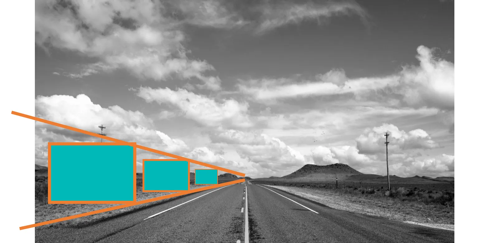
So, two principles:

  1. Only use 3D in PowerPoint when you actually need it to express a point. 3D for the sake of 3D does not make your charts look more fancy or clear
  2. When using 3D, keep it simple, and pay more attention to the proportion and positioning of the objects than “sophisticated” 3D effects
Continue reading →
·Layout

How to present the competition

The best slide to talk about competition of your product or company depends on your specific market.

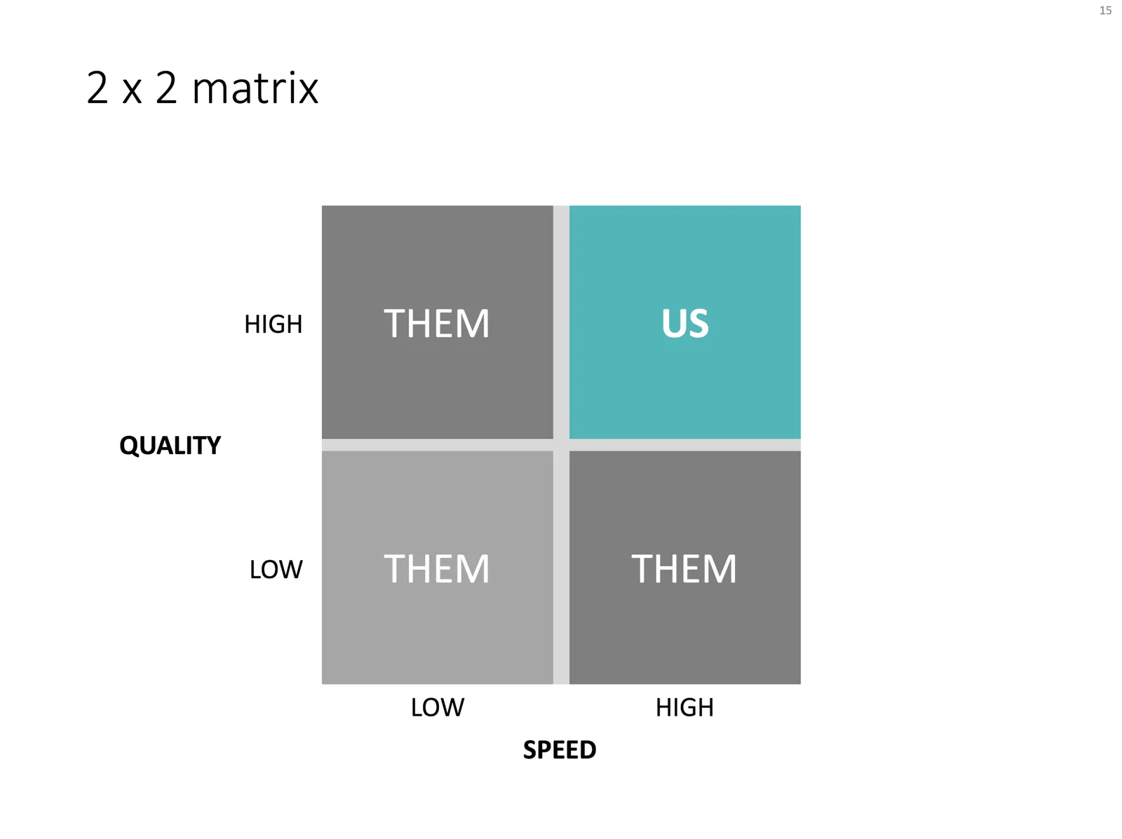
Most people first try to squeeze all competitors on to some sort of 2x2 matrix. This is a great option if there are 2 distinct axes, or 4 market segments.

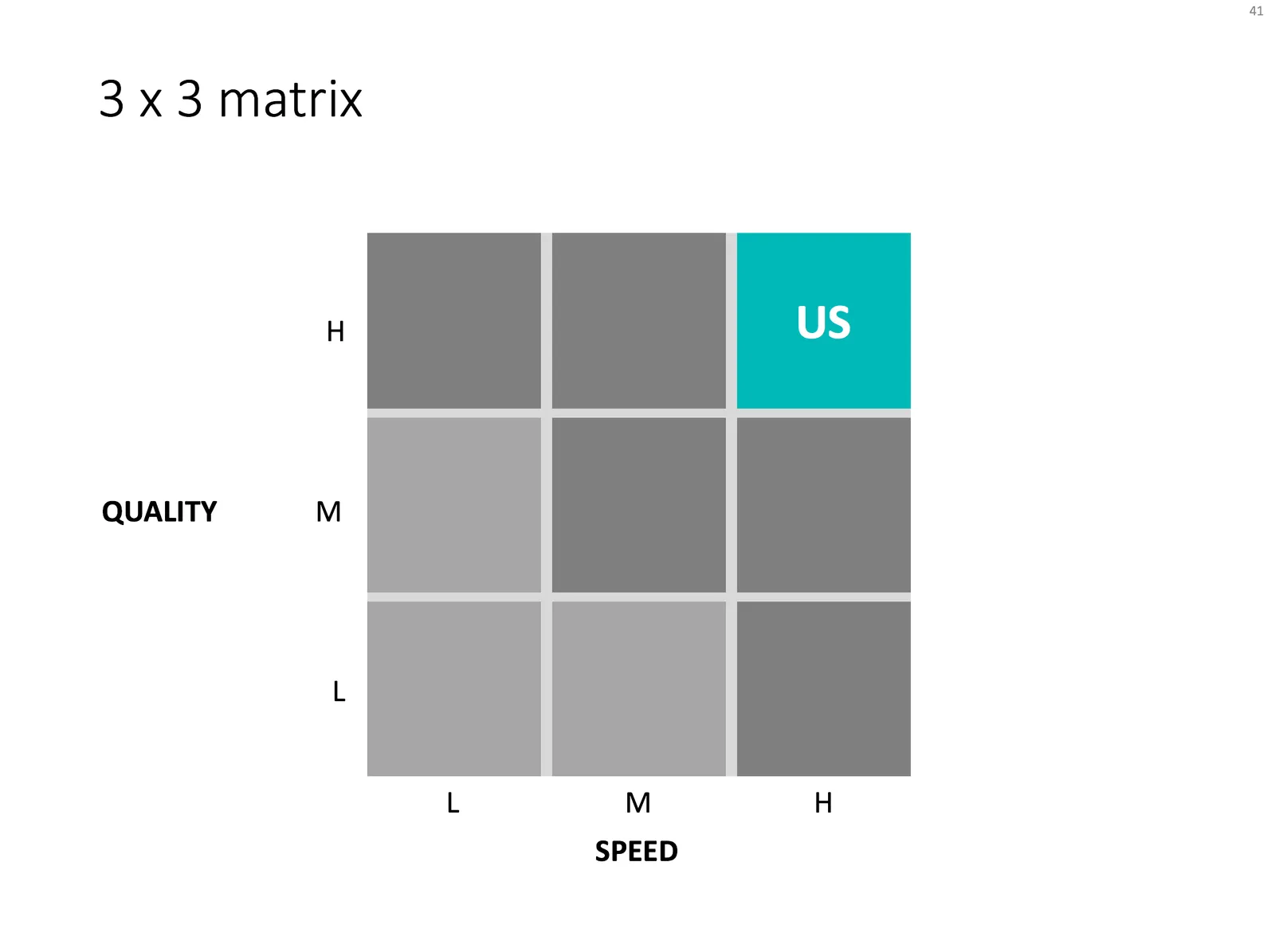
You can add nuance by using a 3x3, creating 9 market segments. I prefer to put the competitors locked to the grid, and don’t get into debates about where they exactly sit on the spectrum.

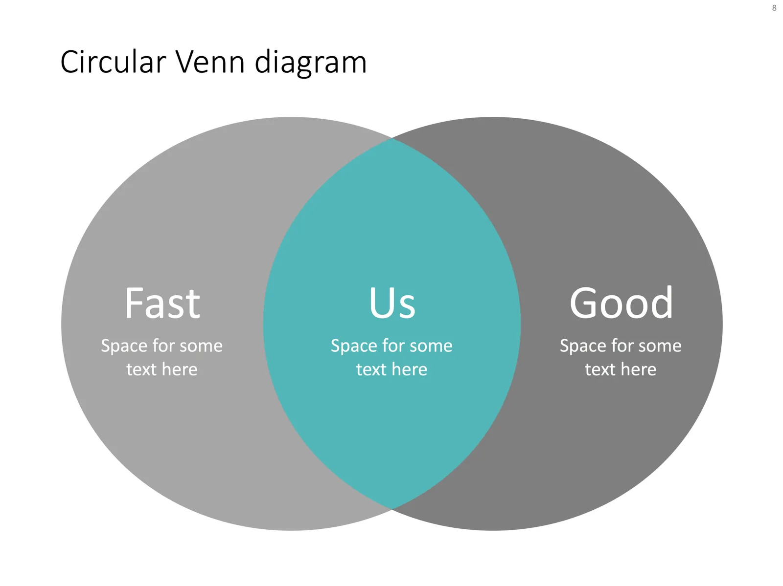
But, if you have a hard time finding the definition of these 2 axes, the matrix is probably the wrong format to use. In many cases, the bottom left quadrant stays empty, and/or is meaningless. In these cases, try using a Venn diagram, which is basically a 2x2 matrix with that bottom left box chopped of.

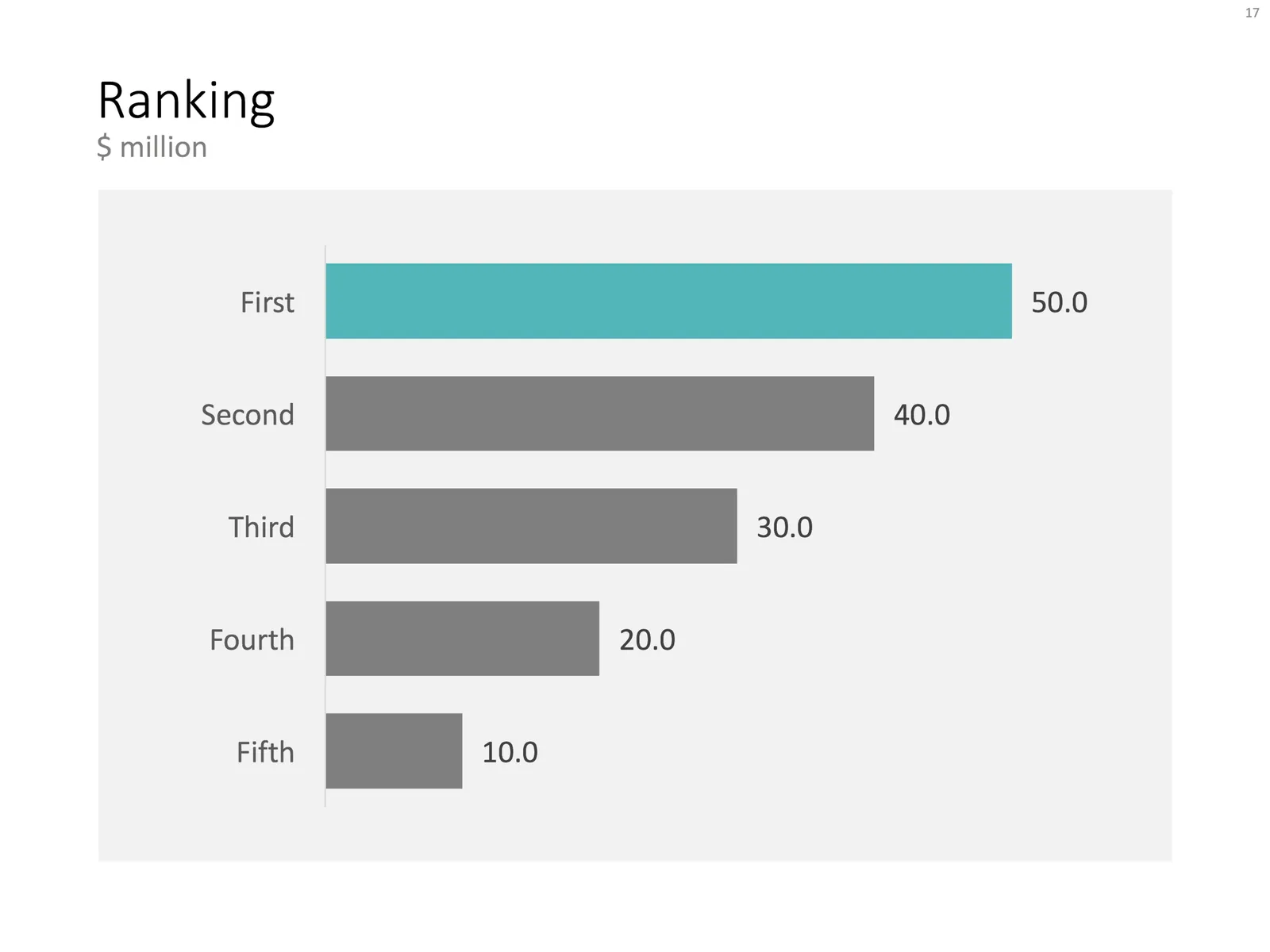
In other cases, a simple bar chart my be sufficient. Rank you versus the competitors with one simple variable.

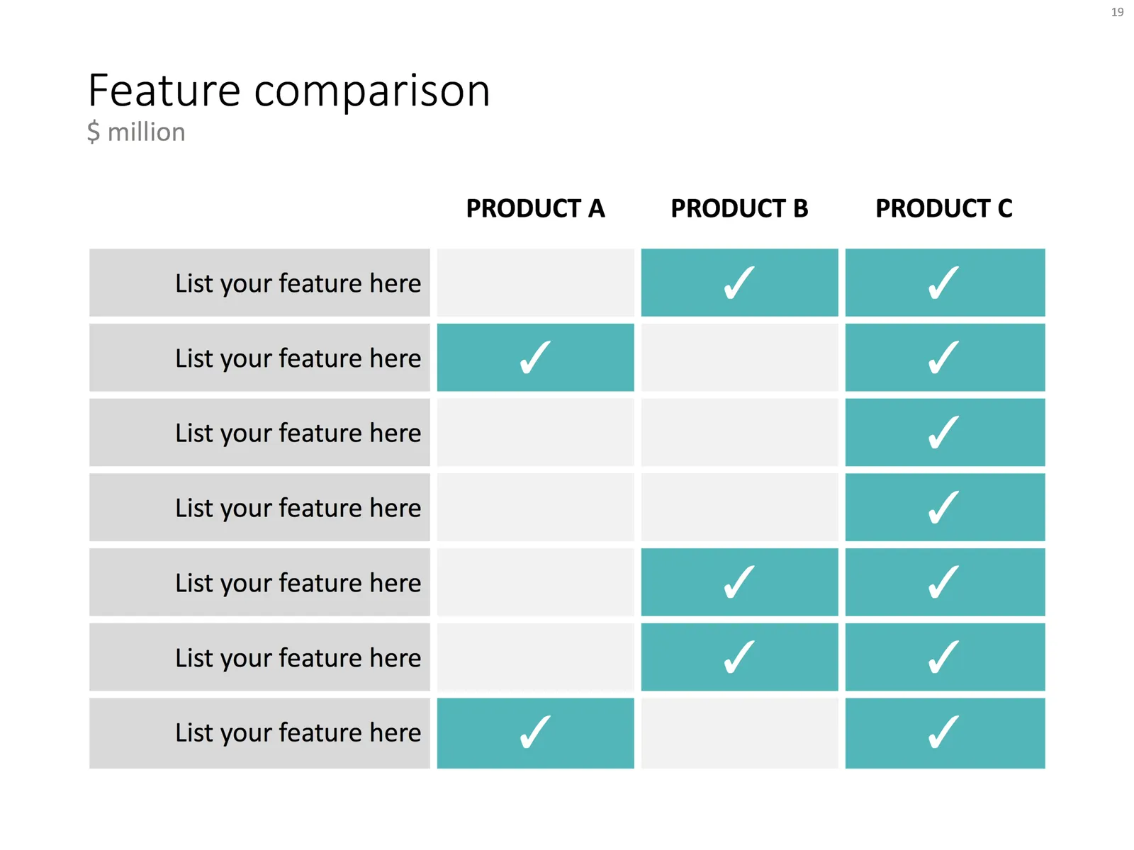
In most situations, I have to use some sort of feature table that can handle more than 2 dimensions on which to compare the competitors. Choose the comparison criteria wisely, avoid duplication, and give them the same level of abstraction/detail. Re-order columns and rows until you get homogenous blocks if “yes” and “no” cells.

Feel free to be inspired by the example layouts in this post. You can also click on the images, which brings you to the template store where I did the work for you. I frequently update the template store and try to tag slides with relevant keywords. A search for “competition” should bring up all the charts that I think are useful for visualising a competitive differentiation.

Continue reading →
·Images

App demo slides

Doing a live app demo in a 20 minute pitch meeting is risky, the technology might go wrong, and probably more than half the time you spent in a 2 minute app demo could be things that are not really interesting: logging in etc.

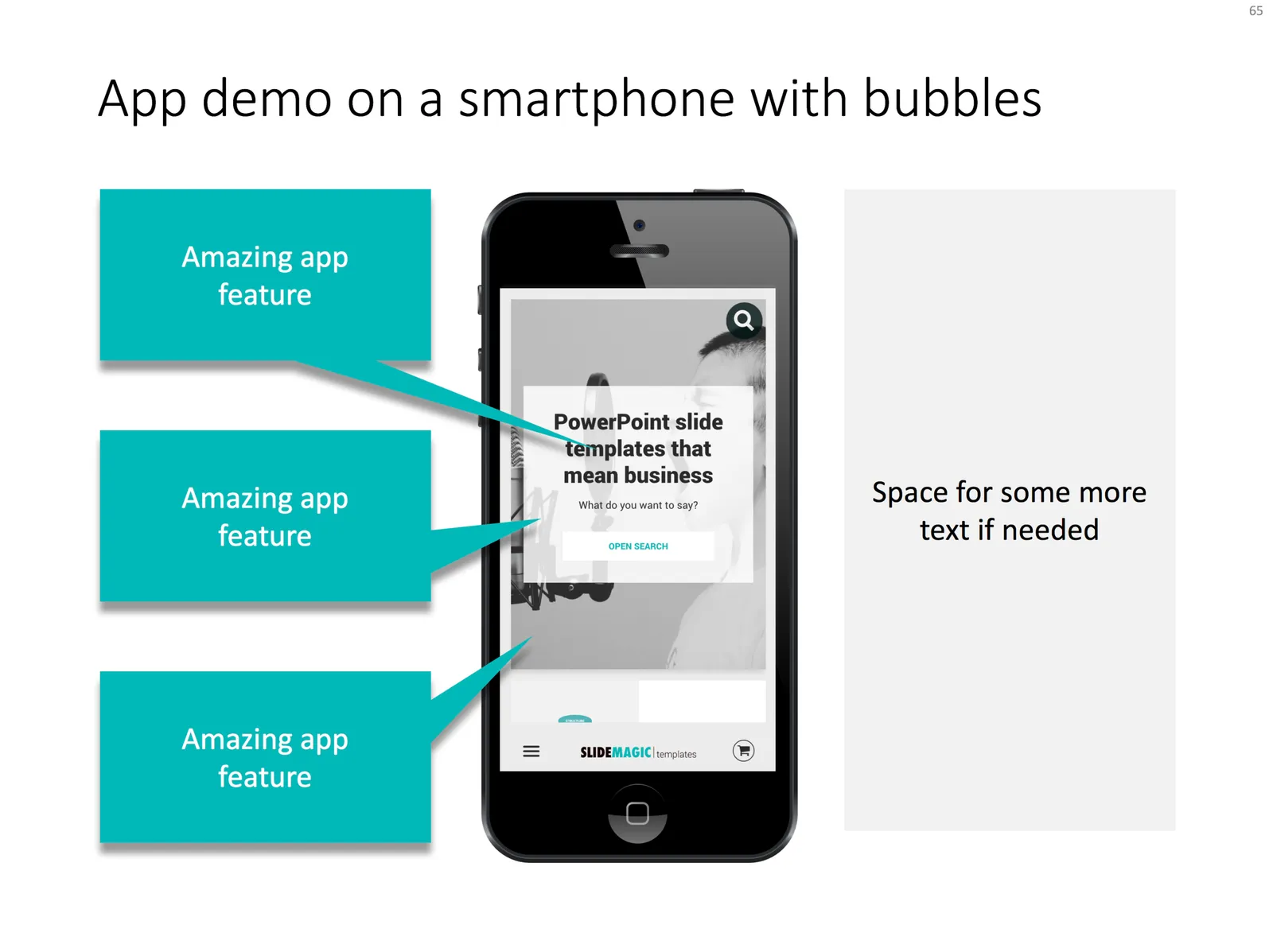
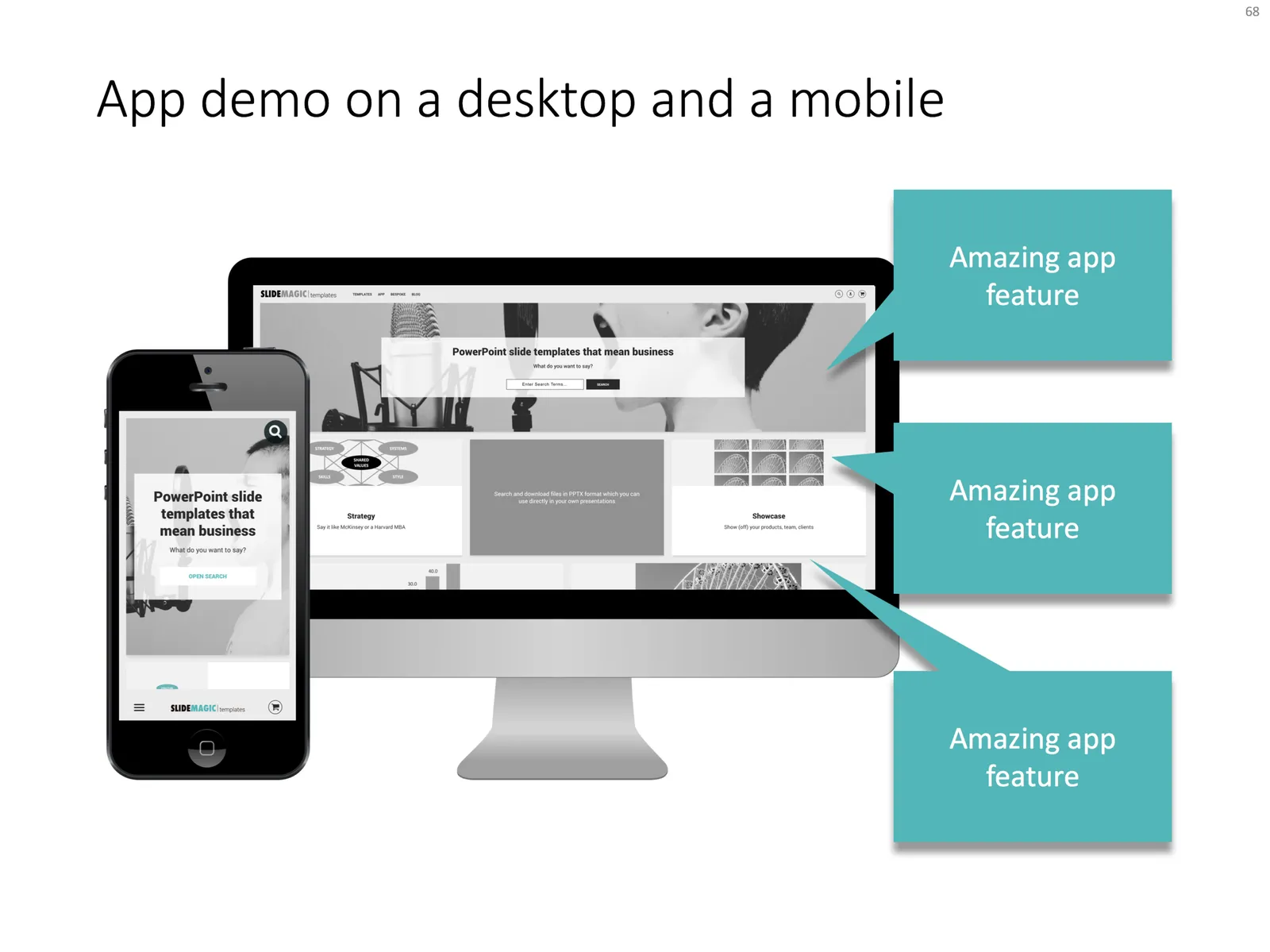
Instead, I usually prepare a series of screen shots with big explanation bubbles in my presentations. No technology risk, no loggin in, setups, and I can set the exact flow I want. The added benefit is that I can zoom into parts of the screen that are hard to do when showcasing the app live in an actual device.

Most of the time, I use page filling images to demo an app, to get as much screen real estate as possible. If I want to introduce the app in a general way, I use a background of a mobile phone or desktop to give the slide a more interesting context. As a result, the the screen itself will hardly be readable by the audience, and becomes a background image.

I added a few examples of app demo slide layouts to my template store.

·Layout

Spacing objects on a circle

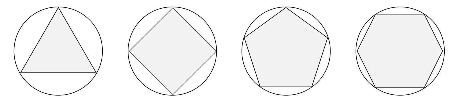
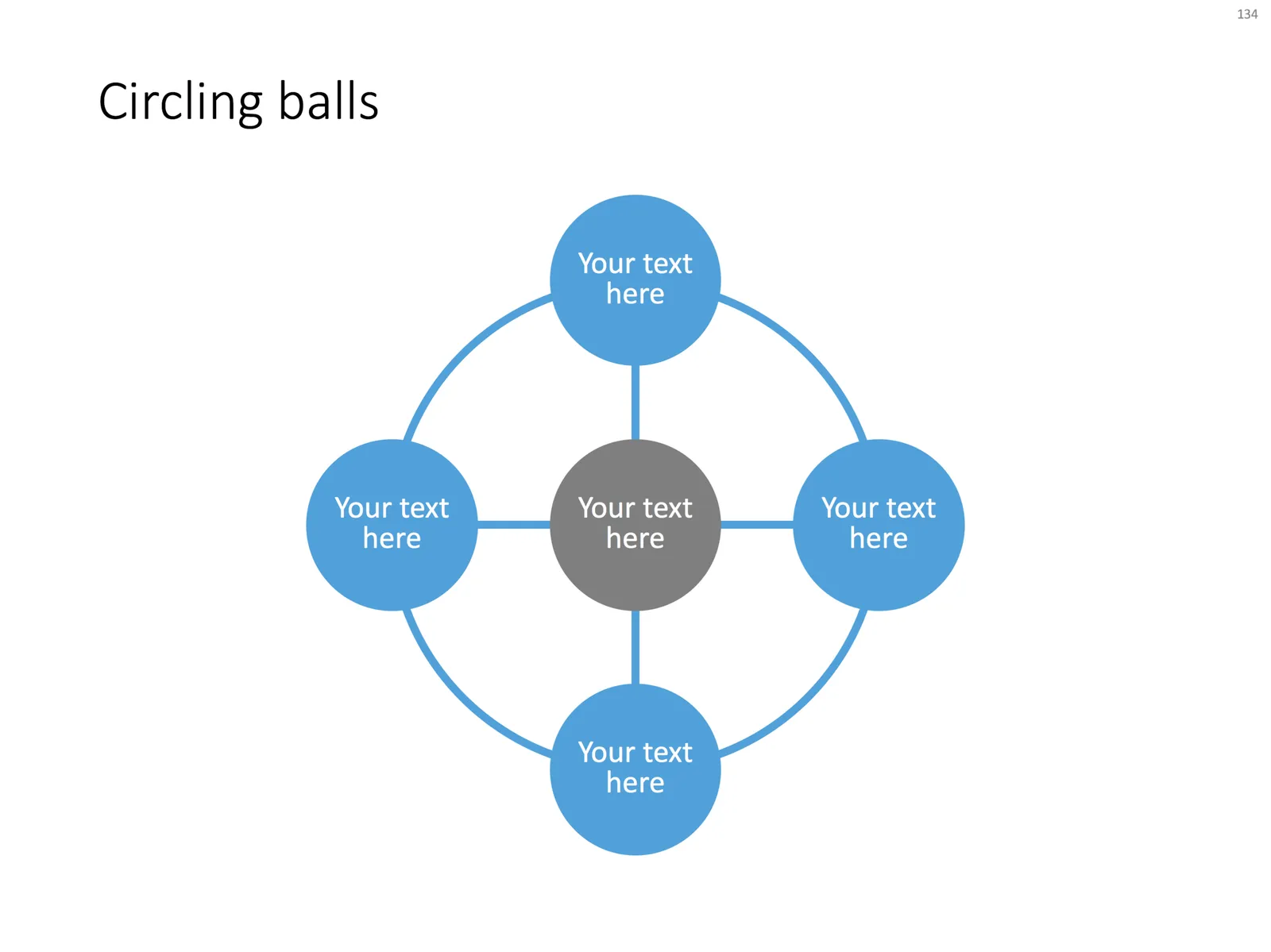
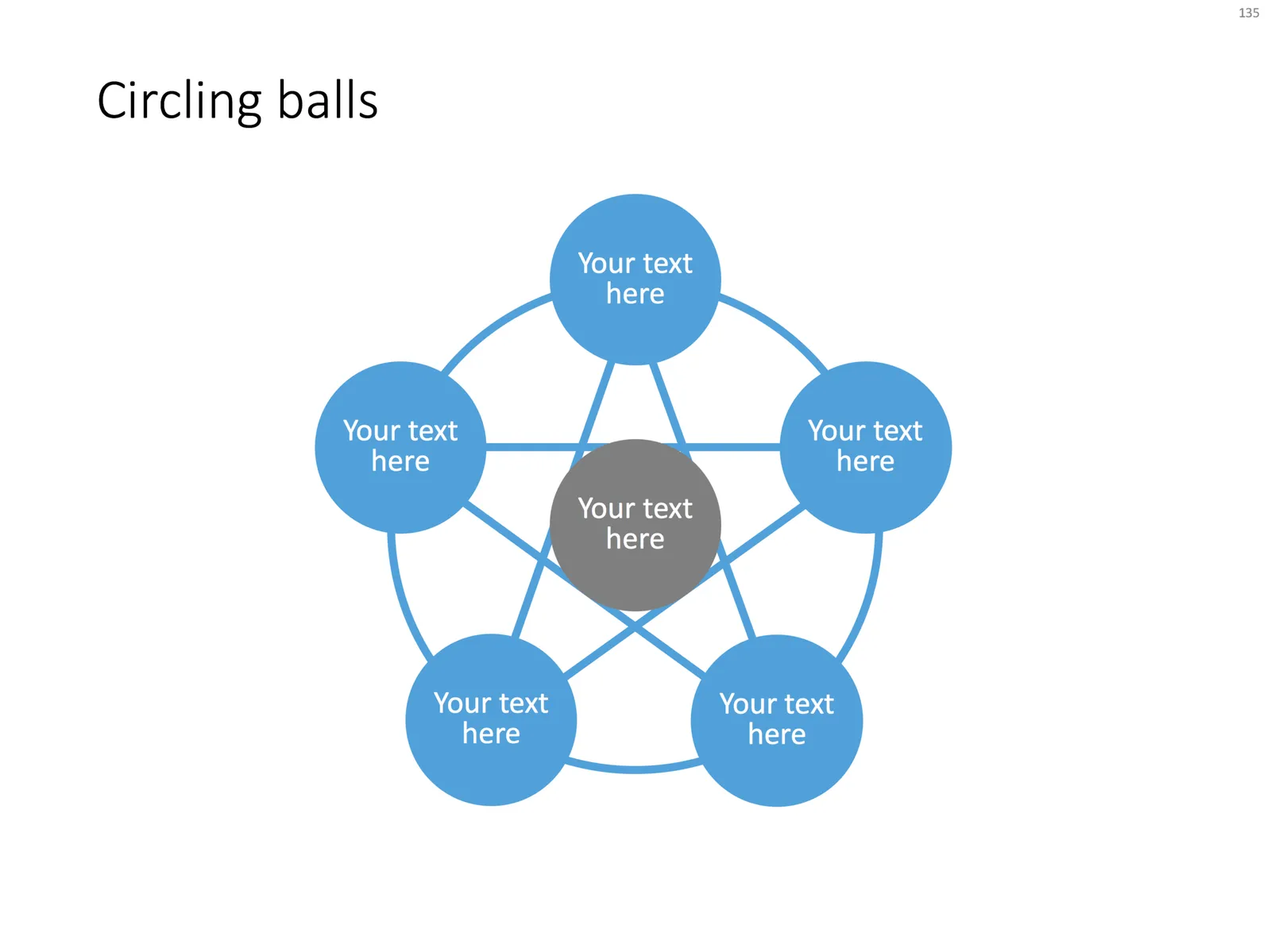
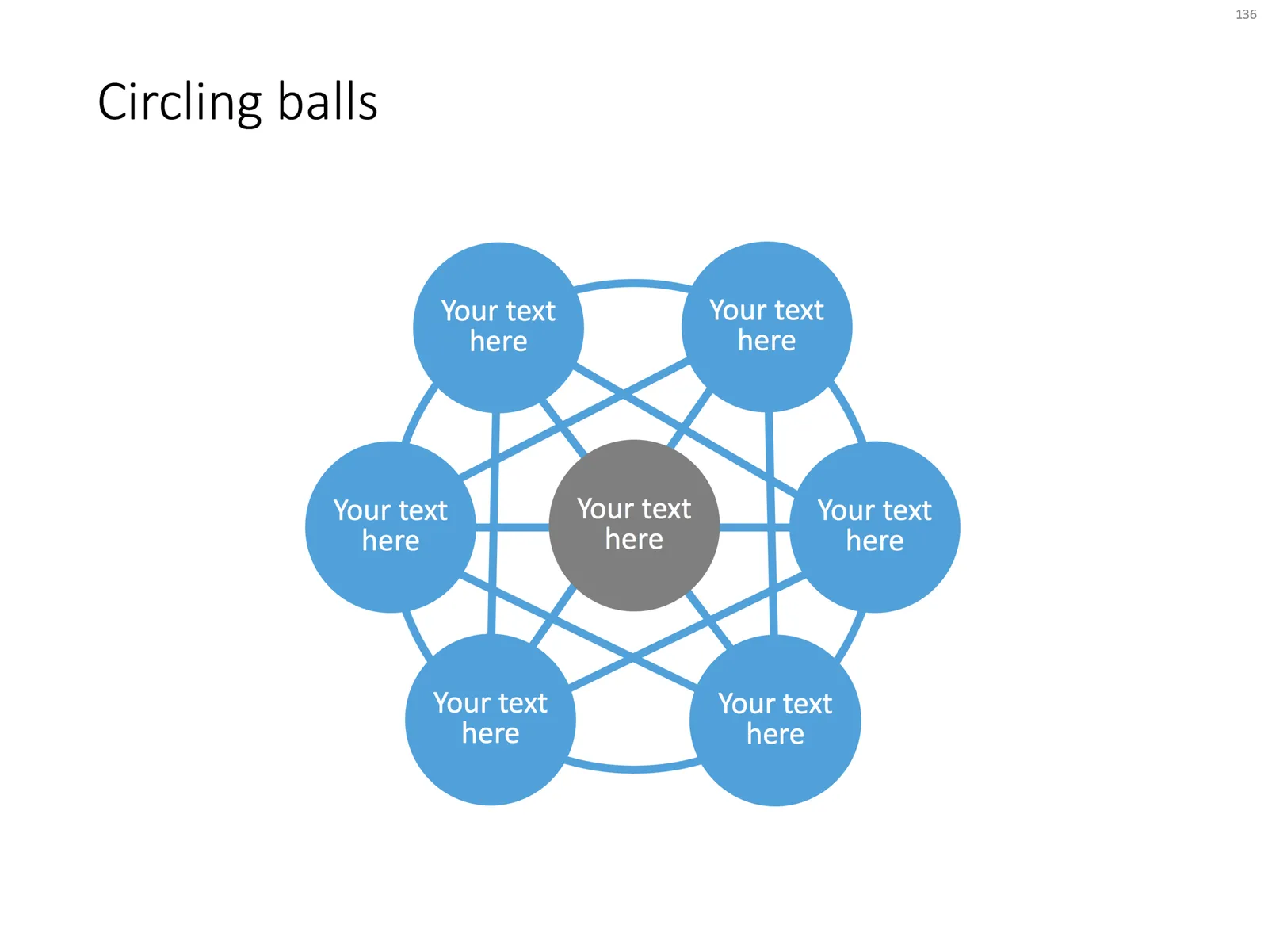
It can be tricky to distribute text bubbles evenly on a circle. To make it easier, you can put a temporary shape inside the circle like in the example below. Delete it after your bubble chart is complete.

UPDATE, I have now added charts based on this concept to the SlideMagic template store, click the image to find out more.

·Data visualization

Mixed cluster and stack charts

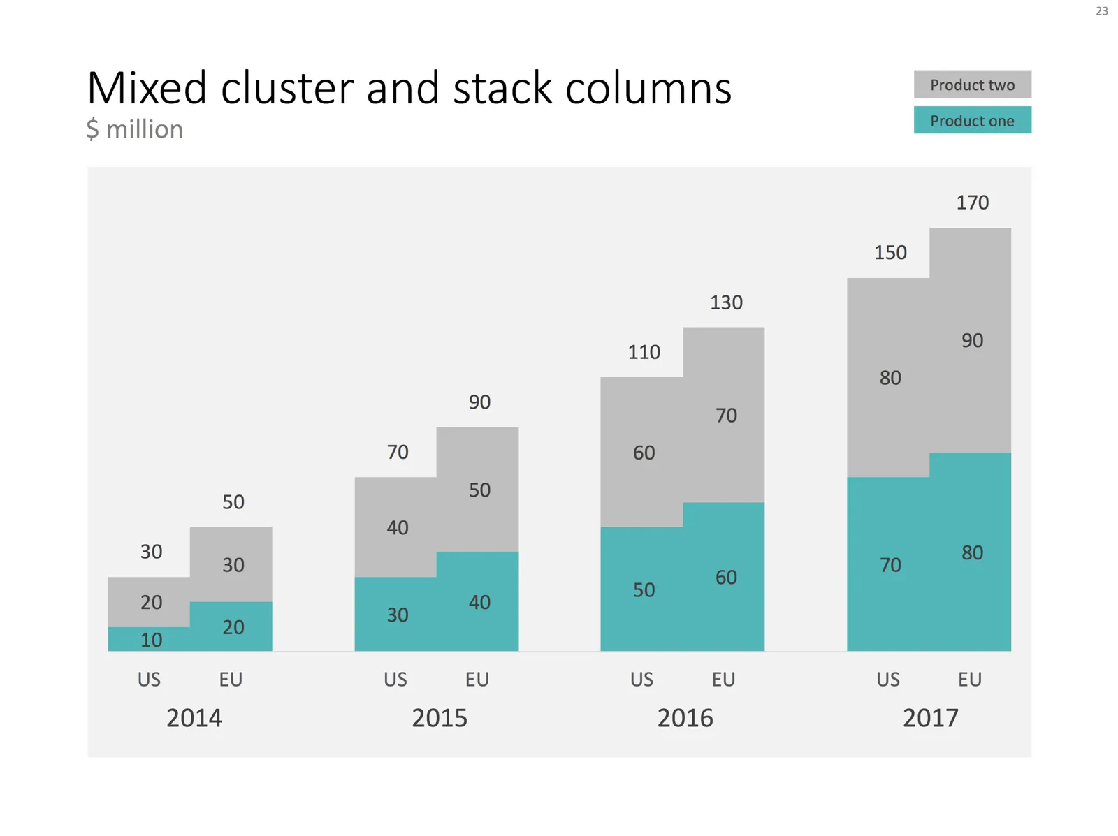
On a few occasions, I had to use a combination of a cluster and a stack chart. This chart is not available as a standard option in PowerPoint. Here is how to make it:

  • Create a regular stacked column chart
  • Set the gap width to 0
  • Blank out the data where you want the gap between the years to be
  • Manually add labels for each of the years

You can create one yourself using the above ingredients, or you can download the one I made in the SlideMagic template store:

·Layout

2 ways to stretch objects in PowerPoint

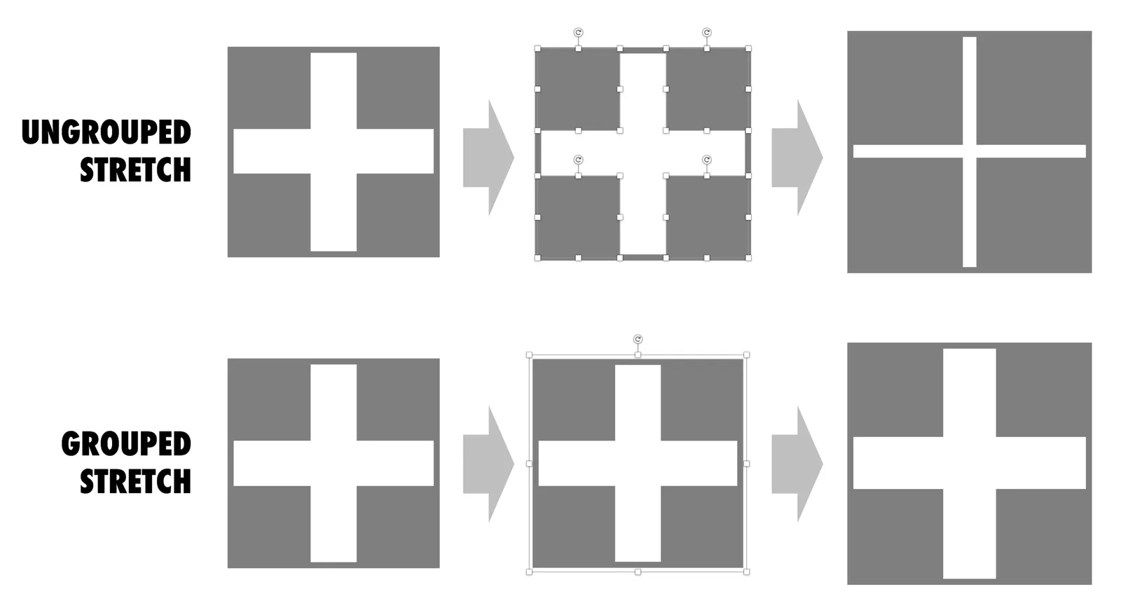
Use these 2 ways of stretching objects in PowerPoint to your advantage. One will make objects closer together, the other maintains the spacing between them. I never paid much attention to this in the first 2 decades of presentation design, but after noticing it, it has proven very useful over the past weeks. Better late than never.

·Layout

Digital car instrument clusters

I had the opportunity to drive a BMW the other day with al all digital instrument display panel. Car manufacturers have something to learn about design. The display tried really hard to look like an analogue one, reflections, depth effects, glow edges, gradients. The whole thing feels very PowerPoint 2007 / Windows 7 / Nokia to me.

Also, a digital display opens up the possibility to re-arrange how the smaller data elements are displayed (kms, fuel tank, etc. etc.), but BMW did not (yet) do that.

Car instrument panels are up for a big shake up. I think the answer is not displays that mimic analog gear, plus eliminating buttons and replace them with touch screens and menu diving. Instead, I would opt for a beautiful, minimal display of essential information, and actually, very high quality, regular “analogue” buttons.

It affects not only the user/driver experience today, but also whether cars will eventually turn into a classic or not. To make the parallel with electronics, old gear from the 1960s / 1970s can still look/work beautiful, while designs from the 1980s and 1990s with low res/poor digital interfaces look cheap and ugly. Digital displays that look advanced today, will be totally obsolete in 5 years from now.

We will see what happens.

·Layout

Slideuments and graphics designers

Many designers with excellent skills in web and/or print design somehow cannot deploy their talent very well in PowerPoint/business presentations. I have been thinking hard about why this could be.

The key challenge I think is the tight relationship with content and design. In print/web the design of a page does not really change that much if the content changes (it is still a block of text, an image, and an icon that fit in the same overall grid). In a business presentation, everything goes upside down when your competitor analysis needs to include 3 instead of 2 dimensions.

The second reason is - I think - that both people who write presentations and designers who polish them, stick to the conventional slide format: title across the top, list of bullets.

Now here is an interesting experiment for a 100% graphics designer who is not allowed or does not have the knowledge to touch any of the content (the classical print graphics designer situation). Assuming the presentation is a slideument (meant for reading rather than presenting).

Hand over the material in a word processor, as a long text file rather than a partly finished PowerPoint presentation. Now give the designer total freedom to present this material in any form she wants, even in any software she wants, using any page layout she wants.

Changes are you might get a pretty good lucking slideument by taking “PowerPoint” and its familiar layout out of the equation.

Image via WikiPedia

·Layout

Useful busy slides

Increasingly, presentation meetings are about discussing a proposal for investment or a product sale, rather than confronting an audience with an idea for the very first time. People have gotten the basic idea in material they saw beforehand.

So, there is a new role for busy slides, meant for pondering on a desktop screen.

A number of things can make slides busy:

  • Too many topics/ideas to cover
  • Lots of filler/buzzwords that inflate a simple point into a paragraph of prose
  • Complex relationships, dependencies, architectures, pricing models

The first two are a no-go, even for presentations that are meant for reading. The third option however, can be useful. In many cases, it is virtually impossible to visualize a complex timeline or network in a series of slides with pretty pictures and one word on them.

Some guidelines how to design these useful slides crammed with content:

  • Think about every word/label you type, can it be shorter, and if so, will we save an entire line?
  • Grid, grid, grid: make sure everything lines up with everything where ever possible, this will make the composition calmer on the eye
  • Hierarchy: create multiple layers of insight, big bold ones that catch the eye immediately, smaller subtle one for the reader who has more time
  • Use color to connect items

Image via WikiPedia

·Layout

4:3 or 16:9?

“What, it is 2017 and you design a deck in 4:3 format?”, I got these questions a few times. Here are the pros and cons of both formats.

A 16:9 or widescreen aspect ratio will give you a nice image on an LCD conference room monitor or desktop/laptop screen with the black bars on the left and right

A 4:3 aspect ratio will look better on projectors, which are still used in many larger presentation rooms. Also: 4:3 looks better when decks are printed, a habit that is still very common in the financial services industry where people like to take notes, look in detail at data tables, (and probably want to take an opportunity to quickly flick ahead if the presenter is slow/boring).

And personally, I like the design freedom of a more even design canvas (4:3) better than the wide screen version, which forces me to make horizontally stretched slide designs. (A cheat: put the headline across a number of lines to the left of the slide and use the imaginary 4:3 canvas to the right of it for your slide content.

So, here you have it. I don’t think 4:3 is old fashioned for presentations (it is for movies), it just depends on the most likely presentation context you expect.

In my presentation app SlideMagic, I used a 4:3 canvas, but use the extra horizontal space of a 16:9 screen to add your “explanation boxes” that you can slide in and out. When set to “out”, the presentation becomes 16:9 with a more detailed description of the slide in case you send the document ahead of a meeting and the recipient will open/read it without you being there to explain it.

Continue reading →