SlideMagic Blog

Frequent updates about all things presentations since 2008. Subscribe to never miss a post.

RSS
all posts

Category Images

·Images

An alternative to a logo

When you need to list a handful of companies on a presentation slide, the main visualisation people use is a logo. It always looks great. Make sure you have the latest one (they tend to change rapidly), and pick one in a nice high resolution. If the colours clash too much, consider toning them down by making them black and white.

But the alternative to the logo, is actually getting an image of the company in action. An ad on the street, the neon on the corporate headquarters (no, not the HQ reception desk), a store front, etc. Make sure you don’t have any copy right issues. I usually search for photographs on Google Image search that are “labelled for reuse” Below an example for Vodafone:
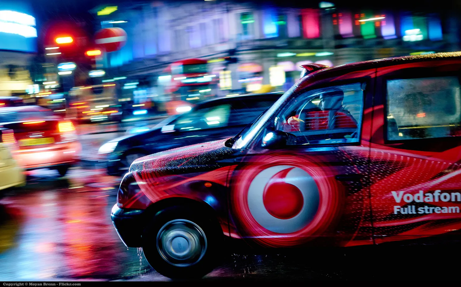
 Image by Moyan Brenn on Flickr: https://www.flickr.com/photos/aigle_dore/15754634911

Image by Moyan Brenn on Flickr: https://www.flickr.com/photos/aigle_dore/15754634911

If you need to deal with a lot of company names, there is no escaping to the logo page. My presentation app SlideMagic makes lining up lots of logos very easy. Use the black and white toggle to mute logos if the colours get too busy.
Banner image from Wikipedia
·Images

Pushing the analogy too far

Analogies are great. You take a concept that anyone can relate to, and use it to explain something unfamiliar. But you can push it too far.

  • An analogy that is complex in its own right defeats the purpose
  • An analogy that only partly fits
  • An analogy for which you cannot find the appropriate professional visuals easily without an advance degree in Photoshop
  • An analogy that is number 12 in a series of completely unrelated analogies for every single concept in your presentation
  • An analogy that is not “serious”, it undermines the professionalism of your presentation, a bit of humour is OK, college humour is not.
  • An analogy that is a cliche

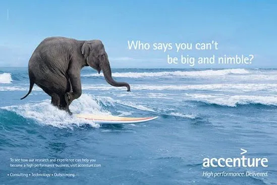
Or, like in the Accenture ad below, you are actually insulting your target group.

Good analogies are pretty much the opposite of the above. They are simple, fit the subject, are easy to visualise, and ideally, can cover all aspects of your story.

·Images

The mood of images

The first layer of the image in an image is what it is about, a tree, a house, a car. The second layer though is what general mood it evokes. Even if your images depict the right thing, somehow they do not feel right, and it is hard to pin down why. Here is a check list, I am exaggerating on purpose.

  • Cheesy, tacky, not real, fake people
  • Something aggressive, violent, scary
  • Things are gross, ugly, not pretty, repulsive
  • A bit too racy
  • Girly, cutesy, childish
  • Dark, somber (including colours)
  • A closed, trapped setting
  • College humour that is actually not really funny
  • Cliche: ice bergs, dominos,

I am exaggerating on purpose. That image of the apple pie is probably not “gross”, but subconsciously, there is something not tasty about it. The image of the solider is not violent, but somehow a military association sets the wrong tone of the presentation.

The opposite is also true. The best images can uplift your mood and somehow makes your feel right. Images can set your mood pretty much like a painting / piece of art can.

If your image does not feel right, it probably is not right.

·Images

Selfies are not professional head shots

Images are a great way to liven up an “about” page on a web site or a team page in a presentation. The best images are the one where all team members are present in one image. You can overlay name tags and get a great composition. No issues with images in a different style, images that are outdated. And it shows how well the team works together.

Second best alternative is individual images. But please avoid selfies. Most people assume that where-is-the-button-I-need-to-press look when taking a selfie. It does not come across very professional. The least you can do is ask a colleague to take a quick picture with your phone if you are in a hurry.

·Layout

I like to frame images

Big, confident images look better on a presentation slide. The maximum size of your image is achieved when you let it “bleed” of the page (the term comes from the age of print, where the ink would drip of the corner).

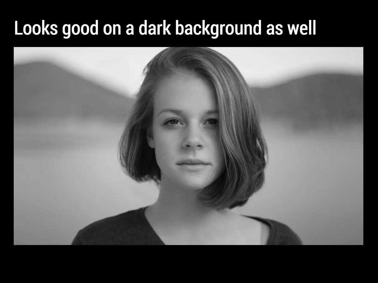
These full size images look great if your presentation is just images. In most cases, my client work is not. Hence, I prefer to frame my images within a box of white (or black). Some people say it is bad practice, I disagree:

  • You do not have to worry about legibility of slide titles
  • Photo slides look consistent with other slides in the presentation
  • I think, it actually looks very distinguised

My presentation app SlideMagic caters for both formats, so don’t worry if you disagree with me. You can clone the slides below (and all other slides I have used on the blog) into your own SlideMagic presentation via this link.

The image was found on unsplash, free images under a do-whatever-you-want license

·Images

NASA Apollo photo archive

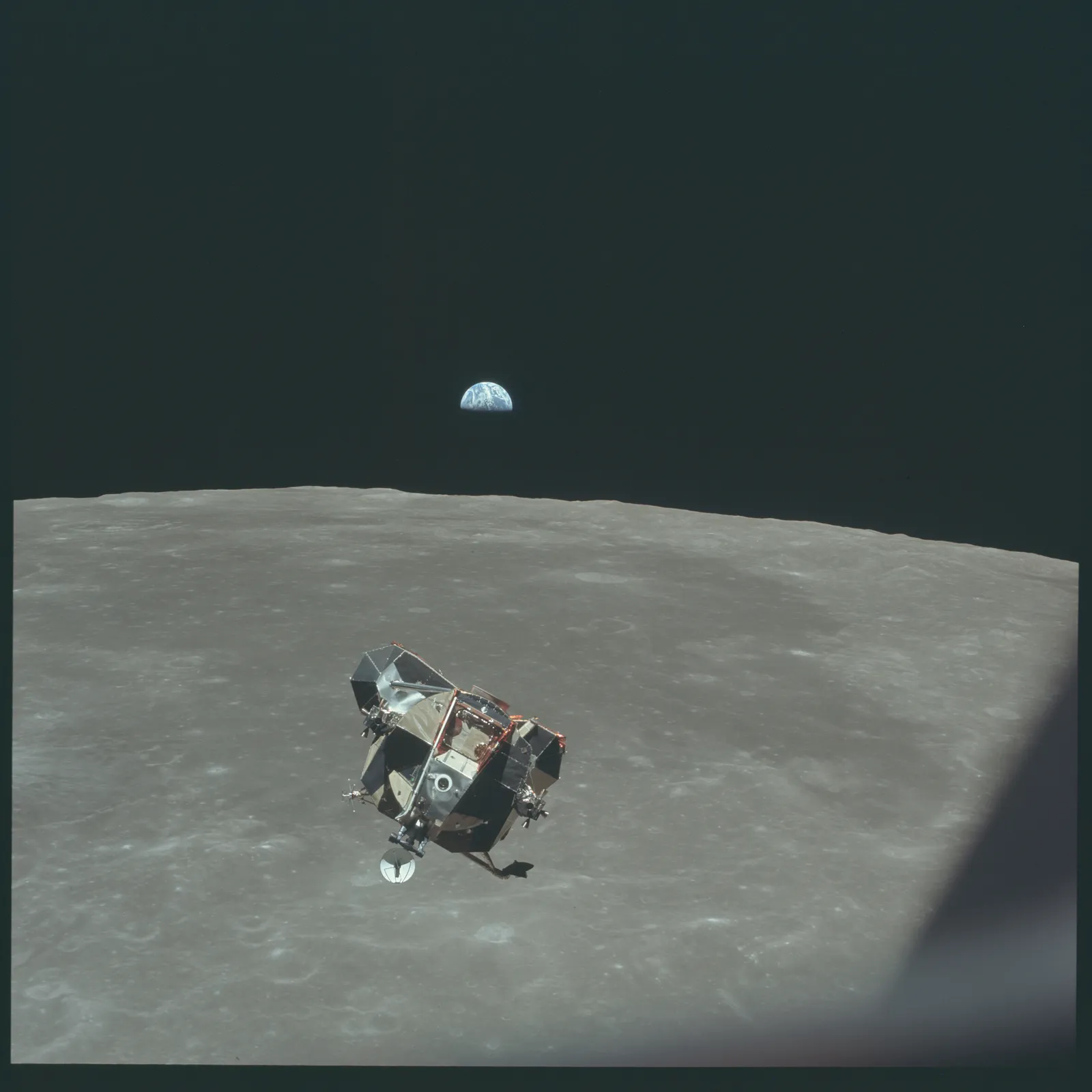
NASA has uploaded a ton of public domain images of its Apollo missions online. Free to use in presentations. You can find them here. You can find more sources of free images here.

·Images

Stock image sites come second

My use of images has changed a lot over the past year. I have now reached a point where stock image sites come in as a last resort. And when I do, clients often push back and ask me to look for something different than that cheesy, cliche, polished stock image.

So, most of my image search starts with Google Images, with the option “labelled for re-use”. or I browse through some of these excellent sources of free presentation images. (Although I must say that the latter now become so popular that you start recognising images instantly because of over-use).

·Images

Google uses "glow" to put its logo over images

I don’t think it looks very good. Adding a glow around an object always makes it look “dirty”. The better solution in my eyes is to create an all-white version of the logo and put that over the image.

·Images

Images from museum collections

Step by step, museums are putting their entire collection of paintings online. These archives make for a great source of images: consistent in style, without copyright issues (if you go back sufficiently far in time). You won’t find stock images of smartphones though, but maybe that makes your presentation actually look better.

Here are some examples of well developed web sites:

There are still big differences in how advanced museum web sites are, but ultimately every museum will come to realise that access to their collections should not be restricted to the people who happen to be in town.

Art: View from a balcony, Gustave Caillebotte, 1880

·Images

But that image does not exactly match?

Not every image that is used in advertising has a functional objective. Take fashion ads, for example, sometimes the product is missing all together.

  1. Images that show something highly specific: a product, a medical condition, a location
  2. Images that show a relevant scene or background: people tapping on their mobile phone, a driver in a traffic jam, calm bamboo forest, a sunset
  3. Images that make a visual metaphor: a prisoner in a cage, a cat chasing a mouse
  4. Images that just set the mood of the presentation

I use 1. and 4. more, and 2. and 3. less because they often lead to visual cliches.

Art: “[Self-Portrait, Yawning](https://en.wikipedia.org/wiki/Joseph_Ducreux#/media/File:Joseph_Ducreux_(French_-_Self-Portrait,_Yawning_-_Google_Art_Project.jpg)” by Joseph Ducreux, 1783