SlideMagic Blog

Frequent updates about all things presentations since 2008. Subscribe to never miss a post.

RSS
all posts

Category Images

·Advertising

Too much - "painful graphics"

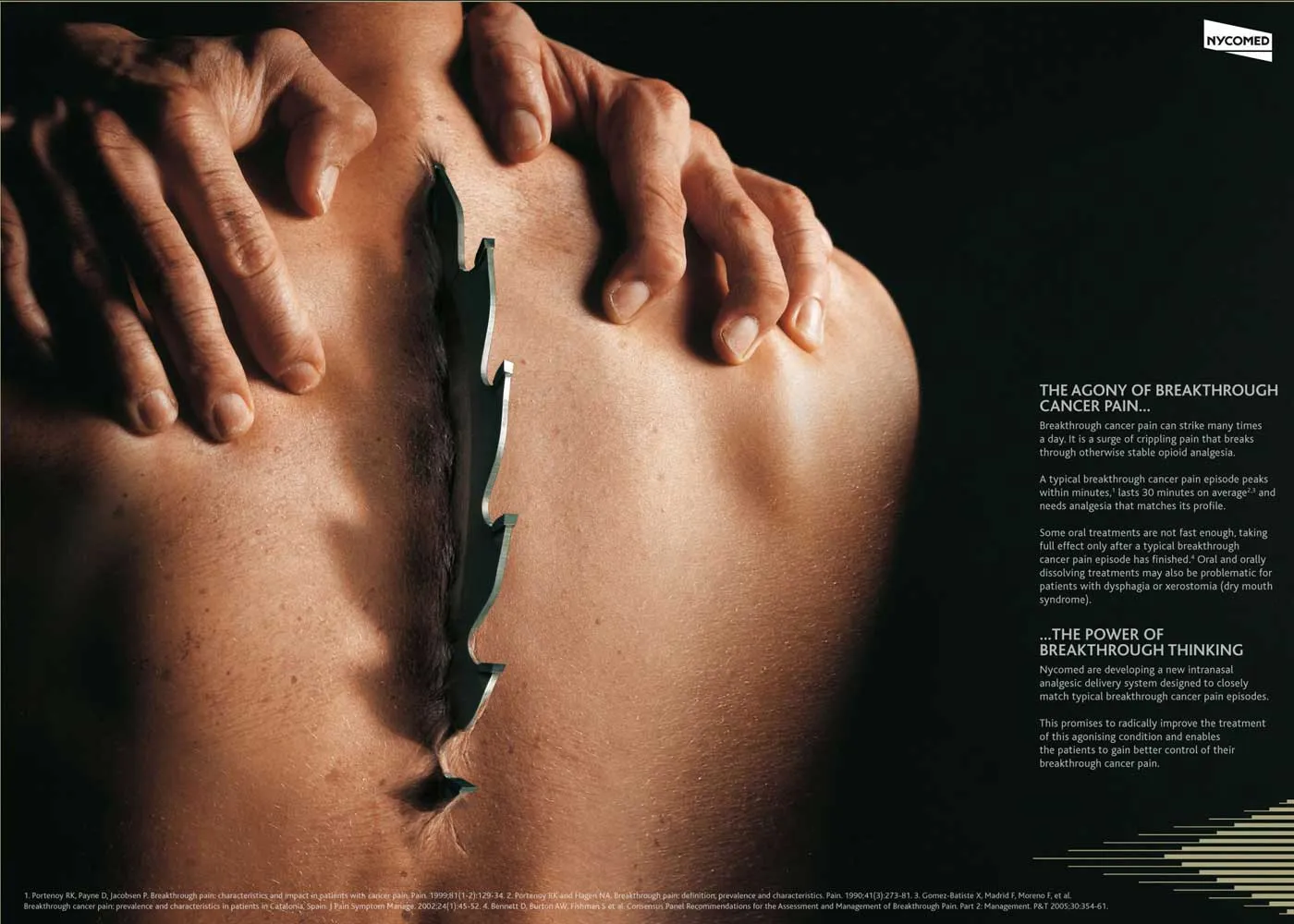
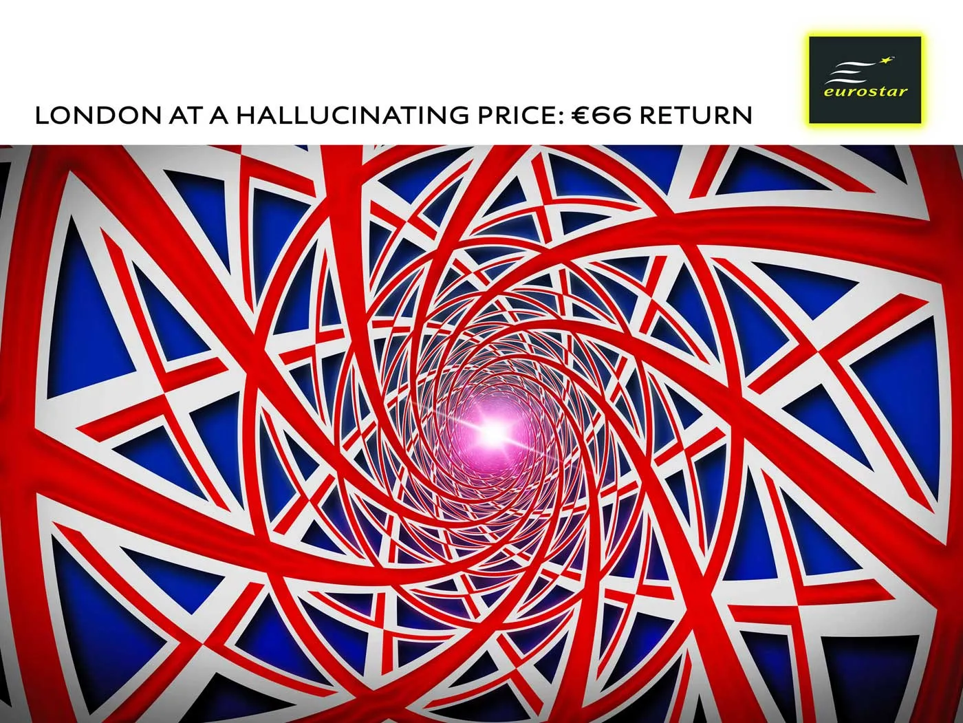
Before I argued that slightly irritating the audience’s senses could support your presentation. Two cases of overdoing it:

More details about these ads on Ads of the World: Nycomed and Eurostar. I recommend adding this blog to your RSS reader.

·Advertising

Visuals - 30 Christmas ads from around the world

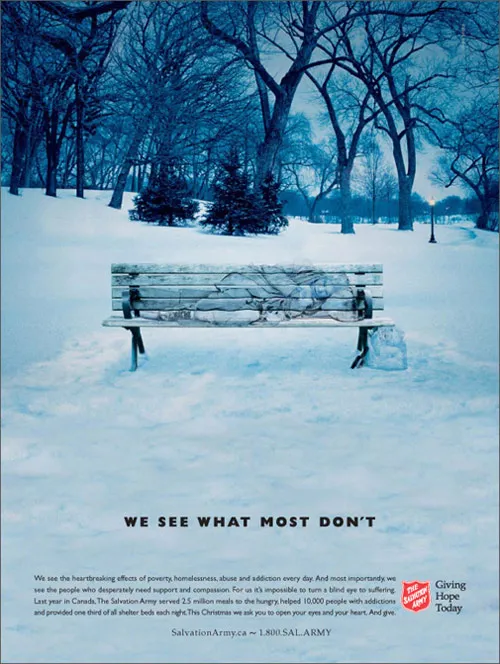
Not much time to write elaborate blog posts over the holidays. Some interesting visuals on Digg Design - 30 unforgettable Christmas ads today (here is one to them):

·Design

Create your own buttons and lights on a metal skin in PowerPoint

Inspired by a post on slide:ology today linking to a set of newly released PowerPoint templates with examples of what graphical effects PowerPoint can produce, I decided to start posting some of my own favorites.

Many logos of Web 2.0 companies are examples of how not to use these graphics capabilities: add a “bevel”, “reflection” and “drop shadow” and the result must look good. In graphics design, most of the time, less means more.

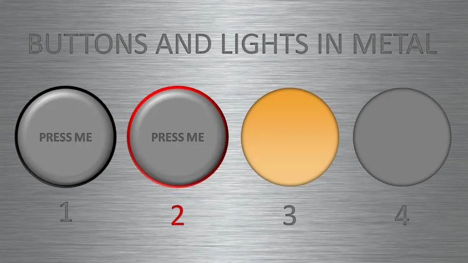
But sometimes these effects can help. In my case a client needing to explain software functionality. We decided to go for the metal “HiFi component” look with buttons that can easily activate functions. (Click image for a larger picture)

  • Metal skin: an image purchased from iStockPhoto
  • Metal text: a big font in a similar, but slightly darker color than the background with an interior shadow applied to it
  • Button 1 and 2: a circle with a heavy outline (red or black), a simple “bevel” applied to it, but in the tab “3D options” of the bevel functionality I increased the depth to 20.
  • Light 3 and 4: a circle without an outline, with an central interior shadow and a color gradient running from a full color to a slightly faded color.

Let me know in the comments if you are interested in the detailed instructions.

·Design

Bleeding edges - you can use them both for images and text

A “bleed”, or “bleeding edge” is a page with a graphic extending over the edge of the page. I like to use them a lot in PowerPoint presentations.

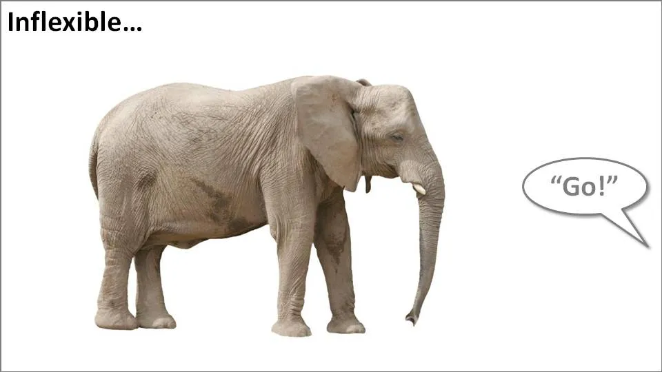
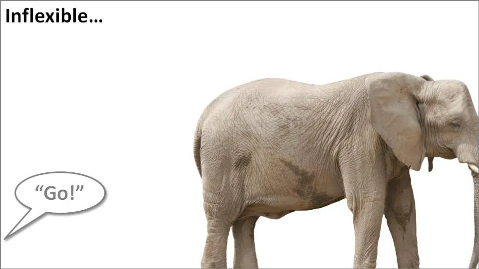
Take the following example. When the elephant is positioned in the middle of the slide, the composition is not really interesting. Have him walk off the page and insert a bit more white space makes it a lot more interesting (our friend just stands there, ignoring all things around him).

Pushing things a bit further, you can use the same technique for words/typography as well. The brain does not always need clean typography to be able to read. You probably remember this text (I do not know who wrote it, or whether the research actually happened):

i cdnuolt blveiee taht I cluod aulaclty uesdnatnrd waht I was rdanieg. The phaonmneal pweor of the hmuan mnid, aoccdrnig to a rscheearch at Cmabrigde Uinervtisy, it dseno’t mtaetr in waht oerdr the ltteres in a wrod are, the olny iproamtnt tihng is taht the frsit and lsat ltteer be in the rghit pclae. The rset can be a taotl mses and you can sitll raed it whotuit a pboerlm. Tihs is bcuseae the huamn mnid deos not raed ervey lteter by istlef, but the wrod as a wlohe. Azanmig huh? yaeh and I awlyas tghuhot slpeling was ipmorantt!

An example of letting words “bleed” off the page (I used to highlight problems with current solutions in the market for a client in the technology sector):

Continue reading →
·Design

Preserving custom fonts when presenting away from your own computer

Complex, custom fonts can be beautiful. Seth Godin even recommends everyone to buy their own as one of his 9 steps to PowerPoint magic.

One problem, custom fonts are a disaster when used on a machine that is not yours. And you discover it when you click through slide 2 of your presentation in front of  a live audience…

Therefore, I won’t use them as my default font in a presentation, but only in specific pages. Here is the trick:

  • Make a copy of the original (editable) slide and put it in the back of the deck, you don’t wont to lose the original
  • Group all elements of the original slide into one object
  • Cut it (CTRL-X)
  • Paste special as “PNG”

The whole slide has been transformed into an image which for sure will show up correctly on whatever computer you are using.

UPDATE: POWERPOINT NINJA SHOWS A MUCH BETTER SOLUTION. HOW TO EMBED CUSTOM FONTS IN POWERPOINT: LINK

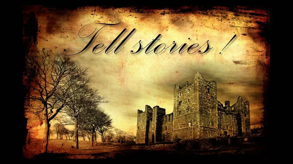
Background image purchased on iStockPhoto. Font used is Palace Script MT, built into PowerPoint 2007.

·Advertising

"Burning" typography that almost hurts the eye

I am more and more fascinated by design lessons from consumer advertising billboards. Take this ad for Tango (a UK soft drink):
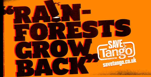
First of all the message. Confident, huge font, but the reader will discount the message completely “yeah right”. But it makes you think.

Then the typography. It almost hurts. Like watching a broken television screen. The onset of a migraine aura. Looking through the corner of your glasses and see how the lenses distort colors because of light refraction.

I argued before that slightly irritating the senses of your audience can help get your message across.

How did the typographer (Chris Chapman) do it? Clashing colors. Full orange background. Bright red shading. Colors that are very close on the color spectrum, but not similar. Like hitting 2 adjacent keys on a piano (harmonic dissonance). Grunch letter fill (hard to imitate in PowerPoint).

More on working with color wheels in a later post.

Via Ads of the world.

UPDATE after a comment. People should not misunderstand me. Any dissonance effect should serve a purpose. Simply screaming out a message does not make it stick. However, certain “painful” situations can be supported by a (one) “painful” chart.


·Advertising

One Lego visual - 2 insights about leveraging imagination

I found this great Lego ad yesterday on SlipperyBrick:

Sometimes relying on audience imagination can work, sometimes it does not.

  1. Sometimes it can work. Although adults might lose some of their imagination capabilities over time, it is still possible to get across visual messages with very simple graphics. Simple shapes, simple cartoons, even just creative typography. The mind will fill in the missing pieces
  2. Sometimes it does not work. The book Made to Stick introduces the concept of Curse of Knowledge. The presenter “hears”/imagines a tune in his head and taps it with his fingers on the table. All is perfectly clear to the presenter. All the audience can hear is… someone tapping.
·Design

Chart concept: "fast forward" - a good summary chart is like a good headline

Putting a summary slide as page 1 in your PowerPoint presentation is tricky.

  • A diluted and boring summary might turn the audience off (“let’s check email on my phone”)
  • A summary chart might “give away the point” of your presentation too early
  • Some presenters might get stuck on page one and tell the whole story without using any other slides (sometimes this can be a good thing, a presentation with PowerPoint)

A good page one is a slide that gives the audience some clue about what’s going to happen and presents an interesting teaser about what is to come.

Now that I come to think of it - a good summary chart is like a good headline

The following image (purchased from iStockPhoto) adds another possibility to presentation opening concepts I discussed before (here, here, and here). “Let’s fast forward to the end before diving in”. Shrink the image to one side of the screen and add your teaser in big-font-text

·Images

Funny - video about cliche stock images

Great images can do amazing things to your PowerPoint presentation. But, cheesy stock images are as bad as poor clip art. The Empower Your Point blog dug up this amusing video on the subject:

There are no golden rules here. In practice I find that any image that is not “natural” usually does not pass the bar: renderings, staged compositions with models (exception: children), combination of 2 or more images (you can do that yourself). Related posts about this issue here, and here.

·Design

Using "paste as PNG" to wash out complex PowerPoint objects

Going a bit (only a bit) against the “Zen” presentation philosophy, I have argued before that overwhelmingly complex PowerPoint charts could be used in a large keynote presentation, if (big if) they are positioned well.

One way to use it is as follows:

  • Put up the overwhelmingly complex chart, message: “it’s complex, don’t even try to understand this now”
  • In a subsequent chart, wash out the original object
  • Start highlighting individual components for further explanation

You can use the “paste as PNG” function in PowerPoint to transfer any object (including complex groupings) into a picture and subject it to the regular picture manipulation tools available to you: resize (a pain for complex PowerPoint objects with text in them), crop, and of course re-color.

Recoloring the image with a very light overlay creates a wash out effect that you then can use as a background for subsequent highlights. I have tried to explain all this in the following SlideShare presentation (click on “screen” image at bottom right for full screen mode).