SlideMagic Blog

Frequent updates about all things presentations since 2008. Subscribe to never miss a post.

RSS
all posts

Category Images

·Advertising

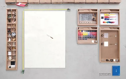
Brilliant visualization of a "real word" design user interface

Weekend reading (1 day earlier than the rest of the world in Israel). I stumbled on this great ad for Adobe Photoshop CS4.

It shows what graphics and presentation design is all about, a creative process working with shapes and colors and a blank piece of paper. Computers make it easier to work, but in our mind we should go “back to basics” now and then. Go to this Flickr stream for more detailed/hi-res images. Agency Bates141. Via Zurb.

·Images

Improve your looks in a picture - automatically!

Israeli scientists have not only found a way to specify human beauty mathematically, they go a step further to develop a tool that automatically improves your looks in a picture. Not sure when this will be added to the PowerPoint format ribbon…

Project page here, found via Haaretz. An earlier post about face “recognition” here.

·Images

A new source of vintage images: LIFE (now hosted by Google)

Google has just put the massive archive of images from LIFE magazine online (Google blog post). The majority of which never made it to print. Google will ultimately scan in the entire collection of about 10 million images. Large-format print can be purchased.

Another example of how online media is unlocking the “long tail” of historical information.

This opens up a great new source of vintage images for use in PowerPoint presentations. They are very hard to find (stock image sites hardly list them).

The Parisians

Wide range of facial expressions on children at puppet show - The moment the dragon is slain, Guignol puppet show, Parc de Montsouris, Paris, 1963. Photographer: Alfred Eisenstaedt

I like using vintages images:

  • Non-disturbing, neutral B&W colors
  • Iconic images that have become part of our common culture can get a point across quickly
  • It provides a nice conctrast, especially when used in presentations on high-tech subjects
  • There are some good examples of concepts that can be explained using vintage images: i.e., the old grocery counter is a much better visualization than a cliche image of a smiling call center rep.
  • Vintage images can get across raw emotion, like the image of the children above, much better than searching a stock image site for “happy children”

To search images from the LIFE archive, simply add “source:life” in your Google Images search bar (example: search results for Picasso)


·Advertising

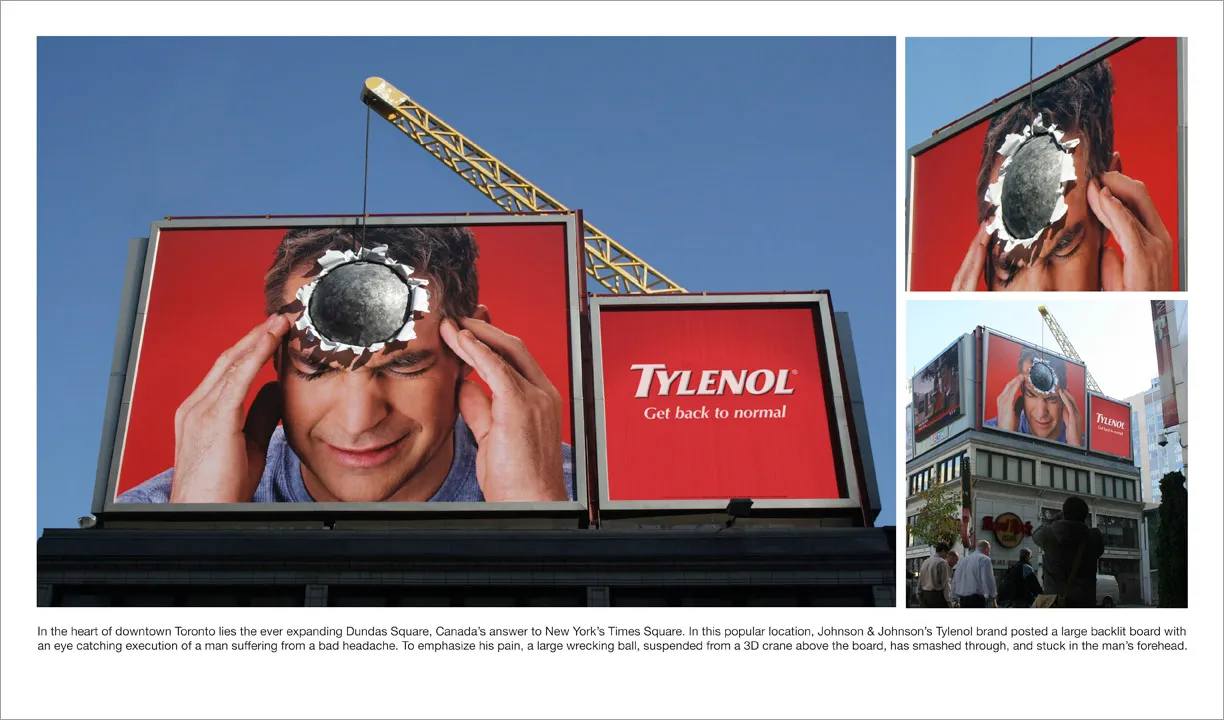
Great visual - you can almost feel the headache

I am adding adgoodness to my blog roll. This is another great find.

·Advertising

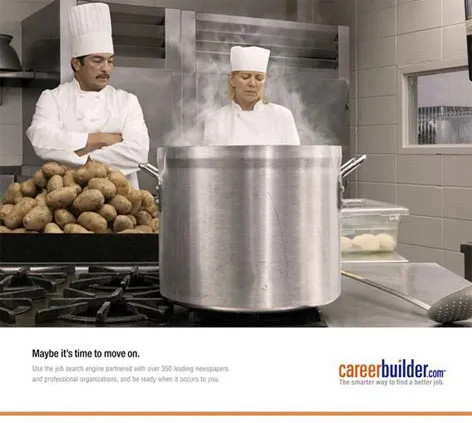
Great visuals - "maybe it's time to move on"

These ads do a great job in visualizing a state of mind (maybe in the current situation, people have less of these thoughts though). These type of images are good ice breakers in a presentation, but because they attract so much attention, I would follow with a black/white empty screen afterwards to get the attention back on you, the presentator.

The site careerbuilder.com seems to be down though… Via Fubiz.

·Images

Visualizing your consumer and/or audience makes it real

Using a good image is the best way to describe something as complex as a consumer segment. Putting a page loaded with bullets: young, Asian, affluent, female, confident, well-educated on a piece of paper does not get the message across. A picture does the trick: hey, here she is!

Finding good, non-cheesy, non-artifical-model images is a challenge though.

Visualization of a person is helpful in another way: preparing your presentation. Putting up that picture of a “typical” CIO of a medium-sized company might put you in the right “mood” to fine tune that important sales presentation for 200 blade servers. The picture itself of course will never make it into the final presentation (it might if the audience has a sense of humer, but it is extremely high risk).

Our Asian consumer image was purchased on iStockPhoto.

·Advertising

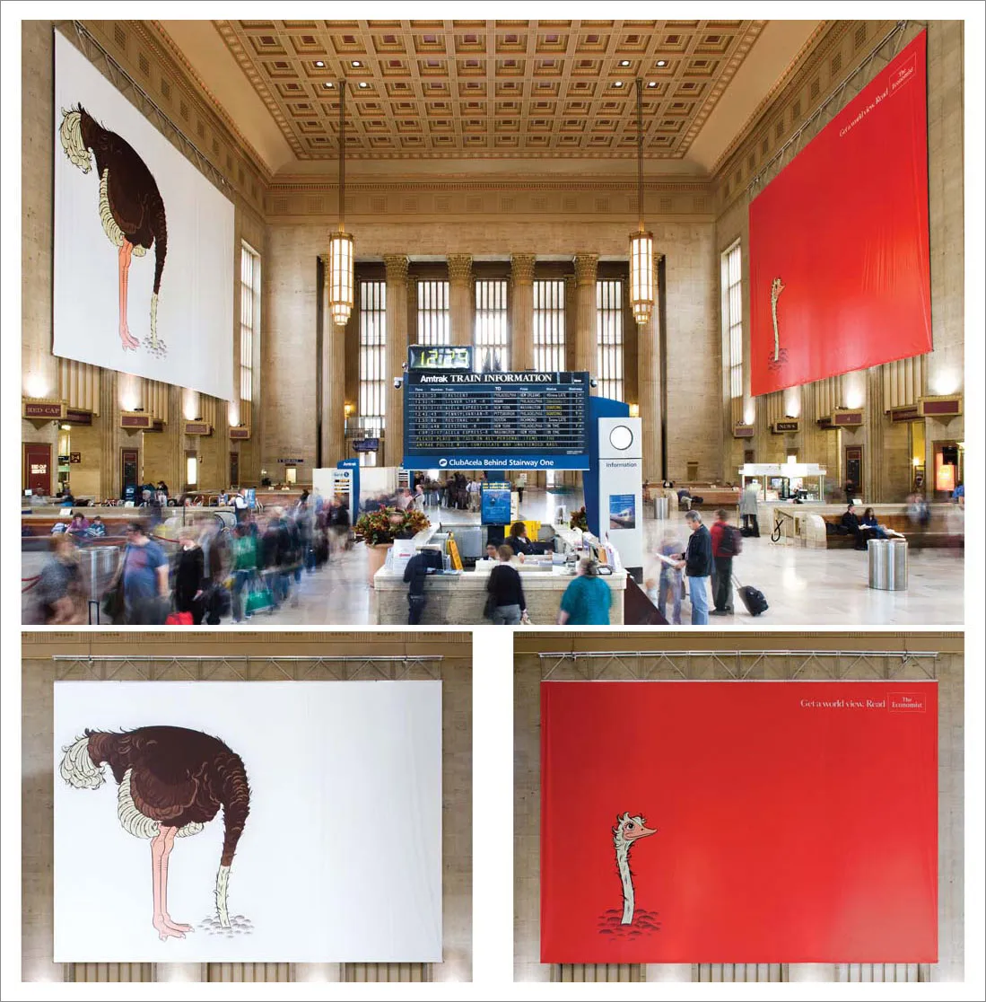
Powerful billboards - The Economist filling a train station hall with an ostrich

We can always learn from outdoor billboards. This one’s great. Huge but still elegant.

Via adgoodness

·Images

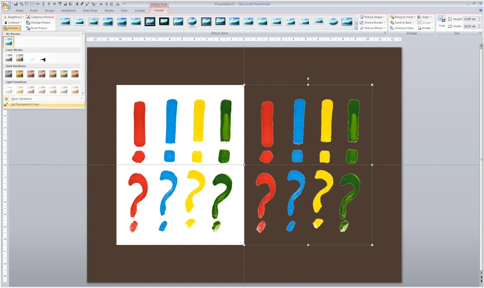
Stripping out the background color of an image in PowerPoint

Adobe Photoshop has professional tools to cut out objects from images. In many cases, setting a transparent color in PowerPoint will do.

In PowerPoint 2007:

  1. Select the image
  2. Go in the “Format” ribbon
  3. Click “Recolor” all the way to the left
  4. Choose “Set Transparent Color” at the bottom of the menu
  5. Click the color that you want to be transparent

The cut out is not perfect and it works best with images with a sharp color contrast. I mostly use it when working with a stock image from iStockPhoto that is an isolated object on a white background. Making the white background transparent gives me more design freedom in PowerPoint.

·Images

Chart concept - stage curtains waiting to be opened

Although a bit cliche, I like using an image of a red stage curtain about to be opened. They give a sense of anticipation, look beautiful (nice warm colors, lots of detail), but at the same time focus all the attention on you, the speaker, since there is not that much to look at at the projector.

I got the image below from iStockPhoto (referral program link), many other stock photography sites have many, many of them.

·Images

How to get the most out of stock images for your presentation

Stock image sites with affordable pricing schemes (iStockPhoto is one of them) have transformed PowerPoint presentations. While using a stock image instead of clip art will always lead to a better chart, there are many poor (and cheesy) images out there. How to pick a good one? A slightly random, rambling list of suggestions (resembling the creative design process):

  • Start with the slide design. Brainstorm concepts. Write down chains of keywords. Think through what images could work. Only when you are happy with the short list of design ideas, start taking the limitations of PowerPoint or your design skills (i.e., making complicated 3D compositions) into account.
  • Iterate, go back and forth between image sources. While a stock photograpy site might be the final source of an image, use Google Images as well to get ideas by seeing what sort of images are returned based on key words. Use Flickr for “real images”, especially locations (check the license). Stock image sites usually go for “touristic” photo compositions of landmarks and/or artificially smiling models.
  • Models are not real people. I hardly ever use images with faces from stock photography sites, they hardly ever look natural (with the exception of children). Search “team” on iStockphoto and you will see what I mean (here). Sometimes these images are even funny (the opposite of what you want them to be. Photographer takes model that usually does fashion shoots, puts on suit, puts on spectacles without lenses, and hey: we have a “business person pondering his vision as he looks towards the horizon”
  • Leverage advanced search. Add the word “isolated” in an iStockPhoto search to get images on a white background. Sort iStockPhoto images by “most downloaded” instead of “best match”
  • Crop. Consider that you can zoom into images and take just a small detail if you purchase a high enough resolution. The photographer’s composition does not have to be yours.
  • Avoid “cheesyness”. Be careful with using renderings or illustrations, often cheesy. Make the conceptual graph yourself, use stock images only for the components. Ready-made stock photography conceptual images (i.e., a few dollar bills with an arrow going up in the background) do not look good. There is a good list of cliches (where is that accent) on the Slide:ology blog.
  • Think of color. In iStockPhoto you can narrow down images by color range, especially important for large, page filling images. If no option, use a PowerPoint color overlay to take the color out the color all together and replace it with an overlay of one of the colors in your color scheme.
  • Look at many, many, many images until you find something that catches your attention. A small thumb nail is enough (and actually better than the full size image) to check whether an image evokes some emotion in you.
  • Less is more. Look for white space, or in fact, any empty space to add text if required.