SlideMagic Blog

Frequent updates about all things presentations since 2008. Subscribe to never miss a post.

RSS
all posts

Category Images

·Colors

B&W images

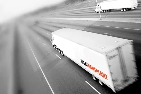
Converting all your images in a presentation to black and white can help even out the colours in the document. What is left is a series of slides in subtle shades of grey with your corporate color popping out to make a strong accent. I use that look a lot recently.

·3D

LiveSurface 2

A few days ago I wrote about LiveSurface and their set of stock images with blank surfaces to put your own artwork on. On the site, I signed up for their new product: LiveSurface Context (request an invite here). It is a small program that takes care of the 3D manipulation of your artwork in order to fit it on the surface.

The experience is much better than the vanishing point filter in PhotoShop. No more guesswork to draw the guidelines, no more fiddling and copying/pasting to move your artwork. Everything is ultra-precise and with total control for the designer.

A few drawbacks though for the casual designer. You need to have a version of Adobe Illustrator installed on your machine (and more importantly, know the basics of how to work with it). Secondly, the service charges a subscription model that works if you need to use a lot of these compositions, but is not economical for infrequent use. And finally, the library of surface images is smaller than you would find on regular stock image sites.

All in all a good service, and as a professional designer, I might give it a try.

·3D

LiveSurface

Putting objects on realistic 3D image surfaces requires a good eye to find an image on a stock photo site and some skill in PhotoShop. LiveSurface aims to make life a little bit easier, if focusses just on these types of images and the file you buy has everything you need (layers, filters). Still, you need to know what to do in PhotoShop though and you pay for the extra work through a higher image price.

The above was created from an iStockPhoto image that has increased in price since I purchased it a number of years ago (see earlier post)

·Colors

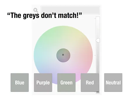
The greys do not match!

A few days ago, a friend posted a “complaint” on her facebook timeline that her husband always failed to spot fashion imperfections, in this case grey tints that did not match.

Grey colours sit in the center of the color wheel with equal balance of Red, Green, and Blue. But tipping the balance of the color mix a little bit instantly makes your grey look different. Use it as a design option to create a matching set of colours, watch out if it is not what you intended to do.

The same is true in black and white images, not every BW image is really pure grey, but it is easy to correct it, just have PowerPoint or Keynote turn it into a proper black and white image.

·Images

Stock image pricing

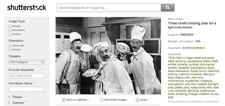
There are big pricing differences between stock image sites, especially for snaps that are different from the over-used smiling call center rep head shots. For example, iStockPhoto uses tiered pricing for images that have a more interesting composition. Shutterstock still uses flat rate pricing. These pie throwing chefs will cost you as much as an image of an orange isolated on a white background. It is worth to give Shutterstock a try. (No, I was not paid to write this).

·Images

High-res images from YouTube

Increasingly, YouTube is proven to be an excellent source of images. More and more videos are uploaded in 1080p HD (you can change the resolution in the settings menu at the bottom right of the video) which creates very good stills when you pause the video and make a screen shot.

To get the best results, try to size the YouTube window in such a way that it is around 1080 pixels wide.

If you want more control over what images to take, you can download the YouTube video to your machine (instructions here) and load the video into a video editing program such iMovie. Here you can move the playhead frame by frame to get the perfect shot.

Because of video encoding, you will see that images get blurrier when there is a lot of movement in the scene. If you want to show action, go ahead and grab the screen shot. If you want a crisper picture wait a few 1/24th of seconds until everything is calmed down again.

An obvious point: make sure that you have the rights to use the content.

·Images

Crop to fill

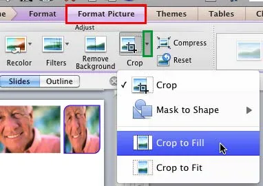
It is never too late to learn something. After my post about fixing aspect ratios of image fills in PowerPoint, Geetesh Bajaj pointed out that there is a much smarter way to do this. Here are his posts for Mac and for Windows.

·Advertising

Anticipation

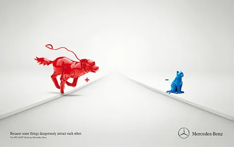
Most of the time, it is more powerful to show events that are about to happen rather than the event itself. It is very well done in the ad below for an automatic braking system that anticipates the movement of objects on the road. It brings great tension to the visual, almost making the still image move.

Commenters on Ads of the World were less enthusiastic though. Maybe the plusses and minuses should have been made a bit bigger. And well, if there is something wrong with the chart, it is in its 3D composition. The dog is too close and actually not running towards the cat. But I am probably the only one who bothers about that…

·Images

Centring objects

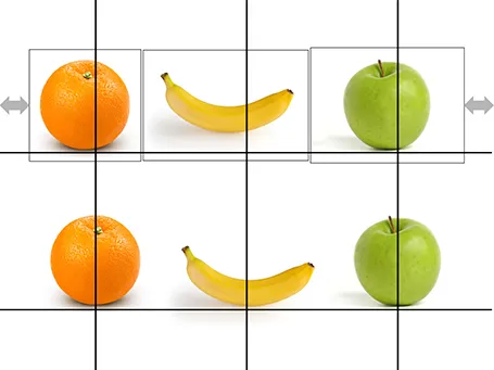
Images with objects isolated on an empty background are not always cropped perfectly. Centring the image will not center the object. Draw a some quick guide lines and you can align things properly.

·Images

10 points that say it all

One of my clients is one of the finalists in a long RFP process full of long presentations, documents, meetings. After all this information, the client thought it was appropriate to send one last piece of PowerPoint: a simple recap of why they are the best choice in 10 slides.

It was probably one of the most convincing presentations of the entire process. It took very little time to write. It contained much more emotional arguments (we are fun to work with etc.) than all the previous material that was used.

The visual concept I used was designed for on screen reading. I doubled the width of the page to an aspect ratio much wider than 16:9. Reserved the entire left side of the chart for a sentence in huge fonts, and supported that sentence with a very simple picture on the right side. Just 10 pages.

PDF it, email it, and hope for the best.