SlideMagic Blog

Frequent updates about all things presentations since 2008. Subscribe to never miss a post.

RSS
all posts

Category Images

·Images

Aspect ratios and image fills

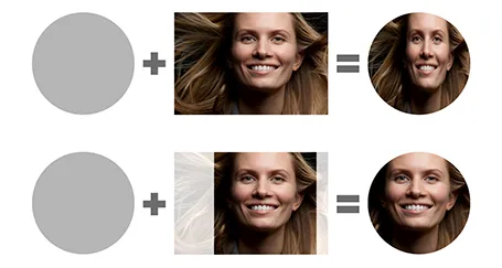
PowerPoint distorts the aspect ratio of images when you use them to fill a shape. To work around the issue, you need to crop the picture in the aspect ratio of your target shape. In the example of the circle below, that is a square.

I use PhotoShop to crop my pictures. You can also use the PowerPoint crop function itself and right-click, save as image.

·Images

Kickstarter presentation

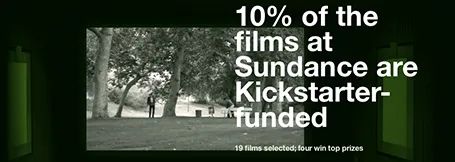
This Kickstarter presentation is a beautiful example of simple visualisations that go beyond PowerPoint slides. It is a series of web pages, with simple typography, well-chosen images that are made uniform in style through a color overlay.

Slide design and web design are converging.

·Images

Open clip art

I am not a fan of 1990s-looking presentations full of childish Microsoft clipart, but this site Open Clip Art can still be useful resource for presentation designers. Firstly, clip art designers are moving into full illustration designs. Secondly, the site is a good place to find icons for your presentation. All material is free to use. As with all user generated content sites, there is no professional reviews before designs get posted, you need to select the poor from the great yourself.

·Images

Market sizing

Forecasting the size of a market that does not exist is tricky and nobody will have the right answer. Googling will result in endless research agencies or investment banks or consulting firms throwing in yet another inconsistent number.

With new markets, it is often as important to convince/teach an investor how to think about the market sizing than getting her to accept the answer, the point estimate. So merely quoting a random number without having a clue how it was derived is not going to help you very much.

So here is an alternative approach: make your own and keep the analysis very transparent. Build a spreadsheet that start with hard facts (populations etc., and slowly, slowly, adds more uncertain numbers. Use different colours for numbers with different confidence levels (green for rock solid all the way down to red for I-made-this-up). Put the resulting market size in your presentation, and add the detailed calculation to the appendix of your presentation.

Now you are on top of your numbers and understand where they are coming from. It shows you know what you are talking about, and you can teach your potential investor how to make her own market estimate.


·Images

Face or no face?

It depends:

  • To make an emotional point, or show a human connection to whatever you want to say, show the face (pick a stock image that is not fake, but shows a real person)
  • To show a gesture or an object, it is better to crop the face out and zoom in on what you want to show
·Images

The same boring framework

Frameworks are great to structure information but incredibly boring to present, especially if you have to repeat them many times over.

“Over the next 30 minutes I will describe each of the 15 business units using this framework: challenges, opportunities, profit potential, next steps. Here is business unit 1. ”

Oh no! 14 more to go…

It is better to tell a specific story about each business unit, actually on purpose using a different approach to tell it. The 15 data tables can go to the appendix for bed time reading.

·Images

Gestures

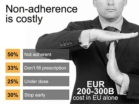
Sometimes simple human gestures make the most powerful background images. See the example below about people not being compliant with their medical prescription.

·Concepts

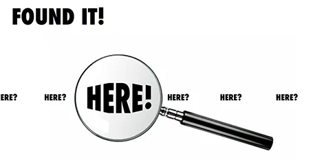
Found it!

A client spend a lot of time and effort looking for a solution to a problem, until they discovered it in an unexpected place. The chart below is simple to make: a magnifying glass and different font sizes (and a transform font effect if you want), that is all.

·Images

How to position a logo

Many logos come with tag lines and/or ® or ™ attachments. When positioning a logo on a page, ignore these and focus only on the main text or graphic to align the image on a slide (even better: violate the logo style rules and crop them out). For horizontal alignment of a number of logos in a row, draw a temporary line and make sure the text of all the logos sits right on it.

·Images

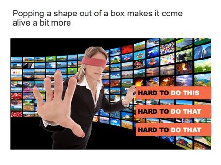
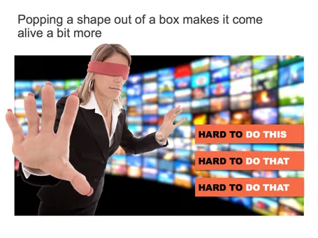
Pop out of the box

If you have a person or an object standing in front of a background, make it pop out a bit: increase the size, and fade the background.