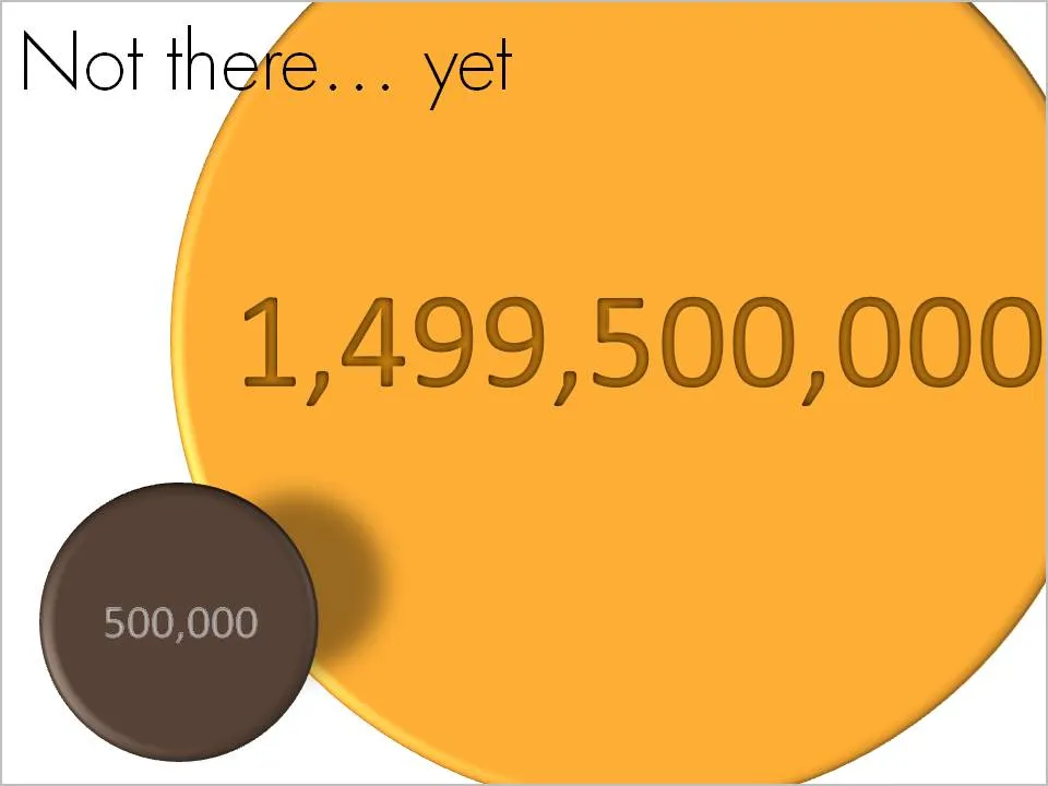
OK, we made some significant achievements, but we still have a loooong way to go. How to visualize this? Here is one solution inspired by a solar system constellation. Working with actual numbers can add a nice twist: take a bite of 0.5 million out of 1.5 billion can be visualized differently.
A follow-up on yesterday’s post about avoiding bold fonts whenever you can. Sometimes, reducing font sizes can actually help you increase the readability of a point. See the example below.
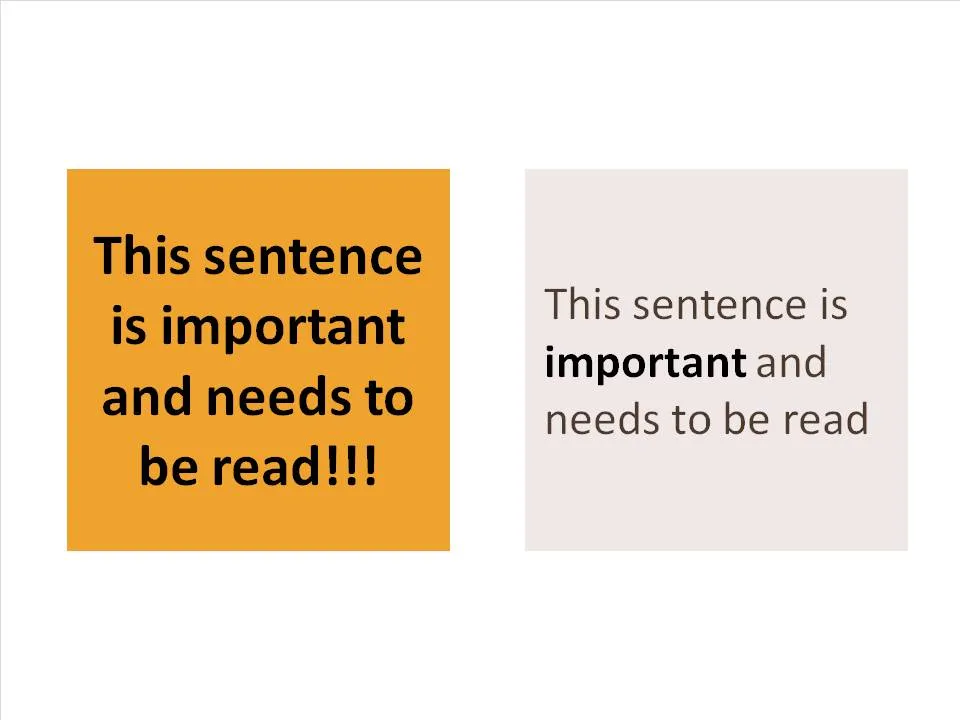
Why is it easier to read the box on the right? (At least I find it easier to read)
There is (empty) white space around the text, drawing my attention to the sentence that now sticks out. On the left side, the sentence blends into the very loud background noise of the slide. The text now looks like a coherent piece of information that can be interpreted by the brain in one snapshot, as opposed to the left side where we need to read out each word left to right, top to bottom to see what’s written there.
The proportion of the text block is more rectangular, close to the 16:9 aspect ratio of a wide screen TV, a shape that is more natural for the brain to absorb information
Removing the bold font except for one word makes the whole typography more calm and easier to read
Taking out screaming exclamation marks and left-aligning the paragraph improves readability further
Typography designers design a bold variety of a font as if it were a completely new type face. There is no magic computer algorithm that turns a regular font into a bold one. From scratch, designers need to make the call about balance and readability all over again.
I think bold fonts do not look as good as regular ones. They are often bulky and lacking elegance. Italics/bold fonts are usually even worse.
What to do as a presentation designer? Design your slide without bold fonts initially, and only add bold as a last resort. Your first tool of emphasis should be to increase the size of the font/
To highlight a single word, rather than inflating a whole sentence
To give more contrast to text written over an image as a background
To highlight a label in 10pt font or smaller in a complex diagram such as an IT system architecture
(Not) surprisingly, I find that regular slide titles look better than bold ones. Adjust your template if you can.
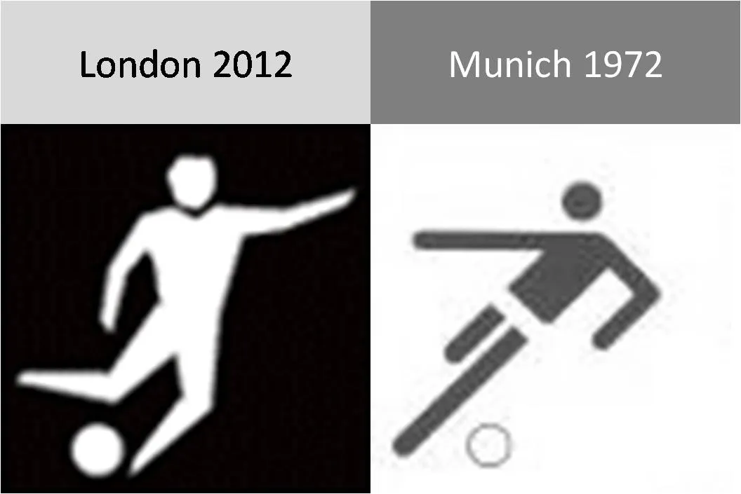
The pictograms for the 2012 Olympic games were launched yesterday, designed by Yasmine. Glancing back over the pictograms of the past decades (a new set is designed for every tournament), I actually still like those of the 1972 Munich games best (designed by Otl Aicher). Simple, recognizable, and full of movement and energy.
Somewhat related, designs for Olympic posters that were not adopted in an earlier post. Again simple and full of motion.
The audience might feel a little bit like they just stepped out of a roller coaster after you showed them your 30 images in 10 minutes presentation. Some suggestions to calm things down:
Not every concept needs a supporting image. “We’re running out of time” [click - image of a time bomb ticking away]. “We’re under pressure” [click - Atlas lifting the globe on his shoulders]. “It’s either” [click - A pot of gold] or “the end” [click - image of the Grand Canyon]. A data chart showing a rapid decline in sales over the past month will do if you want to create a sense of urgency…
Consider taking the color out of your images. Black and white images, or images with a monochrome overlay look more in harmony with a presentation’s color scheme.
Film directors can use powerful tools to throw us in the middle of a story right in the first seconds of a movie. Steven Spielberg’s opening of Saving Private Ryan is a gruesome but good example. Everyone in the audience thinks “Wow, I should be grateful to these guys that drew the short straw and had to come out of the boat first…”
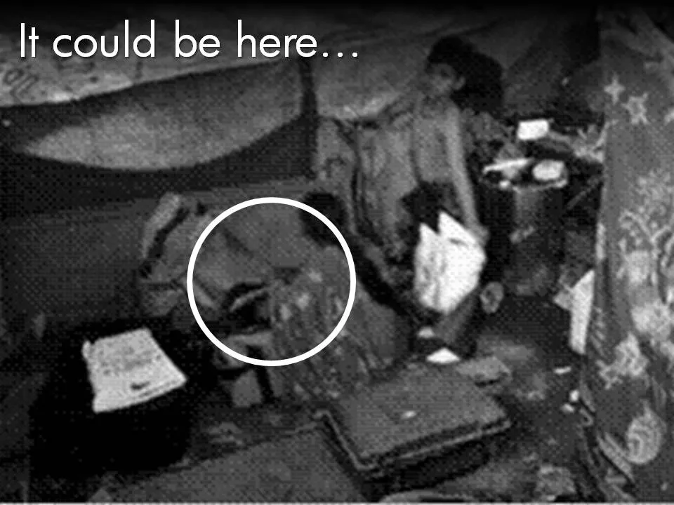
Presenters can use similar techniques. Try to find big images with a perspective as if they were taken from someone in the middle of the issue you are talking about. These images trigger an emotional response from the audience, especially (and maybe only) if they are “real”. Think of photographs that make it on the front page of a newspaper.
The following 2 images could lead into a presentation about the issue of maternal deaths due to poor living and health conditions in the slums of India:
Less powerful examples of images with a patient or victim perspective here and here.
Many of my investor pitch presentations use different styles of charts throughout the presentation:
Emotional opening (images) to connect the audience to the problem
Conceptual diagrams (arrows, boxes) to explain why my solution solves it
Data charts to show why this is a big deal
“Standard”, almost slideument, charts to give more background on the company
P.S. Read more about the great work that the Acumen Fund is doing to combat the issue of maternal deaths here.
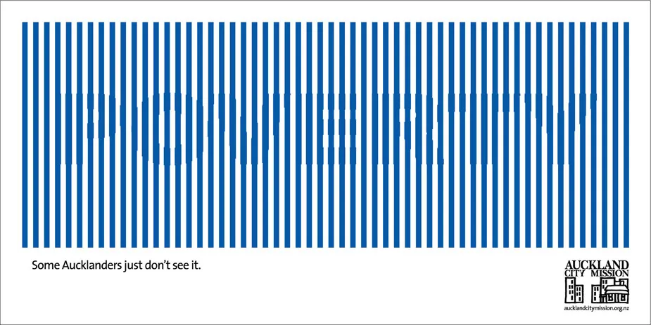
Sometimes you can’t see the forest through the trees. How to visualize this? The ad below uses a technique that can be copied easily in PowerPoint: a huge word/sentence in a bold font covered by a set of fat, spaced out stripes in the same color as the text. Via Ads of the World.
Garr Reynolds wrote a beautiful post on what Zen arts can teach us about minimal use of color. Let’s take things down to the very practical level: how to use these concepts when sitting behind your slideware edit screen.
Make sure your template has a decent color scheme that works well with your corporate colors. See one of my earlier post how to set one up.
Design your charts in black and white. Really, switch off the colors, and give it your best shot using only shades of grey. This is especially useful when working on busy data charts or complex IT architecture diagrams.
Now start adding additional background colors from the template to group items together that belong to each other. A cluster of servers, all pieces of a pie chart that relate to manufacturing businesses, etc. Within each background color, again use shadings as if you were working in black and white. A very light orange database server, with a slightly darker orange data pipe coming in, and label it “data base server” with an almost brown orange font.
Finally add very bright accent colors to highlight aspects of the chart. The server with breached security that is letting all kind of viruses into the network definitely deserves a dash of red.
The key lesson: the color goes in last (if at all).
Some places are easy to get in, and hard to get out. (That one-off discount which becomes permanent for example). How to visualize this?
Things that come to mind (the one-way revolving door, permanent temporary structures such as the Eiffel Tower or the London Eye) are not obvious when you use them in a slide. “You see, your discount scheme is a bit like the Eiffel tower”. Blank stare.
Images of someone stuck in a well and looking up into the light do work. The idea was triggered when I found myself inside the double helix staircase in the Château de Chambord in France, and looking up. Stock image sites also have lots of “inside a well” images.
There is a bigger point in this: presentation designers should look at cinema direction to move audiences inside a scene or a situation and make them “feel” what your message means. A future blog post on this is in the pipeline
Most people have now caught on to the idea of using large images in presentations. But with a few graphics design tricks you can make things look even better:
Make sure that they are not stretched or squeezed: the proportions between height and width are the same as in the original
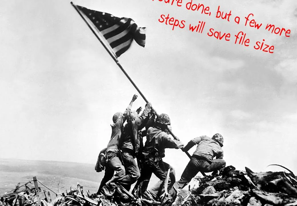
If the image is big, go all the way and have it cover your entire slide.
Here is how to do it:
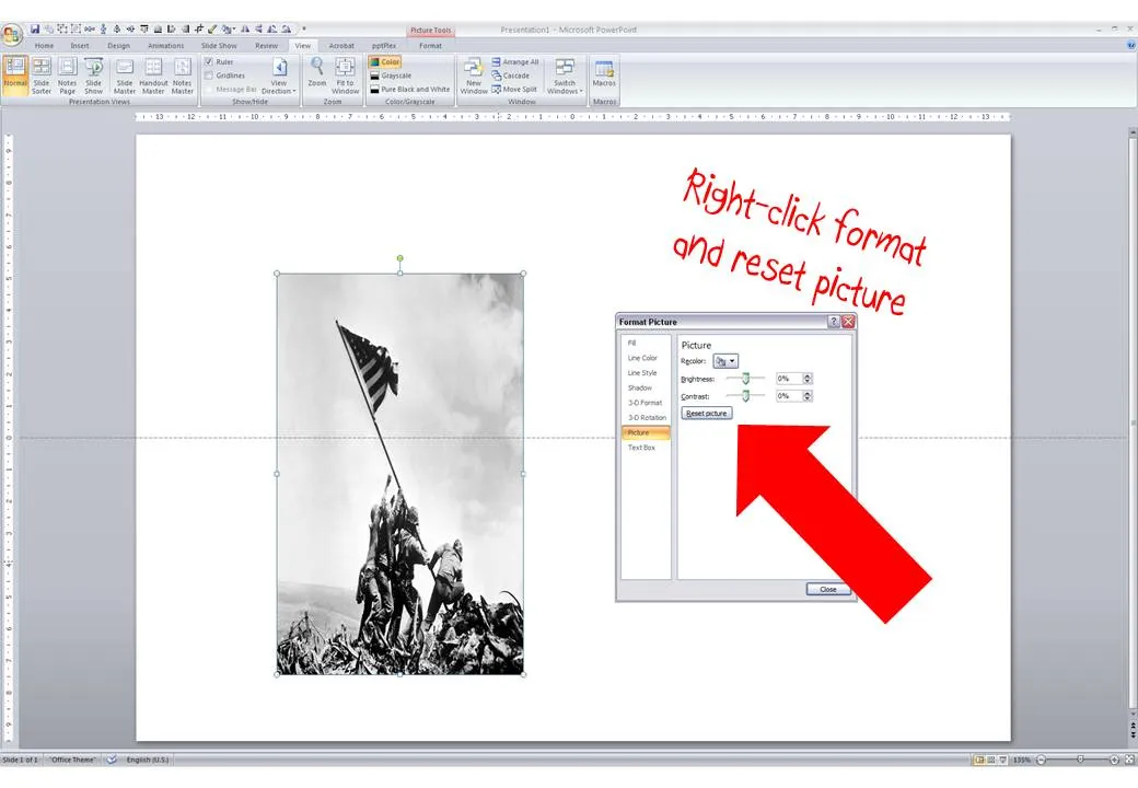
Right-click the image, select format picture and click “reset picture” to restore the original aspect ratio (between height and width)
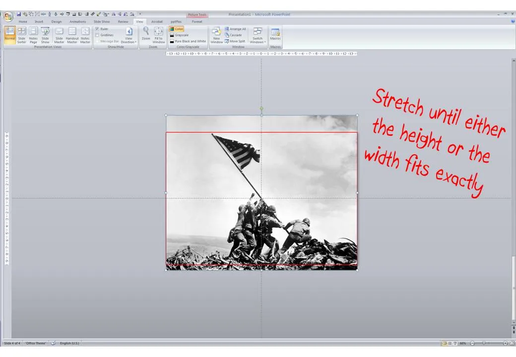
Re-size by dragging a corner until both the height or the width are at least equal to the full screen
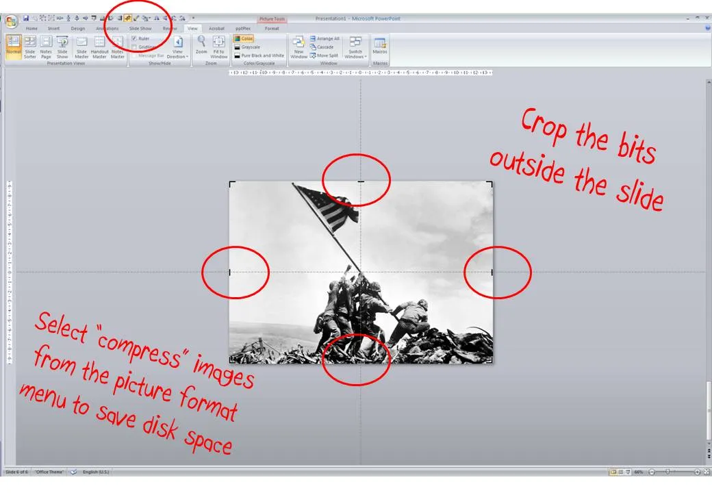
Reposition the image and crop the bits of the image that are sticking outside the canvas
Select the image, press format and compress pictures to reduce the file size of your presentation