Motion graphics going analogue
A cute video clip designed by David Pino full of analogue motion graphics: characters held up by wires and movement because of a camera actually changes location.
Found via Fubiz


Frequent updates about all things presentations since 2008. Subscribe to never miss a post.
A cute video clip designed by David Pino full of analogue motion graphics: characters held up by wires and movement because of a camera actually changes location.
Found via Fubiz
A bit noisy, but nicely done.
Via Ads of the World
Typographic color is the apparent level of black (or color) that appears to you when looking at a block of text.
Matt Robinson engineered an interesting experiment to test it. Take low-cost, transparent ball points, use them to write the same text in different fonts on a a wall, and see how much ink is left in them afterwards. A quantification of typographic color use (and/or) waste of ink.
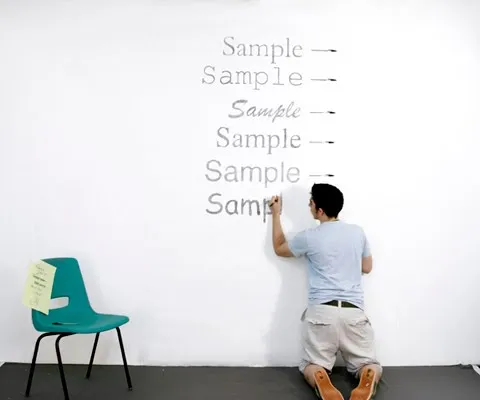
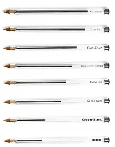
Courier comes out really environmentally friendly in this test. It might be true in terms of ink, but this is definitely not the case of you measure the amount of paper used.
I am a bit late to discover this via Ministry of Type.
White space is a powerful element in slide design. An image with the subject in the center often does not leave enough space to let the slide breathe a bit. The following image sequence explain a work around. Basically, you stretch the background of the image without stretching and distorting the image subject itself. Flipping the cropped background makes sure that there is a smooth transition between original and stretched background.
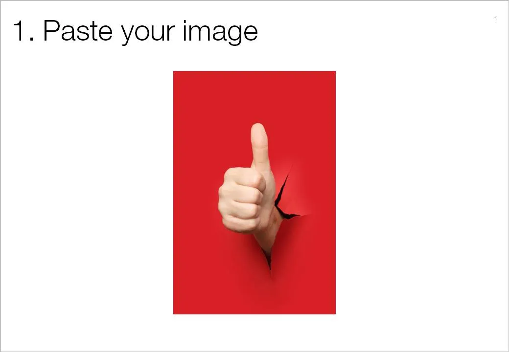
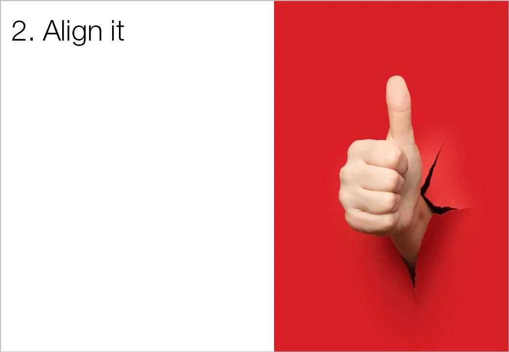
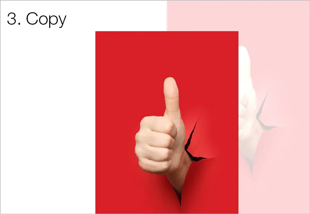
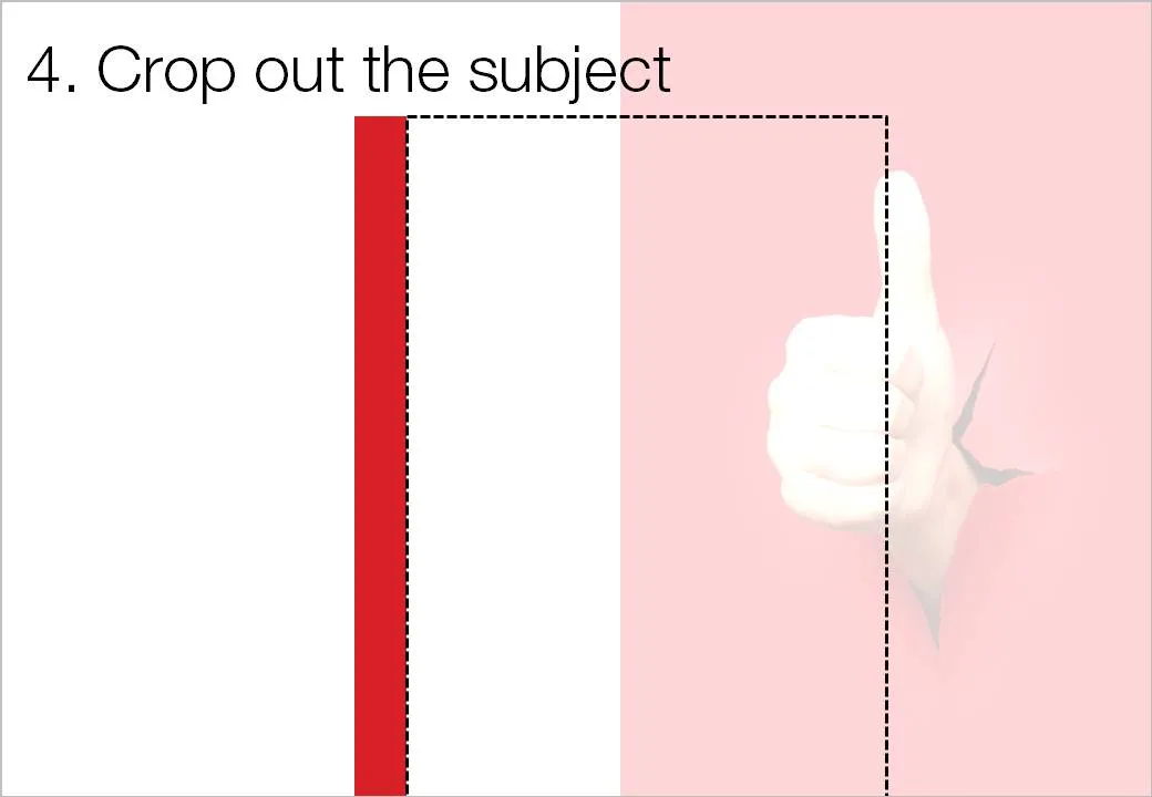
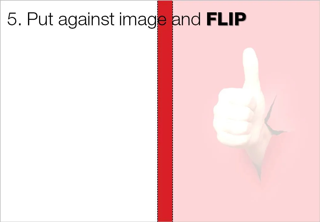
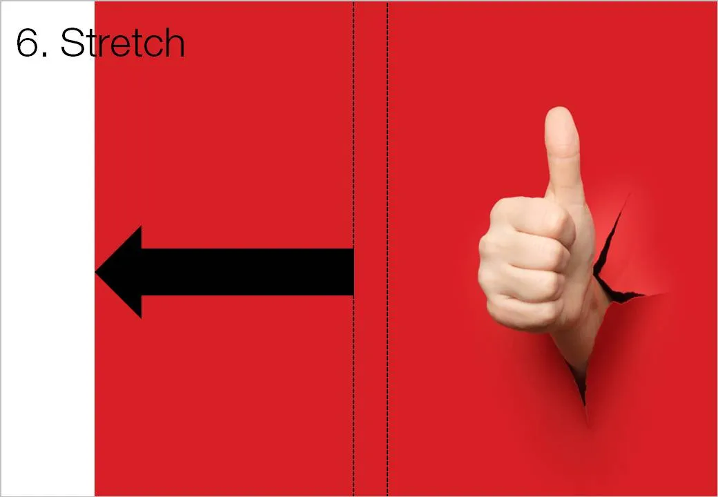

Image via iStockPhoto.
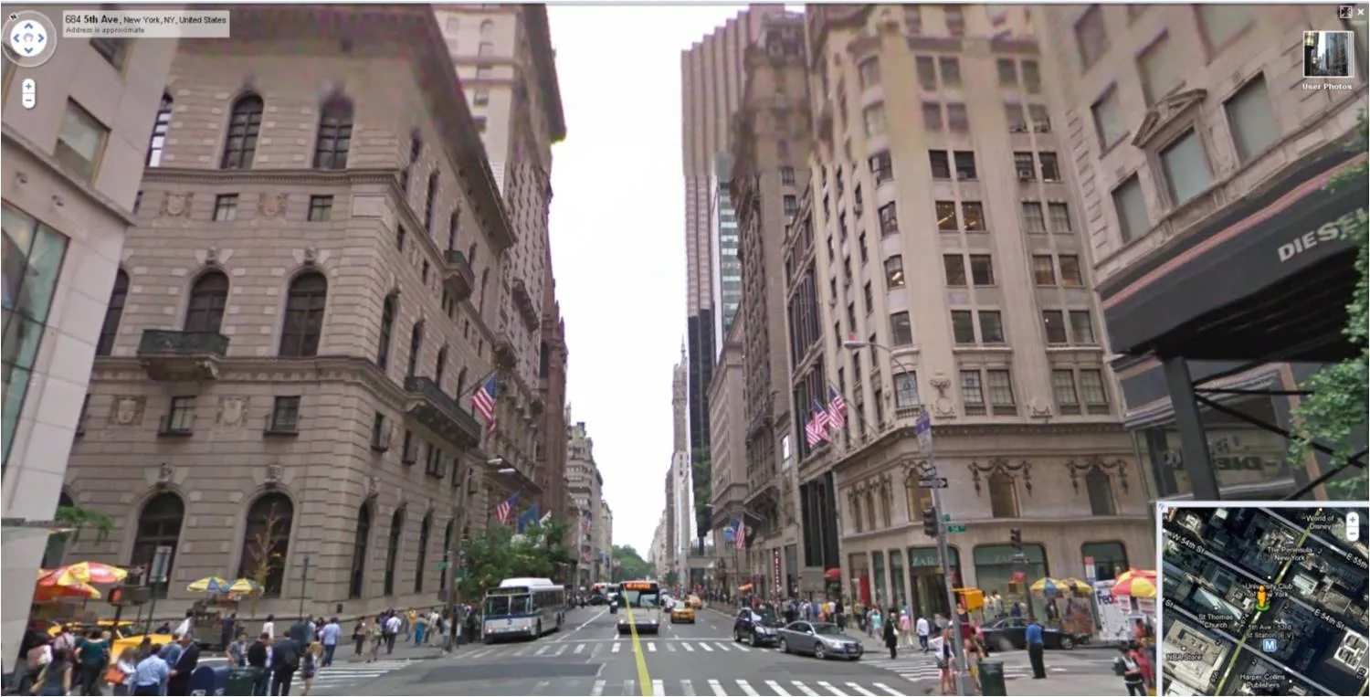
For those who do not know: Google Street View lets you look at images taken in the streets of more and more cities. You walk around, look up, down, sideways. Like Google Earth (see an earlier post about how to tilt Google Earth maps), this is a fantastic source of images for presentations.
See the ad below. Something is not right. It is hard to see what it exactly is, but the image is not natural. The light? The shadows? The 3D proportions?
Photo manipulations are increasingly easy to make, but the technology of image editing is not the problem. We already learn as a child that getting 3D to look right on a 2D canvas is hard. Architects and designers use a full 3D design environment to create realistic-looking simulations.
But, a 3D composition can look great even if the designer does not even bother to get the proportions right. Art would be have been incredibly boring if painters had stuck to the conventions all the time. Luckily they did not.
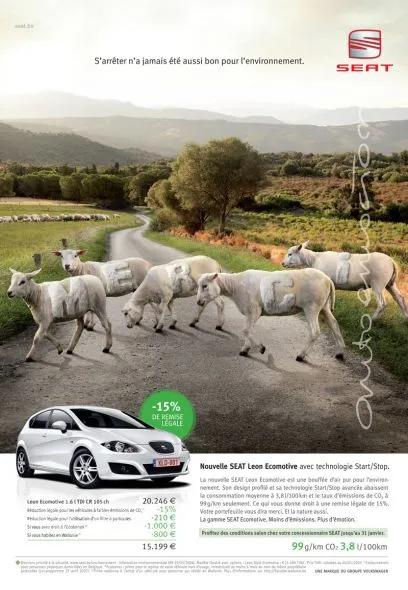
The problem are those compositions that are almost right, but not 100%. Look at the ad: very good technical execution, no ruffled borders around the sheep, drop shadows re-created, letters embedded in the fur: far better than most PowerPoint designers (including me) could do. Still the viewer is distracted: what is going on here? A distracted audience does not absorb messages.
In short: distort reality completely or forget about photo compositions all together.
Related, one of my earlier posts contains some useful links about photo manipulations.
Ad via Ads of the World.
Practice, practice, practice.
Every public speaking book talks about it (this one and this one for example). Every presentation design and public speaker blogger repeats it all the time. So much so, that it is tempting just to speed read over the paragraph to get to the cool stuff about adding that 3D shadow to your slide. “Hey, I am a confident speaker, ticked that box”
Some sentences to get you to change your mind:
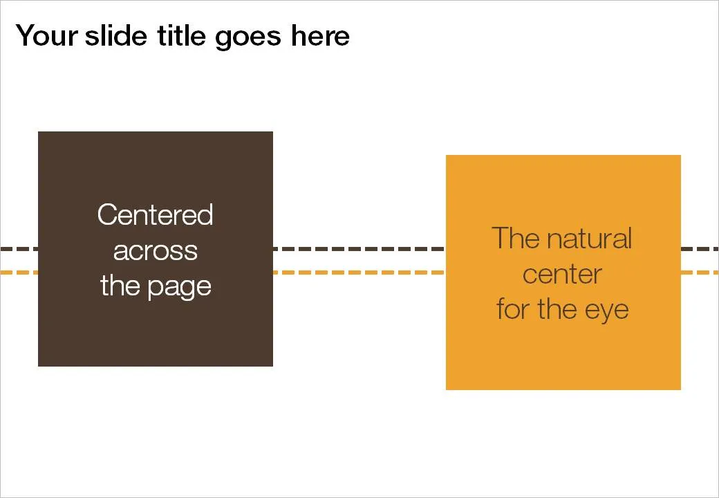
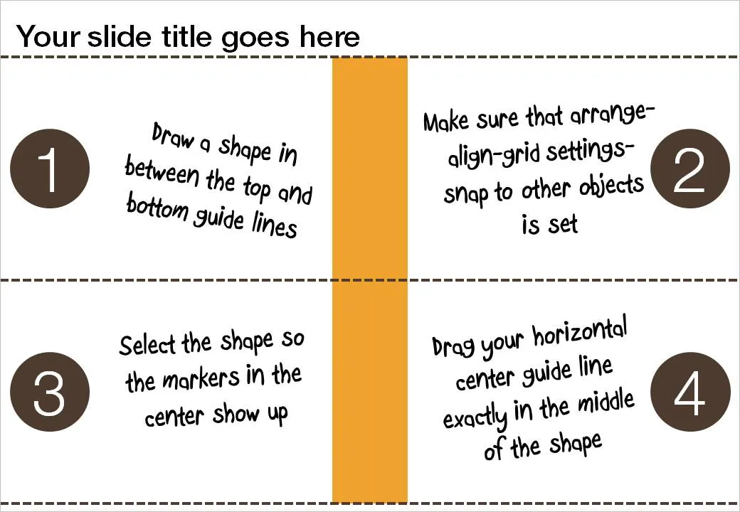
If you use big title headings on your PowerPoint slide, the exact vertical center of the slide might not feel natural to the eye. I suggest centering items slightly lower. Here is how you can find the exact location where to set your drawing guides.
I just noticed that iStockPhoto has increased prices over the weekend. A medium-sized image now costs 10 credits instead of 6. That means that such an image costs around $15 depending on the pricing plan you use.
What image sources are you using for your presentations?
I must admit, I am ignoring my own earlier assertions about not using non-standard fonts in presentations. PCs do not come with Helvetica installed, and I love it. In most cases, embedding the font inside the PowerPoint presentation makes sure that people can use it on other computers as well.
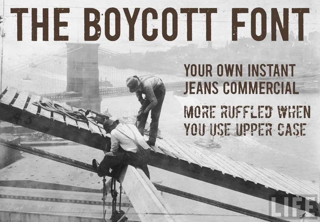
Helvetica is a relatively tame font. Selectively you can go a bit wilder. The image below (taken from the excellent Google LIFE image archive) mixed together with the Boycott font gives that instant jeans commercial effect. Here is an example of a presentation that uses something similar. Obviously, these type of fonts are only to be used for big image/huge font presentations, and probably not in every presentation you make.