SlideMagic Blog

Frequent updates about all things presentations since 2008. Subscribe to never miss a post.

RSS
all posts

Category Design

·Design

CNN-style lettering tape

A semi transparent overly is one way to keep text readable over busy images (previous post). CNN uses a different one: black and colorful bars behind white text. The length of the bar varies with the length of the text that it covers.
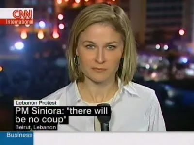
It is easy to recreate this effect in PowerPoint. Here an example with an image from one of my favorite boulevards in Paris (image credit to jfgornet). You can go further and imitate the retro lettering tape using stock images like this one.

·Design

OK, so what do you do exactly?

Startups that are pitching to venture capitalists for funding often start off with a barrage of product benefits, the great qualifications of the team, and the remarkable patent that you secured for the entire world (well, excluding Japan, but that is not a really important market anyway, and we have a way around this black spot on the globe through working with a great distributor we know there who happened to be my room mate while I studied biology, molecular biology to be more precise, in Oxford).

Pause, rewind.

What is it that your company does? “Aah, now I understand more or less in what part of the world I am in.” And your audience is ready to put the rest of your messages in context.

·Cartoons

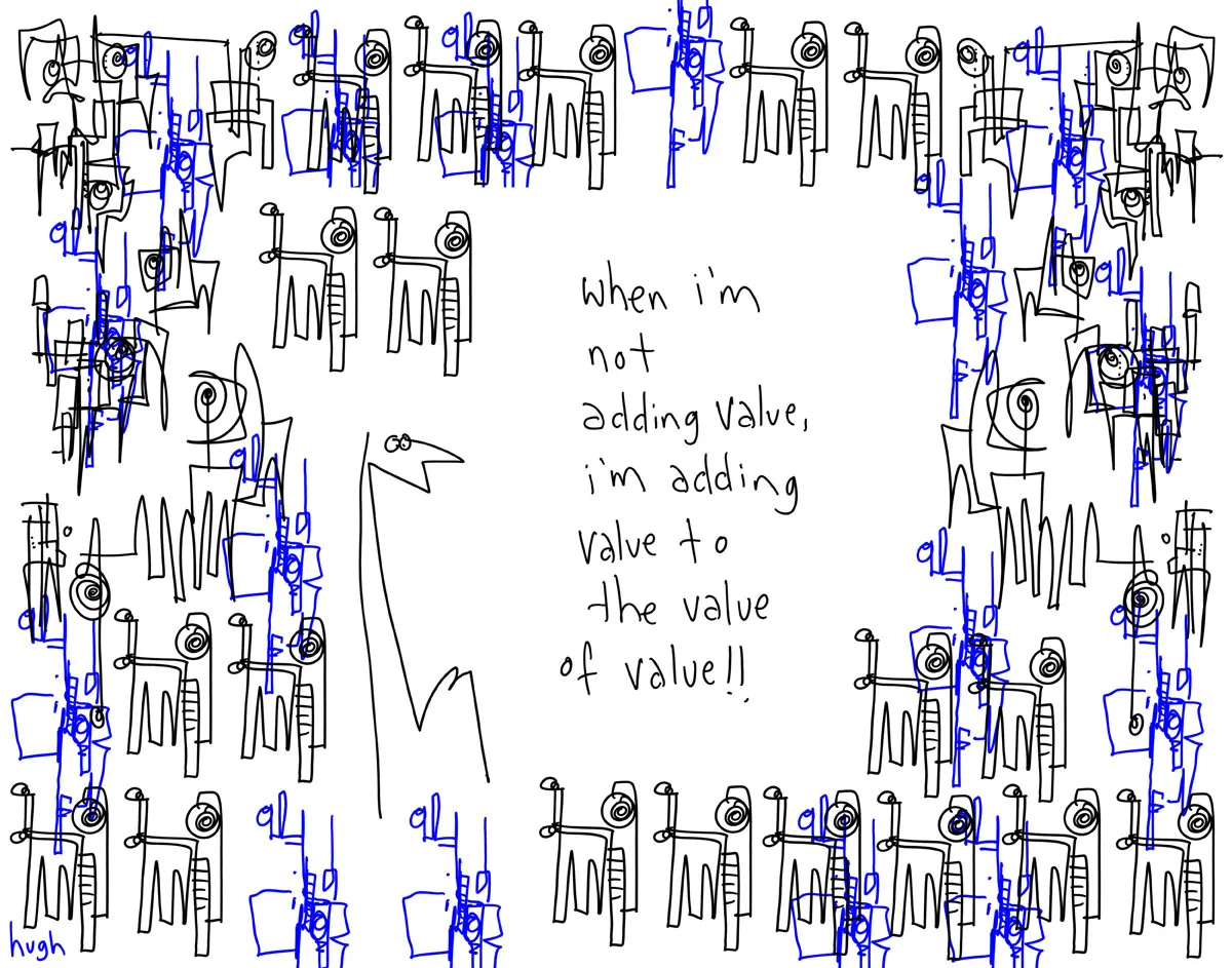
Adding value to the value

Presentations use too many buzz words and empty phrases. Hugh MacLeod (gaping void) made a great cartoon about the abuse of “adding value”, you can buy a print here (no commercial interest) or subscribe to his daily cartoons by email here.

·Design

CVs are coming to PowerPoint

The end of the standard CV or resume is near (Seth Godin post). The classic A4 CV full of woolly language/blurb is similar to the infamous “Executive Summary” of an investor pitch, or the 2-page “fact sheet” of a software product: people do not absorb any information from them.

Why not use a presentation to present yourself to a potential employer?.

  • The number of pages is a useless restriction: it is the time it takes to digest them that counts. A 5 page presentation with attractive graphics provides more info and is faster to read than a dense A4 sheet.
  • It makes you stand out. If the potential employer does not appreciate you deviating from the standard practice, it might not be the right place to work.
  • Data charts and timelines enables you to visualize things that are hard to capture in writing: i.e., the length you stayed with one company versus another
  • Images can convey passions and interests that are hard to capture in words

I wrote about using a PowerPoint presentation for an MBA application in an earlier post. My suggestions would be similar for a presentation CV. My own (slightly outdated) introduction presentation gives some examples of a graphical representation of a career timeline, and using data charts to quantify and visualize your experience.

·Art

Extreme close-up

An extreme close-up of a face can have a dramatic effect in a presentation. I used photographs of animals and people before (Miles Davis for example), but never a painting. What a great ad based on a painting by Renoir.

The ad encourages people to come visit an art museum (MASP in Sao Paolo). In case you have difficulty reading the text:

I saw paint turn into Impressionism. I saw Renoir painting me. I saw the disappointed banker who ordered me. I saw his disregard while throwing me into a dusty room. I saw years go by. I saw Europe finally acknowledge my value. I saw Brazil embrace me. I saw a new home. I saw that same home turn into the country’s most visited museum. But, having seen all that, there’s one thing I haven’t seen yet: you. Come. I wish to see you.

Two more examples on Ads of the World. If you are interested in art, try this book.

·Design

Dealing with ugly corporate templates

Corporate PowerPoint templates are often (in fact, most of the time) too busy and too cluttered for presentation design. Lots of graphics that is repeated on each page, big logos with reflections, legal disclaimers, huge page numbers, all of this eats valuable screen real estate. Depending on how strongly the corporate communication department insists, here are some work-arounds:

  1. The most radical option: go into the slide master and take all the unnecessary stuff out. [view, slide master]. But then do something extra: go into [design, create new theme colors] and enter the exact RGB colors of your company’s color scheme, a step that is often overlooked in corporate templates
  2. Keep the front page, but design a presentation full of large images that you stretch across the page (including the cluttered graphical elements). “What, I did stick to the template, the images just did not fit in in any other way”.
  3. If 1 and 2 do not work, create a window inside a window: design your slides inside the frame that is left, using the correct corporate colors and ignoring the bullet point default template. If the window is consistent, the audience will slowly loose the attention for the clutter around your chart, in pretty much the same way as is the case in big conference halls with distracting sponsor logos around the projector screen.

Thank you Gonzalo Álvarez Marañón for suggesting this topic.

·Design

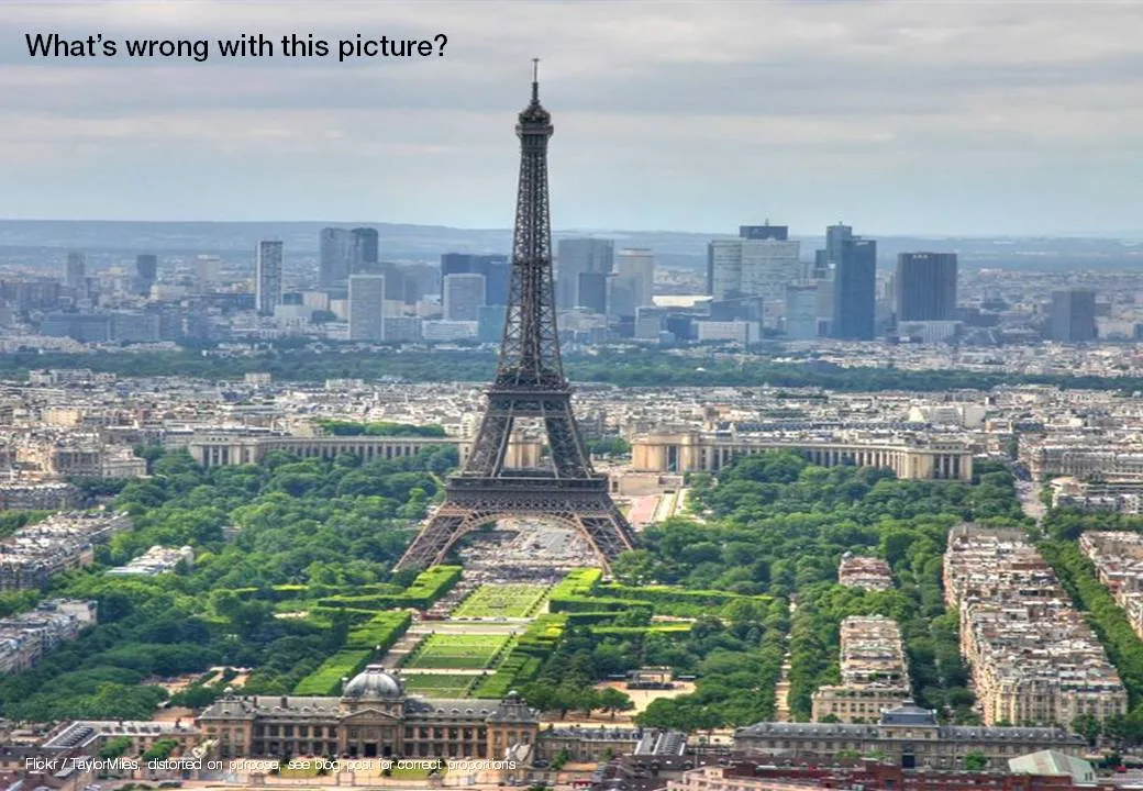
Un-stretch those images

Many presentation images are distorted: the proportion between height and width got confused somewhere along the way. It is easy to correct this. In PowerPoint 2007: right click the image, format picture, reset picture, and you got your original image back. Now hold the shift key while resizing your image and the proportions will be preserved.

Here is an earlier post with a more advantaged tutorial how to scale images to a full page without distortion.

·Design

Credible customer testimonials in presentations

An excellent post on copy blogger: hardly anyone reads/believes a customer testimonial. They all sound the same, they use sugary language and buzz words, they are one sided. Most sales presentations have the customary slide with customer quotes in text bubbles inside:

  • Far too much text
  • Stuffed with generic adjectives
  • No specifics related to the customer situation
  • Not a specific source who said it
  • No facts, numbers

Do not send a blank piece of paper to your customer and ask “write something nice”, instead, interview the customer, write down a very specific story with facts and have her approve it. The “reverse testimonial” suggested by copy blogger is a powerful structuring technique.

UPDATE January 2018: we have now added customer testimonial presentation slides on the SlideMagic template store

·Cartoons

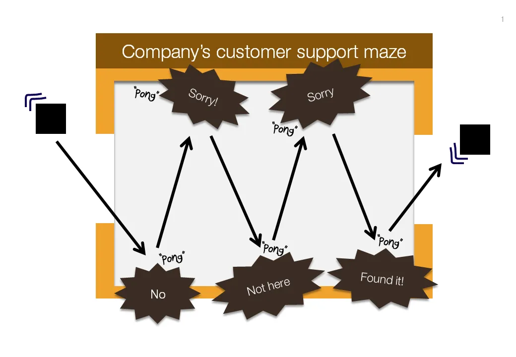
Chart concept: "Pong", "Pong", Pong"

Cartoons have a great way of adding movement to an image. Images can be static and without animations (easier to share online). All you need to do is use an informal font such as Boopee and add some arrows and loosely drawn lines.

The following chart example was inspired by the first “pong” video games that came out in the 80s.

While the style of the slide is informal, the content is serious enough that I would not hesitate to include it in presentation to the Board. I took out the specific customer example to maintain client confidentiality.

I am a big supporter of the global “ban comic sans movement”, try not to use that font.

·Design

A VC investment case in the public domain

The Internet opens up everything, including investment cases by venture capitalists. If you are working on a presentation to pitch your startup to a VC, read Mark Suster’s recent post on his investment in Burstly. Here is the full content on how he convinced his partners to back him with the investment. Valuable input when you design your pitch deck. Mark is not the only one, many VCs now run blogs, given very good transparency in how their mind works. Much better input than what their portfolio looks like and/or the standard blurb on the VC’s web site. Every VC is different, every VC pitch is different. Do your homework before opening PowerPoint.