SlideMagic Blog

Frequent updates about all things presentations since 2008. Subscribe to never miss a post.

RSS
all posts

Category Concepts

·PowerPoint

The snapping chain

Business presentations usually rely on a few basic concepts. One of them is the snapping chain or rope, where 2 forces pulls something apart. One way to create this is with a stock image of a snapping rope or chain, but it can be hard to find one without an unhelpful 3D rotation, another approach is to create a chain from basic PowerPoint shapes.
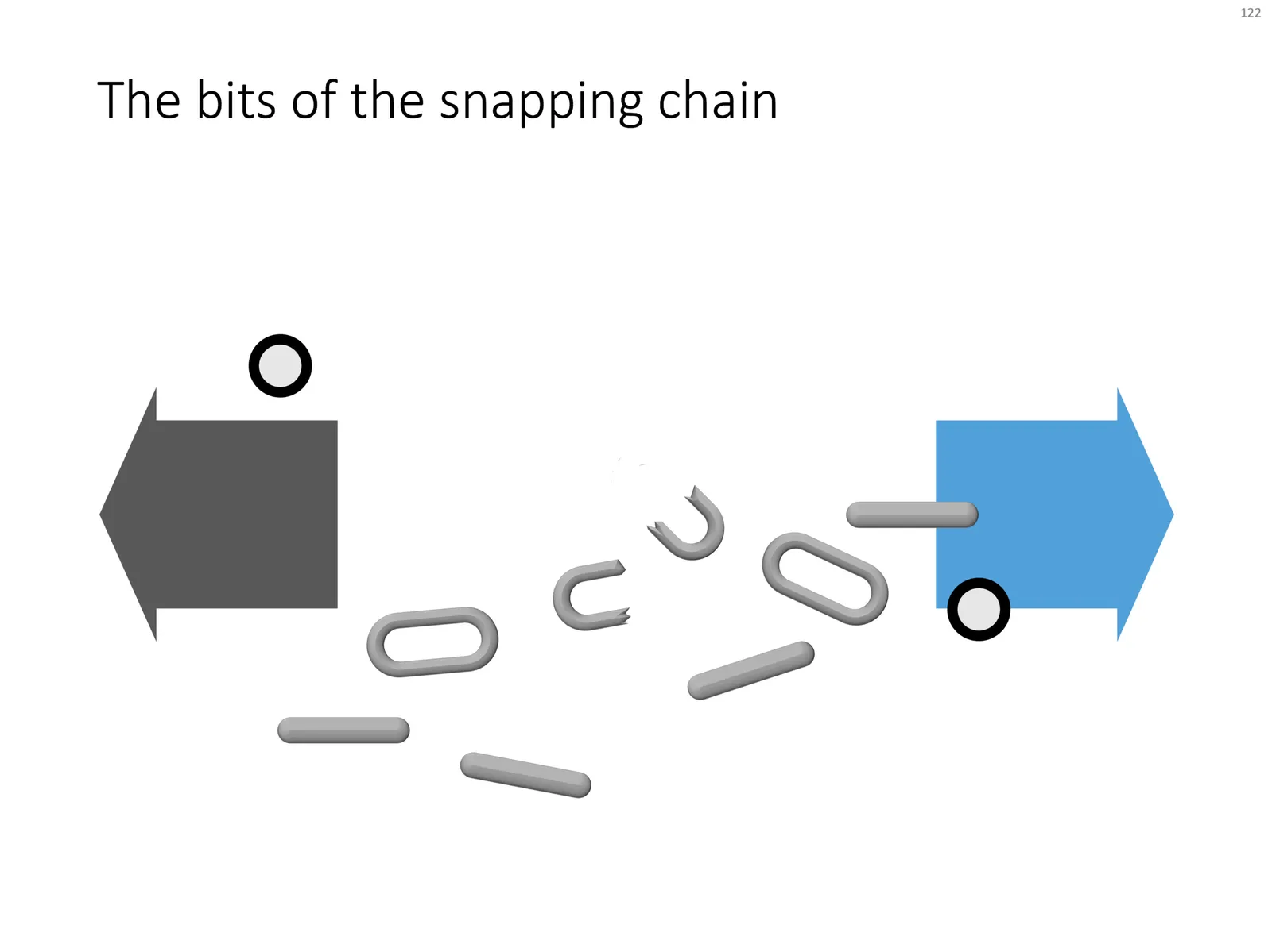
Here is what I did

  • Take a rectangle with rounded corners
  • Increase the rounded corners until they become half circles (the small yellow dot in the shape)
  • Copy the shape, make it smaller
  • Centre the 2 shapes, subtract the smaller from the bigger
  • Apply some 3D bevel to to get the basic chain ring
  • The other chain ring is simply a rectangle with rounded corners.
  • Now, scribble a “saw” freehand shape.
  • Copy a chain ring, subtract the saw shape to get the broken ring
  • Copy this broken ring, and subtract it from another ring (to get the exact complement of the break lines)
  • Line everything up for the final composition.

You can follow these steps, or download the finished product from the template store.
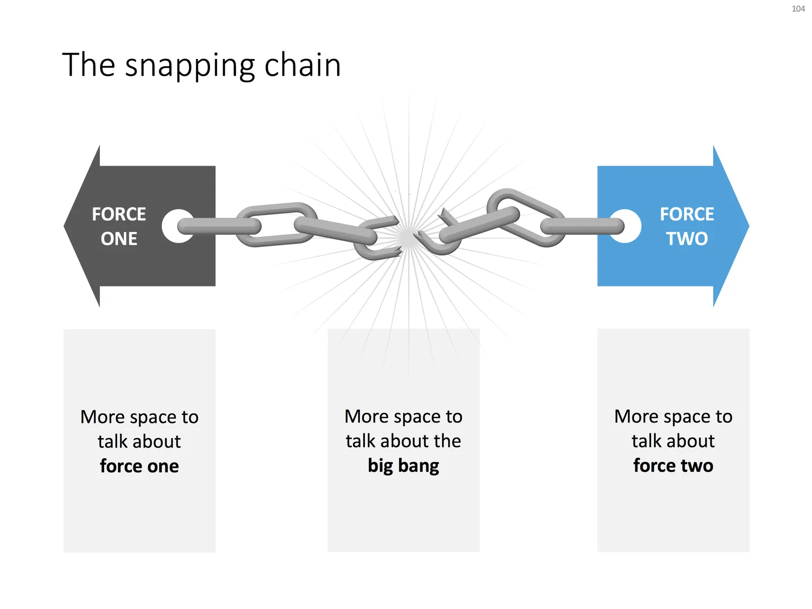
Once you have your chain, “store it in a safe place”, there are endless ways you could use it in future slides: multiple chains, longer chains, chains that go all around the slide :-) Here is another possible composition from the SlideMagic archive

The resulting chart is not a master piece illustration, but its unpretentious simplicity can do a decent job in an everyday business presentation. People spent too much time dealing with presentation software, and the objective of SlideMagic (the app, the store) is to help you get business concepts on a decent slide quickly and move on with more important things in life (and business).
·Concepts

SWOT analysis

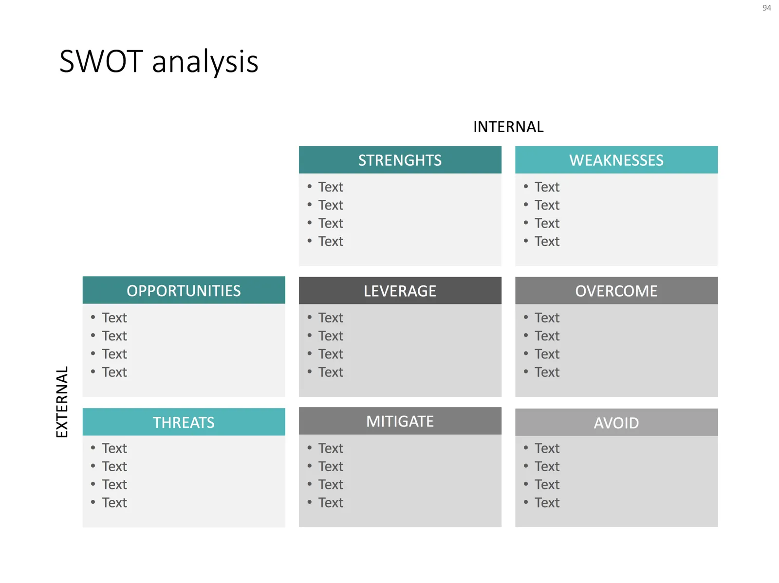
You have been searching “SWOT” a lot in my slide template store, and got blank results. So, by popular demand, I added a SWOT slide template.

The slide is a bit too dense to put up in your next TEDTalk, but that is never the purpose of a Strengths-Weaknesses-Threats-Opportunities analysis. A SWOT is an analysis rather than a presentation tool. In my life as a strategy consultant at McKinsey, a SWOT analysis rarely solved a big strategic problem start to finish, but it is usually a great tool to get people started.

It can be especially useful in big group discussions where strategic debates can go all over the place. Putting an empty SWOT framework on a flip chart immediately calms the group down and focuses the meeting.

I expanded a bit on the traditional 2x2 (4 boxes) model: the SW, and OT boxes are now put on the side of the matrix, leaving space for 4 new boxes in the center that enable you to scribble what you are actually going to do about all these internal and external factors.

(I vividly remember that 50% of the group discussions around a SWOT whiteboard were about in which box to throw a particular thought).

Feel free to copy the design, or download the SWOT analysis ready made from the template store. You can find there more examples of strategic frameworks as well.

·PowerPoint

Turning a bar chart into a Gantt diagram

Project Gantt charts are a pain to create in PowerPoint. Screen dumps from professional project management software are too detailed and don’t have the right look & feel. Manually resizing blocks is tedious, and oh boy, what if you have to add or change an activity…

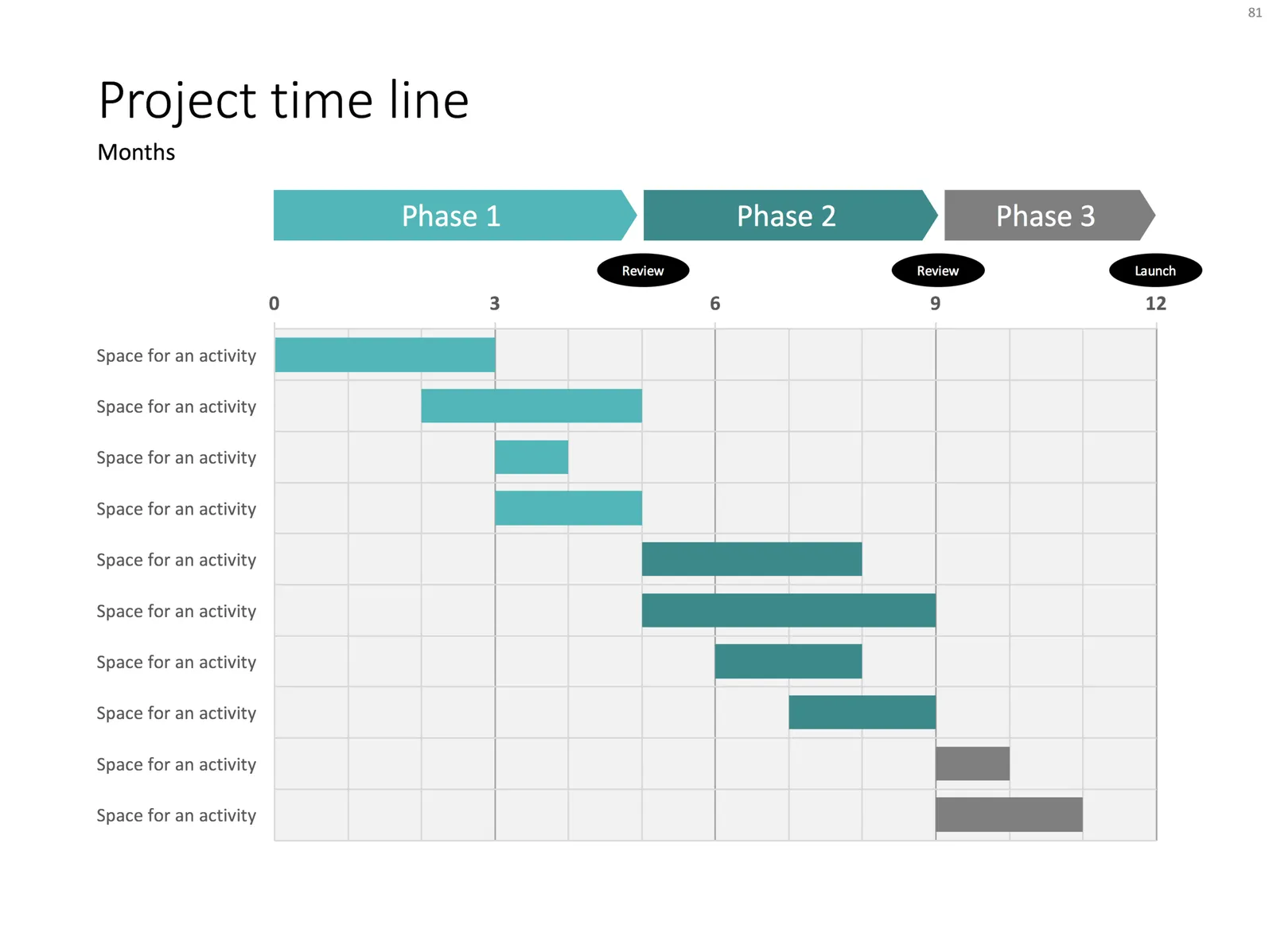
I often use a disguised stacked bar chart to create project flow charts in PowerPoint.

First, you need to look at the content. Like my approach with all data charts, project plans should not be copy pasted directly into PowerPoint. Project planning, data analysis, is not the same as presenting the result to an audience, you need to disconnect the two activities. This means in most cases starting with a blank sheet of paper.

Purely from the stand point of communication (not planning): which activities should be grouped together, which separated? What is a logical phasing? Sometimes, nitty gritty activity details are crucial for planning purposes (exact roll outs for each city), but can get pretty boring in a presentation. Sometimes the opposite is true, a small pilot might be worth highlighting in the presentation.

Once you have this sketch, you can transfer it to PowerPoint. PowerPoint does not have pre-configured Gantt chart templates, but the stacked bar chart can provide a solution. See the chart below as an example:

It takes a bit of thinking to set up, but once in place, it is easy to make small changes to the length of the bars and/or add and subtract activities without having to go through the hassle of lining up everything again.

Continue reading →
·Layout

Evidence from press clippings

Here is a slide I often encounter in draft publications: a screen shot of a news web page, with a few words circled in the middle of the article. There are a few problems with this:

  • The circled quote is often impossible to read
  • The other elements of the web page screen shot compete for attention: the big headline, the photo. The article was not designed to focus the attention on your circled text
  • Today’s web pages are crammed with screen elements that you don’t need on your slide: social media like buttons, advertising
  • A screen shot of a random news web site does not carry the same credibility anymore as a cut out article of the 1935 New York Times once did

There are better way to show that piece of evidence:

  • Incorporate data in a bar chart, comparing it to something, and putting the news web site in the bottom source line
  • Creating a big quote page, again quoting the news web site as a source

When should you use news web sites? Maybe if the headline in a very credible news source is what you need. But then, cover unwanted screen clutter with white boxes to draw the attention of the audience to that headline, and nothing else. Here is an earlier blog post about formatting newspaper screenshots.

Photo by G. Crescoli on Unsplash

·Concepts

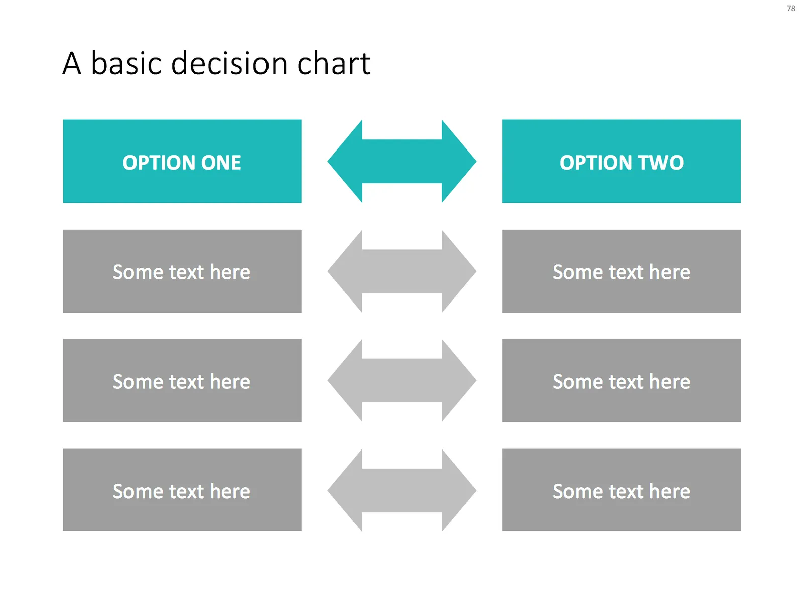
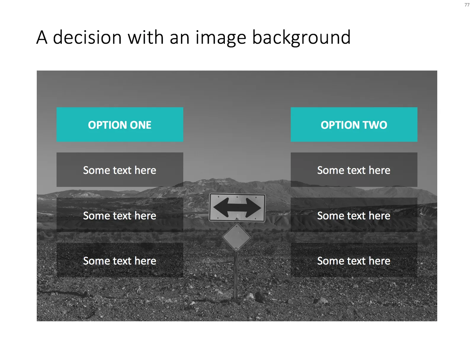
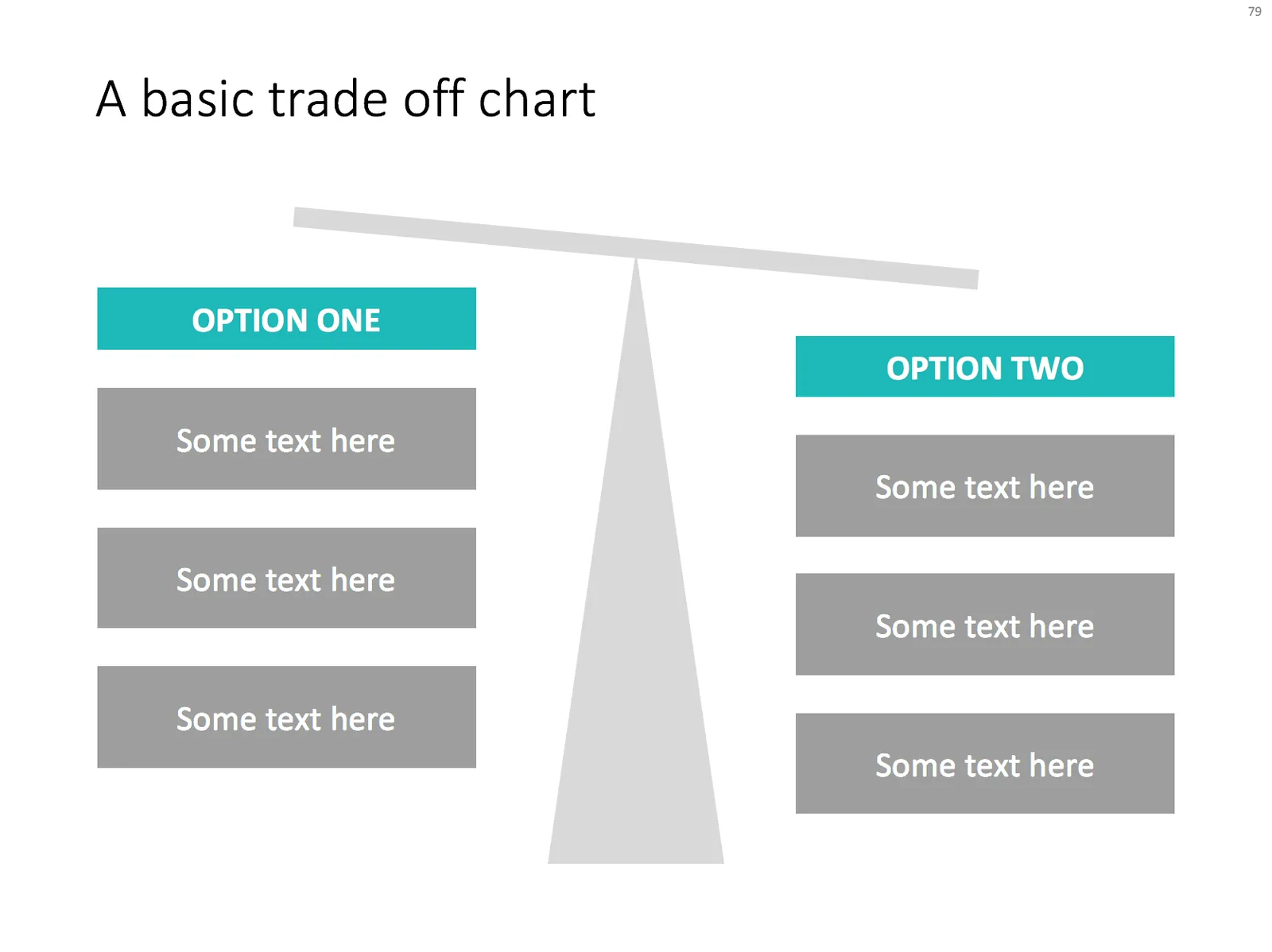
Some decision charts

Simple charts are often the best. I added a few slides to visualise a decision or a trade off the store: simple boxes, the same boxes over an image background, and a minimalist scale. With the latter, it is not the objective to make a photo realistic rendering of a scale, but rather give a subtle visual hint of which arguments win.

Feel free to copy the design, or download them from the template store

·Concepts

Merging flows

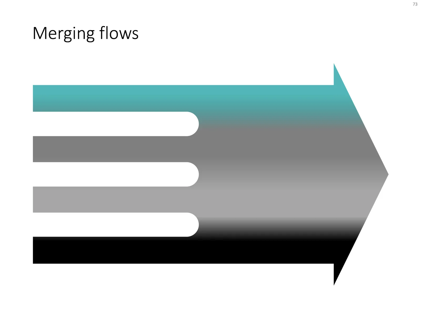
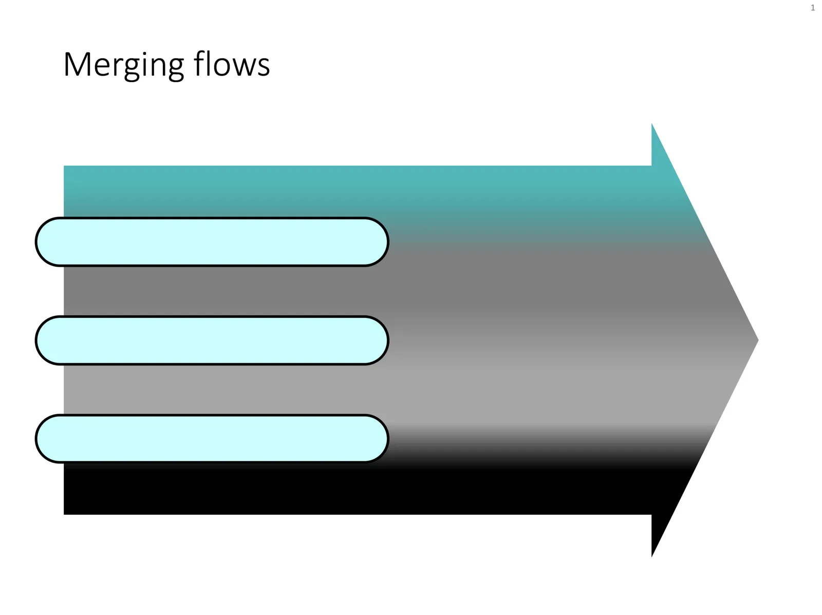
Here is a chart that visualises the merging of different flows. See in the second image what components I used to build it. Play around with the gradient stops to get the colours right.

Feel free to copy this design, or download it ready-made from the SlideMagic template bank.

·Concepts

Sankey diagrams in PowerPoint

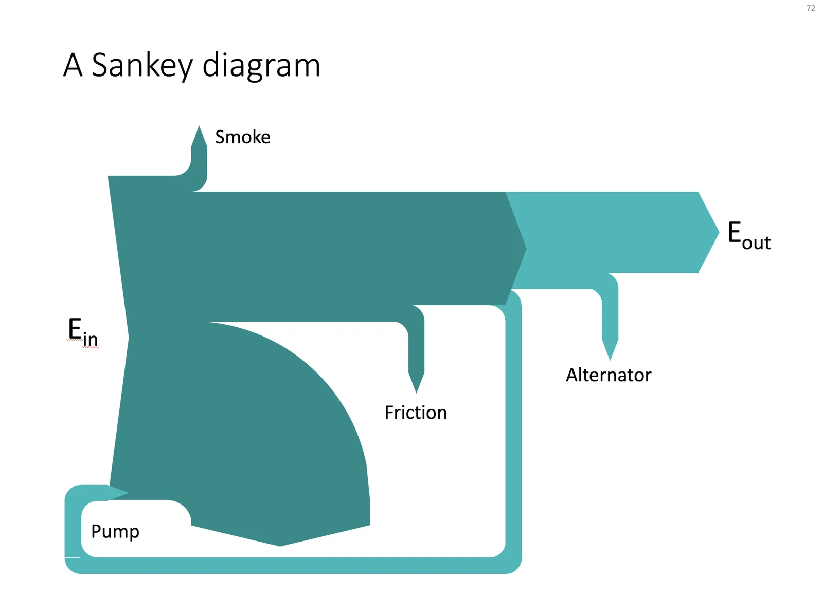
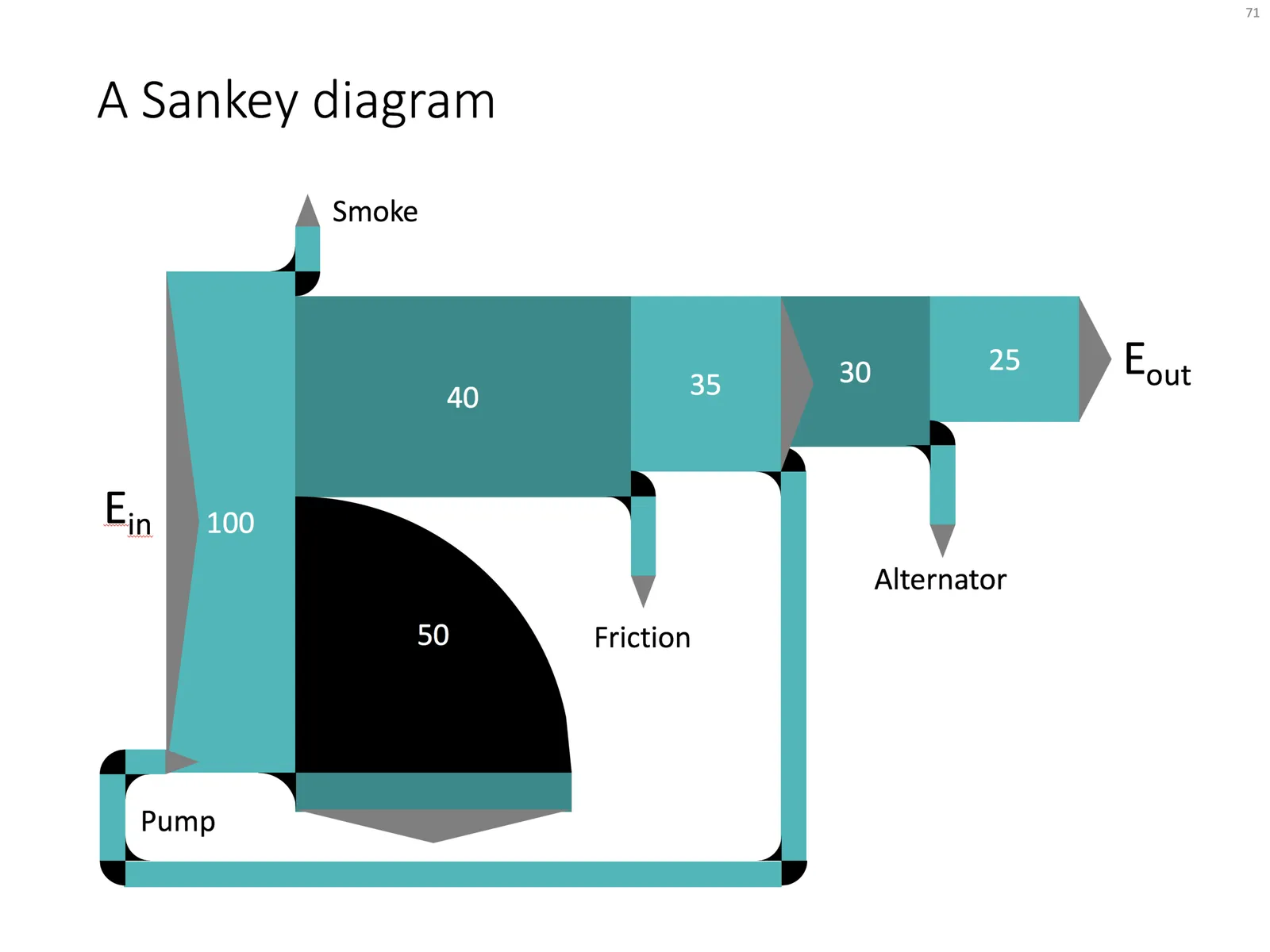
Sankey diagrams are tricky to make in PowerPoint, in the absence of a standard tool, you have to DIY the diagram from individual components. See below the approach I took to recreate a Sankey diagram that is used as an example on WikiPedia.

Here are the steps I took:

  1. Make it easy to make size adjustments by setting the height of the first block to 10cm
  2. Create all the square blocks
  3. Create the quarter circle shape (shape subtract) and put at the appropriate corners
  4. Create the inverse circle shape (take a square and subtract the quarter circle) and place it on the other side of the corners
  5. At triangles where necessary, note that I also used a white triangle at the entrance of the system.

The solution is not perfect, but it works. Feel free to copy this design, or you can download this chart from the SlideMagic template bank.

·Concepts

Popping out of the box

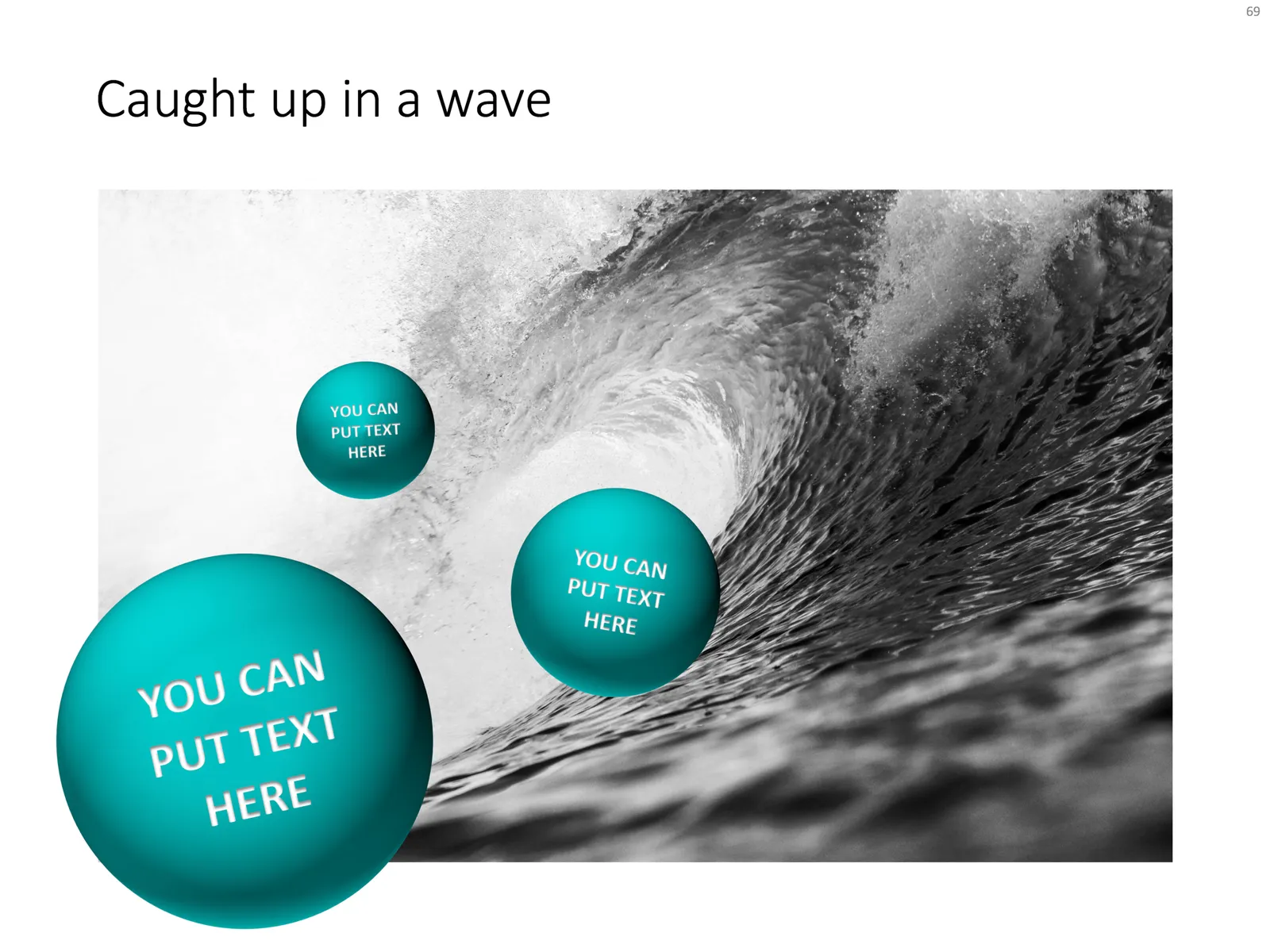
Unlike many designers, I actually like framing my slides, leaving white space around the edges. Stretching your picture all the way to the slide boundary looks nice on one page, but creates inconsistencies with more traditional data slides, and reduces the readability of slide titles.

One advantage of the frame is that you can make things pop out, a trick that is often used in magazine design. See below an example I made using that approach.

Feel free to copy the design above, or buy it ready for you to use from the SlideMagic template store.

·Concepts

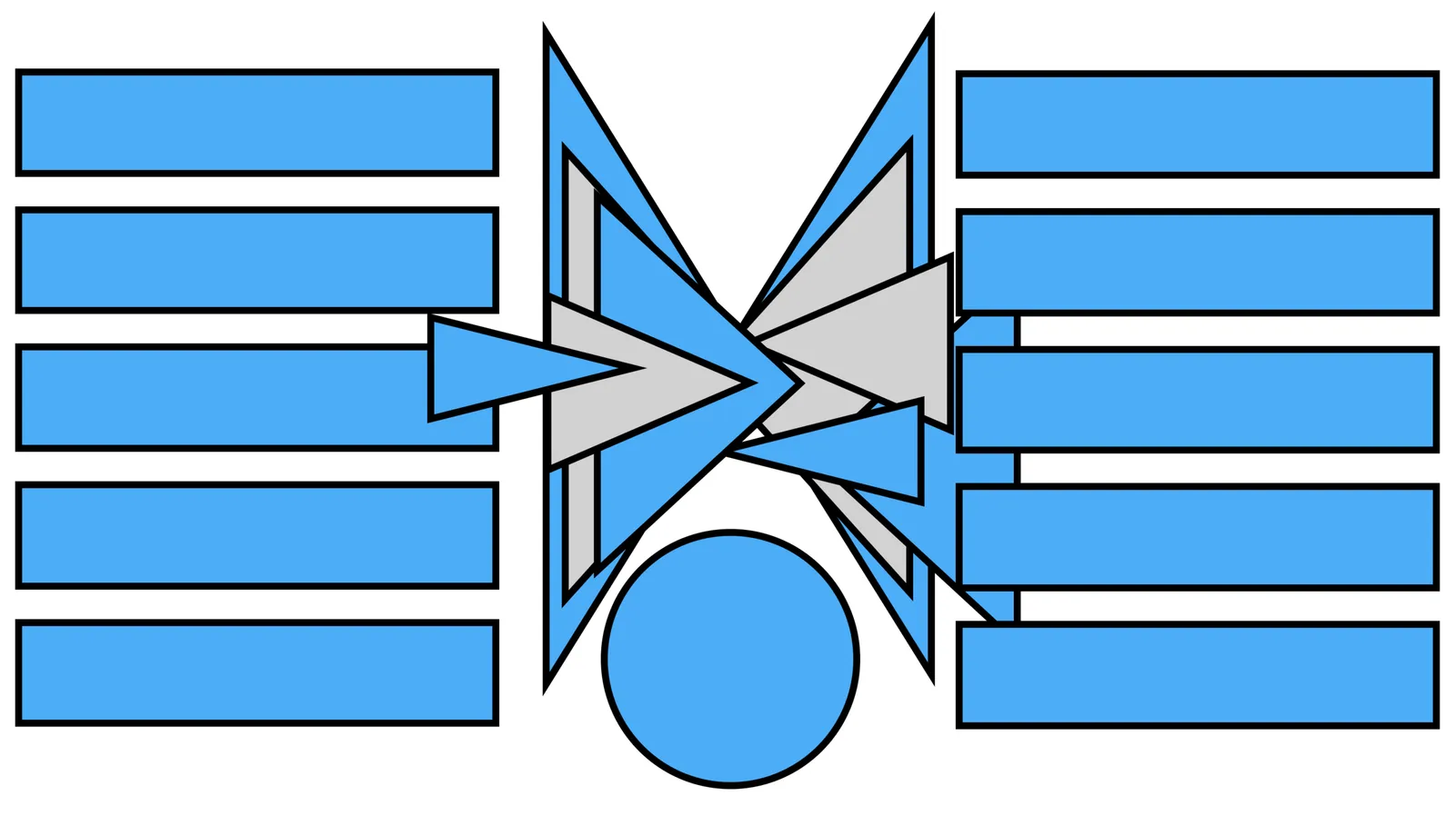
Fusion chart

In the 2 images below you can see how to create a “fusion chart” where lots of stuff flows into something central. In the second image, I changed the color of the white triangles to grey and drew strong border lines so you can see what shapes are involved.

UPDATE: You can now download this slide concept from the SlideMagic store

·Advertising

Different interpretations

Here is a picture of a bill board snapped by a friend on Facebook. Venn diagrams are very useful in presentations. But there can be a catch.

There are 2 possible interpretations:

  1. Intended: we are just so much bigger than these good things
  2. Version b: our values do not really include all these good things

Have you key slides checked by a few different people, especially if they go in front of many eyes.