SlideMagic Blog

Frequent updates about all things presentations since 2008. Subscribe to never miss a post.

RSS
all posts

Category Concepts

·Concepts

Chart concept - 2000 iMac versus 2010 iPhone 4

A chart concept I used yesterday in a client’s presentation to demonstrate the progress of personal computing technology over the past decade (technical details taken from this post by AdamH).
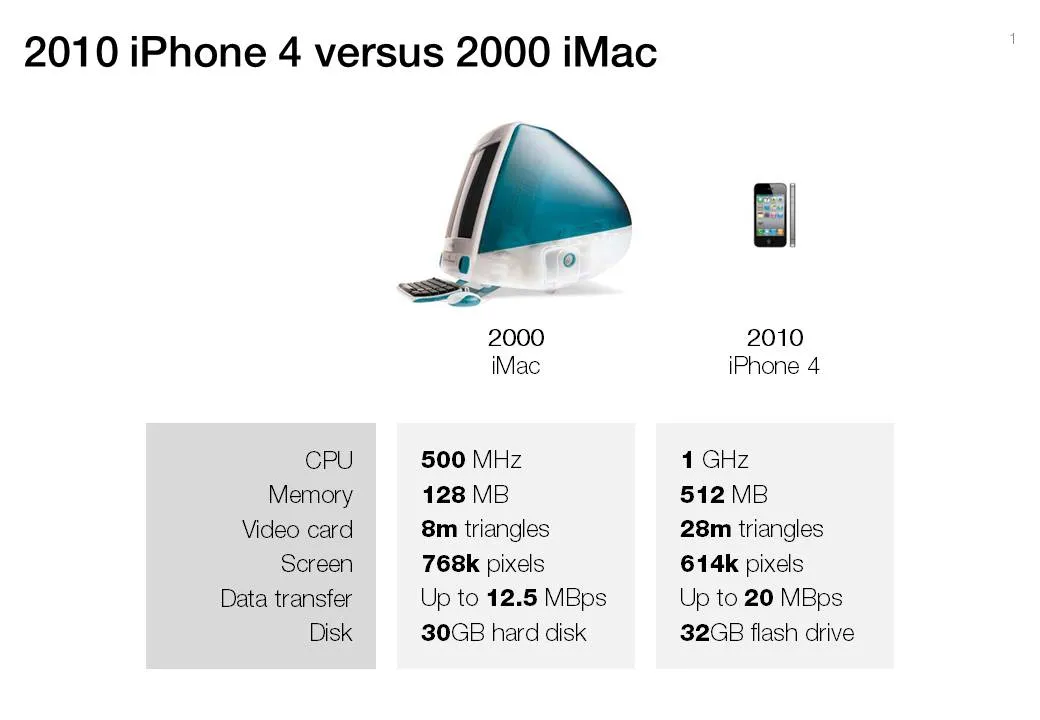
There is no point to construct complicated bar charts to compare the values of the technical specifications, they are similar (the point of the chart). Rather what is important, is to shrink the image of the iPhone so that it’s more or less to scale with the much bigger iMac.
·Concepts

Visualizing the curse of knowledge

I often have to explain the concept of “the curse of knowledge”: it is actually harder for an expert to explain something than a reasonably intelligent outsider (here is why presentation designers should be reasonably intelligent :-) ).

Dan and Chip Heath use a musical metaphor in their book “Made to Stick”:

  1. The presenter thinks of a musical piece and imagines the full symphony orchestra giving all it can
  2. He taps the tune with his fingers on the desk, it all makes perfect sense
  3. The audience sees/hears someone tapping…

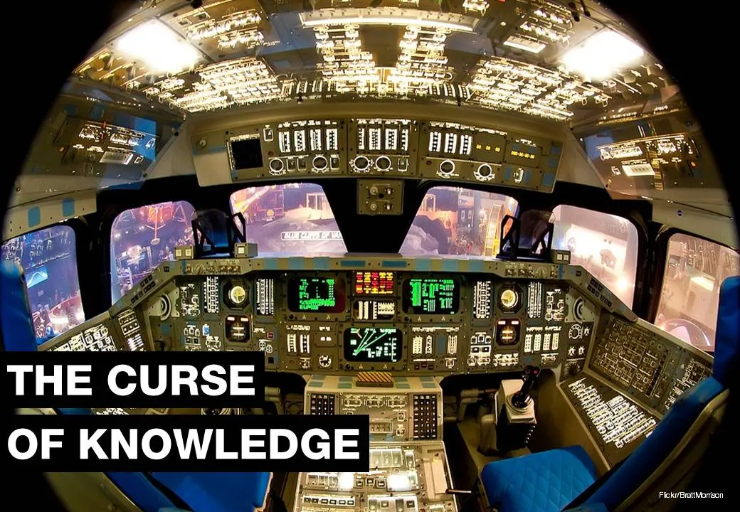
For executives who are keen to load their slides with data for an external audience, I use the cockpit analogy. A pilot can interpret all the signals of all the instruments in a split second and understands the situation the plane is in. The novice needs a bit more time to digest the information…

Thank you Brett Morrison for this beautiful picture of a Space Shuttle cockpit.

·Concepts

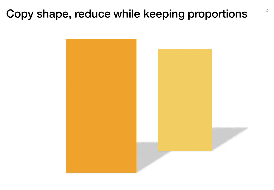
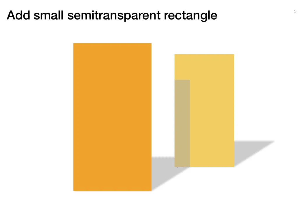
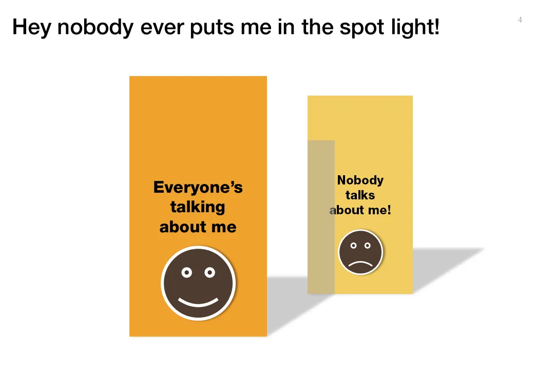
Chart concept - standing in the shadow

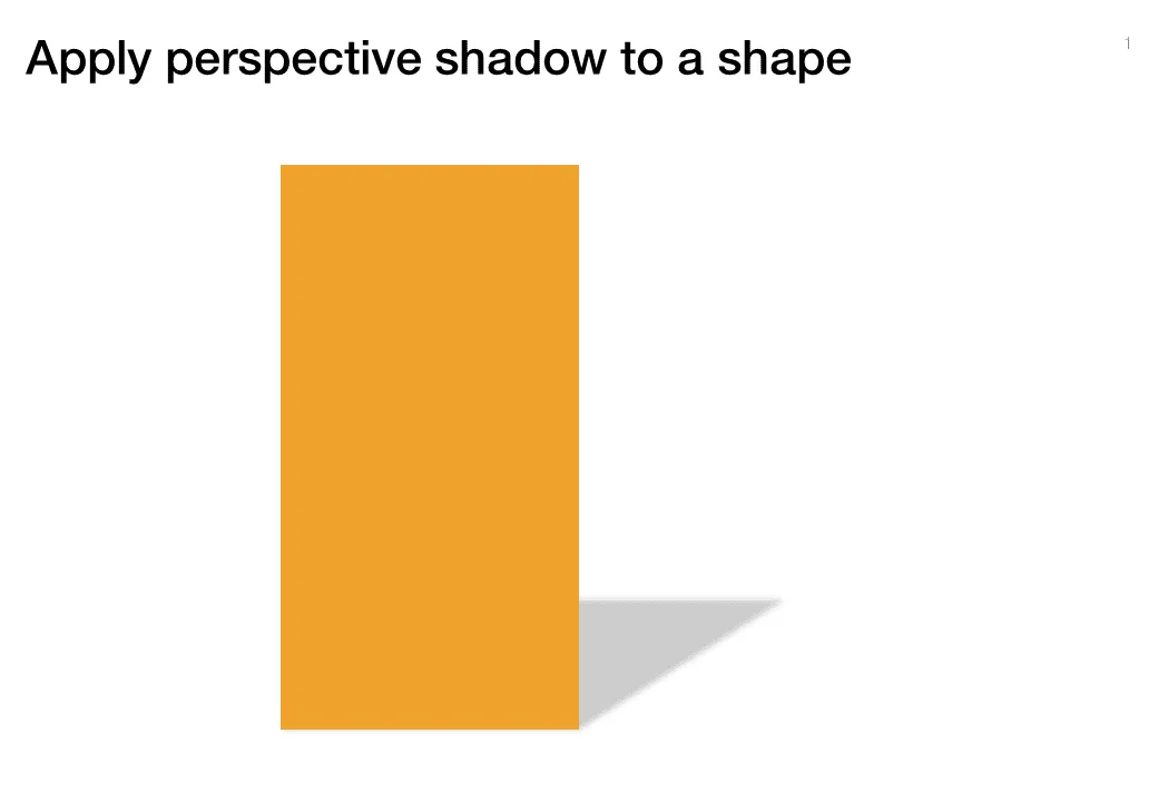
Some issues/people get all the attention, while others never get discussed. The chart below looks a bit like a child’s drawing, but the point is to show how you can play with shadows to create the effect.

·Concepts

The PowerPoint blur filter

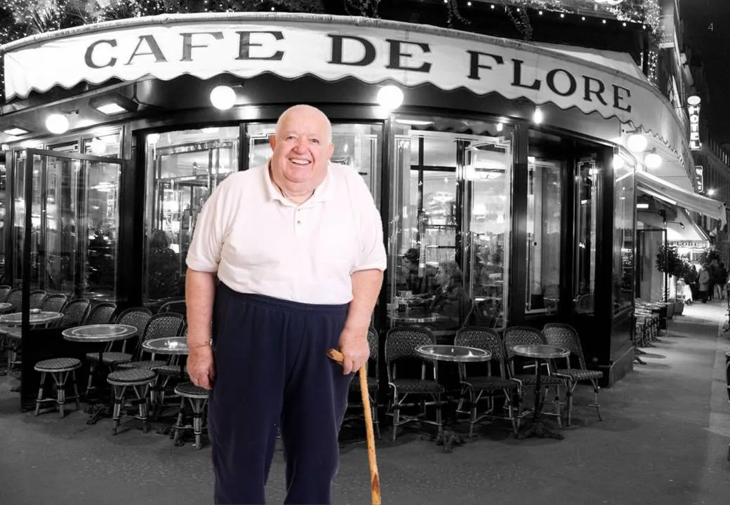
PowerPoint is slowly adding features that have been standard in Photoshop for years. One useful one is the image blur filter to increase depth of field of your photos (earlier post). It adds some extra realism to this composite image trick (discussed earlier here and here)

  1. Find an image for the foreground and use the PowerPoint format/remove-background function to get rid of the white background
  2. Find a background (nice image of Cafe de Flore by DarkB4Dwan)
  3. Combine the 2 images
  4. Blur the background with (click the image, format, artistic effects, the right one in the 2nd row)

One other application is to repeat a blurred version of a busy chart for additional comments (see post here)

·Concepts

Chart concept - mixing console

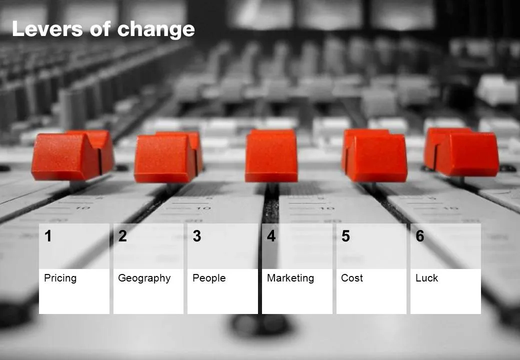
Mixing consoles used in recording studios are a good visual metaphor for situations where you carefully need to balance, fine tune, juggle a set of drivers. Image via iStockPhoto.

·Advertising

Chart concept - painted billboard

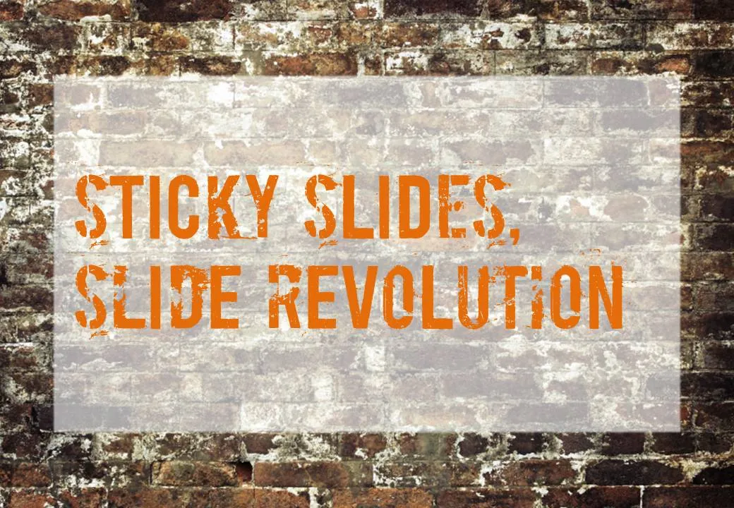
This vintage-style ad found on Ads of the World can easily be replicated in PowerPoint. A white box, semi-transparent with a bit of soft edges and a nice font against an image of a brick wall and you’re done.

·Concepts

Chart concept - overwhelmed

It is important to pay attention to camera positions when selecting images for your presentation. This wave that is about to crash on top of the photographer is a great example. Add some dramatic typography and the audience can almost feel the need to swim to the shore before it’s too late.

Image via iStockPhoto.com.

·Concepts

Chart concept - sky writing

You take a picture of a cloudy sky, and hand write a text with a healthy dose of “glow” and you can create your own skywriting images.

Here is how people used to do this before the age of PowerPoint:

·Concepts

Chart concept - you can do it

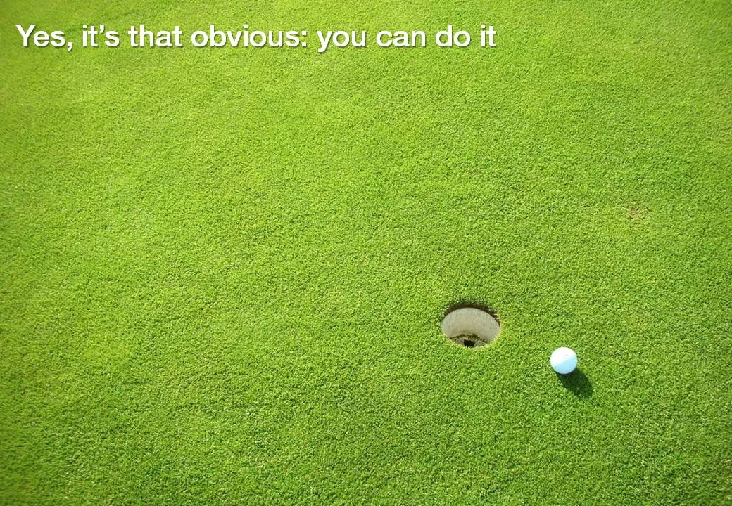
Low hanging fruit, it is easy, a shot for open goal, come on: you can do it.

Image via iStockPhoto

·Concepts

Chart concept: eye test

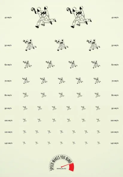
This ad about safe driving uses an interesting concept: the eye test. You can use it in a PowerPoint presentation exactly as it is used here: one variable is declining/increasing and visibility of another goes down.

Another use could be some sort of health check: “how well protected is your business?”, using a different image that repeats and gets smaller all the time.

Via Ads of the world.