SlideMagic Blog

Frequent updates about all things presentations since 2008. Subscribe to never miss a post.

RSS
all posts

Category Concepts

·Concepts

Reinforcing loops

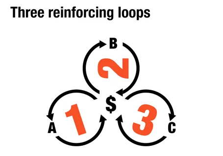
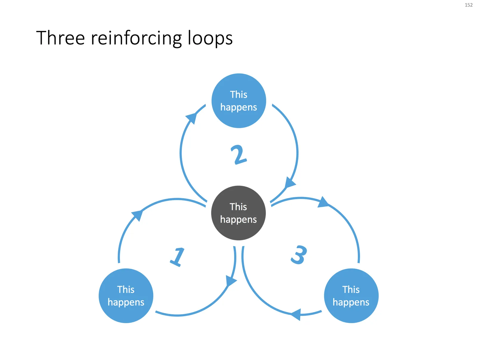
At McKinsey, we used to call this Business Dynamics, mapping reinforcing and opposing forces using arrows. The concept is borrowed from systems theory in mathematics and physics. These circles can make a great chart to show the main growth drivers behind your business.
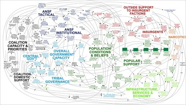
The notorious US army spaghetti chart is a more complicated execution of the same principle. Contrary to many critical review, I actually liked it as a visualization of the incredibly complex situation over there.

UPDATE: There is now a PowerPoint slide template with 3 reinforcing loops available in the template store.
·Concepts

Rigorous deal selection

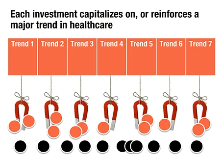
A U.S.-based healthcare-focussed venture capital fund only invests in a company if it pushes forward on of seven trends in healthcare. The page below tries to visualize that.

The point here is only about the rigorous selection, the trends themselves get explained on separate slides, and the portfolio companies get discussed somewhere else in the presentation. After the presentation, institutional investors should remember that the fund is very picky in investing their money, “remember that magnet slide?”

·Concepts

Endless permutations

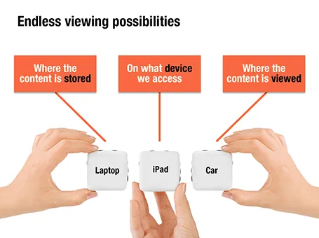
Here is a nice way to visualize an unlimited amount of possible combinations. The sanitized example below was designed for a client with a new digital media technology. You could create a similar concept with a suitcase combination lock, or maybe a slot machine.

·Concepts

(Unusual) example of my work

Most of my work is confidential (fund raising pitches, sales presentations), but this presentation is not. The style is also a bit different from my usual work, there are hardly any numbers inside. The presentation is meant to run at an exhibition booth on a plasma screen. I adjusted the look and feel of the presentation to match the style of the client Optimove. The video below is running at a higher speed than the actual presentation.

·Concepts

Movement without animation

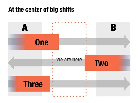
I am not a big fan of animation. It distracts the audience, can sometimes look funny instead of serious, and is not visible when you send people a PDF file, the new standard with the proliferation of platforms (PowerPoint, Keynote, mobile devices).

Here is an option to give a sense of movement in your slide without using animations. When filling a box, select the gradient option and let one side fade out to 100% transparent or 0% opaque. The chart below is a sanitized version for a client that is right in the center of some pretty major transformations that are going on now, so if you are an investor, that is where you want to be as well.

It has been a while since I blogged about chart concepts (here are some earlier ones), let me know if these ideas are useful for you.

·Cartoons

My friend the silhouette man

I love the simple elegance of the silhouette man. The figure can easily be constructed in PowerPoint by combining circles and rectangles and gives a lot of freedom to draw simple actions. Simple to draw, but the result does not look simplistic. If you find drawing them still to be a challenge, stock photo sites are full of ready-made files that you can use in your slides.

I recently designed a 150-page deck where he was used again and again in different situations. Here is an adaptation of one of the charts.

·Concepts

Fly through that circle!

The shape combine function in PowerPoint 2010 is great. Here is an example of how you can create text that seems to be flying through a circle. The key is the create 2 half circles and send one of them to the back. In earlier version of PowerPoint, this was very hard to do. (See a review of PowerPoint 2010 here).

Draw 2 circle shapes
Center them horizontally and vertically
Select the shapes, (inner last), shape subtract
Draw a rectangular shape
Same trick: select them both and do shape subtract
Copy and flip the half moon
Send the right half moon to the back and put some text
·Concepts

Back to simple

There are just so many advantages to making slides with very simple shapes:

  • It focuses on what you want to say only
  • They are easy and quick to make
  • They look highly professional without a degree in graphics design and/or the full suit of Adobe software
  • It easy to create a sense of motion
  • There are no issues with images/illustrations that do not fit your color template

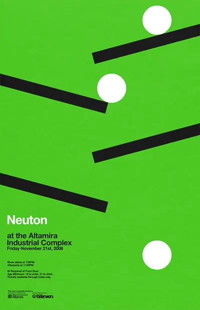
An example is this poster by Network Osaka (actually must better than a concept designed by me a year ago):

·Concepts

So how many different types of slides are there?

I think there are 4 different type of visuals,  Have I forgotten any? (The images below are taken - out of their context - from previous posts on this blog)

  1. Big picture, big emotion slide. A huge image of a squeezed orange “the competition is killing us!”, a big picture of an audience asleep “presentations are boring!”, swimmer dives in the pool “let’s go for it!” (lot’s of cliches here, but I have seen many good ones as well). These slides are an emotional shortcut, they unlock an idea/feeling that is already present in everyone’s brain quickly.

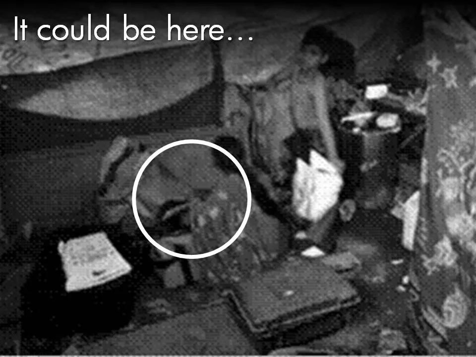
  1. Location port, a big image of a place, a street, a country, a customer. Pretty much like a movie director opening a film to bring us to a different time, a different place. An image of the interior of a messy store is much more powerful than a list of bullets: isles are not straight, labeling is unclear, lighting is poor.

  1. Relationship slide. Shapes/boxes with text, arrows, to show how issues are related, impacting each other, are dependent on each other, sit in different places on the same map.

  1. Data chart showing us a trend, or comparing numbers.

An incredibly dense relationship or data chart should actually be in the “location port” category, the U.S. army spaghetti chart is an example: it is not so much about understanding the chart in detail, rather the viewer understands immediately that “it’s complex” (earlier post).

Continue reading →
·Concepts

Chart concept - negative lettering space

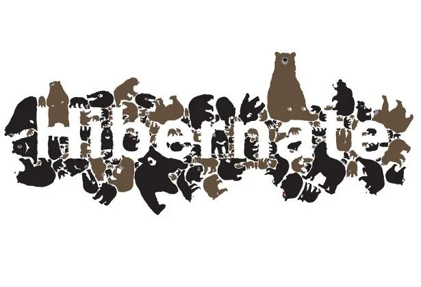
Here is a cute idea for a slide: negative lettering space. Computerarts.co.uk has a full tutorial how to create this effect here. It is easy to copy in PowerPoint: start with a word in a huge font on a page, set the font color light grey (or another color with a light contrast to your background), fill the page with the images you want, and as a final step delete the text or color it the same as your slide background.

Here is a search for earlier posts with a “can’t see the forest through the tress” type of concept.