Most of the animations and slide transition effects currently available in PowerPoint do more damage than good to a presentation (an earlier post on the subject). The video below is guilty of some of these mistakes, but it also contains some effects that would be very useful to have in PowerPoint 2010 (preview in an earlier post):
Very slow moving zoom
Extreme image zooming
Image blurring
Zooming inside data charts
See how often I used the word “zoom” here. In the current version of PowerPoint you cannot control zooming enough: effects are blunt. Either via devices like the iPad, or via a breakthrough by software innovators like Prezi, or via improvements in Microsoft’s/Apple’s slideware, eventually we will get to advanced zooming capabilities in presentation software.
Sometimes, a live presentation can be a pretty inefficient way to get a message across. For example, TED presentations are usually really good, but they still need around 20 minutes of your time. Have a look at the new fund raising video of the Acumen Fund that was released yesterday. It lasts 1:35.
In this 1:35 the video manages to explain a completely revolutionary concept to charity. It is not about giving food, it is not about giving the tools to grow food, but it is all about investing in profitable businesses that produce goods/services, create wealth and can grow by themselves.
The video does not need long speaker introductions, does not use spectacular motion graphics, does not rely on “look how miserable these people are” images. Just a number of upbeat people talking straight in the camera at you. It is hard to do this in 1:35 on stage with PowerPoint slides.
Sign up for the recently established social network of the Acumen Fund to learn more about the dramatically different approach the organization is using to combat poverty.
Two days ago I posted about a motion graphics video that was designed beautifully but relied too much on text bullet points to compare quantitative data, the brain had to do too much work in too little time (before the next piece of information shows up):
Read sentence
“Visualize” numbers internally
Interpret them
This is a better example of the use of motion graphics. Zooming is used to visualize the enormity of the number 1 trillion. It comes at a price though: this video is almost a full-blown animation. A bit of PowerPoint/PhotoShop skills and After Effects are not enough to produce it (unfortunately).
Xplane continues to develop beautifully animated presentations using motion graphics. After Did you know 4.0, there is now another video developed in cooperation with the Economist: The carbon economy.
I really like the effects, textures, typography and animation of this presentation, but I think we still have to learn how to use all this technology effectively. The video is relying heavily on text to explain and compare quantitative data (similar to what bullet points do). The pace is so fast, that I have difficulty processing it all (and I had my 10,000 hours of data processing training).
My early thoughts on how to make the most of motion graphics:
Be careful with background music
Use text animation only to highlight quotes with non-quantitative information
For quantitative data go back to the good old simple data charts, but feel free to leverage those beautiful textures and typography
Beef up the animated character animation: things morphing into another shape, things growing/shrinking (the rising water levels in this video is a good example), the blend of animated film design and presentation design is great
Think about pacing of animations like you think about pacing of words. Have the courage to pause, accelerate, talk loud, talk softly, pause again. The entire video does not have to be an information roller coaster.
It’s a beautiful example of kinetic type or motion graphics. Some comments.
It is made with software available to everyone, the source files are here.
There are some interesting visualization concepts, for example pie chart overlays abour 2:30 minutes into the video (thank you Steven Levy for pointing this out)
Quotes are great to get one number across. Still I believe that comparing two numbers is not very powerful in 2 consecutive quotes. Rather the good old bar chart does a better job.
The real artistic power in this presentation is the subtle use of informal cartoon drawing techniques, I style that I like.
You should design a presentation for an online audience in a different way than those for a live audience. Software such as Adobe After Effects are bringing the graphical tools traditionally used in professional video animations within reach of everyone. As an example, see this recent video produced by Paul Durban: a teaser to get people to download an ebook created by the members of Seth Godin’s triiibes community.
Two more examples of motion graphics:
A few observations:
The text-only animations are very useful for high energy, very short commercials. The bombardment of animations can carry one message across. “This tribes ebook contains a lot of questions, what was that tinyurl again, let’s back up”. “Got you, women are an underused resource in the 3rd world, we should help them help themselves rather than relying on food aid”. Software opens this genre up to the masses.
The real master pieces are the ones that include images and artwork (like video number 3). I think these remain highly specialized projects almost similar to TV commercials that can only be executed by animation professionals.
(Amateur) presentation designers can still learn from these techniques. See how they use fonts, spread messages over different slides and create subtle transitions between slides that are far different from the spectacularly animated PowerPoint effects.
It is interesting to see how the Girl Effect video tries to make up for the lack of images: it constantly encourages you to imagine/visualize things (“No go ahead, really, imagine her”) . See my review of the book Brain Rules, describing the difficulty the brain has with processing text.
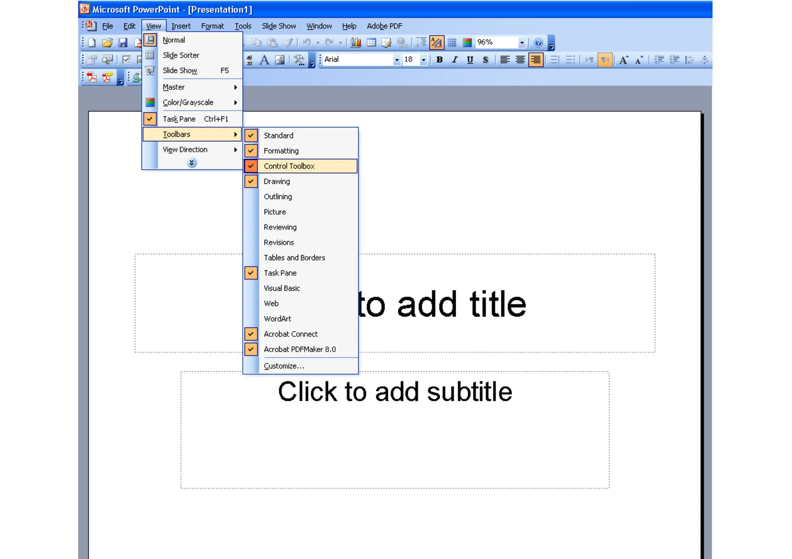
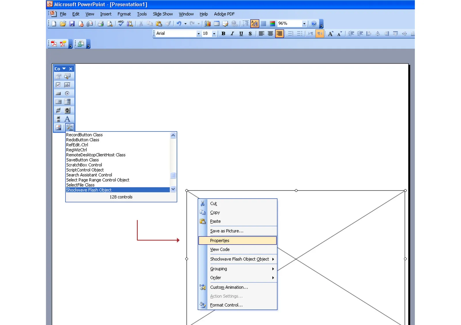
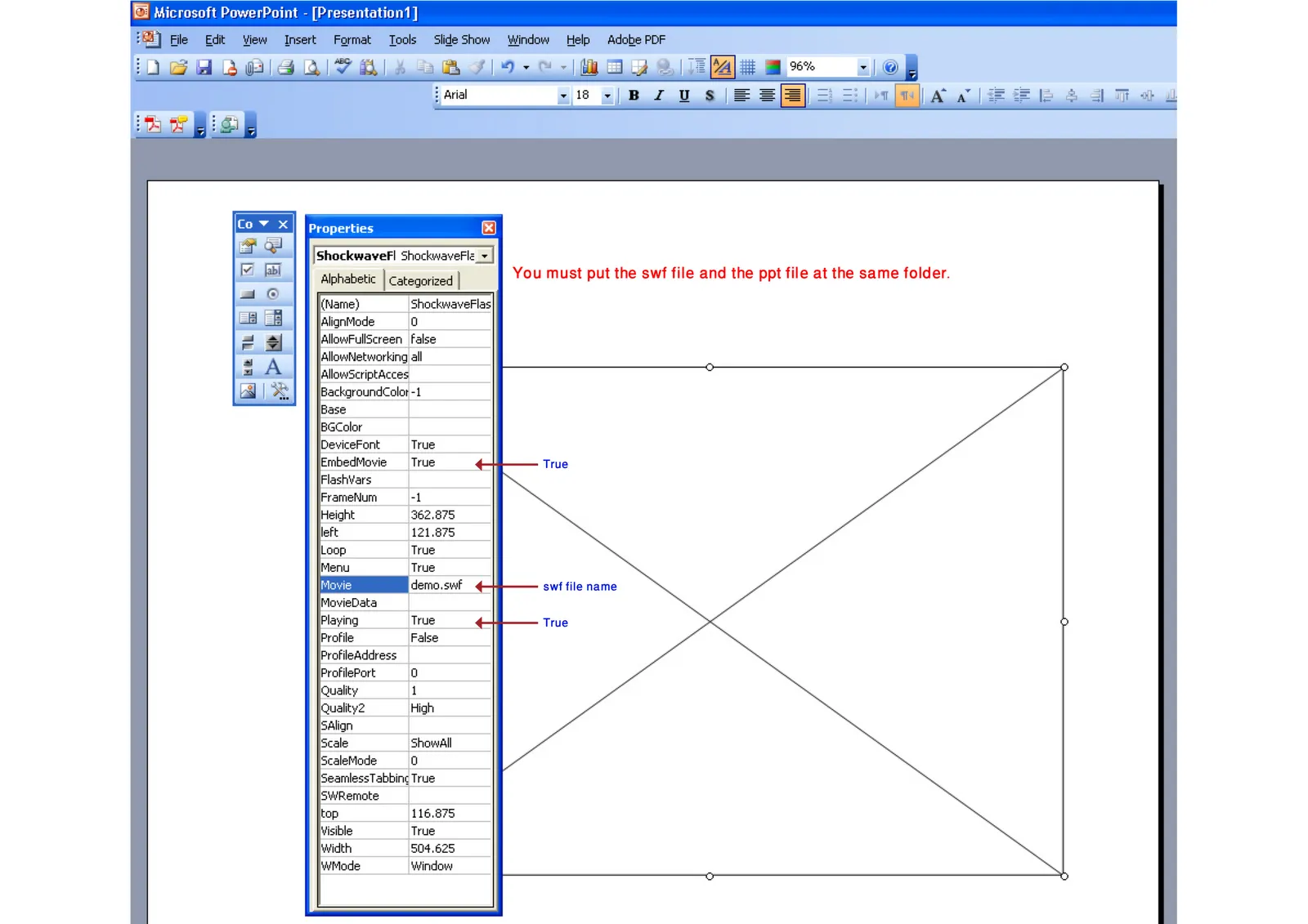
Maybe because Flash files are not a Microsoft format, integrating them into PowerPoint is a bit tricky. Here is how to do it. Make sure that the .SWF file is in the same directory as the PowerPoint file. Click on the images for a larger picture.
When sending the presentation via email, it is best to ZIP the 2 files (PPTX and SWF) into one document. Still there is a high risk that the receiving party will not manage to see the Flash animation correctly. Do not use this for the critical slides in your deck.
Thank you Karin Mazor for pointing this out to me.
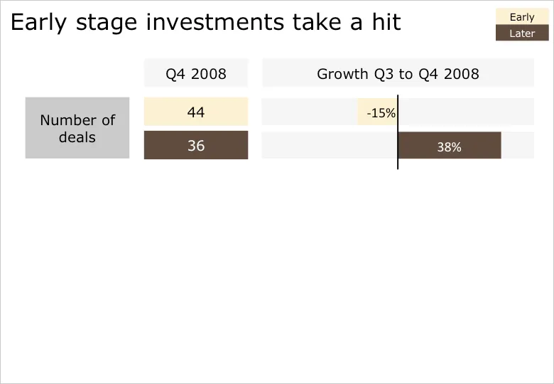
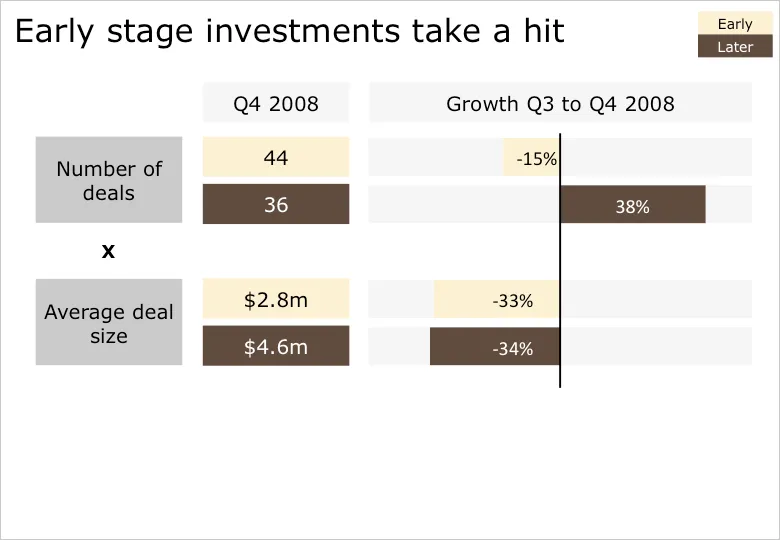
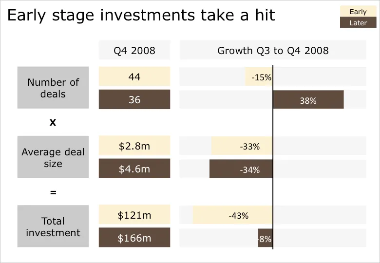
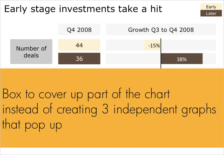
Sometimes you cannot avoid building up a busy data slide to take your audience through it step by step. In case of data-driven charts, it is tricky to create 3 independent graphs that are nicely aligned. I tend to create one big chart and use a white box to cover part of the information. Gradually I unveil more information by taking the white boxes off, instead of creating animations with new elements popping up.
B.t.w. for those interested: the data above is the quarterly overview of VC investments in Israel, compiled in PwC’s Money Tree report for Q4 2008.