SlideMagic Blog

Frequent updates about all things presentations since 2008. Subscribe to never miss a post.

RSS
all posts

Category Advertising

·Advertising

Experimenting with "real" textures

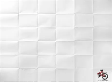
While I am getting a bit tired of stock images (first only the cliche ones, and now actually almost every image that is not real), I find new inspiration in textures of real-world materials (there are lots of these on stock image sites). See the ad below for the folding bike (via Ads of the World).
Do not forget to compress your images before saving. High-resolution textures can consume a lot of disk space on your computer and as an email attachment.
·Advertising

Filling charaters with an image (redux)

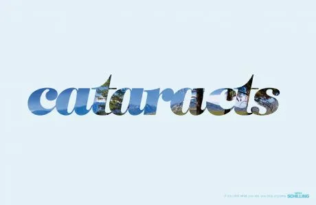
This ad (via Ads of the World) reminded me of an earlier post showing that you can also achieve this effect in PowerPoint (2007). It only works with huge, huge characters. The ones I used in my original post are actually not big enough.

·Advertising

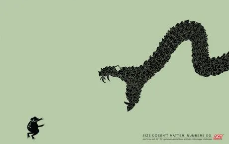
Chart concept: size does not matter, numbers do

This ad uses a concept that can easily be replicated in presentation slides. Find a silhouette of let’s say a shark, and fill it with small gold fish shapes and you’re done.

I used something like this once to show how small individual components of an information security architecture can create a formidable defense against cyber crime if they coordinate their activities well.

A larger image can be found on Ads of the World.

·Advertising

Chart concept - giving it all a fresh new layer of paint

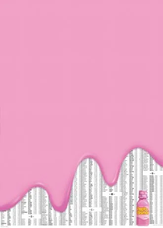
Sometimes you need a fresh start, begin from a clean sheet of paper, do some serious house cleaning. Covering a busy messy image with a paint roller and some stripes of fresh paint is a great way to visualize this message.

Here is an example of images on iStockPhoto that could be that basis of such a chart (the yellow paint rollers, make sure to strip out the white background color in Photoshop or with this PowerPoint trick). This post was triggered by this ad on Ads of the World:

·Advertising

Hyphenation and line wrapping - do it manually

When you use very little words on a slide, the position of the them becomes crucial. I always correct the automatic line wrapping manually.

  • Make sure that key noun-verb combinations are placed together in one line
  • Adjust the text (using different words) to make sure that there are no big empty white spaces in a line because of long words that did not fit in (I rarely use hyphens)
  • Re-order “sentences” according to their length

Either the designers of this ad wanted to make something that is hard to read on purpose, or this is a mistake.

Via Ads of the World.

·Advertising

Home run image

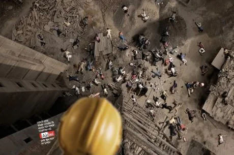
It is hard to find that one image that tells your entire story, especially when writing fund raising presentations for technology startups. This one comes pretty close: “Dont’ lose your contacts when you drop your phone”, and ad by Indian mobile phone operator Airtel for a phone address book backup service.

See how the composition of the image creates an enormous depth of field. Although it might clash with a minimalist approach to design, I would put the message in a big bold title on top of the image if I were to apply something like this in PowerPoint. Over-communicating is better just to make sure that everyone gets the point.

A larger image can be seen here on Ads of the World.

·Advertising

The blunt photo composition

Technology allows you to create almost any photo composition. Professional use PhotoShop, but you can get some pretty good results in PowerPoint as well. As with many technology tools, the fact that they are available does not mean you have to use them.

Photo compositions that are “blunt” are more likely to invite a laugh from your audience than help you make a serious point. My opinion. What do people think? (McCow taken from Ads of the World)

For some great Photoshop creative work check out FreakingNews.com

(This post-flood New York image by Mandrak)

·Advertising

The power of repeat - redux

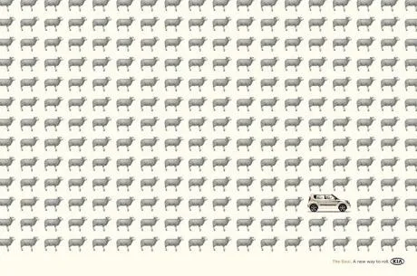
Computers love to repeat things. You should use it in your PowerPoint presentations. Control-C / control-V the same object over and over, making sure that things are aligned and spaced properly. The resulting chart is both busy and calm at the same time. Possible applications:

  • There are lots of these things arond
  • It’s crowded
  • We’re different (2 out of the 234 sheep in this ad are different for example)

“Repeats” are sometimes used to compare values in infographics. I do not think that this is a good application of the technique. Use repeats to talk about one variable, use regular bar charts to compare things.

Via Ads of the World.

·Advertising

The cobbler walks barefoot

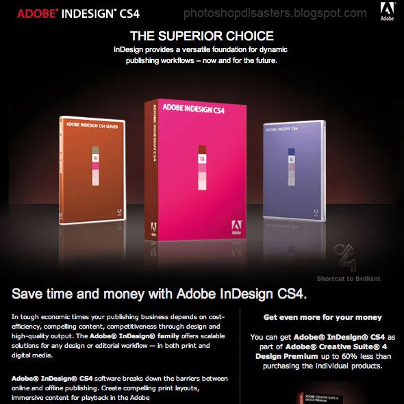
You would expect Adobe, the publisher of many design software packages, to be pretty good at designing print advertising. Not always. Have a look at this image that was featured on Photoshop Disasters.

Especially Adobe should have spent more effort to get the reflections right (see the right box), make the box shots look more realistic, and use better typography. This image looks like a poor “Photoshop”, not the best way to promote the Photoshop software.

Leaving the technicalities of the ad aside for the moment, there is a broader lesson here. This ad looks exactly like PowerPoint slides that many technology companies use to promote their product. They can do better.

  • A lot of headlines competing for attention
  • Box shots (software is not a breakfast cereal)
  • “White paper language”: spelling out the product benefits explicitly using very generic statements that do not get internalized by the audiece: “superior”, “dynamic”, “competitiveness”, “scalable”
·Advertising

Filling shapes with pictures

This ad from Ads of the World sparked some ideas.

One, the image bubble with the contrasting thought is an interesting concept that can be used in PowerPoint charts.

Two, I am not using the ability to fill shapes with pictures enough. It’s easy. In format shape, go to fill, and choose texture or picture, and off you go. The effect is best used with irregular shapes (clouds, stars, etc.) rather than plain rectangles.