SlideMagic Blog

Frequent updates about all things presentations since 2008. Subscribe to never miss a post.

RSS
all posts

Category Advertising

·Advertising

Message arrived - nobody understood it

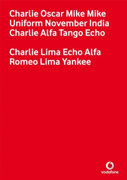
My attention was drawn to this Vodafone ad that uses the NATO alphabet to say C-O-M-M-U-N-I-C-A-T-E  C-L-E-A-R-L-Y. An excellent example of the difference between delivering a message (i.e., writing your bullet points on a slide) and getting someone else to understand/internalize what it says.
I am not sure yet how to use it yet, but this NATO alphabet is a good thing to remember when thinking about chart concepts.

Via Ads of the World.
·Advertising

Chart concept - word find

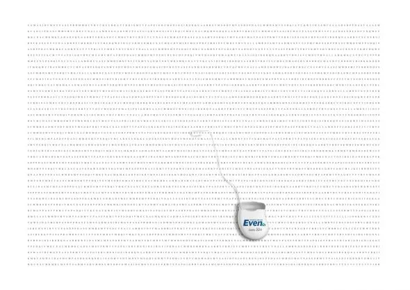
The concept of this ad for a dental care product can be very useful for a slide conveying “solution x helps you see the forest through the trees”. It is a bit tedious to generate rows of random words, but the end result will be effective.

A larger image can be found on here on Ads of the World.

I discussed similar concepts earlier here and here.

·Advertising

Let your audience's brain fill in the missing pieces

Highly graphic and gruesome ads that should stop you from smoking or driving dangerously are not only not pleasant to look at, but also often fail to achieve their objective (according to books like “Influence”).

This U.K. “wear your seat belt” ad shows that you can communicate these messages in a different way. I like the way it triggers the brain to fill in the missing pieces in an emotional way. (Books such as “Brain Rules” show that your mind is very good at this).

Watch the full 90 seconds of this ad, it is very powerful.

Via Ad Freak.

·Advertising

"Be stupid" - DIESEL ad with motion graphics

A bit noisy, but nicely done.

Via Ads of the World

·Advertising

Everything in excess

This ad reminds me of many poor PowerPoint slides I see. It sure grabs the attention, but that’s probably also the only thing it does.

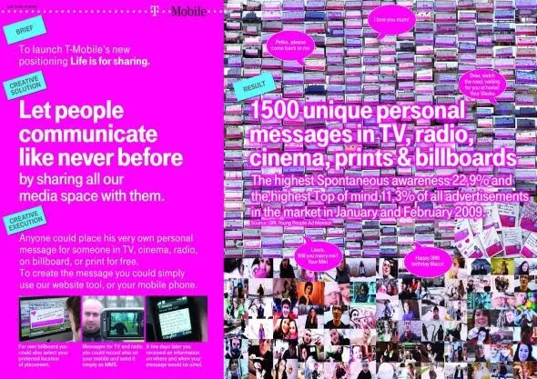
Let people communicate like never before, let’s try to achieve that in 2010 but in a more positive way. A happy new year to you all.

A bigger picture on Ads of the World.

·Advertising

Here is a new way to look at 3D typography

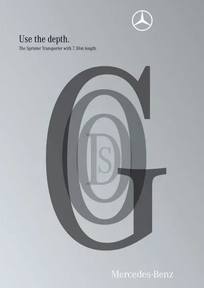
This ad uses 3D typography in a way that is obvious, but only after you have seen it. The letters are positioned and sized in such a way that it creates a sense of depth, semi-transparent fills add to the effect. Very well done. It works best for short words that have lots of “open” characters in it, for example “goods”. Via Ads of the World.

·Advertising

Keep your text trapped in its box

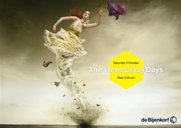
The elaborate tornado illustration of this ad is pretty, but it looks like there was not much time left to think of a good place for the punch line and the dates of the event. Eyes and brains do not like reading text over fluctuating backgrounds.

Via Ads of the World.

·Advertising

Chart concept - "Stuck!" (redux)

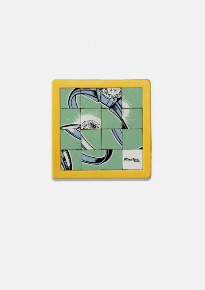
This ad uses a visual concept which I discussed in an earlier post. The easiest way to recreate it in PowerPoint is to stick to simple shapes with numbers, similar to the original puzzle with 15 pieces. You can go one level up and use an image (like in the ad). To do this, re-read an earlier post about slicing up PowerPoint shapes.

Via Ads of the World.

·Advertising

Filling parts of a data chart with an image

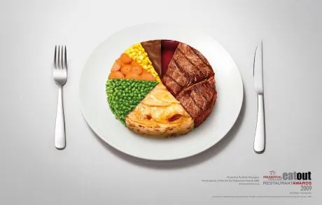
This ad on Ads of the World uses an effect that you can easily replicate in PowerPoint. Select a data point (or a data series), right click, fill, and select “image”.

·Advertising

Chart concept - can't see the forest through the trees

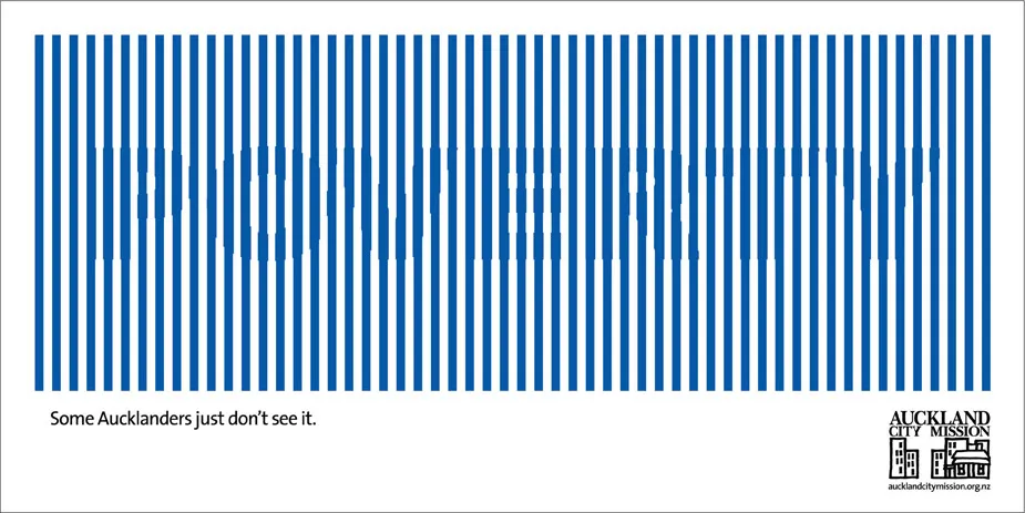
Sometimes you can’t see the forest through the trees. How to visualize this? The ad below uses a technique that can be copied easily in PowerPoint: a huge word/sentence in a bold font covered by a set of fat, spaced out stripes in the same color as the text. Via Ads of the World.