SlideMagic Blog

Frequent updates about all things presentations since 2008. Subscribe to never miss a post.

RSS
all posts

Category Advertising

·Advertising

Chart concept: you can't see what's under the surface

I often have to use a visual concept of the “tip of the ice berg”, “things are different as they appear”. The picture of an actual ice berg is the obvious choice to use. The Titanic archetype is deeply engrained in our collective memory.

These Sanyo ads show how you can use typography to do the same thing. The first image replaces the image of an ice berg with the actual words, but it gets really interesting when removing the link to the ice berg all together and start using giant text cut in half. Big enough that you can actually read both sentences (sort of) easily.


Not very friendly to audience members with dyslexia though.

Via Ads of the World.
·Advertising

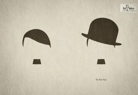
Everyone can draw - iconic graphics

Look around you and see how powerful simple graphical shapes can be. The ad below is an example (text below Chaplin: “It’s the hat.”).

A larger image can be found here on Ads of the World.

·Advertising

Esthetics in everything you do

Another ad found on Ads of the World: Samsung wide-angle CCTV.

Very good Photoshop work. Still, the resulting image is not esthetically pleasing. My personal rule: never let an ugly chart or image enter my PowerPoint presentation, ever.

·Advertising

Chart concept: can't see the forest for the trees

I often need to produce a chart that needs to say one’s inability to see the forest for the trees. This ad by Orange warning people against SMS-ing while driving makes the point nicely. Very labor-intensive to replicate in PowerPoint.

Via Ads of the World.

·Advertising

PowerPoint lessons from a toilet paper ad

I am learning a lot from print advertising. I am learning a lot from the adgoodness blog.

Especially in fund raising presentations I design for startups that are going to pitch to potential investors, I am spending a lot of time/effort in finding that one image or visual concept that really nails down the idea in one big bang. Almost to the extent that the following slides are not required anymore.

Consumer marketing is all about focus on one single and clear consumer benefit. Here is a(nother) great example. Food for thought when designing your next presentation.

·Advertising

(Snow) white space to the extreme

Don’t fill up your slides to the last square inch. Instead: leave white space (or negative space). Have the courage to write nothing, take a visual break. This ad for a ski resort takes it to the extreme, but makes its point brilliantly (large image here).

Via Ads of the World.

·Advertising

"Signature" advertising for a hairdresser

Unusual. An well-designed ad for a more or less local hairdresser/spa. Like a good slide:

  • You get the point instantly
  • Understated, elegant, and lots of white space

I like the small light-source-behind-the-model effect, I will experiment with it in my next presentation using a radial-gradient with very close color shadings.

Still, there is something “criminal” associated with a finger print (as people suggest in the comments of Ads of the World, where I found this image).

·Advertising

Humor: "someone just had to do it"

This act of vandalism added to the communicative power of the billboard:

Found on PhotoBasement, via a Tweet of Ouriel Ohayon.

·Advertising

So hard to do - "real" art in PowerPoint

PowerPoint effects, PhotoShop, and a bit of typography/fonts enable an amateur to create PowerPoint slides that start approaching the capabilities of a graphics professional. Not so fast.

This ad for a financial services firm shows that good artwork cannot (yet) be matched by a PowerPoint slide.

  • Taking someone like Dali as the inspiriation for a slide
  • Creating the characters and the elaborate backgrounds
  • Insert the detail and small “jokes”

You immediately “get” this ad. Another one I took from Ads of the World (larger image here).

·Advertising

Too much - "painful graphics"

Before I argued that slightly irritating the audience’s senses could support your presentation. Two cases of overdoing it:

More details about these ads on Ads of the World: Nycomed and Eurostar. I recommend adding this blog to your RSS reader.