SlideMagic Blog

Frequent updates about all things presentations since 2008. Subscribe to never miss a post.

RSS

Rehearsing

Rehearsing a live presentation is the best way to invest time in your pitch, better than tweaking slides and editing headlines.

Many rehearse settings go as follows: the project team takes turns in going through their slides, sitting down at the table, looking at the laptop, starting and stopping (to do a quick edit), and not doing a real practice: “OK, on this page I will lay out the company strategy” .

This is a bit like an imaginary workout: “and then I will do the 10 lifts”.

The real practice:

  • Can be on your own in the beginning (so you can embarrass yourself if needed)
  • Laptop with the slides behind you (or dual monitors with presenter view)
  • Imaginary objects to create an “audience”, divide your eye contact to the red chair, the water jug, and the desk light for example.
  • No stopping, at least not in the middle of a slide, if you trip up, you have to correct as if it happened in front of 200 people.
  • Time your talk

Even if you think you know your story, you will notice that it is tough to say things clearly, without “uh”s, without duplicating what you already said, without getting stuck, but things will improve radically after a few iterations.

I think 99% of the world’s brilliant speakers simply have given a the same pitch in some form or another hundreds of times. Yes, they get confronted with a new slide and present it brilliantly without preparation, but, that slide probably contains a story that they have told many times before.

Continue reading →
·Data visualization

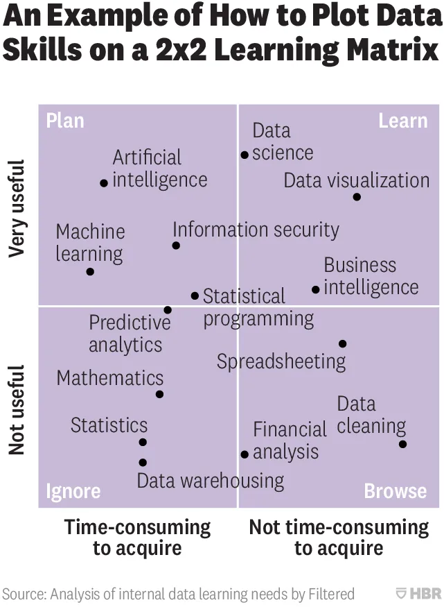
2x2 matrix overload

This 2x2 chart is hard to understand (source on HBR)

From a design point of view:

  • Axes labels are hard to read
  • Axes labels are too blunt, mathematics has its uses
  • Too many dots at locations that are too precise
  • Typography of the labels goes across the boxes
  • The 4 quadrant labels do not stick out enough

And that’s the design part. More importantly, the content… The title of the chart seems to suggest that it is just an example of how to use 2x2 matrices, but I think people are serious about its content. A comparison of apples and oranges. I need to start casually learn how to do data cleaning, and not yet get into AI but be prepared for it, and to use AI, I don’t need to understand statistics at all.

Cover image by Nick Femerling on Unsplash

What do you do?

It is important to settle the basics about what you actually do in the first instance of a pitch. It will pop some of the suspense, but in return you get the upside of an audience which pays attention instead of one that is trying to figure out what you do.

In fiction, readers are longing for that moment where the entire plot comes together. In business, not really.

Recently, I coached a company in the field of quantum computing, and I suggested to put 3 very short bits of info at the very start of the presentation, and claimed that this would actually not kill the “suspense” in the talk.

  • A super quick “reminder” of quantum versus traditional physics
  • A super quick highlight what quantum vs. binary computing is
  • A super quick description what a “quantum computer” actually is, physically.

The challenge is not to elaborate about the points above on that first summary point:

  • In Newton’s traditional physics, objects have a specific location and behave according to the laws of gravity (i.e., electrons “flying” around an atom nucleus), in quantum physics, these boundaries no longer exists and you are no longer able to say where objects are precisely.
  • Quantum computing uses this ambiguity of an infinite number of states an object can be in, instead of a discrete 0 and 1, we now an infinite umber of states that opens up the potential for massive parallel computing
  • Today’s quantum computing setups are lab installations in which scientist try to control / measure these states, and try to use the speed of their variations to solve problems where you need try out a particularly large number states (i.e., trial-and-error AI algorithms). It is still early days.
Continue reading →

PowerPoint conversion is working!

I managed to implement the conversion of all SlideMagic features, including the tricky ones (data charts, image cropping and positioning, speaker notes, etc.) into a razor sharp PowerPoint deck with all shapes, data charts, objects completely editable if you created them yourself from scratch.

(This as opposed to the current PPT conversion that makes a rendering that works as you as you do not touch/edit any of the shapes inside the deck)

Now it is on to debugging and making everything super robust in every possible user (ab)use scenario.

The current setup is in a lab environment and not yet kosher enough for public release. If you are curious, are have a SlideMagic deck that you are desperate to convert, email me your SlideMagic presentation ID and I can apply the new technology for you. The conversion software only runs on Windows, but since it is me doing the conversion on my machine (for now), both Windows and Mac users can submit their decks.

Cover image by Rob Bye on Unsplash

·Creativity

The art of procrastination

Waiting with things until it is too late to do them properly is not very good practice. But postponing the moment you open your computer to start making slides before you have a really good idea could be helpful. Take time to ponder different approaches.

In the video below, film score producer Tom Holkenborg gives his point of view from the world of music.

Cover image by Xu Haiwei on Unsplash

Page numbers...

After more than 10 years of daily blog posts, they deserve a mention.

Some presentation templates have page numbers prominently featuring on every page. Page numbers are useful for coordinating viewers who each have a copy of a document in front of them: attendees of an investment bank roadshow with a pitch book in their lap, or people trying to pay attention on a conference call without a screen sharing tool. But in most cases, the presenter controls the slides and there is actually no need for them at all.

As a compromise, I tend to put them really, really, tiny in the top right corner of a slide in a faded font color. You don’t see them if you are not looking for them.

Cover image by Jess Watters on Unsplash

SlideMagic to PowerPoint - update

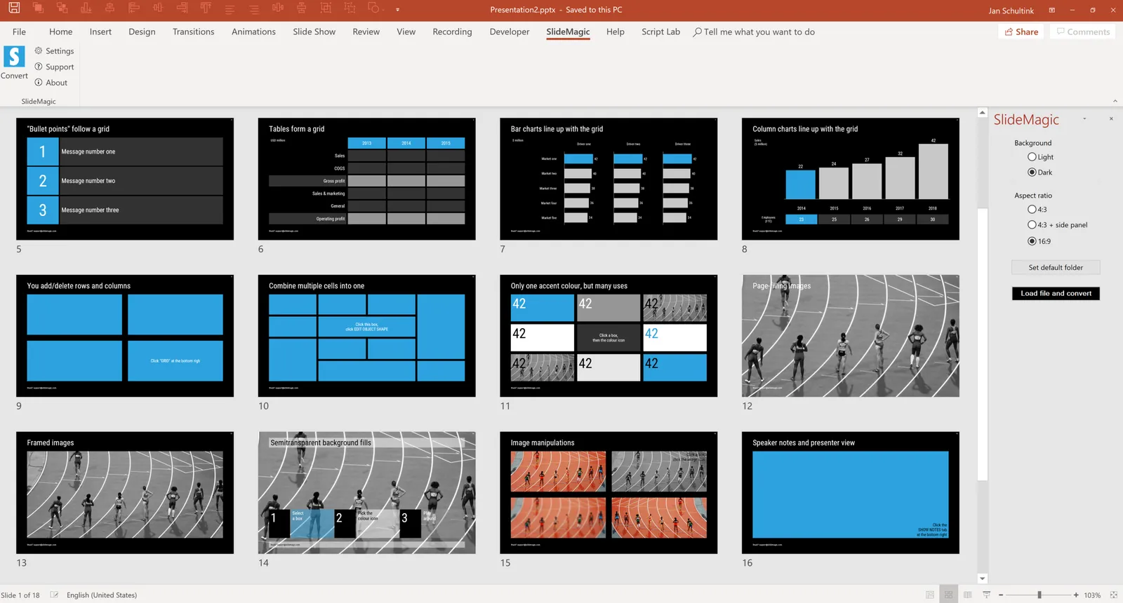
I made a lot of progress over the past weeks with getting the conversion of SlideMagic files to PowerPoint sorted. Below are some of the first screen shots. All shapes are fully editable, have the exact/perfect sizing, and sit on a slide that has the grid lines as guides added to them, so it is easy to make correction if you want. Note how this also applies to data charts.

All this took some figuring out since the PowerPoint object model is incredibly complex. The pay off is that I start to understand not only PowerPoint file structures very well, but am also getting a deep understanding of my own software (the development of which I outsourced). This is sparking all kind of ideas where I can take things next.

At some stage over the next few weeks I will invite beta testers for the new software. Let me know if you are interested to join. Things will run only on Windows at the moment, and either you or your IT manager need to happy that you install all kind of plugins that have permission to write on your hard disk etc…

 A new SlideMagic tab will added to your PowerPoint ribbon

A new SlideMagic tab will added to your PowerPoint ribbon

 Making progress, the column charts will get done today

Making progress, the column charts will get done today

 The grid will be reflected in the guide lines on the converted slides

The grid will be reflected in the guide lines on the converted slides

Continue reading →
·Hardware

Logitech MX Master 2S review

My recent deep dive into the writing code (More than 1000 lines and counting) forced me back on the Windows platform to make the best use of Microsoft’s development tools (see an earlier post). The biggest problem I faced with the Apple Magic mouse: wild UI swings when navigating PowerPoint slides because of the imperfect calibration of the glass touch surface in Windows 10.

So, I got myself a Logitech MX Master 2S mouse…

I burnt through many of these clunky mice in the 1990s and 2000s and actually liked them, except for the “silky” silicon covers of them that would turn sticky after a year of use.

This Master 2S version got rid of that silicon by the feel of it. Yes, it is bulky and looks nerdy but I must admit, it feels actually a lot more comfortable to have something you can rest your hand on when working all day. That resting is the big problem of the Magic Mouse: by design you cannot really rest your hand on the touch sensitive glass, your hands is always hovering above it, requiring constant energy. On Mac, the calibration works, on Windows it does not.

Instead of the glass, the Logitech mouse has scroll wheels. The vertical scroll is brilliant: you feel a clicking resistance when while moving slowly, but the wheel starts spinning smoothly when you race up and down (pages of code). Horizontal scroll is another (small) wheel on the side, which is definitely less natural than the Magic Mouse.

Continue reading →

Windows on a Mac - 2018

For my SlideMagic development efforts, I need to dive deep into the bowels of Microsoft’s .NET architecture and there was no other option but to install a Windows machine on my Mac. I am running a 2015 iMac and here are my observations of using this set up as a production environment:

  • In general

    • Windows 10 is great and at par with MacOS
    • PowerPoint 365 on Windows is better (has more feature and UI updates) than PowerPoint 365 on Mac which in turn is better than Keynote (2018)
    • The CTRL-C/V vs CMD-C/V is an absolute productivity disaster, after a few days of coding I am used to CTRL, which I then need to unlearn when working on a Mac (design, music) before I have to unlearn it again.
  • There are some glitches with running Windows 10 on my machine (presumably these do not happen when you buy a “proper” PC)

    • I had to do some pretty hard core registry entry hacking to get my mouse to behave properly (direction flipping), even after tweaks the sensitivity of the Apple Magic Mouse is too strong. Especially when resting your finger on the glass surface, this immediately triggers the wildest switches between slides in PowerPoint for example. I am considering investing in a Microsoft mouse in the hope that these are properly calibrated
    • The video graphics card is acting a bit strange here and there (this could be a problem of my specific iMac generation). In some cases, after the computer wakes from sleep, the mouse pointer is a blurry vertical line. Also, hardware acceleration has a tendency to mess up text in Google Chrome (switching acceleration of kills the user experience). As result, I am one of the 500 people in the world who run the Microsoft Edge browser, which is actually pretty good for consumer browsing, but less suited for coding. I Googled extensively to find solutions for these problems but always hit a dead end where someone discovered that these are actually graphics card drivers bugs that have not been fixed yet.
Continue reading →

What's interesting, what's not

In some industry sectors, product benefits are pretty much the same in the last decade. The next iPhone has as least as good a battery life, management of all those different IT security solutions is now made much easier with the increased visibility of the security management tool, the range of electrical cars is again increasing.

Every company pitching in the same industry as you says the same thing. (“We offer more battery life, provide better visibility, etc. etc.).

In these cases, the interesting bit of your story is how you do it, and maybe even more importantly, why it is so hard for others to do this.

Cover image by Philipp Lublasser on Unsplash