SlideMagic Blog

Frequent updates about all things presentations since 2008. Subscribe to never miss a post.

RSS

Coding...

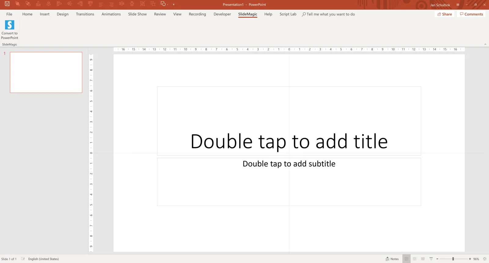
I left the world of computer science in 1992 after receiving my engineering degree, and recently made an effort to bring my skills back to 2018. The first version of the SlideMagic app was outsourced to a developer, and I had virtually no understanding of the underlying code, and focusing purely on designing the user interface.

As I am pushing for the next iteration of the app, I want to change that and I am making great progress. The “practice” feature I am working on is developing a razor sharp, 100% correct, conversion of SlideMagic decks into fully editable PowerPoint files. (The current conversion gives you a clean file that you can present in PowerPoint, but as soon as you start to edit PowerPoint shapes, the imperfections in the conversion are revealed, but it is already one level up from many other presentation applications that simply paste a screenshot of a slide into a blank PowerPoint slide).

The process so far has been interesting and I am starting to understand the file structure of PowerPoint files, the PowerPoint object model, Microsoft’s .NET framework and the C# language. All of this technology is sparking new potential ideas where to take SlideMagic next.

Software development in larger teams is like a funnel: you define the spec, and the developers set the train in motion to deliver it. Sometimes, the phase I am in, less organised and experimenting where I can, works better to come up new concepts to make it easier for people to create presentations and business documents in general, especially the “everyday” ones.


Continue reading →

Number (in)consistencies

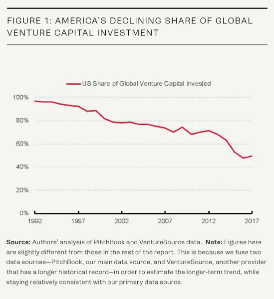
Have a look at the elaborate footnote at the bottom of this graph in a recent Venture Beat post:

A big apology for using multiple data sources, and as a result, producing 2 sets of slightly inconsistent numbers in the same report.

Data sources are almost always confusing and inconsistent. But that is the problem of the analyst, not the audience of a presentation. Using inconsistent in a presentation makes it harder for the audience to understand your story, but more importantly it also undermines your credibility.

If you have a good reason to adjust publicly available figures (and the VB team seems to have), why not create your own new data set? This is what we did at McKinsey all the time, adding the famous “McKinsey analysis” as a source of the figures at the bottom.

So, when having to present an analysis:

  1. Analyse all the inconsistent and confusing data around there
  2. Decide if you are confident enough to make adjustments: decide whether you are going to go with the raw data, or your own data. Stick to this throughout your presentation
  3. If you decided to use your own, you can throw in a backup chart at the end that shows how/where your adjustments impacted the data that people are used to seeing.

Cover image by rawpixel on Unsplash

Ways your presentation can look wrong

There are many:

  • It has standard PowerPoint colors, you couldn’t be bothered to even try to make an effort
  • It looks so slick and professional, like an iPhone launch deck, that potential investors in your seed company start to wonder what you are hiding (and how smart your spending is)
  • It is clear that you made a tremendous effort to make things look slick but all those gradients, shadows, clip art, and icons somehow still do not look right
  • Those curly accents, mint green soft fonts, and cute images look pretty but it does not seem right for a semiconductor company that needs to pitch to global device manufacturers
  • The spectacular animations that keep on moving and/or these clashing colors unsettle the audience’s central nerve system

Cover image by rawpixel on Unsplash

The summary bullet point page

Some sections in a presentations cry for something that ties everything together, a summary at the start rather than charging straight in with 1-message, 1-slide charts. Also, these summary charts come in handy for people who are reading your slide deck, rather than experiencing the live performance.

How to avoid turning your presentation in a boring bullet point reading exercise?

The mistake people make with these bullet point summary charts is that they spent too much time on a bullet point more or less telling the whole story, and then, repeating the whole story again when they hit the slide that was supposed to deliver the message, but probably spending too little time on that one because it feels repetitive.

So what to do?

  • Keep these summary bullets really short (but meaningful)
  • Go through them as a summary (“Our product has 3 advantages: design, weight, and an exciting colour, let’s look at each of these in a bit more detail”) [CLICK, next slide].

Almost keep up the same speed as it would take someone to read the bullets, and develop a radar for when you start using the word “uh”, and go into a tangent about product colours at bullet 3.

It requires discipline.

Cover by Estée Janssens on Unsplash

Consistency = credibility

“Our technology saves costs!”. In the early days of a startup it is often not possible to quantify exactly what the cost benefits of your product will be. And many decks I see reflect that uncertainty. In the same deck you can see:

  • Slide: cost is a big problem
  • Slide: a technology gap makes users lose a lot of time
  • Slide: our technology can deliver double the power at the same cost
  • Slide: cost savings at our pilot client were 30%
  • Per transaction cost went from $1.1 to $1.2 at 40% more power

Investors will forgive you if things are not completely certain at the moment, but get confused when you throws different stories at them.

All the points above can be rooted in one single, consistent story. Maybe it is better to phrase exactly what is happening with your product, and then show a number of scenarios who it could create value for clients.

Cover image by Brendan Church on Unsplash

Story evolves - the chart did not

I often say that slides are a safety net for the presenter in the early days of a presentation. After a number of runs, the presenter becomes confident enough to deliver the story pretty much without slides. Putting up the next slide is merely a mental placeholder that triggers the next point in the story.

As a presenter, you might fail to notice that after a couple of months your story can change/drift, and the actual slide that you put on the projector no longer back it up completely.

It is good to do an objective 10,000 km check up now and then, maybe with the help of a person who is not that immersed in the story as you are.

Cover image by Vincent Botta on Unsplash

·Investor presentation

Logarithmic scales

In the 1980s, I remember plotting the results of science experiments in high school on millimeter paper. Logarithmic scales came in handy: they allow you to plot data series with big variabilities accurately, and/or they can show mathematical relationships beautifully (a completely straight line on a logarithmic scale for example).

Scientific charts are for pondering at your desktop, a different setting from a 20 minute all or nothing investment pitch. When you show a boring growth line and have to alert the audience that the tiny labels on your y axis are in fact on a logarithmic scale, you have lost some of your fire power. It looks less spectacular, and more importantly, it requires additional thought steps in the brains of your audience. The hockey stick simply works better.

If you are dealing with serious science, consider 2 charts right after each other, the first (populist) one showing the raw growth, then followed by a logarithmic one that takes the responsible scientific approach.

Cover image by Sawyer Bengtson on Unsplash

Customer service

Seth Godin always reminds me that it is impossible to please everyone, and as a result focus on people who really love and support your work.

The SlideMagic app and template store currently are small retail businesses where I am also in charge of customer service. And as a result, service at the moment is at the highest standards, you get a pretty experienced presentation designer to fix charts for your for $1 if things are not right.

Still, now and then you get interactions with clients who talk to you like the hotline of a major airline rather than a mom & pop store, requiring immediate refunds or else…

Hopefully one day SlideMagic will be big enough to merit an airline-size customer support desk, in the mean time I continue to develop things with followers who support me.

Cover image by Adi Goldstein on Unsplash

Like writing a letter in the old days

Pitch presentations have become more common, to a level that they now match the request letters people used to write on type writers in the 1970s to pitch business proposals: most people have made hundreds of them, seen thousands of them, everyone knows how they look, everyone knows what it is trying to do, everyone knows the basics of a startup pitch.

Despite them being very common (and maybe because of), writing a good pitch letter was (is) hard. Writing the actual thing does not take a lot of time, but knowing what and how to write is tricky and that blank piece of paper is daunting.

That is pretty much the feeling you get when having to email a pitch deck to someone.

Cover image by Bernard Hermant on Unsplash

·Investor presentation

Pitch deck = open book exam

Well said:

So a pitch deck:

  1. Makes you in charge of the flow
  2. Helps you show data
  3. Is a check list
  4. Lets you rehearse

“Earth shattering, stunning visuals that will convince the investor in the spot” does not feature in this list.

Cover image by Hans Vivek on Unsplash