SlideMagic Blog

Frequent updates about all things presentations since 2008. Subscribe to never miss a post.

RSS
·Data visualization

Waffle charts in presentations

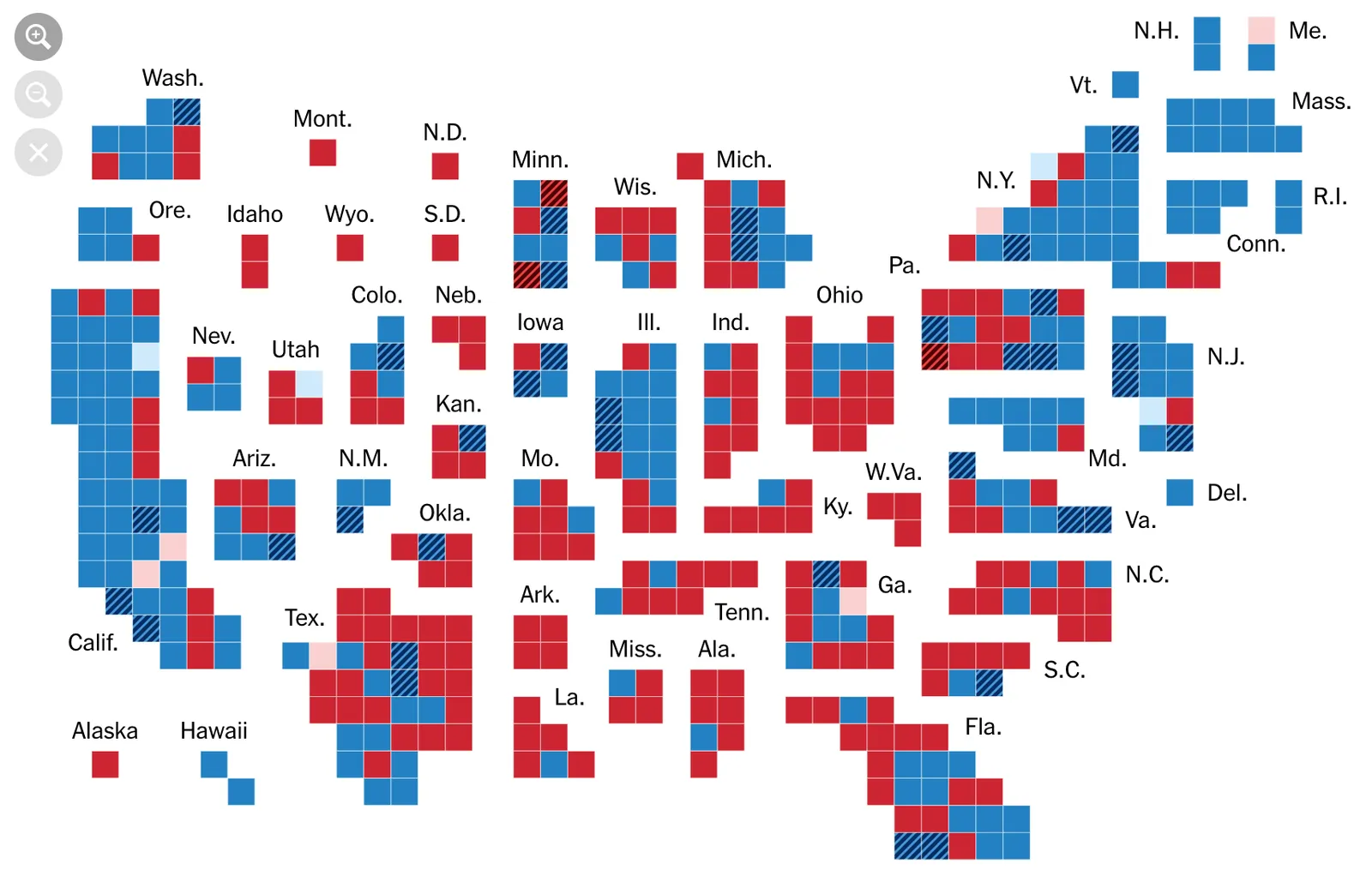
I never have been a big fan of waffle charts:

  • I find it harder to read them then straightforward bar or column charts (in a similar way, pie charts are less readable)
  • They are a pain to maintain in PowerPoint/Keynote (counting boxes)

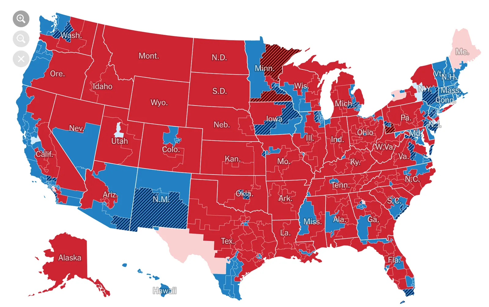
But, what people do to show the results of the US elections is clever. by adding the semi-saturated colours in, you get a nice sense of how things are developing:

Coding one month later...

Here are some more observations from my refresh course in programming 30 years after graduating in IT:

  • My engineering degree came in handy to understand the basic concepts of programming language, but that was actually just a start, it makes sure your not intimidated and give up at the first glance of code
  • What is useful though, is the years of experience of finding bugs in code (including my high school years), it requires a certain skill to put in the right checks and breakpoints
  • My design experience is super important, it is so easy to create ugly user interfaces with stupid menu structures
  • 50% of the effort of learning how to code is understanding the tools that help you write code. Wow, these things have moved on since the 1990s, eliminating a first layer of potential bugs by at least getting typos and syntax errors out the moment you write the code
  • I might be approaching 50, but the majority of people doing what I do is in their late teens or early 20s, and many are in emerging markets all over the world, which makes it legitimate to ask basic beginner questions online and have them answered by experts who want to help bring up the next generation. Thank you!
  • Google and Stack Overflow bring a whole new dimension to learning. For each issue there are dozens of posts that address a similar issue you have, never exactly the same, and sometimes the answer is way down the bottom with very little votes as another contributor perfected the #1 answer years after it was posted.
  • Legacy technology and backward compatibility adds an incredible layer of complexity to development. Something that I should be able to use to my advantage as the writer of a version 1.0.
Continue reading →

Too detailed?

Analysts at the bottom of the hierarchy get sometimes mocked for being “too detailed”, the senior partner can make a point at a super high level of abstraction, and this big picture view gets equaled to, well, being senior and successful. Making your way up = losing that obsession with detail?

Well, not really. There is a role for everyone in the team:

  • Sometimes you have to go through massive amount of detailed analysis to support a basic outcome (option B is cheaper than option A) that can be communicated beautifully on just 1 bar chart.
  • That senior partner at some time was a junior analyst as well and all those years of crunching detailed analysis has given her the background to lift things to a big picture perspective.
  • Someone with a more senior role on a project has insight what all the different bits of a project are doing, making it easier to put things in perspective

So, if you as an analyst drop all sensitivity to detail to prove that you are ready to move up, things will go wrong.

Cover image by Andrea Sonda on Unsplash

Slide designs on 16:9 screens

16:9 monitors are the norm now. And while this aspect ratio definitely works great for movies, I find wide layouts work less for presentation slides. Titles tend to get very loooong, and it becomes harder to make nice diagrams that usually call out for a 1:1 shape.

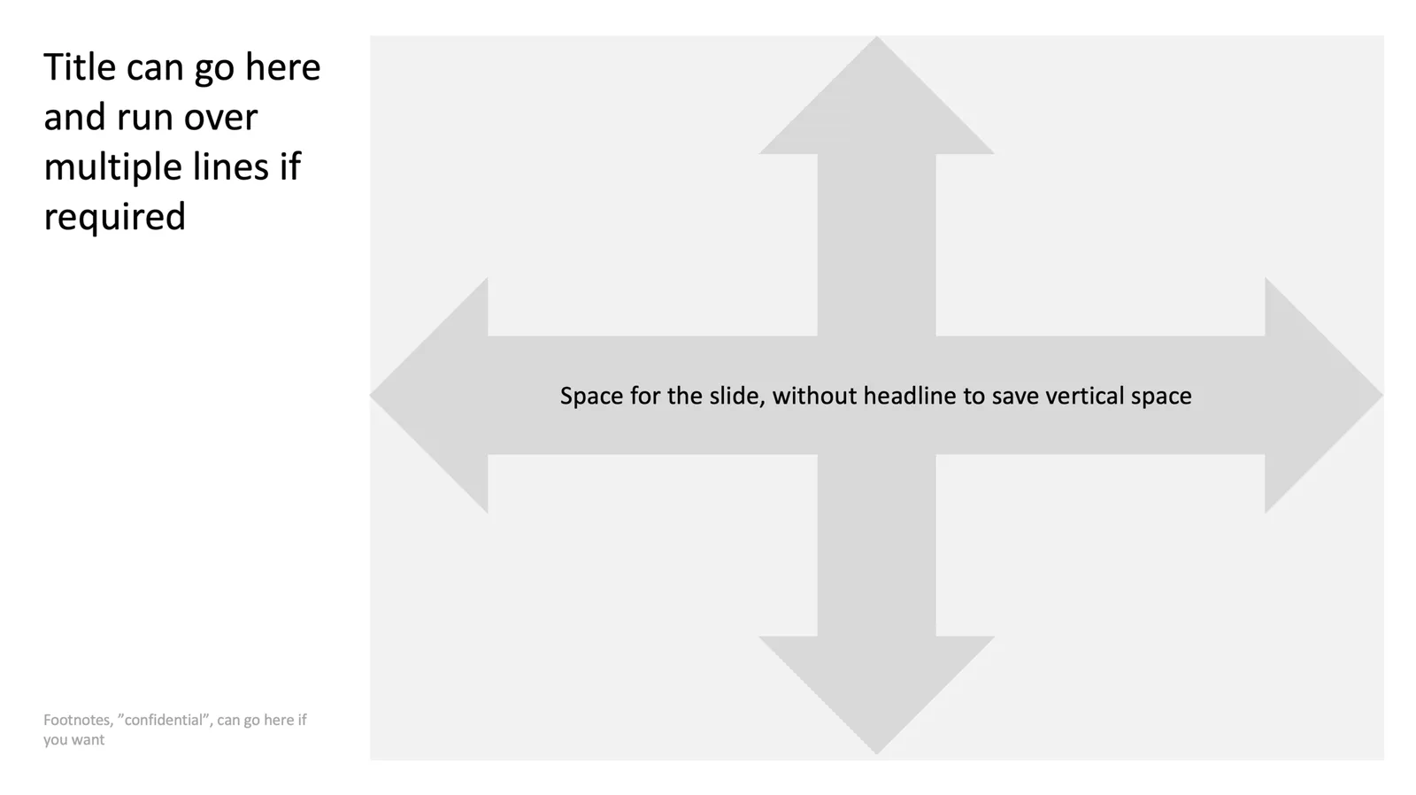
You might not realise it, but the slide headline on top of a traditional 4:3 slide actually created a slide canvas that is pretty much 16:9 below it.

Here is one way to deal with this screen aspect ratio: place the slide title to the left of the slide and use the full vertical space for the slide content next to it. What do you think?

Cover image by Michael D Beckwith on Unsplash

Business presentation market

A series of tweets that got me thinking, as someone who is still arguing about Windows versus Mac in 2018

I am definitely in the 10% category, and I think my target audience is as well. Professionals making stuff on PCs is a pretty old/stable market. Many other presentation apps are aiming for the 900m and many of them branch out to other types of content than just business presentations. But 100m is still a big number. I am working hard on making those pro apps a bit less “pro”.

Cover image by Vincent Botta on Unsplash

Maybe a few more pictures?

Many people find it hard to pose for pictures naturally. Here is a good trick to calm them down: switch of your camera and say the photoshoot is done, but then say, “wait, let’s do a few more just in case”. Your subject is likely to be more relaxed and these are the shots that are probably going to be used in the end.

Cover image by Sweet Ice Cream Photography on Unsplash

Most rewarding blog post

The comment section on this blog is usually fairly quiet, so I don’t get a lot of direct feedback about whether my posts are useful or not. There are regular readers who send an email now and then, and I bumped into people I thought were strangers but had been following me for 10 years.

In general, I hope my blog gives the world better/less boring presentations, and cuts the time people spend creating them, there are so many better things to do than designing slides. Also, I hope that I can give the foot soldiers, the junior analysts, who are working late in various office towers around the world to meet a presentation deck deadline, some encouragement to speak up about what they think is right.

One post provokes a lot of responses: a little trick to recover a PowerPoint file on a Mac after a crash, even if Microsoft claims it is no longer there. It is just great to get these responses, some of them in language that captured the energy when that document you had been working on all night re-appeared on the screen.

Cover image by Jakob Owens on Unsplash

Document editing 1990s vs now

This post by Seth Godin about “STET” reminded me of my time at McKinsey, where in the early 1990s presentation design was pretty much a manual activity. You would draw all your charts by hand, then give them to the graphics department who would produce them for you.

Graphics designers make typos: suggested valuations of take over targets could be cut in half, or worse changed by +/- 10% which makes the error much harder to spot. Graphics designers had mostly no understanding of the context of the document, which could lead to pretty funny interpretations of hand writing.

As a junior analyst, you found yourself in a sandwich: every sentence and number had to be checked for typos, graphics designers tend to push back on poor chart design (please ask the senior partner to stop writing these dense bullet points will you), and the senior consultants would use the opportunity of this “slow” production process to try out endless variations of headlines and chart orders. Most instructions were scribbles on faxes and/or instructions in lengthy voice mails. All of this usually at hours where the rest of the world was no longer in the office.

Looking back at those days, I estimate that roughly 25-50% of the time (=fees) of these management consulting projects would go into document production. The solution was there, now we just need to put it on paper convincingly (and for the analyst: with the correct numbers).

Today, everyone probably has an understanding of PowerPoint that is good enough to produce most of these documents. This is a huge efficiency gain. But we also have lost something I think. That process where everyone is painstakingly focused on those 25 pages with a red pen really made sure people put their thoughts in slides, with everyone more or less in agreement. A more careful approach than quickly slapping/Frankensteining charts together.

Continue reading →

Automatic 16:9, dark background conversion

The SlideMagic presentation web app has a few neat tricks up it sleeve, one of them is automatic conversion to a dark background (and back). I managed to get that one to work as well in the new PowerPoint conversion plug in.

And I added a new one that has not yet been implemented in the web app: automatic 16:9 conversion that keeps your picture cropping in tact. The tool reads the center of the image crop, and repositions the picture correctly in the new aspect ratio.

It is interesting to see what you can do now that I have control of an entire presentation file with all its bits and pieces and can basically tell an algorithm to do with it what I want.

I hope to get the plug in ready for release soon, some further stress testing is required, plus I need to get smart on signing software / distributing license keys. Watch this space.

Stock image creep in Unsplash

I really like the free photo site Unsplash, I hardly use stock image sites such as iStock or Shutterstock anymore. As a pro with paying clients, the prices of the stock images are not really a concern in the overall budget of a presentation design project, it is simply the dilution of quality of these big stock photo sites with cheesy images.

But worryingly, I see the first “stock images” pop up on Unsplash as well, I hope they will continue to curate their uploads carefully, or maybe add a “stock image alert” warning button on a photo.