SlideMagic Blog

Frequent updates about all things presentations since 2008. Subscribe to never miss a post.

RSS
·Concepts

Heat maps in presentations

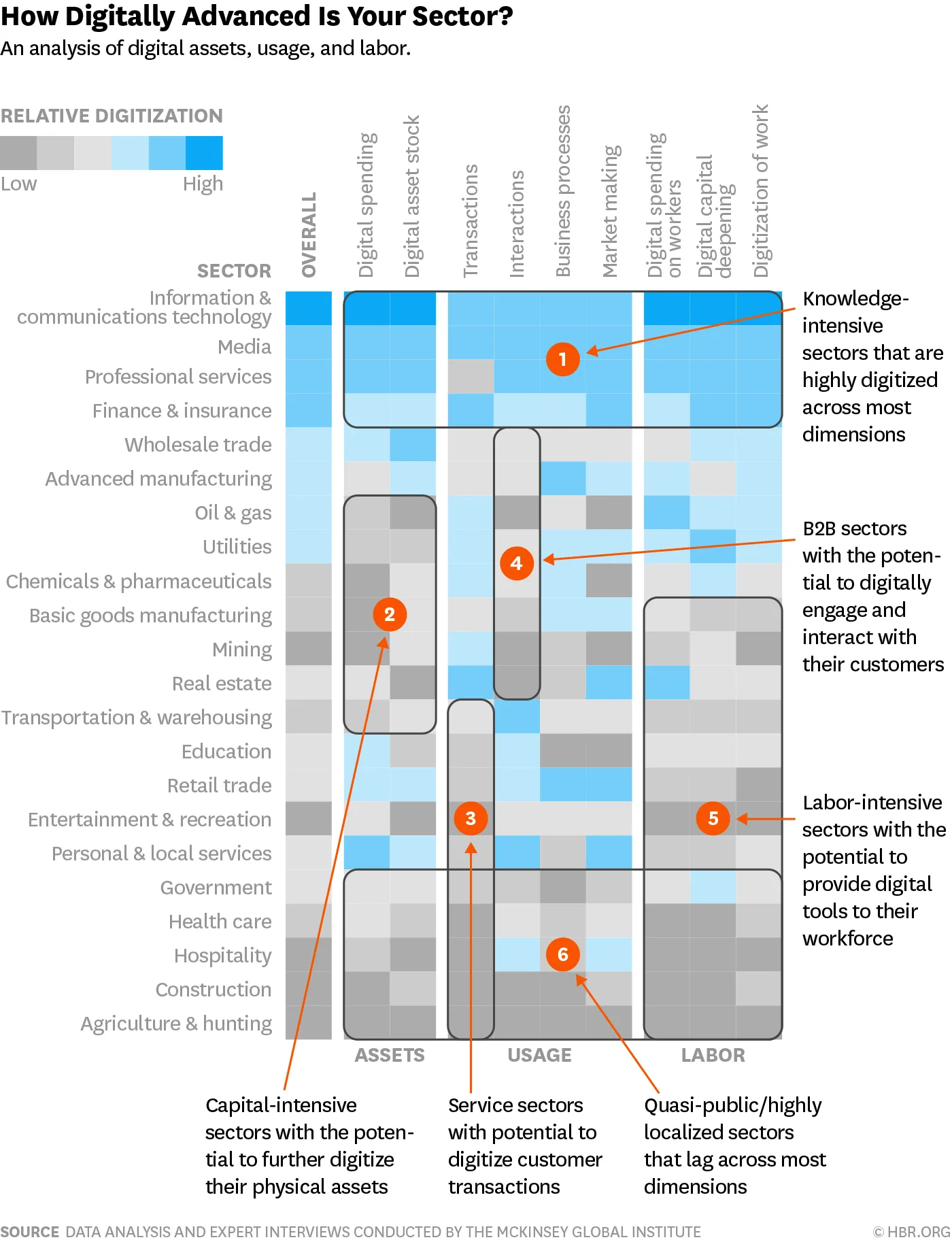
Harvard Business Review is bombarding (spamming?) my Instagram feed with this ad almost every day (Google shows that the chart was first created somewhere in 2016):

It is a very busy chart, so not to be used in your next TED Talk, but for close-up reading these heat maps are actually pretty good. This is a pretty decent summary of what much have been a huge scoring spreadsheet.

  • Only a few colours (suspiciously similar to the SlideMagic look…)
  • Careful attention is paid to sorting and grouping rows and columns

Some more improvements are possible:

  • There is too much text in the descriptions of the boxes: we know that we are talking about sectors, no need to remind us, and there is too much lingo in there (“digitally engaging”).
  • Column headings can be shortened, especially that long word “digital” can be lost here and there
  • I would move the “assets, usage, and labor” headings (nice short ones) to the top to make the link with the column headings clearer.

This boxy chart will be a good challenge for my code of SlideMagic 2.0, I am going to try it.

Photo by Guillaume Bolduc on Unsplash

·Creativity

Taking a step back

I just returned from a wonderful bar mitzvah trip with my son that took me to all kind of car-related venues throughout Germany and Italy. Upon return I did two things: open the code of SlideMagic 2.0 to remember where I left things, and recording some musical ideas. Both were surprisingly positive.

Taking a break does wonderful things for creativity.

  • Your brain continues to think / process thins in the background without you realising it
  • Often, you dig yourself in a hole of small problems that make you lose the ability to see the big picture
  • Rest is always a good thing.

I use this all the time in presentation design. A few weeks before the presentation deadline, I force myself to think really hard about the presentation. Make rough sketches, write down story lines. Then I put things away before working on the presentation in earnest at a later time. This small investment of time pays off handsomely later. The key here is to make a real effort in the beginning, not just a quick though experiment.

Image via WikiPedia

PowerPoint templates - impossible to customise

The Internet is full with PowerPoint template packs. Some are plain ugly, but others are actually very pretty. These templates are usually created by designers who are good at design, but have little understanding of business. (When the template is called “business template” you should be warned).

These templates look great as a template, but as soon as a non-designer touches them, the magic disappears. This is partly the fault of the non-designer, PowerPoint itself, and the template.

The most common problem non-designers have is item counts: my problem has 4 issues, not 3, I want to add another dimension, how to put in the business units? Simple actions like adding or deleting a row in a carefully balanced graphical composition is tricky.

In addition, designers stick to a subtle consistent style, properly without realising it. Fonts are a certain size, white spaces, margins, composition. It all looks right. The non-designer does not have this natural eye. Charts look somehow different and inconsistent, even if you followed the “rules” of the template.

Most “business” slides are not 3D staircases or beautiful maps: your quarterly budget presentation needs tables, graphs, and boxes. But a template with just boxes does not look very attractive on the PowerPoint template market place.

In my own template store I tried to make an effort to do it right, it might look less spectacular at first sight, but the design will be 500x more useful. Still, things are not perfect, hence the work at upgrading the SlideMagic app to version 2.0.

Continue reading →

3 levels

A presentation slide has 3 levels:

  1. The basic information: what it is that you want to say
  2. Some sort of visual organisation of that information that makes it comprehensible
  3. The design production quality

It is hard to get all 3 right. Most people are stuck at 1, a list of bullets of the speaker notes of what the slide should say. People realise this, and jump to 3. Either “spicing things up” themselves or hiring a professional designer to make that slide look great with awesome illustrations and spectacular animations.

They key is number 2: what do you show, what don’t you show, and how do you organise it on the page. Yes, you need some design knowledge to do this correctly, but only 20%. The other 80% is understanding of the substance.

  • Most designers lack the understanding of the substance
  • Most presenters lack the understanding of design.

And this lack of design understanding is about very basic things: how to layout something quickly with a few boxes that line up. Adding a dimension, removing an option.

The SlideMagic app is working on making you confident enough to take on level 2.

Photo by Blake Weyland on Unsplash

Tools and templates for entrepreneurs

TLV Partners is a venture capital firm in Tel Aviv, it has created a number of templates and tools to help entrepreneurs create board decks, cap tables, budgets, etc., you can find them here at the TLV Partners Funding Playbook

Although I have done presentation design work for both TLV Partners itself and a few of its portfolio companies in the past, I have not been involved in the creation of these specific templates.

You don't know what you want

Steve Jobs used to say that users don’t really know what hey want, because they are lacking the experience to judge something they have never tried before. My presentation app SlideMagic is a bit like that, taking a pretty bold and different approach to presentation design.

Having said that, there is an opportunity for me to listen to users now that the engine is out of the car and separated in its individual components before I put it together again for the development of SlideMagic 2.0. I spotted the obvious shortcomings of version 1.0, which are 99% related to the user interface and the way you interact with the program.

So, if there is other feedback you have about SlideMagic 1.0, now is the time to speak up. I will for sure listen, I might take them into account, or not (for design and/or practical reasons). Feel free to fire away at jan at slidemagic dot com.

Photo by Vincent van Zalinge on Unsplash

Sweeping animations

A VC friend told me that she asked a startup to stop the pitch presentation because of nauseating animated slide transitions (true story). No, the pitch did not stop, it just continued without the slide show. I don’t think it cost the startup a lot of points, except maybe a small doubt about judgement when presenting to investors, strategic partners, or major customers.

Big sweeping animations for the sake of animations to “add a little sparkle” to your presentations have the opposite effect:

  • It puts the audience in a non-serious “giggle” mode when you want them to be dead serious about your business
  • They take time, especially in slide transitions, “oh, here it comes again”, just when you are about to make that killer statement that will win over the audience. Also, quickly going back to slide 3 with the team bios will be delayed by 5 flipping slide transitions.

So never use animations? It depends.

For very complicated diagrams it can be useful to build up a slide slowly, adding complexity step by step. In these cases, I rely on “animations”, but usually do not implement them as animations. Rather, I duplicate slides and add additional elements on each slide. The audience does not notice the difference, my deck can still be sent as a PDF, and the lazy VC who does not bother to engage the PowerPoint slide show model will still get the message.

And of course, if you are Steve Jobs. That iPad dropping in between an iPhone and a Mac using the “anvil” effect worked pretty well.

Continue reading →

What has changed?

Technology has become very powerful over the past few decades, and we could use it for all kind of things presentations: AI-powered template engines, 3D-animated slide transitions, sophisticated online multi-team collaboration, multi-media story narrations, searchable image databases with millions of stock photos.

Still, the problems we have as presenters are pretty much the same as they were in 1992:

  • Quickly jotting down an idea on a slide
  • Finding a slide that you made last week
  • Getting that projection screen to work

Photo by Brett Jordan on Unsplash

Under the skin

For years and years I have used templates, libraries, plug-ins, and tools to try to make my web sites and apps work. But it always requires compromises. That PDF or PowerPoint conversion is a bit of, the blog looks good but I could have been better.

It is incredibly satisfying to write the things directly now. Dragging and dropping slides (from click, to drag, to drop), writing shapes into a PDF file one by one, cropping image bitmaps and being completely in control (and responsible) for image optimisation (file sizes, processing time).

Photo by roman raizen on Unsplash

·Software

A few screen shots

Below are two screens of SlideMagic 2.0, all work in progress (the careful viewer can spot the bugs). The new app will be how the first one should have been: slide design will be mostly the same, the UI will be a lot better to work with. (No, not April’s fool…)