SlideMagic Blog

Frequent updates about all things presentations since 2008. Subscribe to never miss a post.

RSS

Presenting: networking for introverts

This tweet resonated with me:

Many of the world’s best presenters are “high functioning introverts”. A presentation gives them the space to air their thoughts without interruption, the ability to carefully craft your story so that it comes out perfectly, taking into account all those possible nuances, contradictions, and considerations.

Photo by Paul Green on Unsplash

Actually doing it: knowledge versus skill

A thought triggered by my recent attempts at refreshing my 1992 coding skills, learning how to ski, and expanding my musical abilities from keys to the guitar.

Acquiring knowledge can be relatively easy: after you see an animation for 2 seconds you understand why the Moon is facing the earth with exactly the same face for the past few million years. See it, and snap, it has been added to your understanding of the world.

In the world of presenting and design, we can also acquire knowledge: white space, eye contact, one message per slide, “snap” and move on, right? Not so fast, presenting and design are skills, and the only way to master a skill is actually doing it.

Eye balling your slides in a cafe and imagining how you are going to present them is one thing (‘here I will make the point that the competition will never be able to catch up’). Doing it on stage with a crackling microphone while being distracted by a question is different.

Dreaming up a slide is easy, but how do you get these numbers to round in the Excel chart, and how on earth do I incorporate that comment of the CEO in this chart that is already pretty full?

You know that you are getting somewhere with learning a skill when your brain starts to resist, that means that you are getting into new territory as you push it to make new neural connections. Most people give up here, but those who don’t will be surprised when they pick up things again after a night of sleep.

Continue reading →

Back

I have returned from a wonderful ski holiday with the family and can pick up the blog again. Going forward this blog might change character a bit when compared to the past 11 years. I always have been writing pretty much about things that occurred me while doing my work, which was designing investor presentations. That is changing now as I am focusing on coding version 2.0 of SlideMagic. That does not mean that I plan to turn my blog into a Javascript tutorial though. It will be an interesting audit trail of my efforts to get this app on the rails.

Image via Wikipedia

Promises, async, await, in Javascript

Totally, totally, not on topic, I am giving you a flavour of the sort of things I am breaking my head about. Javascript powers websites with unreliable connections, and in 99% of the cases it is not a big deal whether all images are rendered exactly on time. For a presentation software that renders on screen slide shows for a few hundred people or needs to produce a pitch deck in crisp PPTX or PDF, it is crucial that the right image is rendered correctly and appears in the right order, you are happy to wait a few extra milliseconds if you have to (since there is no risk of a million bored people clicking away from you ads).

Web browsers basically run like headless chickens, if one bit of rendering encounters a problem or delay, they will quickly jump to the next one, try again later, try something else. There are a bunch of Javascript commands to try and keep track of this asynchronous chaos. The theory of these is easy to understand. A decent practical explanation though, is impossible to find anywhere online (believe me, I tried).

So, here is a cheat sheet for myself, that maybe gets picked up by Google and can help a lot of people. I left out all the theoretical explanations, just the raw example code.

function unpredictable(order) {
  return new Promise(function (resolve) {
    var resultValue = 'Result from call ' + String(order)
    setTimeout(() => resolve(resultValue), Math.random() * 1000)
  })
}

function ASAP() { // Random numbers, as values come out as soon as they are available
for (let i = 1; i <= 10; i++) {
  unpredictable(i).then(resultValue => console.log(resultValue))
}}
Continue reading →

Rushing to the finish line

I watched a few performances of the annual play of my daughter’s class over the past few days. I noticed that the more performances the class has played, the better the kids know their lines, but, the faster they start to speak. Partly because they have to make less effort to remember the line, and probably partly because they are getting tired and feel like “let’s get this scene over with”.

Something to think about in our presentations as well: you know it inside out, you might get tired from explaining your own story again, but, the audience is sizing you up in a first impression.

Photo by Massimo Sartirana on Unsplash

Web design observations

“Do you do web design as well?” was probably one of the most-asked questions in discussions with new clients. I still don’t do it for a living, but finally finally, I caught up and have a pretty decent understanding about how it works. I must say, web designers have to endure a pretty big mess.

It takes an incredible amount of trial and error to get basic things sorted (try lining up things in a straight line for example). Unlike writing back end algorithms, which you can sort of read/follow, a page full of HTML tags is impossible for a human to understand. Pages are set up as long scrolling bits of text.

No one is to blame though, HTML needs to be backward compatible and fit a huge range of screens and devices.

For productivity application development, things are different. Screen dimensions are more or less the same, people usually work in (almost) full-screen mode, scrolling and resizing is less relevant… All you need is a decent x/y coordinate system and you are done (almost).

That is another business opportunity for someone to cover…

Photo by Pankaj Patel on Unsplash

A little something personal in you slides...

It can be fun to add little “easter eggs” in your slide design. If you need a location, a photo of a city, a street, a car, pick one that is familiar to you. If you have a choice, why go with something generic? To the CEO of the client of your consulting project, it will look like any other presentation and she won’t wonder why your visual comparisons have a car-related theme, or why that quote from the rock song appears on slide 4.

Photo by Thibaut Nagorny on Unsplash

Steve Jobs

I am starting to get really excited about SlideMagic 2.0. It will not be an app that instantly wows you with amazing and spectacular effects. Instead, it will all be in dozens and dozens tiny details, that you will start to appreciate as you use the app more. The design of the interface, the positioning of icons, what you can, and cannot do on a certain screen, what happens if you click. I can now fully understand the stories about Steve Jobs micro-managing the design team with seemingly ridiculous and detailed requests.

The lack of this instant ‘wow’ might give me a marketing challenge as I need to win over people bit by bit. Let’s hope that people catch on to the idea. Personally, I now start using my own tool (in pre-alpha stage) to quickly layout a chart export it to PowerPoint to integrate it with more conventional charts. And that is a good sign, since I already have a pretty design speed in PowerPoint and can still find ways to improve on it with the tool.

Working alone gives me a disadvantage of speed when it comes to number of hands and brains. On the other hand, I am free to experiment with features very quickly, including the ones that turn around common software practices completely.

To be continued.

Photo by Elevate on Unsplash

Next challenge: workflow

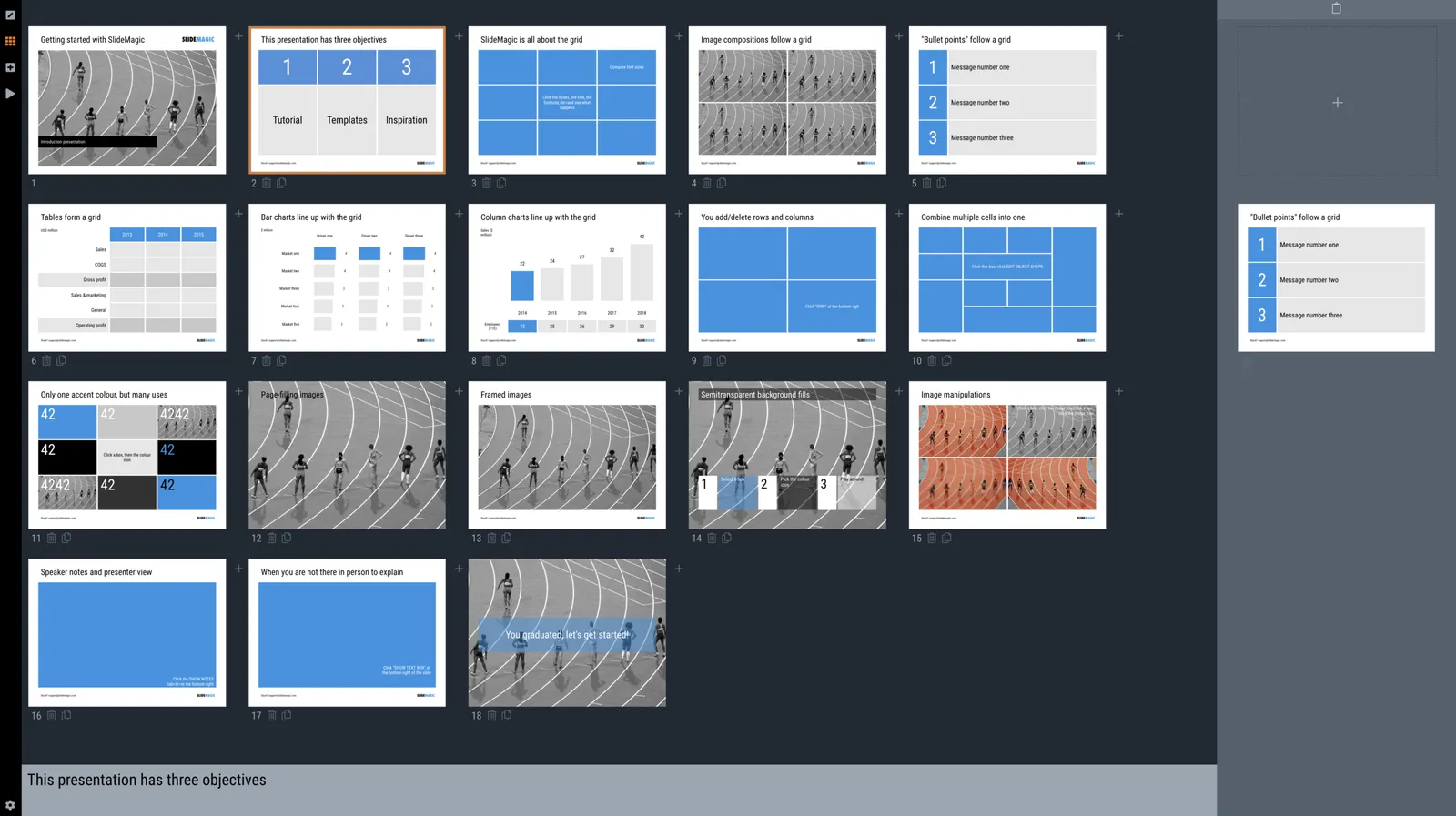
People spend too much time on creating slide decks. SlideMagic aims to change that. My minimalist designs really help I think: they are super simple, look good, and cover 95% of charts you need in a business presentation.

Now that I start test driving my 2.0 app at speed, I see the next challenge: workflow: finding the right template to start with, modifying it quickly, diving back in your slide archive for inspiration with intuitive controls. In PowerPoint this does not work very well, with 20+ years of professional experience I have learned to navigate the menus quickly but the average user is struggling. Apple Keynote looks prettier but is even less streamlined to use.

My efforts continue, it is all about optimising tiny details that make a surprising difference in the speed at which you can put slides together.

Photo by Arie Wubben on Unsplash

Sloppy with labels

People recognise an email address when they see one, or a street address, or a phone number. People understand that they are reading product benefits or seeing a price of a product or a competitive comparison. It is OK to let go of the labels and descriptive titles if you can.

Photo by Wes Hicks on Unsplash