SlideMagic Blog

Frequent updates about all things presentations since 2008. Subscribe to never miss a post.

RSS
·Software

Feature preview: matching slide and user interface colours

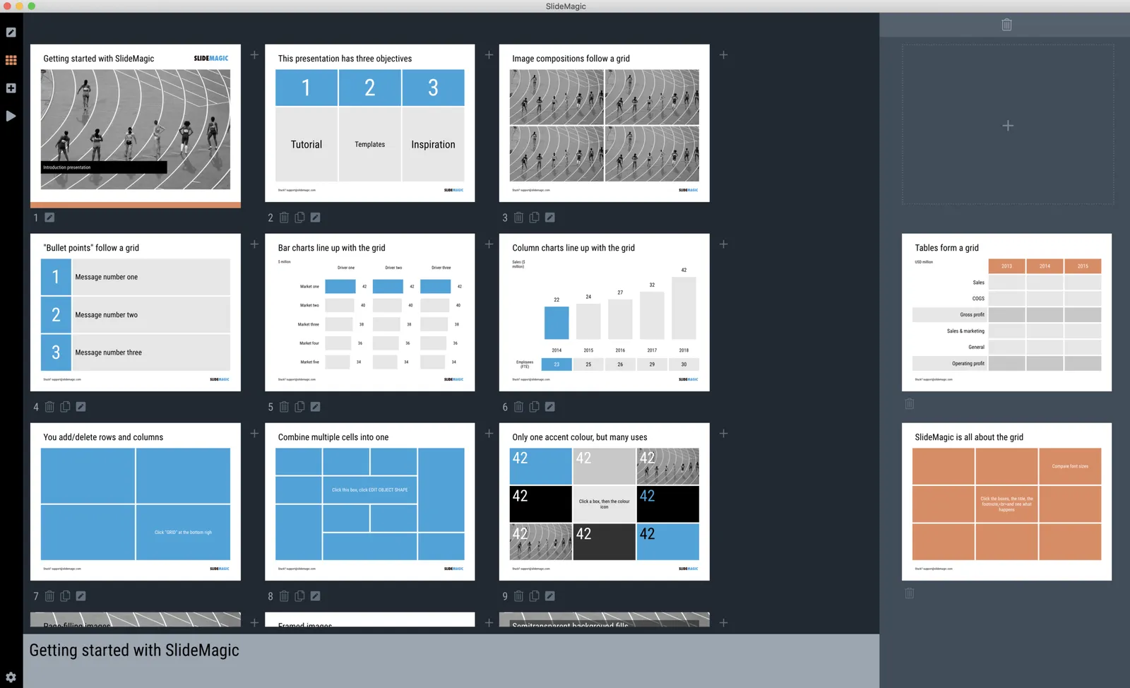
In SlideMagic 2.0, I have pushed the use of colours in the application user interface further. The look and feel of the application will be the opposite of the slides you are working on:

  • If the slides have a dark background colour, the application will be light
  • The accent colour of the application will be the opposite colour on the colour wheel from the colour .you are using in your slides.

Here are some screen shots from the alpha version:

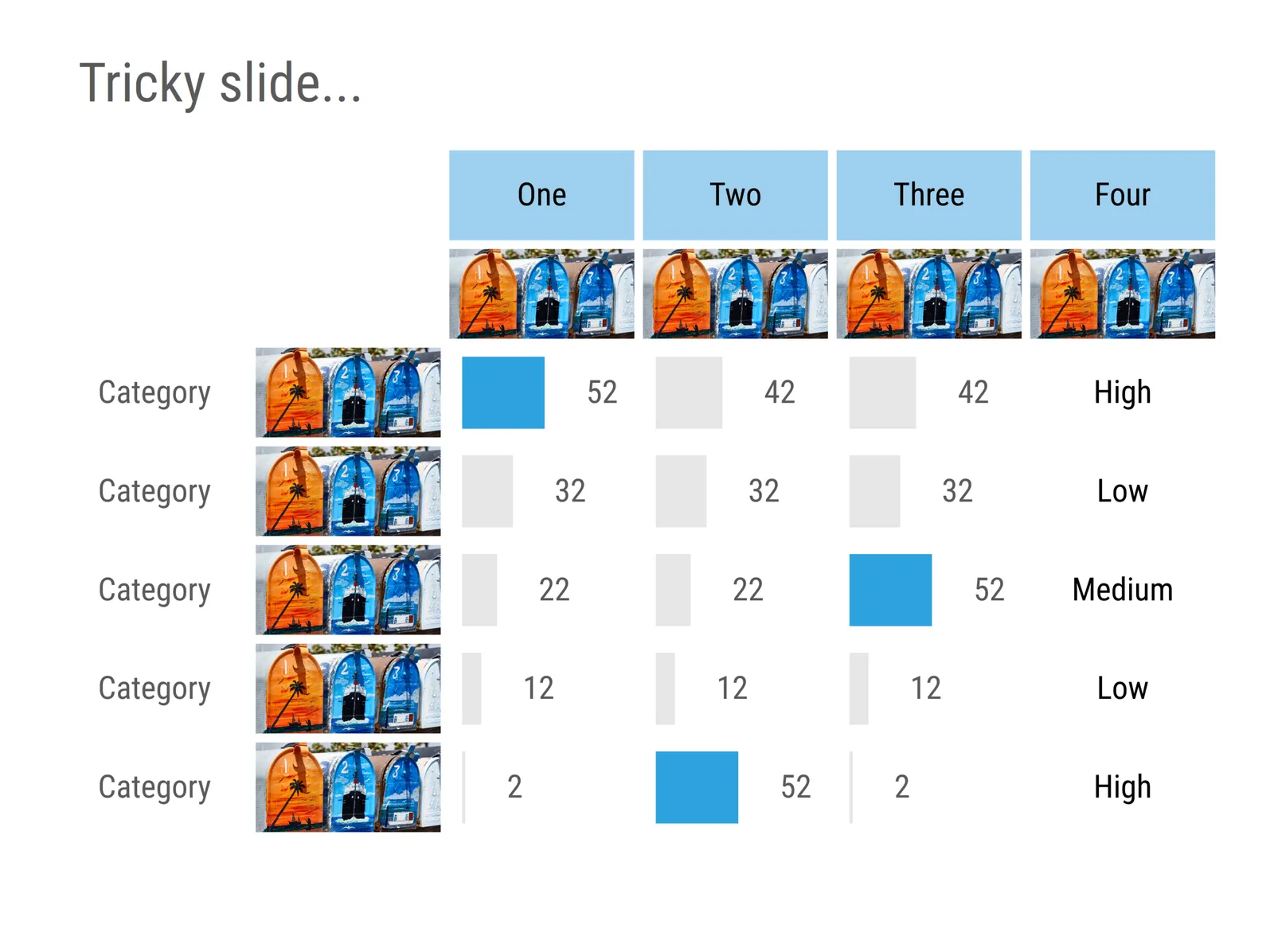
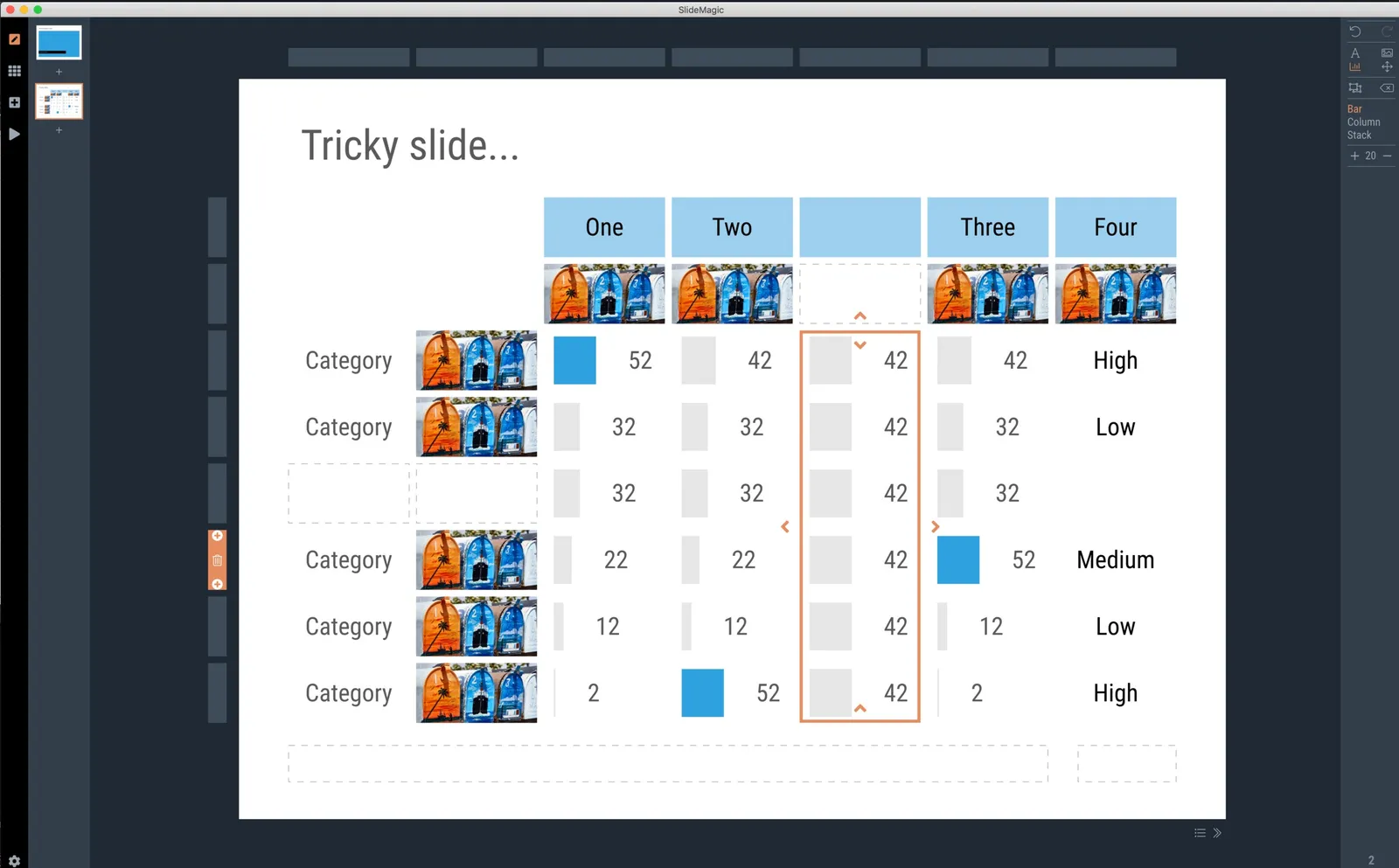
 Brown/red in the slides, green in the app

Brown/red in the slides, green in the app

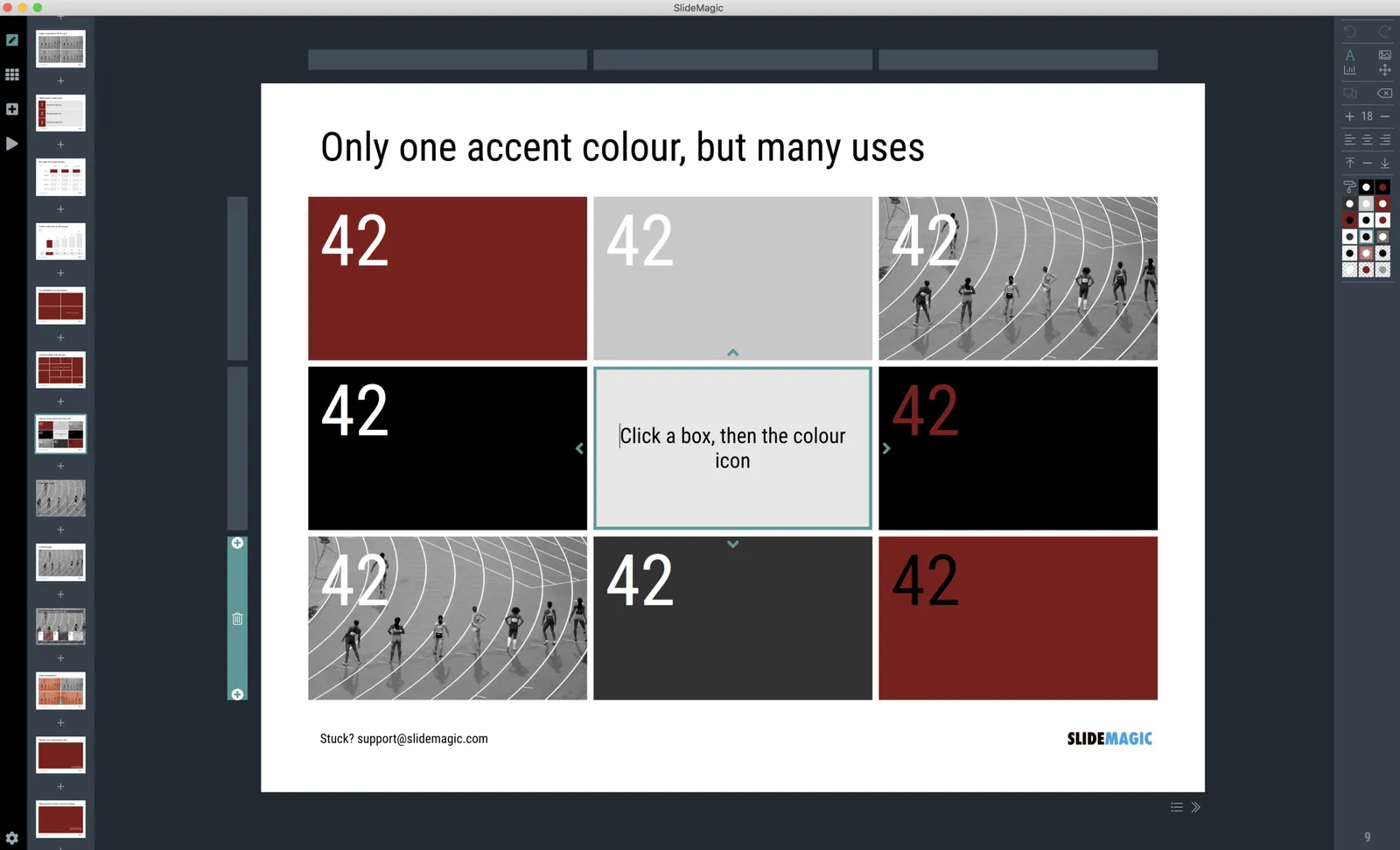
 Switch the slide background to dark, the app turns light

Switch the slide background to dark, the app turns light

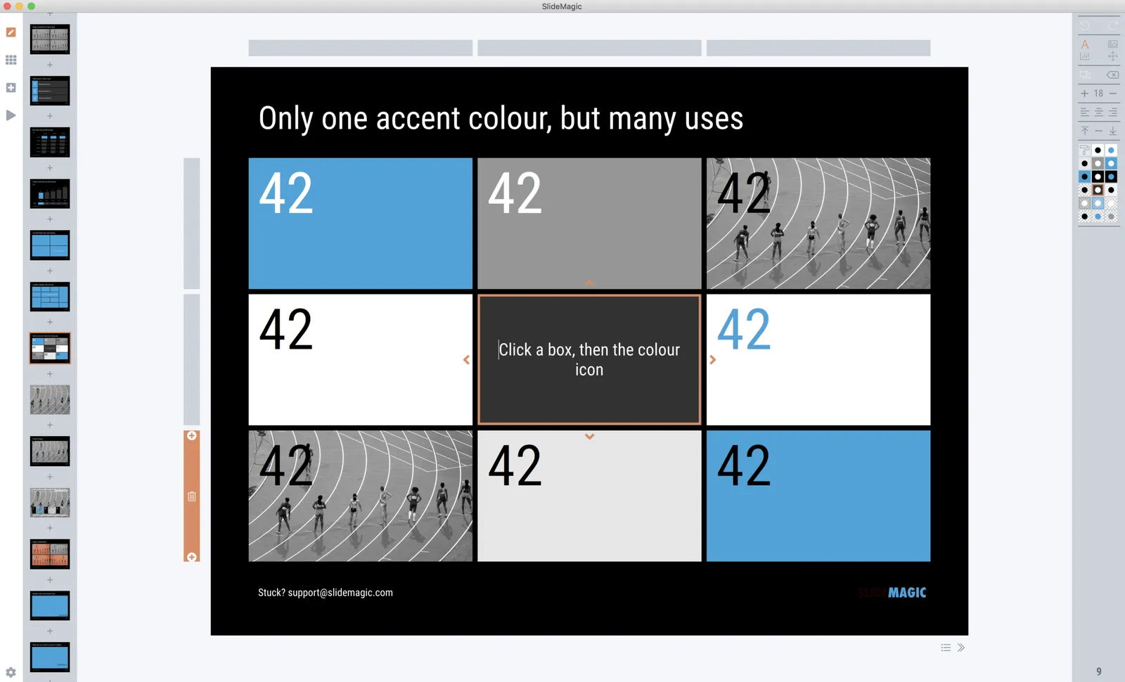
 Slides on the clipboard are in the template bank are presented in the opposite colour so you can differentiate easily between the slides that are already in your presentation, and the ones you could add.

Slides on the clipboard are in the template bank are presented in the opposite colour so you can differentiate easily between the slides that are already in your presentation, and the ones you could add.

"Super chill"

This post byHumans of New York follows on my post from yesterday. This person might have it all sorted out, but 1) you are not working to please your boss, 2) you are not working to achieve “super chill” status, humanity will not progress much if we all do that.

Pleasing versus learning

There are two ways a mentor can be really helpful in your career:

  • She continues to pull you up with her as she knows you will always deliver what she wants
  • You learn a lot from her and your increasing skills get recognised by other people than your boss

Photo by Joshua Ness on Unsplash

One directory workflow

File organisation on a computer is a pain. Going up and down directory hierarchies to find the right folder, then going backwards again if your machine prompts you to load a file from the location you last saved something in.

Back at McKinsey, one senior partner had a different paper filing system from everyone else: simply plop everything in chronologically: mixing up different projects, personal and work, etc. The arguments: it saves a lot of time to put things away, and a calendar timeline is actually a pretty good access mechanism for your stuff. (‘Where is that presentation I made 3 weeks ago?”) .

More and more, I go to a one directory workflow. The one directory usually ends up being the default downloads folder:

  • Save and load everything in one folder

  • Don’t bother naming images, look them up by thumbnails, if you can’t find them, search for a similar one online

  • Once in a while, go through the folder and put the most important things away properly:

    • Most work files expire: that version 29 you were so keen on saving in order to roll back to it, is no longer relevant by version 37. After returning from holiday, the hotel and car reservations are not needed anymore. All can be deleted safely. (That is the reason that the few bits of paper that are still floating around in my office first go in the “buffer box” before filing, usually the archive problem solves itself after 2 months)
    • There are exceptions: for my app source code: I need to be careful not to cause a massive corruption. Family photos, medical files, contracts, they go somewhere properly.
  • Use gmail search as your archiving index:

Continue reading →

Car user interfaces...

My venture into software design also sparked an interest in user interface design.

A recent road trip through Europe provided an opportunity to catch up with modern car user interfaces thanks to many car rentals in different countries. Most of the cars I used now had an all digital display, without any physical indicators.

This should provide a great opportunity for automotive engineers: there is no longer a need to reserve space for warning lights and indicators that you only need when things go wrong (engine temperature, brakes, etc., and you can include things like maps for navigation.

Well, they still have something to learn, up to the point where I think a car’s user interface could be competitive advantage similar to the one Apple exploited in computers in the 2000s.

Take navigation for example. The screen is littered with information you don’t need, and items you want are hard to find. It looks like designers still consider a map (used since the Middle Ages by explorers to ponder and plan routes) and a navigation app to be the same.

Navigation apps show maps in great detail. You pass by a city and are offered the full road map with street names of the city inside the ring highway. Furthermore, the app shows the full detail of the next upcoming 15 turns 100km ahead. Instead, what you need is actually different:

  • A huge display of time now, time to go, km to go (scattered in small print across the screen now)
  • A very clean display of the flow of the road you are currently driving on (hair pins), plus an ultra zoom of complicated junctions with bus lanes that come in handy inside the town centres of Italian cities
  • A very clear indication of landmarks on the road: a city, an airport, a river passing, gas stations.
  • Better selection of destinations: it was impossible for me to enter Milan Malpensa airport as a destination more than 100km from Milan.
Continue reading →

Why you are not getting the sale

A good sales presentation is important for landing a deal, but other factors play a role as well. It is important to understand the dynamics of the decision makers. Investing a lot of time and effort in making slides prettier is a waste if the decision has nothing to do with the presentation.

Some thoughts that can go on in the back of the mind of the decision maker:

  • “These slides look totally 1990s and are full of typos, they are not serious professionals”
  • “Great slides, but I have no idea what they are trying to say”
  • “They never seem to understand/answer my questions”
  • “They are always 5 minutes late, what about future project deadlines”
  • “Better play it safe and hire a big brand for the project, I need a promotion at the end of the year”
  • “Sorry, but I cannot see myself working with this woman managing the project for the next year”
  • “Hopefully she notices my favourite tie I always wear on the days of the tender meetings”
  • “We need on the ground presence in China, and I already told them it is a deal breaker if they don’t have it”
  • “They do not know what they are doing, they charge far too little for all they are doing”
  • “Again trying to argue why we need to spend $10m when our budget is $5m”
  • “The other contender offered a summer job position for the daughter of my boss”
  • “Last night’s venue was a bit shady, but they kept their promise and opened a 1996 Dom Perignon at the end”
  • “All these small calculation errors, not a big deal in a presentation, but a catastrophy for the project”
Continue reading →

Subtle Photoshop errors: as bad

Either you make a perfect digital fake image, or you go for a less ambitious slide layout. I laugh when you seen an obvious Photoshop mistake, I cringe when I see a 95% correct image. “Something is not right”

In the image above, the light on the cars, the camera angles, something is not working. Ultra high definition monitors now also give away the artificial digital backgrounds of movies.

In a few years time, software will have solved this problem. Until then, your presentation slides, web sites, and other marketing material will look like the work of a young kid who slowly starts to add the 3rd dimensions to its drawings. (In the early years children do not actively notice the concept of perspective, and things getting smaller towards the horizon).

App update: the finish line! (well, a finish line...)

Today I reached the point where I have much improved, fully working, stand-alone version of SlideMagic running on my machine, every line of code put in by myself. That was quite a journey…

  • I started with experimenting with PowerPoint macros to automate some processes for the template store
  • Then I moved on to Windows and C# to start writing a 100% accurate conversion plugin that can read and convert SlideMagic files to native PowerPoint and was considering expanding the plugin to cover a full slide edit engine inside PowerPoint
  • I got the sense that Microsoft is not putting all its energy into C#/com plugins for Office, but rather is focusing on Javascript. At the same time, I discovered Electron (owned by Microsoft…), that would allow me to write an app that would run on both Mac (early adopters) and Windows (the market).
  • Next phase: learning JavaScript and coding a stand alone SlideMagic to PowerPoint converter, outside of PowerPoint.
  • Then came the big leap: why not write the whole app from scratch…. Writing a converter is relatively straight forward: you read the file and translate it. An app where the user can click an unlimited amount of items is a different piece of cake…
  • Bit by bit, I made progress: all app modes in one screen, live what-you-see-is-what-you-get editing, hard core image cropping and processing, drag-and-drop (tricky), shift-click selecting multiple objects (app complexity to the power n), and a complete PDF rendering engine in addition to the PowerPoint conversion.
Continue reading →

It is hard to delegate presentations

Most people who go up the career ladder in big companies have no choice but to delegate the activities they were good at and got them promoted. (This provides problems for brilliant stock analysts, architects, coders, designers and other creative people…).

One thing will stay with you though: making presentations. Good managers know how to tell a story, and it is almost impossible to leave creating the story to your junior team. Yes, a little help can be useful to run the numbers and fill in the data, but when it comes to sequencing the points and getting it just right, you are on your own.

Sometimes it looks like you delegated presentation design. But the old-fashioned senior manager who is micro managing the slide production process by making corrections on slide print outs and handing them over to a large team of secretarial staff is still writing the presentation herself, when it comes down to the actual content. She just could not be bothered to learn the basics of PowerPoint herself and is using an army of people to make up for it.

SlideMagic 2.0 is trying to solve this: creating a tool that enables busy people to jot down their story in a decent format quickly.

Photo by Sagar Dani on Unsplash

Mixing up the waterfall

This chart appeared to today in Dutch newspaper NRC Handelsblad, showing the revenues of soccer team Ajax Amsterdam:

There is lot wrong with it in my opinion:

  • Mixing cumulative and non-cumulative
  • A missing final total that leaves the chart “dangling” at the end
  • The typography of the horizontal axis (the matches above the columns are actually much better to use as the x-axis)
  • Than the “extra” bit at the end which makes a comparison to revenues over the past 10 years

Image via WikiPedia