SlideMagic Blog

Frequent updates about all things presentations since 2008. Subscribe to never miss a post.

RSS
·Creativity

"Producing yourself"

I just returned from a short Passover holiday, a first in a year. (Hotels, restaurants, here in Israel are now completely open while virus cases continue to fall towards zero).

During the break I watched a Master Class series by Alicia Keys about “producing yourself”. In music production there are usually 2 roles: the creative contribution of the artist, and the editing and arranging part by a producer. They usually happen in 2 spaces, the artist is in the recording part of the studio, the producer sits on the other side of the glass in the control room.

There is an interesting parallel to presentation design: I think most presentation designers are producing themselves, doing both the creative and the editorial part, pretty much like Alicia does.

At least, they are supposed to do so. In practice, when it comes to presentations, people are more arrangers than creators.

How does Alicia go about balancing both side of the process?

  • She creates to completely different mindsets, amplified by the different locations: the vocal booth, the control room
  • In creative mode she lets herself go completely, mistakes are OK, crazy things are OK (similar philosophy to corporate brainstorming sessions)
  • But, she actually prefers to be totally alone, in order to “embarrass” herself freely, and to avoid being put in the position of an artist who has to entertain and perform (completely the opposite of a corporate brainstorming session).
  • She records and captures everything, if you want to capture a creative idea in the flow / moment, you are too late. (As opposed to the brainstorm flip chart where someone else tries to capture and rephrase ideas that multiple people are “shouting” out).
  • After all this, she takes a break, goes to the control room, and listens back with a completely different mindset.
Continue reading →
·Layout

Do you need the table headings?

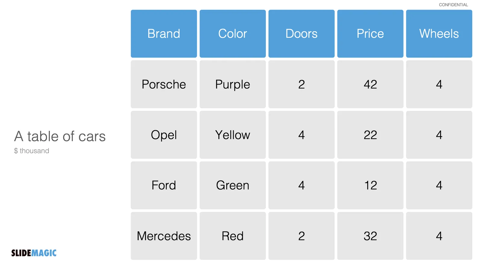
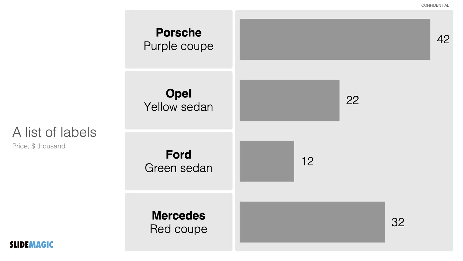
Spreadsheets and databases need table headings. Humans not always. Look at the two slides below

We know how to recognise car brands, colors. Pretty much every car has 4 wheels. Think of replacing the boring tables with cards or labels, making the slide easier to read, and creating more space for information that is more important to show.

Photo by Valdemaras Januška on Unsplash

·Investor presentation

Everything to the front page

So you got some feedback on your pitch deck: “You need to ‘hit them hard’ with your strongest points early in the presentation”

Ok, bring this to the front, bring that to the front, this the front as well. Hmmm, now we have a lot of pages at the front, maybe summarize all of these messages on the first page, then we get to all of them really early.

The result: a dense, boring bullet point page. And it will take you 20 minutes to go through it, since it contains the entire presentation.

Most investment ideas have very few ideas that are truly distinctive, or better phrased: ideas that do not sound like all the other pitches an investor listens to. Be very honest and selective. Often, you might have to deal with an “elephant in the room” early in the presentation. Addressing competition from Google if you are building an internet search engine on page 27 is not a smart idea.

Photo by Georgi Kalaydzhiev on Unsplash

The mood of an image

Paintings and other piece of art affect your mood. Happy, depressing, scary, cute, funny. Often you cannot pinpoint why, but it happens.

The same is true with photographs. When selecting images for your presentation, go beyond the functional specs of the photo: it needs to contain a self driving car, a person on a mobile phone, a clock.

How does the picture make you feel? Colors, perspective, proportions. Pictures can be beautiful and depressing at the same time. When given a choice, maybe the slightly less pretty but more uplifting image is the one to go for.

·Investor presentation

To share or not to share?

Every potential investor will probably reply with “sure” to the question if she is interested in a copy of the pitch deck. But what should you share? Some of your slides could be highly confidential, others might be too detailed. It is impossible to give a conclusive answer to this question, but here are some points to consider, given a number of possible investor profiles.

  • Investor profile: angel investor who invests as a hobby and loves networking and being involved in the buzz of the startup world. She is incredibly friendly and wants to be helpful, but you don’t know her that well. She was asking fairly high level questions and you had to give her a 101 on the industry you are working in. Maybe a short summary deck with non-confidential information will do. She probably does not have a deep technological understanding of your niche, and is likely to forward material to many of her friends to see if they can help you as well.
  • Investor profile: junior analyst at a specialized VC firm who keeps on asking about very detailed financial growth benchmarks. She is begging you to provide all the ammunition you can find to convince her boss. No, they don’t sign NDAs. You probably have to provide the details as it sounds like an all-or-nothing shot with a highly relevant investor.
  • Investor profile: you happen to sit next to her at a post-COVID dinner party and find out she is actually an investor with a potential fit. The setting was not right for an in-depth pitch. Maybe here you should send a very short “business card” presentation, slides that look great, give a brief explanation of the idea, plus additional background on you as an entrepreneur. The objective is not to land the investment, but to get an opportunity to do that proper pitch.
  • Investor profile: someone who makes it pretty clear that the possibility of investment is close to zero: wrong industry, wrong stage, wrong geography. Saying that she is interested in the deck is her being polite. Maybe better not to send anything at all.
Continue reading →
·Layout

Dashboard syndrome

I am following a number of amateur statisticians here in Israel to get insight in how the vaccination campaign is going. This ‘underground’ information sources gives a for better picture of what is going on than the main news media can provide. A better explanation and earlier detection of trends.

Most of these statisticians use the same chart that they update every day. And I noticed that after a few weeks, you actually stop seeing how poorly the chart is designed, your eyes will zoom straight to that one figure that has been updated.

Stock brokers spot the latest share price instantly on a busy ticker board. Mathematicians see the crucial line in the proof on the blackboard.

You , the presentation designer, have become used to your own dashboard. It might be time to take a step back.

Photo by Neil Martin on Unsplash

PPT templates: adding 1 more person to "The Night Watch"

Prefab PowerPoint templates can look incredibly pretty. The problem is editing and customizing them. It is easy to change text, but if your message requires 5 instead of 4 bubbles, you need to make drastic changes to the layout of a slide.

  • There are the technical skills of duplicating and placing that shape.
  • There are design skills, “somehow the proportions of the slide don’t look right anymore and I can not pinpoint what causes it”.
  • There could be a more fundamental problem, maybe a 5 bubble chart requires an entirely different slide than a 4 bubble one
  • There is the problem of fitting things in with the right fonts and colors that fit your corporate identity (corporates usually do not use the cute fonts found in powerpoint templates).

Changing a PowerPoint template is a bit like handing a paint brush to a random person with the request to add one more person to The Night Watch on the canvas, and change the coloring from dark to light (the scene is set in the middle of the day, but got darker over the years).

What I am trying to achieve with SlideMagic:

  • Lower the ambition on the complexity of slide designs, and make sure that the designs that do make the cut look pretty good
  • Offer an editor that makes it easy to change layouts without leaving any traces
·SlideMagic

Limited time...

This chart lays out the philosophy behind SlideMagic: spend more time pitching, less time editing. There are only a limited number of productive hours in a day, it is a waste to spend them on slide design…

  • If you are preparing for an all-or-nothing pitch, you free up time to really, really rehearse your story.
  • If that quarterly report is sitting on the top of the to-do list and preventing your from doing other things, get it out of the way quickly.

P.S. I have add this slide to the database here, or search for ‘slidemagic’ in the desktop app to use it in your own presentation

·SlideMagic

Updates to the settings

As of version 2.6.27, the way settings are stored in SlideMagic. I rely on open source software and the previous engine I used to save settings on your machine was not maintained very well by its developer and started to cause more and more bugs over time.

If you are a pro subscriber, please log in again after you update. Also, you might have to re-enter your accent color to store it on your machine. Apologies for the inconvenience.

Photo by Rima Kruciene on Unsplash

·Layout

Emphasizing by de-emphasizing

Recently, a SlideMagic user asked for some help with adding “some more color” to a slide. (A table to be included in an internal strategy document).

My response was the opposite, rather than adding color and accents, I took things out. To make things stand out, you can either emphasize these things, or de-emphasize everything else.

Here is the starting point (confidential text removed). Btw., look how neat and organized it already looks, thanks to SlideMagic…

Below my suggestion:

The things I did:

  • Changed color accents
  • Grouped and de-duplicated text boxes that contained the exact same text
  • Changed relative heights of rows
  • Moved title category labels to the top
  • Added the arrows to visualize that the bottom item supports everything else