Presentation suffering, live
Just searching for “boring presentation” in Twitter gives you an idea of the suffering that presentations are causing right now, wait a few seconds for the tweets to come in.


Frequent updates about all things presentations since 2008. Subscribe to never miss a post.
Just searching for “boring presentation” in Twitter gives you an idea of the suffering that presentations are causing right now, wait a few seconds for the tweets to come in.
I do not understand software applications that do not use small arrows in their menus for rotating pages 90 degrees clockwise or counter-clockwise. It creates the exact same visual delay as bullet points:
A visual shortcut is needed (i.e., a simple arrow)
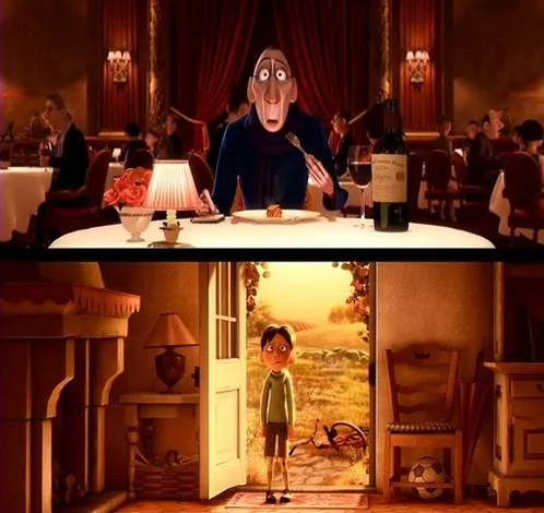
Visual slides are emotional shortcuts. A powerful image or visual concept unlocks something that was already (at least partially) stored in our memory. This scene from the movie Ratatouille (affiliate link)is perfect example: a taste sensation that unlocks a childhood flashback.
I will be speaking in New York on 5 and 6 April (click the bullets for full details):
The events will take place from 18:30 to 20:30 at the NYU Stern School of Business. Tickets are $25, but readers of this blog can get a 40% discount by applying promotion code “ideatransplant”.

I am honored to be invited by Sean Black, CEO of SalesCrunch, the organizer of these events. SalesCrunch is a social selling platform in which online presentations play a central role. The business has 3 elements (my seminars are part of #3):
A claim in a sales presentation: “we will save you $10m over 5 years”. A nice statement, but it does not have instant credibility. How can you make it credible?
You should watch this TED talk by Salman Khan, a former hedge fund analyst who is now fully devoted to turning the education system upside down (see his Khan Academy). His key concept is to humanize the class room using technology: have kids watch videos at home at their own pace and use the time of the teacher in the class room to provide individual support instead of one-size-fits-all lectures.
Now to Prezi. I think Salman is using it as his presentation engine. I am still not convinced that it is a good large audience presentation tool (see an earlier discussion on whether Prezi is a PowerPoint killer). However, the tool does a good job in visualizing the enormous video library Salman has constructed, and the carefully thought-through construction of the curriculum he is proposing. What do you think?
A highly competent presentation designer asked me why I put my slide titles always at the same position (top left). Good question. My slide titles have started to drift, depending on the composition of the chart.
Many presentations end in some sort of Q&A session. During this discussion, the slide show usually comes to a standstill, and the last visual used stays on the projector for a long time. Make sure it is a useful one, since it might be the image that the audience will remember best. To be avoided:
What could work: a visual that links back to a key point in your presentation. For example, if you spend 5 slides on describing how a teenager will use your mobile social network, just putting a picture of her back up will remind the audience of the story. (This time you can leave out the bullets arrows, boxes, just an image to refresh the memory).
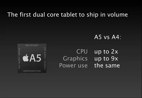
Bullet points happen to the best, even Steve Jobs uses them. See the slide below from the iPad 2 launch presentation (thank you Engadget).

The good:
The bad:
What do you think of this alternative?
Videos that are posted online often come with an explanation: “skip to 4:03”. Think about that when designing your presentation: the audience is watching a video without a remote control or Tivo. It should be interesting from 0:00 to 15:00.