SlideMagic Blog

Frequent updates about all things presentations since 2008. Subscribe to never miss a post.

RSS
·Investor presentation

The press release is dead

TechCrunch blogger Mike Butcher wrote an interesting blog post about how to pitch to tech journalists/bloggers. It is well worth a read (below are his slides that convey a similar message from 2012).

Like VCs/investors, tech journalists are overloaded with inbound pitches. There are similarities in the way you should pitch them:

  • Get straight to the point, cut the fluff/small talk
  • Give more or less the full info the 1st time around, no “can I send you some more information”
  • Be concise and clear what your project does and why it is great

There are differences though with investors:

  • Exclusivity (breaking a story first) is really important to journalists, so blasting your news out to 100 people is not going to make it more attractive
  • Journalists really want something to be news (dah), something that the world has never seen/heard before, investors are looking for the big returns, even if it is an old idea that is recycled
  • Big $ fundraising is seen as validation by journalists, investors probably care less (at least the good ones who can spot a rough diamond before everyone else)
  • Journalists might not have the in-depth technical knowledge as a highly specialised VC (an early stage medical device investor), and like to compare/contrast companies and technologies to the ones they know (competitors).
  • He loves plain text and hates PDFs/attachments. This partial because of practical reasons (mobile devices, copying quotes), but also - I suspect - the journalists are actually used to digesting written/verbal communication and less used to digesting visual slides (hypothesis).
  • The world of tech journalism is changing. In the early days TechCrunch used to be all about startup discovery, now there are increasingly other news sources that plays this role (Product Hunt for example). Mike says he is increasingly interested in deeper, background stories. So putting your pitch into the context of an overall trend that is happening might make it more interesting to publish.
Continue reading →

A new on-boarding presentation

Recently, I have changed the first presentation that appears when people sign up for the beta version of my presentation design app SlideMagic. If you are an existing beta tester, you can still access it in the templates folder of SlideMagic, or you can clone the presentation by clicking this link. I hope it helps you get the most of SlideMagic:

  • Importing and cloning template slides
  • Working with the grid including images and data charts
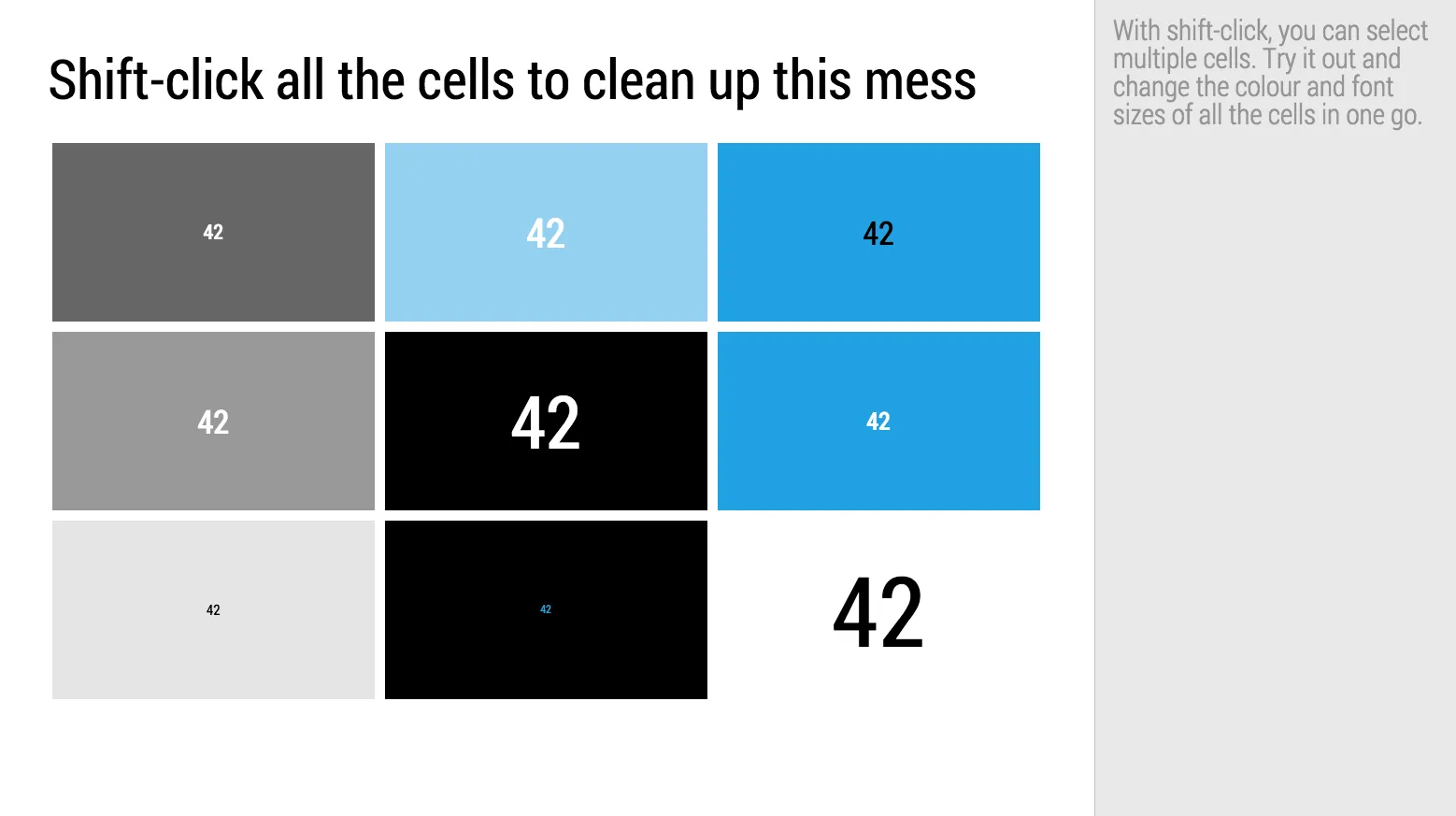
  • Formatting cells in one go, rather than one after the other

·Software

PowerPoint template weirdness

A technical post about PowerPoint templates today.

When you copy the slides of one PowerPoint presentation into another one, the copied slides get formatted according to the template of the presentation your are copying in. Colours and fonts get adjusted. But the most surprising things happen with text placeholders.

The template I typically use is pretty simple: a blank page with text placeholders for the slide title and footnote to make sure they are anchored in a consistent place across slides. Now the strange thing happens. Because the footnote is the only text placeholder available, PowerPoint starts copying text into the footnote.

To accommodate clients who want to use my template after the presentation design project is over, I now add a plain text box to my template slides. Here is the key thing, make sure that plain text box is the first text place holder you create, that’s where copied text will go. (In other words, remove the footnote, put the text box in, recreate the footnote place holder after that).

If you often experience problems with inconsistent formatting of presentations and the issues with copying slides across you will appreciate the way I designed my presentation app SlideMagic (sign up for the beta here).

  • One slide layout grid for all presentations, everything lines up perfectly, always
  • No need for template programming
  • It is not possible to corrupt a template and having it slowly propagate throughout your company
  • Changing the look & feel of a presentation is easy: change your logo and accent colour and you are done (including bar and column charts, try that in PowerPoint)
Continue reading →
·Images

But that image does not exactly match?

Not every image that is used in advertising has a functional objective. Take fashion ads, for example, sometimes the product is missing all together.

  1. Images that show something highly specific: a product, a medical condition, a location
  2. Images that show a relevant scene or background: people tapping on their mobile phone, a driver in a traffic jam, calm bamboo forest, a sunset
  3. Images that make a visual metaphor: a prisoner in a cage, a cat chasing a mouse
  4. Images that just set the mood of the presentation

I use 1. and 4. more, and 2. and 3. less because they often lead to visual cliches.

Art: “[Self-Portrait, Yawning](https://en.wikipedia.org/wiki/Joseph_Ducreux#/media/File:Joseph_Ducreux_(French_-_Self-Portrait,_Yawning_-_Google_Art_Project.jpg)” by Joseph Ducreux, 1783

Cinematic colours

The films by Wes Anderson (The Royal Tennenbaums, The Grand Budapest Hotel among others) have a very distinct visual style. This blog highlights colour patterns of selected scenes. Nice inspiration for your presentation if you like light pastel colours.

·Story

Mowing the grass

Presentations grow over time, stuff gets added over months, years, often by different users/designers.

  • The company started with 2 products, and these 2 products - at the time - seemed like a natural way to structure the story. Now with 7 products that story gets a bit boring. Maybe we need a different presentation structure all together?
  • In the beginning the company had 15 customers which we could nicely lay out on a page, now our 100+ customer list becomes a pain to maintain. Maybe we just show a map with countries where we have customers?
  • When we just moved in, we were really proud of our office and that big picture showed it. Five years later, having an office is not something that merits a slide.
  • In the beginning, the company was equal to its 2 founders. Now that 15-person team slide on page 3 seems a bit out of place.

When it is time to mow the lawn, do it.

Art: Vincent van Gogh, Patch of Grass, 1887

Get straight to it

In big, multinational corporations, many projects follow this pattern:

  1. Templates with extensive data request is sent out to all relevant business units weeks/months in advance
  2. One week before the meeting the chasing for data starts
  3. At the last minute, business units merge pages of filled out templates with existing presentation material (Frankensteining)
  4. At the in-person gathering, each business unit representative goes through page, by page, by page, by bullet, by bullet. Everyone is physically, but not mentally presentation (doing email, walking in and out to take calls until…
  5. …only at the very end the hot issue that has been hanging in the room comes out and becomes the subject of a heated debate while time is running out.

You don’t need the reading out aloud of data templates (people can read for themselves), but you do need a good structure to guide that heated group discussion. The time that people are together is better spent with identifying options and listing pros and cons.

Art: Argument over a Card Game, by Jan Steen, 17th century

You are not the only one

If you are pitching a healthcare IT business to a healthcare IT investor, she has probably seen hundreds of pitches of healthcare IT companies. If you are pitching a mobile content service to a mobile operator, she has probably seen hundreds of pitches by other mobile content providers. If your pitching an IT solution to a RFP evaluation team, they are likely to have invited more (similar) companies to pitch.

  • Check whether you need to invest time in presenting industry background. If you are number 50, others probably have covered that ground (no need to preach to the converted)
  • Don’t make up facts about the competition, the audience might have invited them before you and heard the actual information first hand
  • Use most of the time in the meeting to emphasise how you are different from all the other ones.

Art: Alfred Wierusz-Kowalski (1849–1915)  The lone Wolf

·Investor presentation

I am going to force feed my Executive Summary on you

People often ask me what an appropriate summary presentation is to send a head of the actual presentation, the dreaded “Executive Summary”.

Executive summaries and web landing pages have similar objectives. Keep the user hooked long enough to transfer the idea/messages and get her to do something at the end (click “BUY”, or reply to the email and set up a meeting).

In web design, people have learned a lot. Use lots of white space, attractive images, links with inviting text that scream “click me”, cut out boring non-essential information and put that on pages for people who want to look for it.

The Executive Summary though is still in the 1990s:

  • We expect tat our story is so boring that we need to drag the reader through it as long as we can
  • The solution: cut the amount of pages (maximum 2), anyone can read just 2 pages right?
  • Whoa, how do fit all this information on there: reduce font size
  • We need a big bold vision statement upfront (1 paragraph at least), a big bold vision statement really encourages the reader to keep on reading. Maybe there will be more big bold statements on page 2? Good stuff!
  • The it is important to link our idea to all the latest buzzwords, readers love to hear more of the things they read on the latest tech blogs. Even if it is vaguely related to your idea, put them all in there. Wow, this Executive Summary is all about these great trends? I have to read on!
  • After rereading the Executive Summary, we find that it sort falls out of the blue. We need to tie it into the big things that are happening in society. Mobile phone penetration is huge right now. Social media is changing the way we consume content. (This is especially true for younger people). Gartner and IDC have some good stats and quotes on this, let’s add them. The reader must think: I want to read more about this!
  • The broader market (TAM) is just absolutely big. We are the only company in this space but the market will grow from $15b (2011 data) to $32.67b in 2014. This size market? These guys have discovered something that I completely missed, must read on.
  • Our technology is absolutely amazing. Let’s start with the bottom architecture layer, and build it right up step by step. The “secret sauce” that makes us so scalable and flexible
  • We are 1.5 pages in, time to introduce the idea.
  • Oops, what about the team? Five bullets with CV summaries (don’t forget the undergraduate degrees, and our hobbies).
  • Squeeze the margins a bit, it just fits.
  • Now copy paste selective paragraphs to put in the cover letter of the email.
Continue reading →
·Layout

Columns versus rows and other table design issues

When making a table, what to put in columns, what to put in rows? There is no absolute rule here, but this is what I consider when deciding (some of these can contradict each other).

  • It easier to fit lots of rows then lots of columns.
  • Long labels go in rows
  • Year on year trend: years go in columns
  • Feature/competitor comparison: features in the rows

The most important things is that you never should assume that the layout in which the source data was presented to you is the best way to put that table on a slide. Next to swapping rows and columns consider:

  • Shortening column labels
  • Re-sorting rows and columns so that check marks / similar table content is grouped together
  • Group together multiple rows, or multiple columns if their content is the same as the neighbour
  • Cut text as much as you can in table cells. Side comments and sentences can go in the footnote
  • Design a table at 2 levels: Level 1 (using colouring of cells) to communicate the pattern/conclusion, level 2 (using text) the explanation of the colouring for when people read the slides after the presentation
  • Harmonise column widths and row heights to get a grid pattern that is as calm as possible
  • Avoid boxes/outline lines, rather work with light grey boxes

Users of my presentation design app SlideMagic do not have to worry about a lot of these things, the app will do it form them.

Continue reading →