SlideMagic Blog

Frequent updates about all things presentations since 2008. Subscribe to never miss a post.

RSS

Can you test the new color picker in SlideMagic?

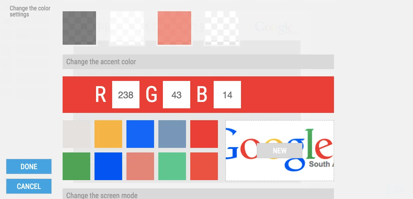
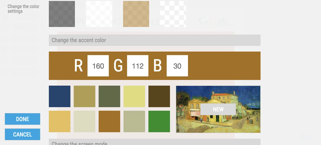
We have just deployed a new color picker in my presentation design tool SlideMagic. It extracts suggested colors from images. By default, it takes your logo image and offers a menu of accent colors that can be selected with one click.

You can also select any image that is in your SlideMagic image library.

This feature had some especially stubborn and unpredictable bugs. It would work on one machine, not on another. Maybe you can check and let me know if it works (well, especially if it does not) together with your OS/browser combination that you used.

Not a user yet? You can sign up here for SlideMagic.

Apologies for infrequent posting, I am driving through beautiful South Africa at the moment.

Art: Vincent van Gogh, The Yellow House in Arles, 1888

Product structure versus presentation structure

Product architectures evolve over time. For you the owner of a company, or the manager of a product category, there is no easier way to structure your story then the structure along which you see the world: the product architecture. Customer issues, competitors, customer segments, it all fits brilliantly together.

That is, it makes sense to you, not necessarily to your audience. Product structures tie your hands and force you to follow a certain story line. Not all products are interesting, not all products are relevant.

Maybe it is time to take a step back from how you organise your internal reports and take a fresh look at how to tell the story of your company.

Art: Paul Signac, Railway Station near Bois Colombes, 1885

Summer posting schedule

I will be spending more time with my family, and less time at the computer over the coming weeks, so blog posting will be irregular and unpredictable. Going straight against the rules of good social media behaviour, I do not build up an article bank and auto post new posts at the optimal time for maximum impressions. Most of my posts are spontaneous and written “live”. I hope all of you have a good summer.

Art: Caspar David Friedrich, The Summer, 1807

Lots of data in one chart

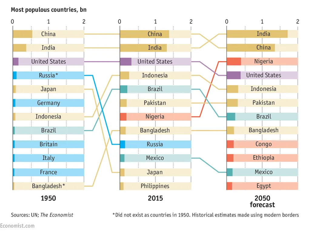
You hear it from a presentation designer: busy charts can be useful. Take this one from the Economist for example. It shows a ranking of country populations over time.

The chart contains a number of dimensions:

  • A ranking
  • Three different moments in time
  • Information about the continent of the country (colour)
  • A rough indication of the population number (the length of the bar)

It is especially interesting to see how the designer integrated the labels of the bar chart in the bars itself. Connecting lines guide the eye over the three time periods.

A number of conclusion jump out:

  • India / China are still going to be the most populous, they just get a lot bigger
  • Europe is vanishing, Africa is coming
  • Especially in 2050, there are a number of countries in the top 10 that you would not have expected there, based on the attention they are getting.

A chart like this is OK to present in a document that is meant for reading/pondering, on a big screen in front of a live audience it is a bit hard to digest. In the latter scenario, I would present the chart in full, apologise for the data complexity and then start covering up specific parts of the chart so that it supports just one message. You can have 3-4 instance of the same chart.

Photo credit: US Army, 2008 Bejing Olympics opening ceremony

SlideMagic update

My presentation design app SlideMagic is slowly making progress. I filed a full patent application for the design UI concept with the US patent office and added new features plus many bug fixes:

  • The UI colour of the app now changes to black if you pick an accent colour that is close to SlideMagic blue
  • CTRL clicking multiple cells enable you to copy paste formatting quickly
  • PDF exports now have page numbers

We are working to make the user interface for the stack chart the same as the bar/column one, add a colour picker that allows you to extract the accent colour from your logo image and enable drawing arrows. With these updates we can start something that we have not done before: marketing the app to a larger audience.

Art: Arthur Streeton, The Golden Summer, 1889

·Investor presentation

People catch up quickly

In many investor presentations, startups want to educate the audience first on a big trend that is happening. But, especially in consumer/internet, people catch up really quickly and you will loose the audience attention and your credibility of you spend time and slides on explaining things that everyone understands.

Some examples I can remember (some of them from my time at McKinsey):

  • Home pages
  • Sticky eye balls
  • Portals
  • Market places
  • Social networks
  • Social media
  • Viral videos
  • Location-based services
  • Online video and the growth of bandwidth
  • Sharing economy

Smart VCs read the same blogs as you.

Art: Student at his desk, Pieter Codde, 1630

·Investor presentation

"This is how we always start"

Your company changes rapidly, your pitch stays the same. I meet many company CEOs that started their company years ago, often at some startup pitch event. The story opening then was about them, in the absence of a real company. Years later, that same intro can often still be found in the presentation, just with an update of the sales and employee numbers.

Your pitch presentation should be one step ahead of your company, not one step behind.

Art: Lautrec, Woman at her toilette, 1889

·SlideMagic

Facebook is a bad way to read this blog

If you are following this blog through facebook, there is a big change that you will have missed many posts. Since I am investing my funds in SlideMagic features and not yet in marketing, I cannot afford to buy facebook ads. The best way to follow the blog is via a good old RSS or email subscription. You can add yourself to the list here: subscribe.

That email list is purely for blog updates, only people who opted in for SlideMagic product updates after registering for the app might get the occasional product update email.

Art: Vincent van Gogh, Postman Joseph Roulin, 1889

·Investor presentation

Finding the bottleneck

If you are struggling to get traction with your investor presentation, it is worthwhile to try to find out where the bottleneck is:

  • Do investors understand what I am trying to do?
  • Do investors understand that this is a big problem/opportunity?
  • Do investors understand that someone can make a big business out of this?
  • Do investors understand that I am the person who can make a big business out of this?

These are slightly different questions than the ideas entrepreneurs often have:

  • My slides do not look “slick” or professional enough, let’s add some colour
  • The story flow is not completely right, let’s talk about the market earlier
  • We have not put in aggressive enough financial forecasts, let’s bump it up to $100m
  • We did not put in that Gartner total market number for 2016
  • We are not mentioning the right buzzwords, let’s add a few
  • The deck is too long, let’s cut it down to 5 slides by combining pages
  • We should use Keynote or Prezi, PowerPoint is stale
  • We should invest in a video clip
  • The deck needs more animated slides
  • AirBNB raised a lot of money, let’s copy their pitch deck

Art: Edvard Munch, Self Portrait with a Bottle of Wine

·Data visualization

Keeping things up to date

Some presentations contain a ton of data that needs to be updated all the time. Quarterly results, LP updates of VC/PE funds, the latest sales data. Updating the numbers is time consuming and errors can easily sneak in (especially problematic with presentations to investors).

I do not recommend cutting and pasting Excel data into PowerPoint. You need serious PowerPoint skills to format the data correctly, and most spreadsheets are not build to present data, they are build to analyse it. Hence my approach of cutting the link between the spreadsheet and the presentation software, and creating a data chart from scratch, 100% focused on the audience, not the analyst.

How to deal with the updating?

I would suggest to create a special spreadsheet alongside your presentation. A new worksheet pulls the required numbers from the big “data dump” worksheet, rounds them up correctly. Place the numbers exactly as they should show up in your presentation slide. Now it is easy to update your presentation data. Add check sums to see whether percentages add up to 100%, and breakdowns go back to the total sales figure.

When the new quarter arrives, you over-write the data dump worksheet, and fix any broken/misplaced links.

Art: painting by Ivan Aivazovsky