

You hear it from a presentation designer: busy charts can be useful. Take this one from the Economist for example. It shows a ranking of country populations over time.
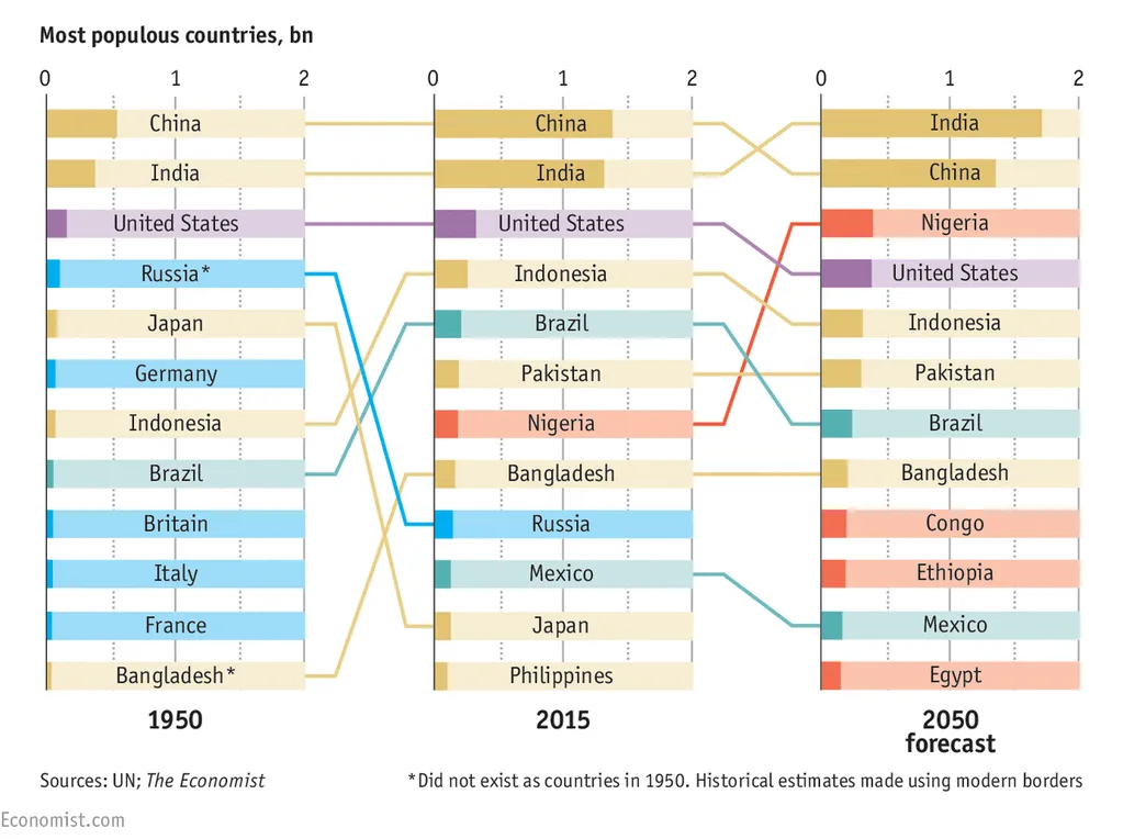
The chart contains a number of dimensions:
- A ranking
- Three different moments in time
- Information about the continent of the country (colour)
- A rough indication of the population number (the length of the bar)
It is especially interesting to see how the designer integrated the labels of the bar chart in the bars itself. Connecting lines guide the eye over the three time periods.
A number of conclusion jump out:
- India / China are still going to be the most populous, they just get a lot bigger
- Europe is vanishing, Africa is coming
- Especially in 2050, there are a number of countries in the top 10 that you would not have expected there, based on the attention they are getting.
A chart like this is OK to present in a document that is meant for reading/pondering, on a big screen in front of a live audience it is a bit hard to digest. In the latter scenario, I would present the chart in full, apologise for the data complexity and then start covering up specific parts of the chart so that it supports just one message. You can have 3-4 instance of the same chart.
Photo credit: US Army, 2008 Bejing Olympics opening ceremony