SlideMagic Blog

Frequent updates about all things presentations since 2008. Subscribe to never miss a post.

RSS
·Creativity

Trends in presentation and pitch design

I opened some old presentations on my hard drive and started thinking about how my work has evolved over the past years. Here are some observations:

  • Starting points of presentations (the briefing decks I see) have gotten a lot better. Garr Reynolds, Apple product launches, TED talks, etc. etc., and maybe most importantly a younger post-overhead project generation is joining the workforce, raising the bar in presentation design
  • The audience has evolved as well. People know the general drill of a startup pitch, the Internet or a smartphone is not as strange as it was in the early 2000s. People have the courage to cut a bad presentation short.
  • Back in 2003, I was probably one of the very presentation designers in the world, now there are thousands.
  • Given the above, my work is moving on a bit. While I still do the proper upgrading of the look & feel of a presentation, it is completely not the most important thing I do anymore. Actually, my graphics and visual concepts are getting simpler, and simpler, maybe even regressing to what I did a few years back.
  • Orchestrating the flow of a pitch is still important, but as pitches get shorter and shorter, and everyone has pretty much settled on a classical investment pitch are start to focus more and more and the pacing of the story. People skip over important things too quickly, while spending far too much time on the obvious, and finally sometimes they do not even touch on a very fundamental missing step in their arguments.
  • My favorite design work are the “puzzles”: diagrams that need to show very complex trade-offs, technology infrastructures, or relationships of multiple factors impacting each other. In the end, these diagrams look very simple, but they can take a relatively long time to construct, burning through endless amount of scrap paper in the process.
Continue reading →

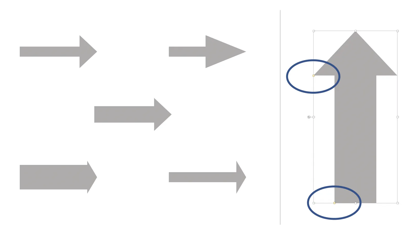
Nice arrows

See below how you can shape arrows in PowerPoint. Most people don’t really pay attention to the way their arrows look, but it can make a huge difference to the professional look of a chart. This is even more important when you need multiple arrows on a chart, make sure their proportions are all the same.

You can change the shape of an arrow in PowerPoint by dragging the little yellow dots that I have circled in the image.

·Investor presentation

Pitch one liners

TechCrunch posted a list of contestants at the latest  Y Combinator demo day, and you can learn from the one-liners that describe the company. A few words capture the essence of a pitch and instantly makes it clear what the company does, and even more importantly, teases you to find out more about a potentially interesting idea.

No buzzwords, filler words, no hype. See how the headlines use concepts that we already know, often brands of established companies. This is a quick memory short cut for a story that would have taken 30 minutes to explain to someone in 1995 who never heard of Palantir.

Voodoo Manufacturing – A robotic 3D printing factory Volt Health – An electrical stimulation medical device Terark – Making databases faster Wright Electric – Boeing for electric airplanes Speak – AI english tutor NanoNets – A machine learning API Scribe – Automating sales development representatives Breaker – Making podcasts a real business Bitrise – Automated build/test/deploy for mobile apps Fibo – Mobile work tracking for construction teams Paragon One – Career coaching from real professionals Tress – A social community for black women’s hairstyles Bicycle AI – Automated AI customer support Vize Software – Self-Serve Palantir Simple Habit – Netflix for meditation Snappr – On-demand pro photographers IQBoxy – Software that replaces human bookkeepers Beek – Book review site for Latin America Bulk MRO – Industrial supplies for India Soomgo – Thumbtack for South Korea Cartcam – Shopping app for the Snapchat generation Peer5 – P2P Serverless CDN Pit.ai – Automatically mining trading strategies SmartAlto – Software suite for commercial real estate XIX.ai – Predictive assistant that anticipates your needs Zestful – Employee activities as a subscription service Arthena – Art investing for everyone Mednet – Stack Overflow for oncologists Penny – A mobile personal finance coach Moneytis – The cheapest way to send money abroad Hogaru – Cleaning for SMBs in Latin America Bulletin – WeWork for retail space Sycamore – Onboarding drivers for on-demand jobs Aella Credit – Consumer and low-income lending platform Tolemi – Software to help cities find distressed properties Niles – Conversational wiki for business Upcall – Outbound calls as a service KidPass – One pass for “amazing activities for kids” Lively – Modern healthcare savings account (HSA) Indigo Fair – Amazon for local retailers Collectly – Stripe for medical debt collection Tetra – Automatic notes for business meetings FloydHub – Heroku for deep learning ACLU – A non-profit you might know

Continue reading →
·Culture

"Do something basic, it does not have to be great"

“I know you are busy, but this is really urgent, I we are on a very tight budget: do something really quick, it does not have to be great, pretty, beautiful”

A warning to all freelance designers don’t fall into this trap.:

  • Your client says it does not want quality, but will for sure be disappointed when she receives the work. Secretly she hoped that you would not stick to the bargain and put in the extra hours to come up with a decent product
  • Your basic, not so good, quick work, will still go out there, it will be passed on, other people will see it, and the poor quality will boomerang back to you.
  • You have crossed the “I am a quick fixer for hire” mental threshold. The mindset of the freelancer should always be, how can I be more valuable, and as a result charge more for my work, rather than less. It should be a one-way door, never go back.
  • If you accept this short term work,  you might have to drop a potentially interesting client a few days later because of it. Opportunity cost of time.
  • Clients who are willing to compromise quality are probably not the best clients to work for.

Another often used argument is “we will do the design, you just focus on the story”. Things go quiet when you actually send over a deck full of boxes and placeholders that is ready to go into the design process.

Continue reading →
·Investor presentation

Presentation half life

Presentations go stale over time. Watch your slides. You might not see it, the audience will.

  • PowerPoint 2010 fonts, colors
  • Out of date logos (of your company, but also customers, competitors, partners)
  • Inconsistent formatting between pages
  • Analogies to over-used, old, example companies ($1 dollar shave club, MySpace, etc. etc.)
  • Growing slides: company history, company events, customer logo overviews, every year another column gets added and the others get squeezed

But what I most often see is that the founder still pitches her deck the same way she got her seed funding (with success). A few years on, the company has moved on, and the investor concerns have moved on. Yes, the technology is still great, but you don’t need to convince anyone that that is the case. But what about that traction with customers?

Some public speaking advice

A lazy post today. Loic Lemeur did all the work with these 18 points great speakers do.

·Creativity

Designer state of mind

Creative jobs are different from managerial jobs. I started noticing the difference when transitioning from being a management consultant to a presentation designer. It especially obvious with being sick. As a consultant, I could usually function pretty much normal with the help of some coffee until drastic body feedback such as fever or a splitting headache prevented you from going any further.

With design work it is different. You notice that something is “not right” in your head 1-2 days before the onset of other symptoms. You can’t come up with any good ideas, or you can’t focus on your creative work and decide to do the monthly accounting. So, sometimes after these 1-2 days, I do actually develop symptoms, or things disappear while others in close proximity do get sick.

Image from WikiPedia

A quick call with SlideMagic feedback?

I am crunching the stats in the SlideMagic user database and singling out individuals with whom I would like to have a short call to talk about their experience with SlideMagic. At this stage, qualitative input is what I value most, quantitative surveys are being ignored and hide what is really going on. I have many options and ideas to take the app further, but I realize that dazzling technology is probably not what it takes to change the presentation culture in corporates. Input welcome!

If I did not approach you and have a clear opinion, feel free to reach out via contact at slidemagic dot com.

Design in Tech Report 2017

I participated in the survey for the 2017 Design in Tech Report by John Maeda. It is full of interesting facts and figures about the state of design.

One insight that resonated with my is the design education gap. Aspiring designers get zero education in business or engineering when studying for their degree. My presentation design business is the direct result of this.

As I blogged, earlier, the design itself of the document is also interesting. It is a consulting-style deck with lots of information and facts, meant more for reading than a stand up presentation. This is a document format that is probably the most common in business today.

  • Some elements are similar to the ones you can use in my presentation app SlideMagic. Grey colors with only one strong accent color. The use of 16:9 to extend slides with a full-text “explanation box”
  • Good use of typography: titles, subtitles, text, quotes (the latter surrounded with lots of white space)
  • The font is nice and elegant, but will make the document not very readable on old VGA projects and/or monitors. You see in the SlideShare rendering that things start to go wrong. This is the reason I went for a heavier font in SlideMagic.

Anyway, this document is a good reminder to look at when you look at your own PowerPoint doc. Why does yours look bad, and John’s look good?

·SlideMagic

Common SlideMagic mistakes

My presentation app SlideMagic will make life easier for every amateur designer. Still a few common mistakes sneak in that are hard to prevent with software. Most of them are related to the balance of typography on a page. Making sure that boxes contain roughly the same amount of text, and that signs are nicely balanced. See the examples below.