SlideMagic Blog

Frequent updates about all things presentations since 2008. Subscribe to never miss a post.

RSS

OK, some more thoughts on the BBC interview video

You have probably seen the video of the interrupted BBC expert interview. More and more meetings, interviews, and even regular calls now involve video. It can be a planned webinar, or a Skype call whether the other side all of a sudden, hey, let’s switch on the video.

First of all the handling of the situation. If your toddler marches in there is basically no point in keeping a straight face, trying to push the distraction away like it is an annoying insect. Apologize, pick the child up, and close the door. But it is best to prevent getting into these situations beforehand…

You see how distracting backgrounds can be. The way you positioned your work desk is almost never the best position for a camera. The best background for video calls are completely blank ones (a white wall), or completely cluttered ones a full book shelf for example. As soon as there are individual items (loose books, a gadget, other objects, the mind of the audience starts to wander of.

Adjust your attire to the environment you are in. Being fully suited up in a home office at night does not look natural. No, pajamas or sweat pants does not work either, but something in between would work better.

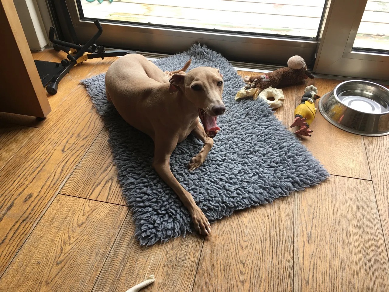
In short, be prepared for everything. In my case, it is my canine office friend who always comes up with a surprise…

·Delivery

Paul Ryan's PowerPoint

This is unusual, a politician doing a PowerPoint in front of the press. You can see his full presentation here.

Here are a few observations:

  • The slide design is actually OK: consistent, good use of color, balanced, not a spectacular TED talk, but still a lot better than your average corporate bullet point deck
  • The screen is too small
  • He is a pretty good and confident presenter
  • Het gets the start wrong. A super technical summary slide with what they are going to do, without having presented the logic of why they want to do it. I think most people switch of in the first minute (See some reactions here).
  • Later on, things get better. But it is almost as if the slides are holding him back. First he presents a statistic or a quote, turning towards the slide, then he steps away from the screen and explains what it actually means. And it is here where he does a pretty good job.

I watched about 10 minutes of the presentation. The key change I would have made, is to change the framing of the presentation. Leaving my own political views aside, if I were trying to make the case for a script, it would: "Hey, from the outside Obamacare looks pretty good, because of 1, 2, 3. BUT, people are missing a few problems 1, 2, 3,. Our plan offers the best alternative. And here is all the technical, legal stuff we are going to do to make it happen.

·SlideMagic

A new SlideMagic user interface

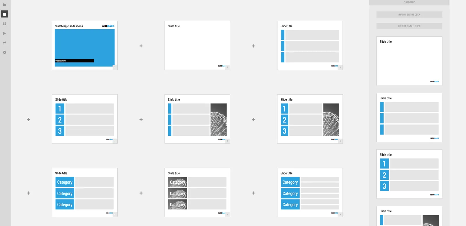
We just deployed a new, more minimalist user interface for presentation app SlideMagic. Have a look!. Some of the things that have changed over the past weeks:

  • Simpler menus: a very short set of tabs on the left side to help you switch between the application modes
  • A more intuitive approach to the slide clipboard where you can import single slides or entire decks
  • Smart insertion of rows and columns in the grid: new rows/columns will now copy color/layout settings from their neighbors

Let me know what you think.

·Layout

The trouble with 16:9

This tweet by a highly competent designer flashed by:

It is work in progress on a presentation. You see what direction he is taking: the big headline on the left, rather than across the slide, and a paragraph of very small text.

I think this might be a format that many presentations will use:

  • More and more display devices are now wide screen (which is a great format for movies)
  • Headlines that stretch all across very wide screens are unreadable.
  • The best visual compositions / layouts are not very wide ones
  • Increasingly, we use presentations to send beforehand, without actual presenting/verbal explanation, hence the need for explanatory text

In my presentation app SlideMagic, I stuck to the 4:3 aspect ratio for slides, enabling you to put the headline across the slide, and added an optional slide out panel for plain text that turns the 4:3 composition into a 16:9 one.

What freelancers should watch out for in NDAs

I know this blog has a big audience of fellow freelance designers. Here is my attitude towards NDAs, non-disclosure agreements, that many clients want me to sign.

NDAs especially come up in conversations with long-distance clients. In the absence of face to face meetings, people are looking for reassurance that the other person is OK. As the project gets underway, trust starts to build and NDAs are usually not brought up anymore.

VCs typically do not sign NDAs, and they see a lot of competing companies, share documents freely internally among partners, and probably forget in coffee chats where they heard what exactly, and whether it is confidential or not. But, they have a position of power: meeting with NDA, or no meeting, you pick.

Sometimes there are actually valid reasons for having an NDA in place. If you file for a provisional patent and your “art” was out there without NDA protection, you cannot claim your status as inventor anymore. Startups might want to prove to their investors that their IP is really theirs, and some obscure subcontractor cannot claim it later. Big corporations might have very strict policies for sensitive financial information.

I am not sure how many NDAs actually ended up in court. It is a big hassle, expensive, and usually there is not much to collect from an independent freelancer. The biggest cost to a freelancer is actually reputation. So maybe the threat in an NDA should not be confiscation of all your assets, but a 20 second television ad with your name being shamed on prime TV: that is pretty much the end of your freelance career.

Continue reading →
·Advertising

What the template says about you

These food packaging make overs illustrate what is wrong with many of today’s presentation templates: they make you look like you are “that kind of company”. But remember, the hipster customer segment is likely to be a lot smaller than the mass market. Think about your audience, and whom you want to look like.

A bit of this, a bit of that

The company positioning can be ambiguous, especially for startups. Things are constantly moving. The environment is changing. The team is learning. Users give feedback. So, Board documents show options, subtle adjustments (“we are going to be a bit more B2B”).

Investor presentations can contain some of that ambiguity. “Some” shows that you are not holding on to a sinking ship, open to change, constantly re-evaluating. Total indecision will of course show the opposite.

In customer presentations however, things should be crystal clear and sharp. A customer presentation can only have one positioning, one company story. The decision to get to a position can be hard, the execution into a sales presentation is straightforward: pick your story and pitch it without ambiguity. Changing your positioning, means overhauling your customer presentation completely, not adding a few charts.

Image via WikiPedia

·Layout

Learn slide design from Teletext

In The Netherlands the old Teletext system is still up and running online. Now ported to the web and mobile apps, the 1970s clunky graphics are still there. Its designs fits 2017 actually very well:

  • Simple but consistently applied fonts and colors create a recognizable visual identity and make things clutter, distraction free and clear
  • Text space limits are really credible, so content writers need to make sure that everything fits in. The result: well-written headlines, and clear paragraphs.
  • A 3-digit menu system that is remarkably effective to get to what you want to know quickly.

Today’s presentations and web sites can learn a lot from that old UI.

What does the client logo list say?

It takes some time for a startup to get traction with major clients. Putting a logo grid slide in your pitch deck can say a number of things, and a smart investor will figure it out in 2 minutes:

  • These major global brands have put our solution on their mission-critical systems
  • These are companies you have never heard of, but believe they have all paid $500k for our product and are processing 500m transactions through it
  • These 15 major clients are using our product, but nobody is paying for it
  • We have done 3 really successful pilots with these local companies and they can testify that our technology is flawless
  • My uncle knows someone at this global brand and he has started a dialogue with them about using the product.
  • “That small logo with the Hebrew letters down there in the corner? Good question. That is the Israeli military that has deployed our firewall software on all their servers”
  • Apple, Google, Facebook, Porsche? Yes, we spotted these domains in incoming traffic to our landing page for our SAAS product.

A logo list on its own is not enough to tell your story.

Now that we are on the subject of logos. It can be tricky to create a nice logo grid where all the images line up correctly. My presentation design app SlideMagic makes doing that very easy. It is not possible, not to line up the logos correctly…

·Culture

Ethics and the freelancer

Many of my clients are concerned about confidentiality when we start working for the first time together. Especially after I ask them for the company financials, cap table, and product development timeline, all essential ingredients for an investor presentation.

Some clients require signing an NDA. Unlike VCs, I sign them if they are capped in time, and do not contain non-competes. But many clients, actually don’t bother. Here is why your secrets might be safer with a 1-person freelance organization than a larger company:

  • The cost of a data breach is much higher. Even the slightest hint of an ethical issue will put me out of business. For big companies, it is a legal issue that can be dealt with in dollars. But, this is hardly ever going to be an existential issue.
  • One person firms are better at controlling information flow than large companies with lots of different departments, with lots of different subcontractors in lots of different locations.
  • Good freelancers probably have a 100% full work pipeline, and select work based on the interest or creative challenge rather than a need to fill the empty capacity of a bank of designers waiting for work downstairs. As soon as a prospective client really gets interested (wink, wink) in knowing more about the specifics of the work you did for a competitor, it is a good sign to walk out of the room.
  • A free lancer works directly with the client, so the eye-to-eye handshake is a personal contract signed with your consciousness. You are not wondering whether you violate a contract, but whether you are breaking someone’s trust.
Continue reading →