SlideMagic Blog

Frequent updates about all things presentations since 2008. Subscribe to never miss a post.

RSS
all posts

Search results for “cliches”

·Images

Image cliches

See below a screenshot of a news article discussing a pipeline review of a pharmaceutical company. Some drugs will be cut and the editor added an image of a worker chopping a tree.

Not sure about this. For this type of publication and news, another cliche image of the main entrance of the corporate building with a big logo might have been more appropriate.

·Concepts

The iceberg in PowerPoint, presentation cliches

I think people are spending way too much time on creating corporate presentation documents for internal company  meetings where the objective is to get your colleagues to agree on something that needs to happen next. Not every meeting is your all company annual sales kick off.

Presentation cliches can be effective visual shortcuts to get your point across. People have seen them before, instantly connect to the concept, and you can move on. The challenge is to make your slide look decent, maybe even referring to the cliche in a tongue-in-cheek way.

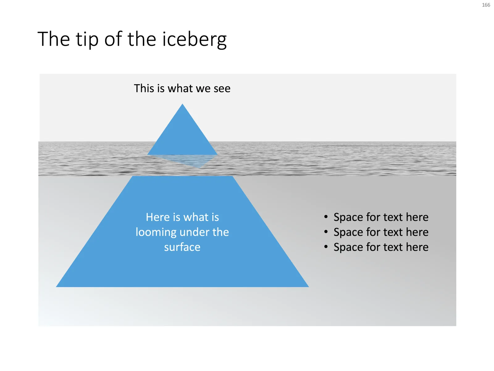
Below is what I tried to do to the infamous tip of the iceberg slide.

 The tip of the iceberg presentation

The tip of the iceberg presentation “classic” (or cliche?)

  • Don’t try to make it look too photo realistic, but rather use an abstract simple geometrical shape, and use the presentation accent color (instead of white against a dark background)
  • Keep the slide very simple, but the depth effect is actually created with clever layering of (partly semitransparent) shapes and image crops, it took me some head scratching to figure out
  • Shift the whole composition to the side to leave some more space for text, if you need it.

All in all, this chart looks better than a boring list of bullet points that describe some looming threat you want to warn your colleagues about. Just resist the temptation to fill that empty piece of arctic ocean on the right or the crisp polar sky with text.

Continue reading →
·Layout

The pillars and other PowerPoint cliches

Some presentation slide layouts have been used so many times that they have become a cliche. You know it, when you see one. In very high profile presentations, it is a good idea to take them out and replace them with a different design, to prevent the audience from thinking “Oops, it’s going to be one of those decks again”.

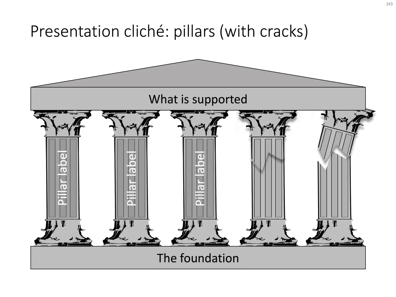
I am pragmatic though, and I you need to stitch together a quick deck for tomorrow’s strategy meeting, and yes, you have a case that your strategy depends on 5 pillars, I will forgive you for digging up that temple slide from the archives.

For your convenience, I have created a downloadable pillar/temple slide in the template store. This version can also come in handy when you need to address not totally stable strategies. In case you  are curious, I  have labeled some other slides as “cliche” in the template store, you can a run a search for the keyword “cliche” and see what comes up. Do you agree?

VC pitch cliches

If you are pitching VCs for money, it is a good double check to scroll through these suggestions how to ruin a VC pitch in 5 words or less.

Some of these are funny, some of these are not. But more interestingly, it reveals the cliche jargon that people are using in these pitch meetings. The first check is if your pitch is directly dependent on one of these. The second check though is whether a VC or other investor who might not know you very well, is a bit tired (you are pitch #15 of the day), and just got distracted by a message on her phone, might actually perceive that you are making this mistake, are just the same as all the others.

How do you come across when people are not paying attention 100%?

Photo by Daniela Holzer on Unsplash

Designing for speed readers

Most books, blogs, and courses about presentations aim at a setting where you present for a big audience. The role of the sides is the support the presenter, who is the central element of the full theatrical performance.

The majority of decks as I see them coming across my desk are meant to speak for themselves, as an attachment to an email for example. “Send me the deck”, says the investor after a 2 minute talk at a conference. Your audience here: impatient speed readers.

Think about yourself browsing a newspaper, or a piece of research. What do you pay attention to, what do you ignore? Some points to consider:

  • Like on the big keynote screen, a page full of dense text and bullet points will get skipped over
  • But, super short, summary statements will not be understood without context, since you are not there to explain them.
  • Anything that sounds like what everyone else is writing, full of cliches, will get skipped over.
  • Real photos attract the attention, people on the team, the prototype, the office, even small text surrounding it (you often read the small print under an image in a newspaper)
  • Arguments, comparisons, pros and cons, need to be made very visible in clear tables or graphs, remember how in car or consumer electronics reviews to skip right to the end to the red and green check marks.
  • Personal stories that sound interesting on stage, might look clumsy when written down in a deck.
  • Watch out for inconsistencies, errors, in financial data and/or market sizes, someone reading at a screen has more time to go back and forth than someone sitting in an auditorium. Errors cost you credibility.
  • Consider putting links in your deck so people can instantly go to LinkedIn profiles of team members, or the source behind market research.
  • The speed reader is a bit less patient to wait for the big punch in your story. Building excitement and anticipation can work great on stage (like a DJ building towards that drop), the speed reader can’t resist and will click through the last page to see how the story ends.
Continue reading →

Non-cheesy quotes?

Most quotes in business presentations are cheesy cliches uttered by people you never heard of. What can you do to avoid falling in this trap?

  • Decide whether your story actually needs a quote at all. In many cases the answer might be “not really”. That workplan deck for a major cost cutting project does not get any more cheerful with a happy “let’s do this together” quote at the end.
  • If you want to give it it a try, make the quote very specific to your situation. Googling “inspirational business quote” will definitely not get you a specific phrase. Generic inspirational quotes have been used so much that they might actually have the opposite effect of firing up people to do something passionately. Quotes with a touch of humor or self-mockery could work much better.
  • To weed out the business book best seller authors, search for quotes by specific people, either because they are in a relevant field or maybe because you admire them. Oscar Wilde produced many for example.
  • Make sure you get the exact, correct, original version of the quote by doing a bit more research than the first Google result
  • Place the quote on a nicely designed slide.

First impressions

An investor double-clicks an attachment, you make a first impression already which is totally disconnected from the idea you are trying to pitch:

  • The slides have a reasonably professional feel: not the standard Microsoft Office template, not a 1990s bevel and gradient template, no times roman font, slide formats are more or less consistent throughout the presentation, images are not cheesy and/or stretched
  • The slides have a grown up language, which shows that the author understands the audience: no padding with buzzwords, no 101 introductions to a subject that any VC is supposed to master, no presentation cliches (“in this ever faster changing world where we all have become digital nomads”)
  • Early in the deck it is at least clear what you are doing
  • The email addresses are not gmail, and the company domain has some sort of place holder in a consistent look & feel with the presentation. LinkedIn pages of founders are consistent and up to date.
  • You are sending a PDF, not a PowerPoint document, and it fits in a 10MB file

These are examples of the digital equivalent of the first impression you get with a handshake. Your deck is compared to all other decks this VC has seen in her career in more or less a second. And she has developed the intuition, what sort of decks usually are associated with good deals, and which ones to avoid.

Cover image by rawpixel on Unsplash

·PowerPoint

Quote slides in presentations

Quotes can add credibility to your presentation. If experts, celebrities, and/or customers agree with you, you must be right. But, not all quotes have equal weight. They have been overused in many PowerPoint decks. (Anyone can find a picture of a serious-looking person and get her to say what you want her to say in a few mouse clicks).

Here is a check list:

  • The person needs to be relevant and credible (third tier social media “experts” do not carry much weight)
  • The person needs to be identifiable (“Senior marketing executive at major high tech firm” can be anyone and is most likely you)
  • The quote needs to be interesting, cut the buzzwords and marketing language, cut the cliches (“Wow,  these guys really have a targeted value proposition that resonates with my medium-term return on investment objectives”)
  • The text needs to be long enough that it is specific, and short enough that it reads like a headline. A full page of verbatim will not come across
  • The quote needs to be relevant, a generic motivational quote might not help close that enterprise software contract.

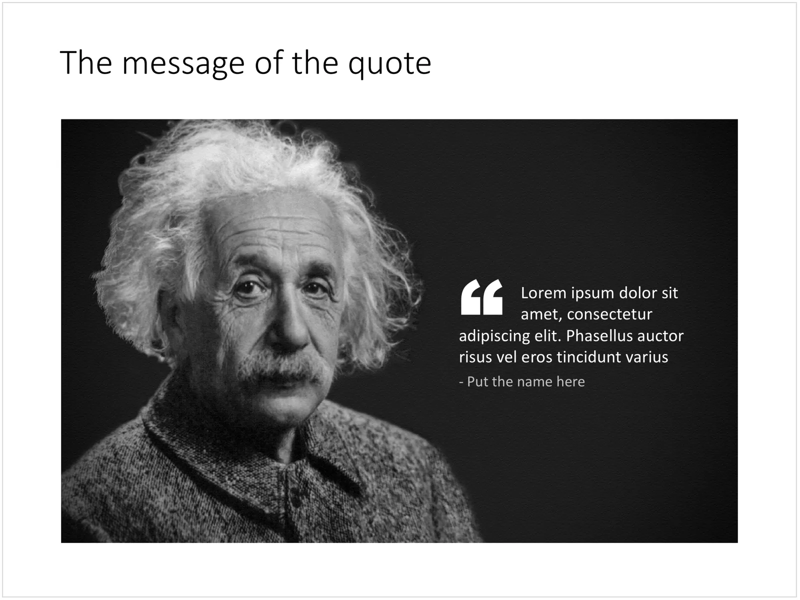
Quote slides are (and should be) pretty simple: a nice big image with a big text overlay. Still there are some things to watch out for. Below is a quote slide that I have added to the SlideMagic template store. Let’s go through the design process.

 A template for a quote slide

  • The image should have a calm background with enough “white” space for text. You don’t need to be a Photoshop guru to extend the background of an image in PowerPoint, it is easy to add a black or white box next to images. You can use the colour picker to match the precise colour, or use semi transparent overlays for the best effects
  • Make the quote symbol stand out. Regular quotes are too small, and the layout does not look good, as the quote pushes the start of the paragraph in. There are endless ways to do it and I settled on this one. One big quote at the beginning of the paragraph with a text indent. Take some time to find a quote in a good font. In the above slide, the text font is the Microsoft Office standard Calibri, but the quotes of this font don’t look that “fat”, I used Arial.
  • This slide is a framed image slide, which gives me the opportunity to add a big headline at the top of the slide with the main message (the headline can say “Customers are really happy”, the quote can say “With product [x], I no longer need to use a pencil”.
Continue reading →

Cliche ads

Business speak is full of cliches, and when you take a cliche headline, and use a cliche image composition to visualise it, you get a cliche ad:

The small print in the ad:

Always one step ahead of the game: Predictions prove a bright future for you. Out autonomous vehicle will be safer, smarter and instinctively more brilliant than anything on the road

On the web site, it has a slightly different version of this (which is actually clearer and gets to the point what the ad means):

Always one step ahead of the game: Complex driving environment requires driver’s fast decision making and responsiveness. Autonomous Ioniq detects and protects its driver even before driver notices hazardous driving situations on the road. Hyundai Motor Company steps forward to bring safe driving environment for everyone.

The ad agency should have picked another visualisation to support their message. The current one is a cliche visual, but also the slow-paced chess does not connect to snap second decisions that can save lives.

It takes more than the slides

The Internet is full with research reports on any subject you ever wanted to explore. In theory therefore, it should be easy to Google together a pile of slides on a certain subject, “Frankenstein” a deck together and go on stage as an expert in a particular field.

Unfortunately, it is not that simple. The audience will figure out very quickly when your knowledge of a subject is exactly the amount of content that is written on the slides. It shows in the way you answer questions, it shows in the way you present your slides.

This can often happen when an executive in the technology industry gets invited for a conference to speak about “the latest in [fill in technology buzzword]”. People take too little time to prepare their talk, and the result is a stumbling performance that recycles some cliches about the subject.

The same is true in consulting firms, where a junior analyst gets charged with “pulling some slides together” on a subject and gets sent of to present to client at the last minute to stand in for a more senior consultant who could not make the slot.

What to do?

Option one is to adjust the topic you are speaking about, often conference owners will be open to this. Speak about something that is really close to what you do day to day. Even if you do not answer the big question on this huge issue everyone is thinking about, that very personal, very specific experience that you have will be very valuable.


Continue reading →