New PowerPoint 2016 for Mac can beat Keynote
The preview of the new Microsoft Office 2016 is out (finally) and I have installed it on my production machine letting it do all my presentation design work for clients. (You can download the Office 2016 preview here)
- It looks beautiful. PowerPoint 2016 for Mac looks exactly the same as PowerPoint 2013 for Windows. A calm flat user interface. Working in a beautiful software environment always encourages you to create beautiful presentations.
- The whole interface feels faster, snappier, and smoother, somehow. This is especially true for Excel. The current version of Excel for Mac has a highly annoying latency when entering data in cells.
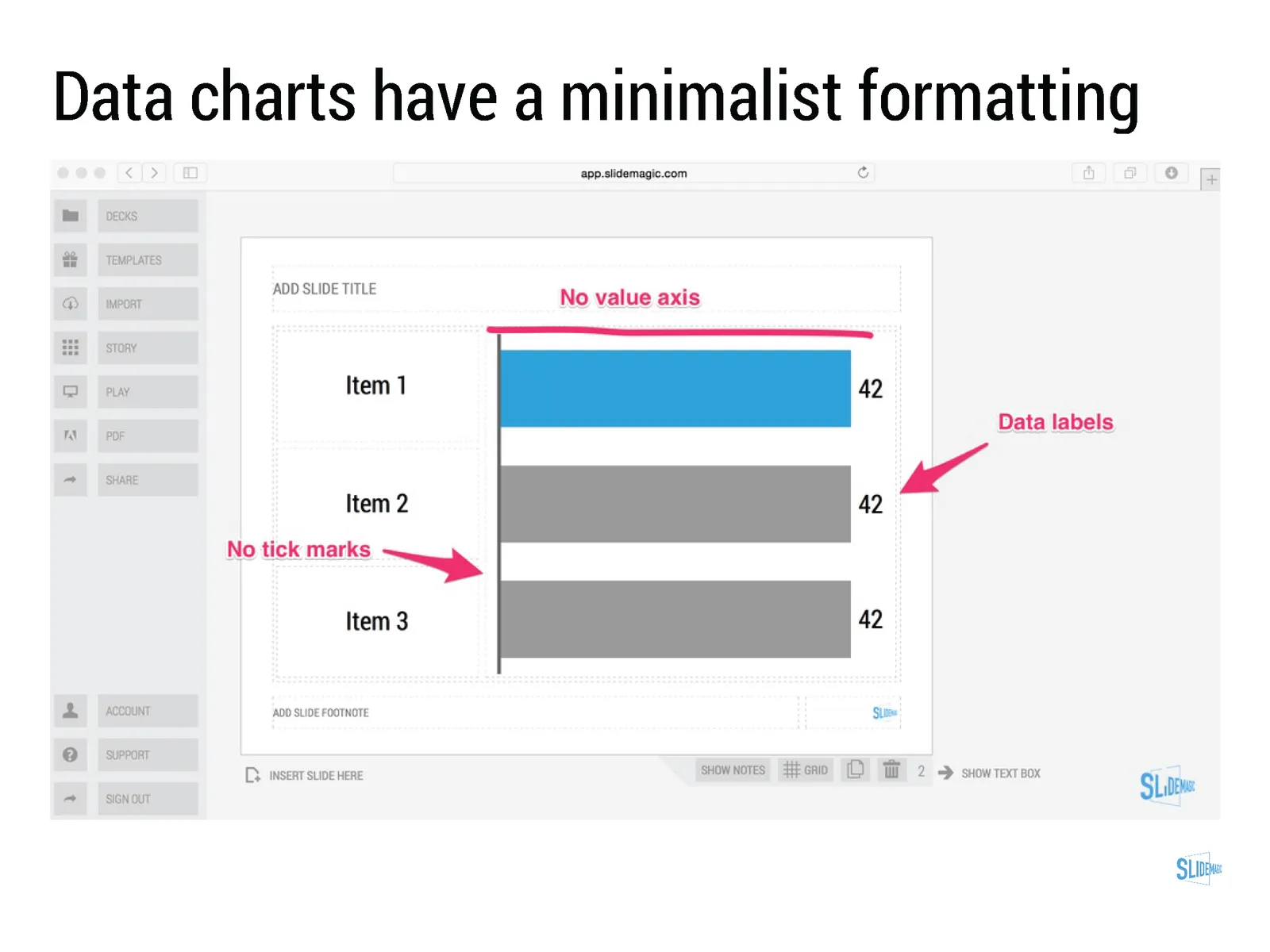
- Subtle changes to the default colours and fonts. Gone are the boring olive greens of the old PowerPoint colour scheme. Calibri light looks great on Retina displays. Gone are the default gradients and drop shadows. Gone are the tick marks in data charts.
- The commenting infrastructure is nice for collaboration with other people
- Full integration with OneDrive cloud storage (if Microsoft has guts they should add Dropbox as well, and maybe even Google Drive).
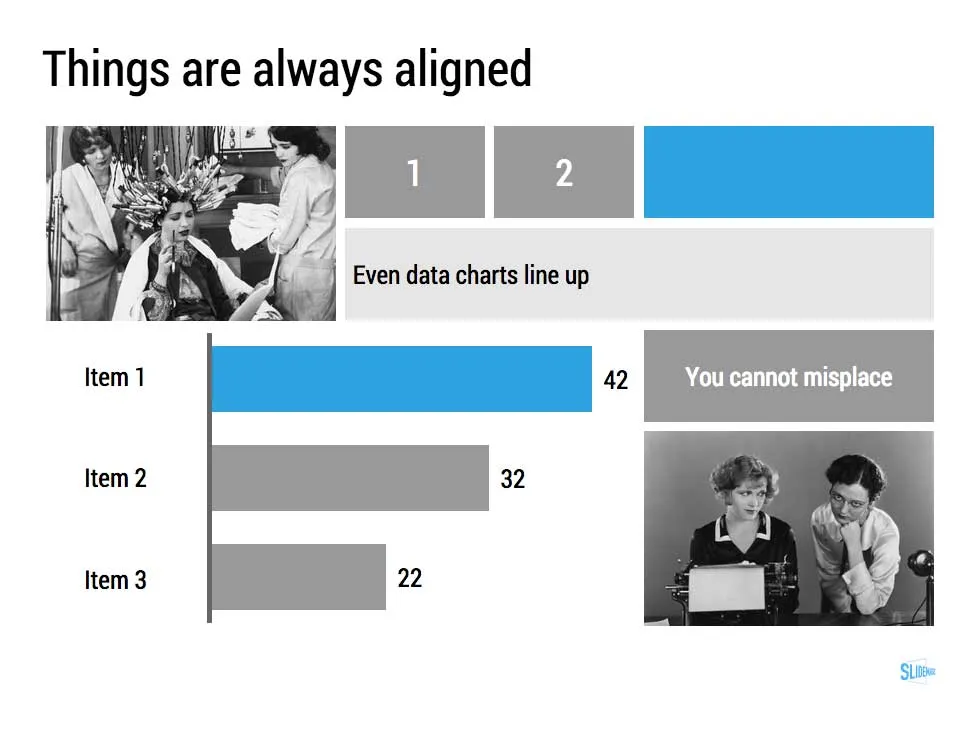
- Now PowerPoint gives suggested snap lines to place objects, automatically distributing and aligning things on your screen.
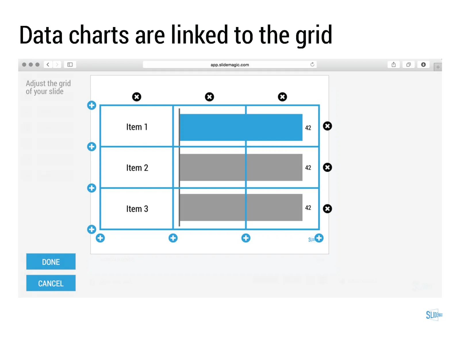
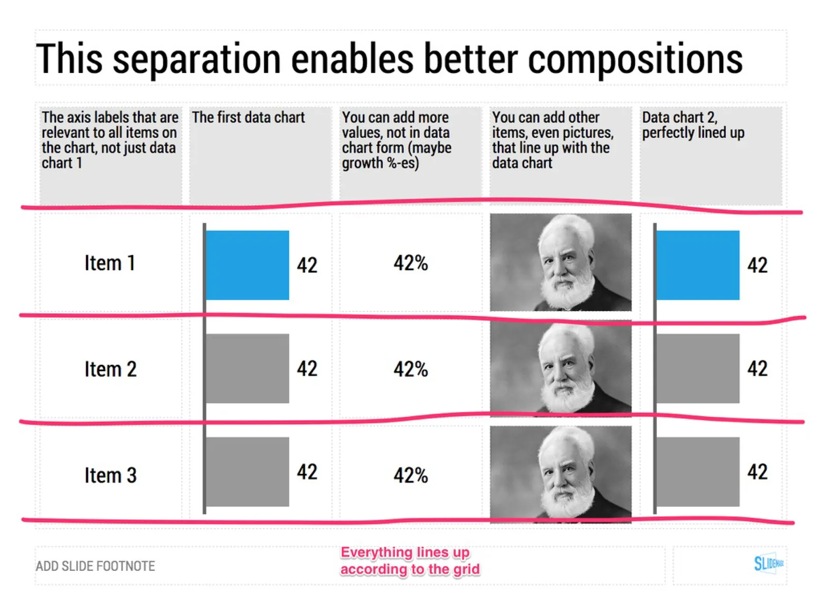
- The grid behaves more normal with a centimeter ruler. If you accidentally move a grid line (yes, this still happens) it is easy to move it back to the right position.
- Now text and shape backgrounds have the exact same colour rendering, an annoying bug in PowerPoint 2011, where despite selecting the same RGB value, colours on text and shapes would render differently.