SlideMagic Blog

Frequent updates about all things presentations since 2008. Subscribe to never miss a post.

RSS
all posts

Search results for “web design”

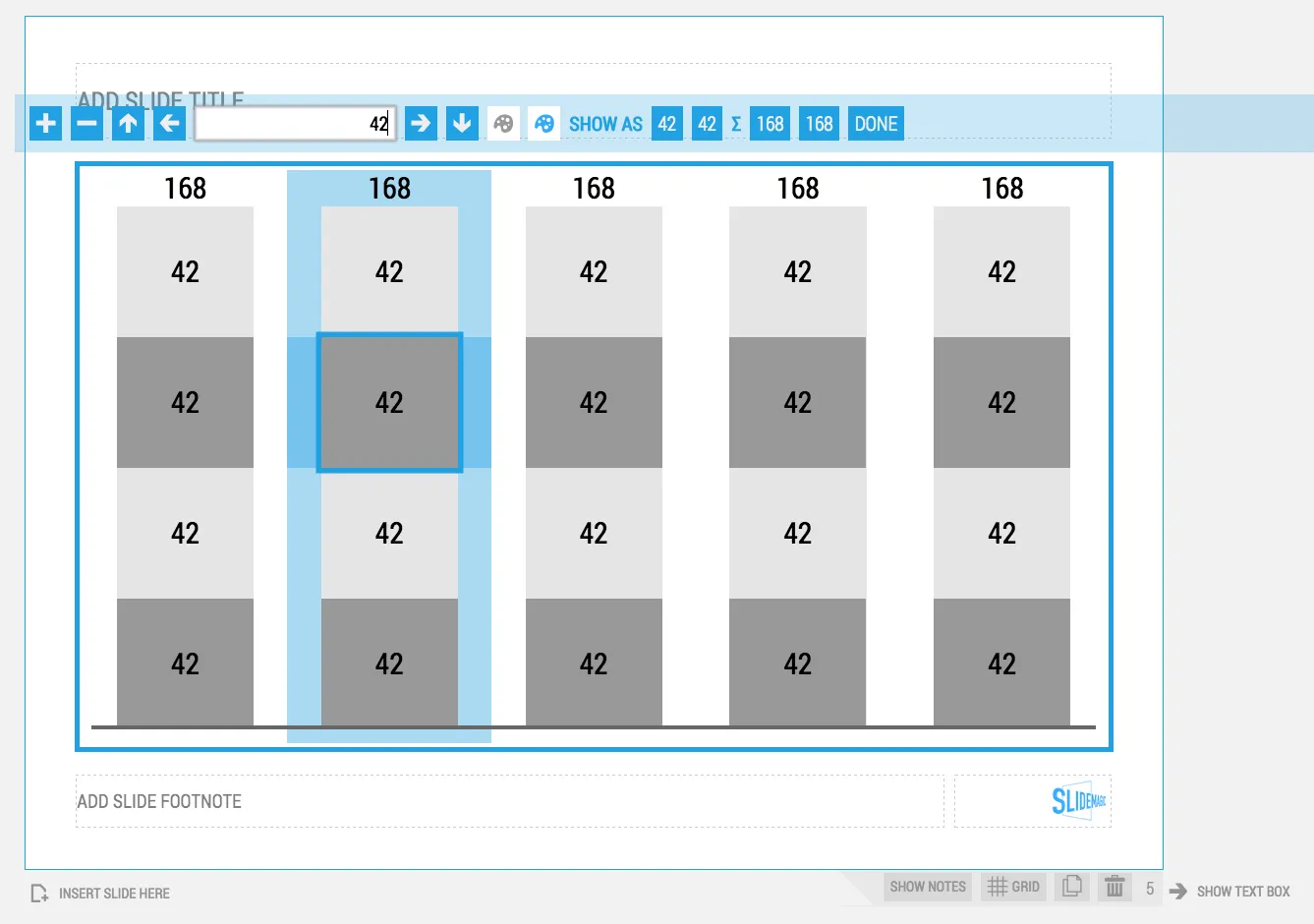
The new stack chart UI

I have recently deployed a new user interface for the stack chart in my presentation app SlideMagic. You can now edit things live on the screen rather than in a separate spreadsheet.

Stack charts are the biggest UI challenge of SlideMagic. How to keep them simple… It is getting there but not perfect yet, I still need to fix the suggested rounding algorithm and make it easier to create a legend. Let me know your thoughts.

·SlideMagic

Thoughts on user interfaces

As I am making progress with my presentation design app SlideMagic, I spend a lot of time thinking about user interfaces (UI) for office applications.

Part of the reason that it is so hard to wean people of Microsoft Office applications is that they have gotten used to the mouse/click/dropdown user interface. Spreadsheets, word processors (who uses them still?) and presentation design software all basically have that same UI.

The drop down UI started out pretty simple. File, edit, help menus. Over the years ribbons and tool bars have complicated things. Most people now use a fraction of the functionality that is available to them. As soon as a program does not have that familiar dropdown UI, people are in trouble. I had a hard time understanding the new Adobe Acrobat UI. It is beautifully simple, but it takes time to figure out how to do very basic operations (zooming in and out, combining multiple files into one, rotating mixed up pages of a scan).
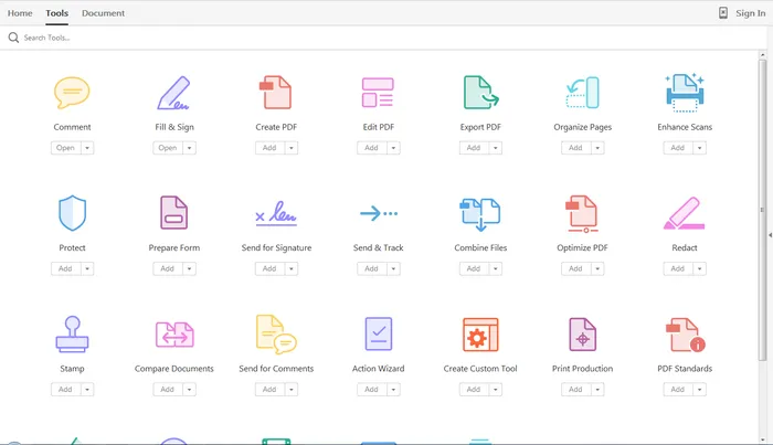
Over the past years, user have gotten to know a second UI: the mobile device. The solution for office apps is super simple functionality that draws heavily on icons, UI elements that we have learned from mobile devices.

See how it can work in SlideMagic.

Investor presentations are not (exactly the same as) TED talks

TED talks have done great things for presentation audiences. They set the standard for minimalist slide design, carefully thought through story lines, and well-rehearsed on stage performances. These are great things for investor presentations as well. However, there are differences.

  • TED talks have a broad general audience, investor presentations face highly specialised, knowledgeable audiences that will have heard dozens of similar pitches by similar companies trying to do similar things
  • TED talks have big audiences without Q&A, investor presentations are dialogues before a smaller audience
  • TED talks are watched live or via online videos (i.e., the presenter is there to explain), investor presentations are often read on a screen without someone present to make the points
  • TED talks aim to change the audience behaviour or stun the audience with a new/little known fact/innovation. Investor presentations aim to get you through to the next round of a due diligence process
  • TED talks do not require detailed information, audiences of investor presentations might obsess over the value of very specific benchmarks (web site visitor behaviour, clinical research results)

In short, use all the good things that you learned from TED performances, but don’t copy a TED format blindly when pitching investors.

Image by urban_data on Flickr

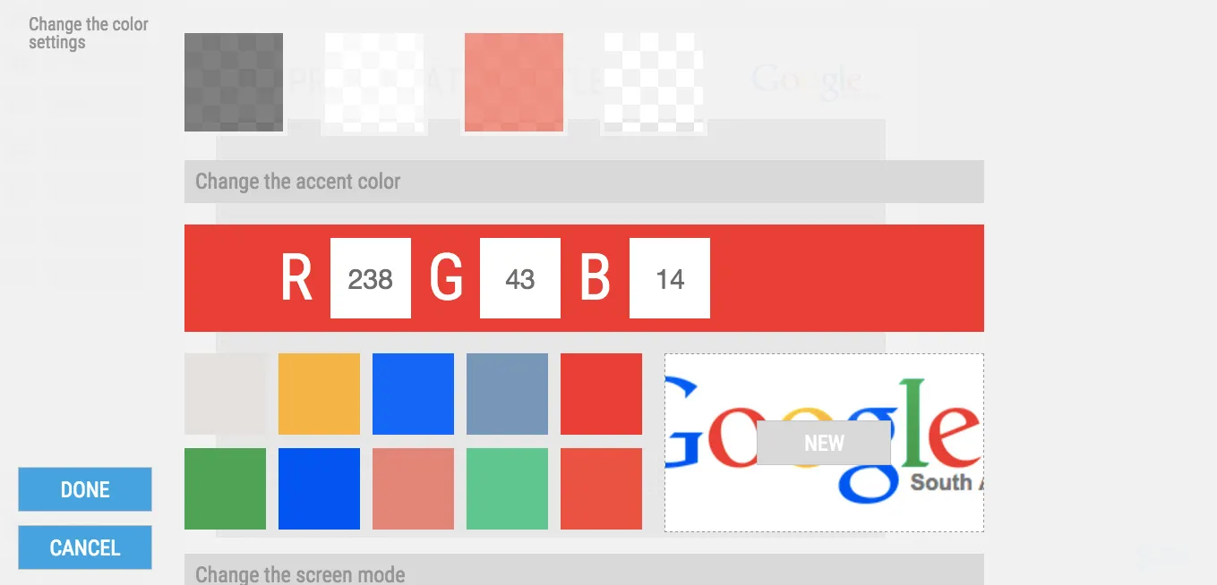
Can you test the new color picker in SlideMagic?

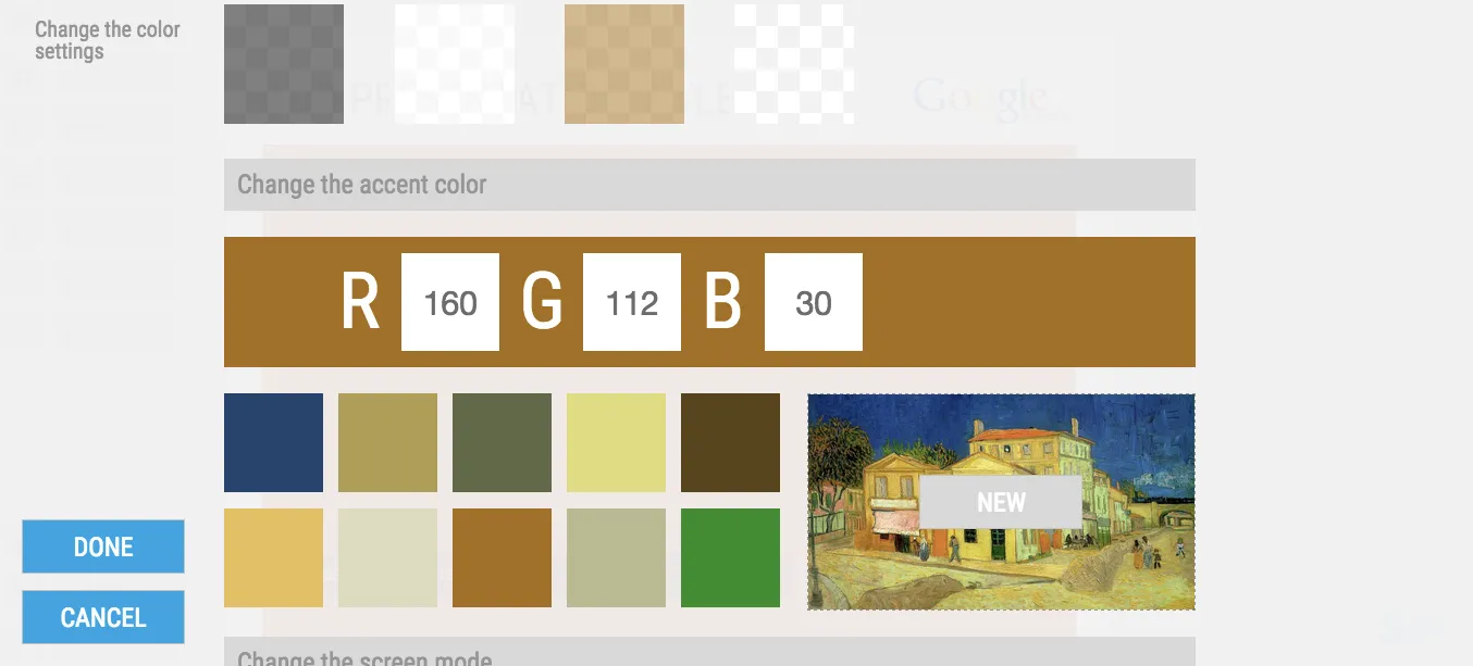
We have just deployed a new color picker in my presentation design tool SlideMagic. It extracts suggested colors from images. By default, it takes your logo image and offers a menu of accent colors that can be selected with one click.

You can also select any image that is in your SlideMagic image library.

This feature had some especially stubborn and unpredictable bugs. It would work on one machine, not on another. Maybe you can check and let me know if it works (well, especially if it does not) together with your OS/browser combination that you used.

Not a user yet? You can sign up here for SlideMagic.

Apologies for infrequent posting, I am driving through beautiful South Africa at the moment.

Art: Vincent van Gogh, The Yellow House in Arles, 1888

Lots of data in one chart

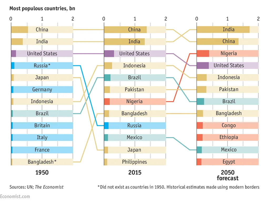
You hear it from a presentation designer: busy charts can be useful. Take this one from the Economist for example. It shows a ranking of country populations over time.

The chart contains a number of dimensions:

  • A ranking
  • Three different moments in time
  • Information about the continent of the country (colour)
  • A rough indication of the population number (the length of the bar)

It is especially interesting to see how the designer integrated the labels of the bar chart in the bars itself. Connecting lines guide the eye over the three time periods.

A number of conclusion jump out:

  • India / China are still going to be the most populous, they just get a lot bigger
  • Europe is vanishing, Africa is coming
  • Especially in 2050, there are a number of countries in the top 10 that you would not have expected there, based on the attention they are getting.

A chart like this is OK to present in a document that is meant for reading/pondering, on a big screen in front of a live audience it is a bit hard to digest. In the latter scenario, I would present the chart in full, apologise for the data complexity and then start covering up specific parts of the chart so that it supports just one message. You can have 3-4 instance of the same chart.

Photo credit: US Army, 2008 Bejing Olympics opening ceremony

A new on-boarding presentation

Recently, I have changed the first presentation that appears when people sign up for the beta version of my presentation design app SlideMagic. If you are an existing beta tester, you can still access it in the templates folder of SlideMagic, or you can clone the presentation by clicking this link. I hope it helps you get the most of SlideMagic:

  • Importing and cloning template slides
  • Working with the grid including images and data charts
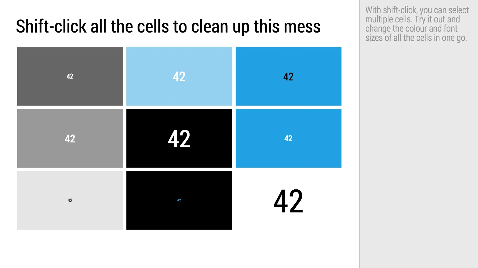
  • Formatting cells in one go, rather than one after the other

·Investor presentation

I am going to force feed my Executive Summary on you

People often ask me what an appropriate summary presentation is to send a head of the actual presentation, the dreaded “Executive Summary”.

Executive summaries and web landing pages have similar objectives. Keep the user hooked long enough to transfer the idea/messages and get her to do something at the end (click “BUY”, or reply to the email and set up a meeting).

In web design, people have learned a lot. Use lots of white space, attractive images, links with inviting text that scream “click me”, cut out boring non-essential information and put that on pages for people who want to look for it.

The Executive Summary though is still in the 1990s:

  • We expect tat our story is so boring that we need to drag the reader through it as long as we can
  • The solution: cut the amount of pages (maximum 2), anyone can read just 2 pages right?
  • Whoa, how do fit all this information on there: reduce font size
  • We need a big bold vision statement upfront (1 paragraph at least), a big bold vision statement really encourages the reader to keep on reading. Maybe there will be more big bold statements on page 2? Good stuff!
  • The it is important to link our idea to all the latest buzzwords, readers love to hear more of the things they read on the latest tech blogs. Even if it is vaguely related to your idea, put them all in there. Wow, this Executive Summary is all about these great trends? I have to read on!
  • After rereading the Executive Summary, we find that it sort falls out of the blue. We need to tie it into the big things that are happening in society. Mobile phone penetration is huge right now. Social media is changing the way we consume content. (This is especially true for younger people). Gartner and IDC have some good stats and quotes on this, let’s add them. The reader must think: I want to read more about this!
  • The broader market (TAM) is just absolutely big. We are the only company in this space but the market will grow from $15b (2011 data) to $32.67b in 2014. This size market? These guys have discovered something that I completely missed, must read on.
  • Our technology is absolutely amazing. Let’s start with the bottom architecture layer, and build it right up step by step. The “secret sauce” that makes us so scalable and flexible
  • We are 1.5 pages in, time to introduce the idea.
  • Oops, what about the team? Five bullets with CV summaries (don’t forget the undergraduate degrees, and our hobbies).
  • Squeeze the margins a bit, it just fits.
  • Now copy paste selective paragraphs to put in the cover letter of the email.
Continue reading →
·Images

Putting text on images

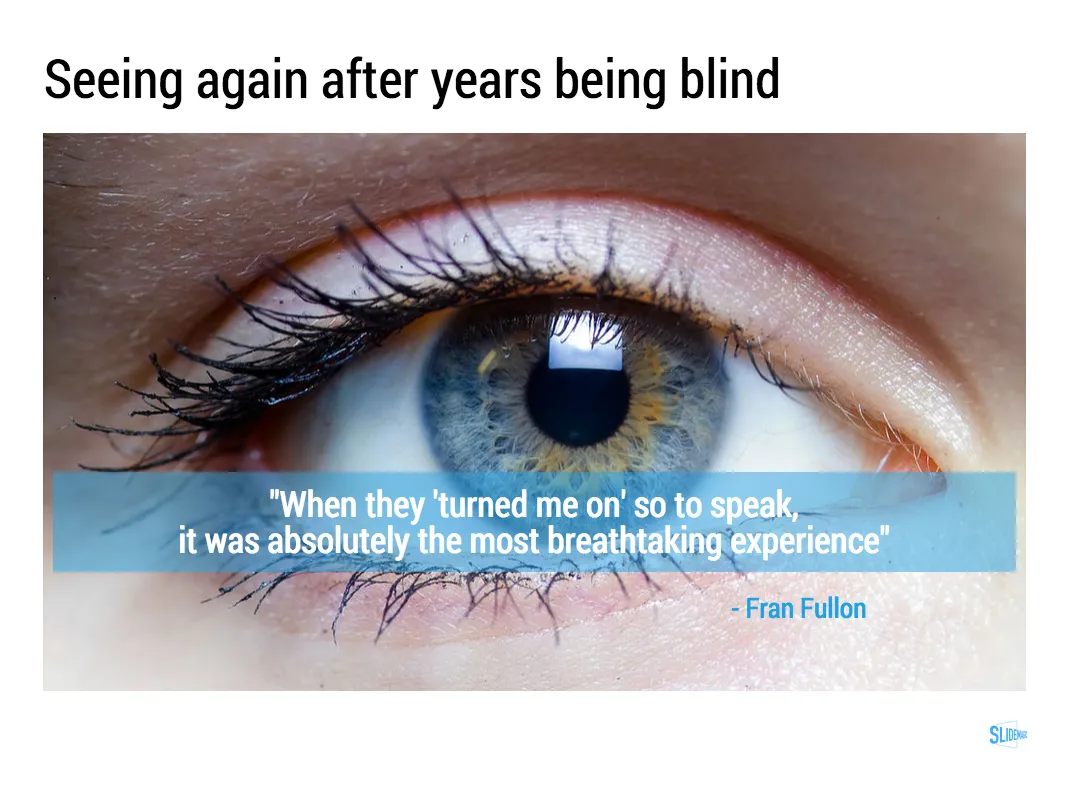
This image that I saw on Twitter has composition problems that you often see in presentation slides:

  • The text in the box does not have enough breathing space,
  • The quotation marks disturb the balance and alignment of the text box
  • The line breaks are not placed carefully enough, breaking apart words that belong together.

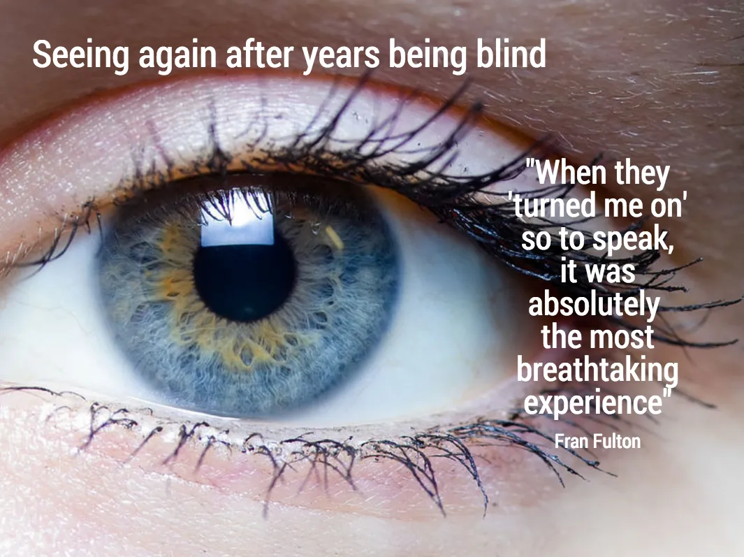
I tried to come up with an alternative design in SlideMagic (which does not support the giant quotation marks [yet]). You clone these two slides to your own SlideMagic account here and use them in your presentations if you want. Image taken from WikiPedia.

Art: detail of the Mona Lisa

·Layout

Adding structure to text

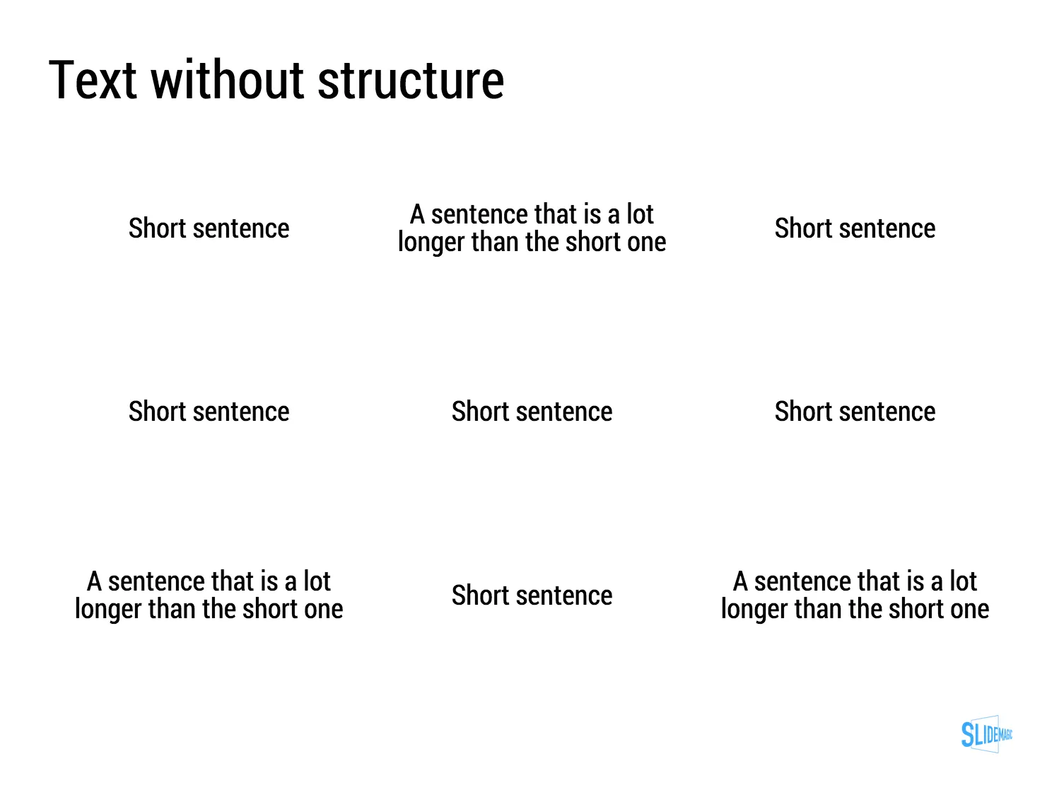
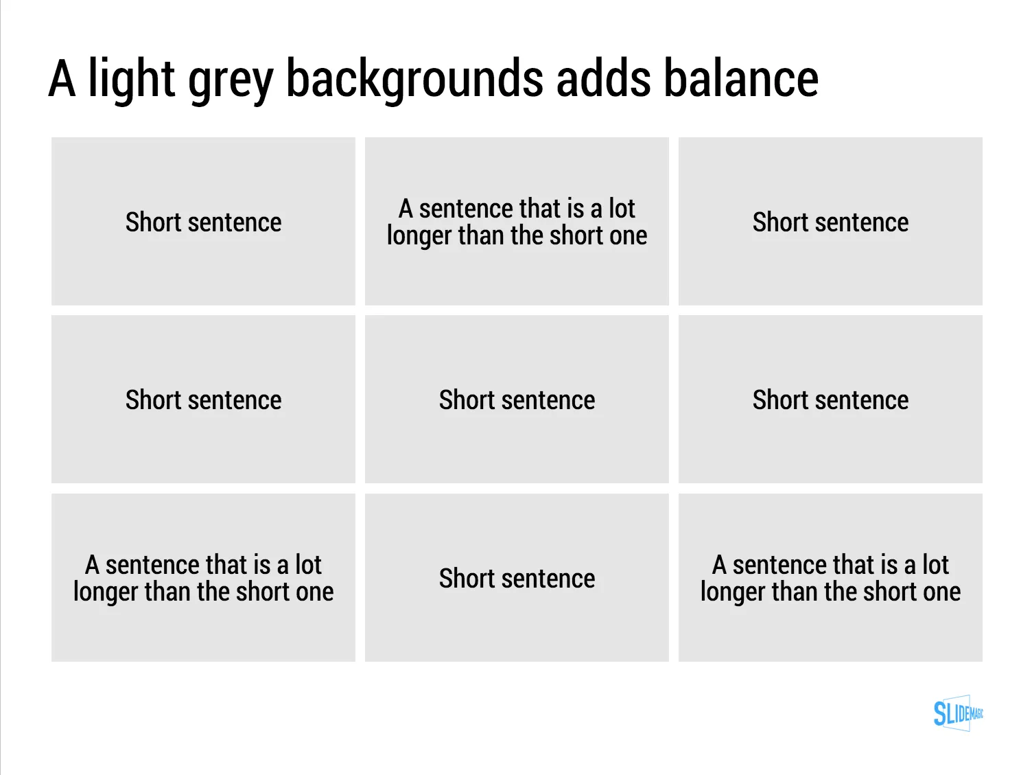
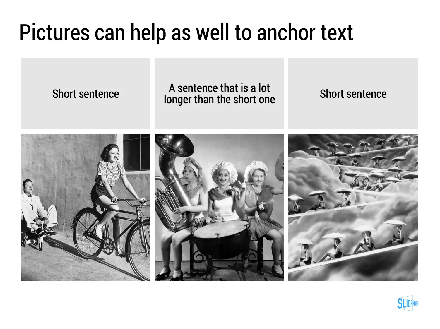
Sentences or titles never have the same length, so putting them on a page without some form of framing makes the whole slide look unbalanced. My solution: a light grey background  creates a box that gives structure to the text. You can also use images to reinforce the slide’s grid layout. Many people use an outline, a frame around text for the same purpose. I think a light box fill looks a lot better.

The light grey box is one of the key structuring elements in my presentation design app SlideMagic. Traditional presentation design software is not very well set up to changing grids of text boxes and images. Try doing it in PowerPoint, then try to do the same thing in SlideMagic.

Art: Piet Mondriaan, Broadway Boogie Woogie, 1942

The impatient clicker

The revolution in presentation design over the past 5 years has mostly been about creating better on-stage experiences. Big pictures, one-message-per-slide, consistent colours, proper layout.

The definition of “presentation” is widening though. PowerPoint is replacing the word processor in corporate communication and is used to create documents that are meant for reading rather than presenting.

In my bespoke design work, I see more and more decks that are used as attachment to a cold email: VC pitches, sales presentations. The audience setting for these type of presentations is a little bit different from the classical standup presentation. Your audience is not captive and can decide to close the file, skip ahead, at any moment. A cold email deck is very similar to a web page competing with hundreds of other links to click to take you somewhere else.

Some design pointers to these types of presentations. SlideMagic beta testers will notice that I have put a lot of these requirements into my presentation design tool.

  • Look and feel. When you are on-stage, you can masquerade the unprofessional look and feel of your slides somewhat with your overall stage presence. No such thing in cold emails. If the slides look like amateurishly designed PowerPoint slides, the company that’s behind them will be perceived as such.
  • Must click. Like the beat in a piece of music, an impatient VC or potential customer has the urge “to keep on clicking”. If the slides it boring, or hard to understand, she will not re-read the slide a second time, instead: “Oh, maybe the next one is clearer” [CLICK]. You do not control the beat, design your slides in such a way that the message comes across before the next click comes along.
  • The basics. You are not there to explain, you cannot keep the audience locked in the room and force them to go through your dramatic analogy as an opening. Tell them bluntly what you are about, right upfront.
  • Keep them hooked. For standup presentations, you do not always have to throw those impressive stats early on. Here, you have to do all you can to keep people hooked. You can do this in 2 ways: mention the impressive facts (2 million paying users in 2 months) and - maybe even more important - anticipate the obvious questions: slide 3: “This looks like a Google me-too? Wrong!”.
  • Branding. On stage there is no need to remind people whom they are listening to on every page. In cold emails, a bit of reminding is actually good. A tiny logo at the bottom right of each page is hopefully enough to get people to remember your name by the end of the deck.
  • Explanation. You are not there, so super abstract slides will not be understand. Consider using 2 lines for the slide title. Or add a subtitle box under your slide with the full length narrative in point 8 fonts (SlideMagic ships with explanation boxes to the right of each slide).
  • Details later. The first part of your presentation is all about getting people to understand what you do, and why things are so great. You do not need the full detail of your team, technology, etc. for this. But, if you succeeded, the reader might want to dig a bit deeper. Consider adding the more dry information in an appendix of your deck, in a denser presentation style. Bios of team members are a good example where dense text with rich backgrounds can add value.
Continue reading →