SlideMagic Blog

Frequent updates about all things presentations since 2008. Subscribe to never miss a post.

RSS
all posts

Search results for “web design”

·Concepts

Most templates now available for Apple Keynote

The template store now supports Apple Keynote, a drop down menu let’s you make a selection between your preferred presentation software. Not all templates could be converted, Keynote is missing the 3D shape rotation feature of PowerPoint that I used in some of the slides.
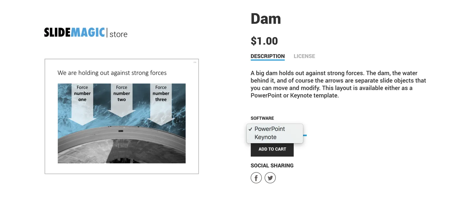
 The store now gives you the option to download templates either as a PowerPoint or Keynote file
The store now gives you the option to download templates either as a PowerPoint or Keynote file

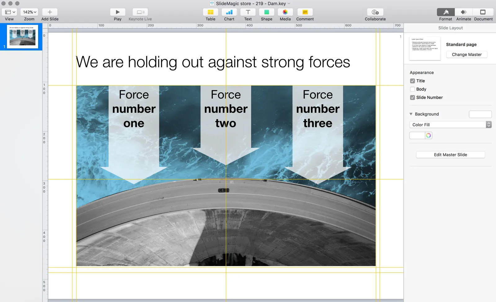
 Slides in Keynote look the same except for the font

Slides in Keynote look the same except for the font

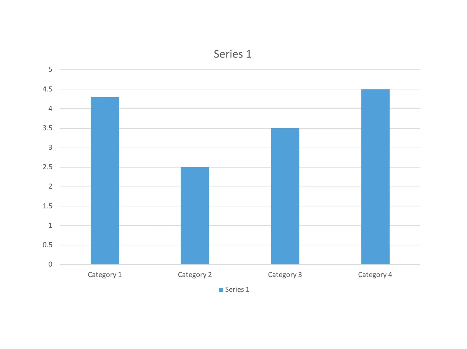
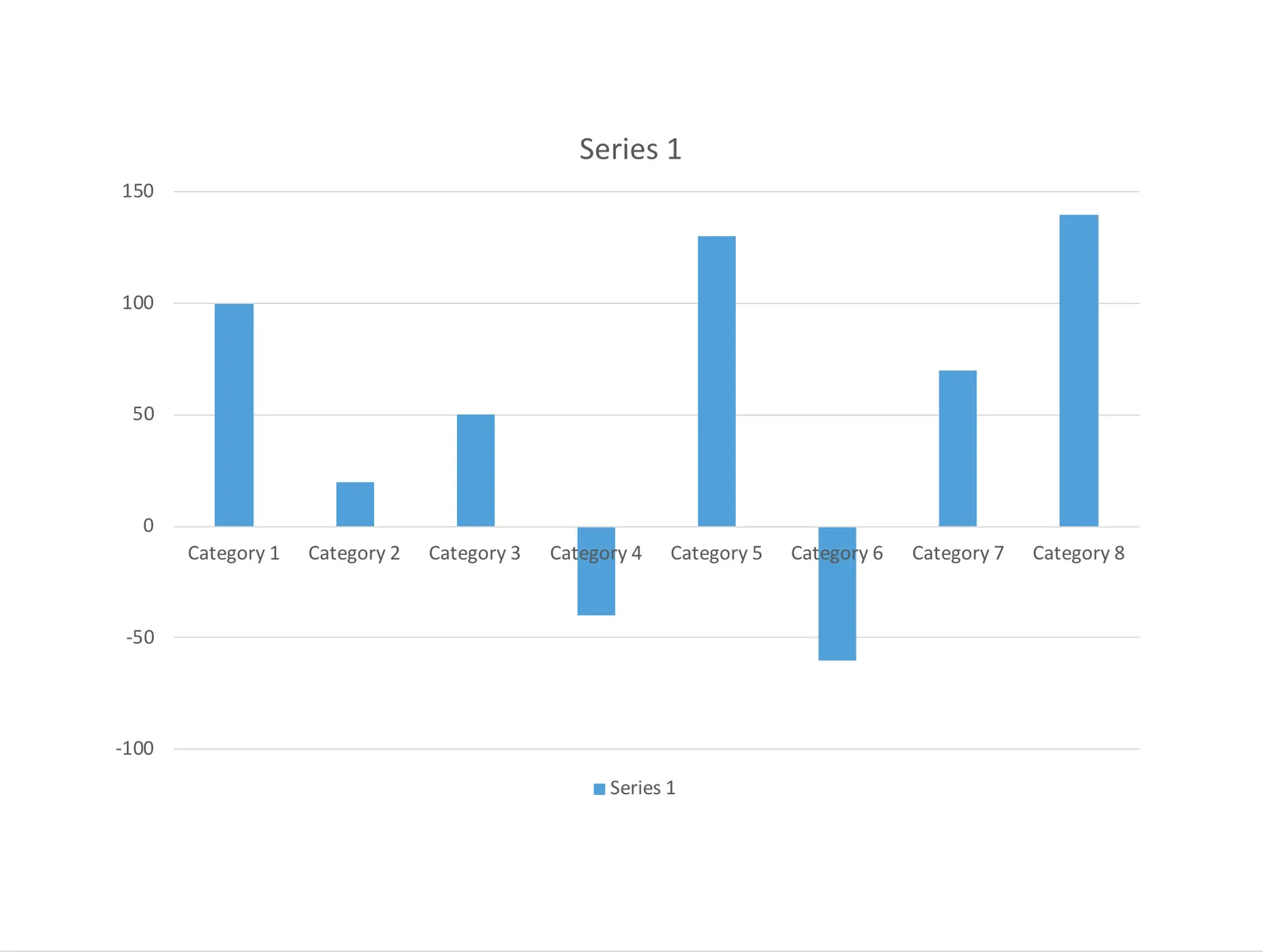
The only adjustment I made was the font: switching it from PowerPoint’s default Calibri to Helvetica Neue for  Keynote. I am keen to keep the look and feel of the charts as “standard” as possible to make it easy to integrate the design in the corporate presentation templates that people are using.
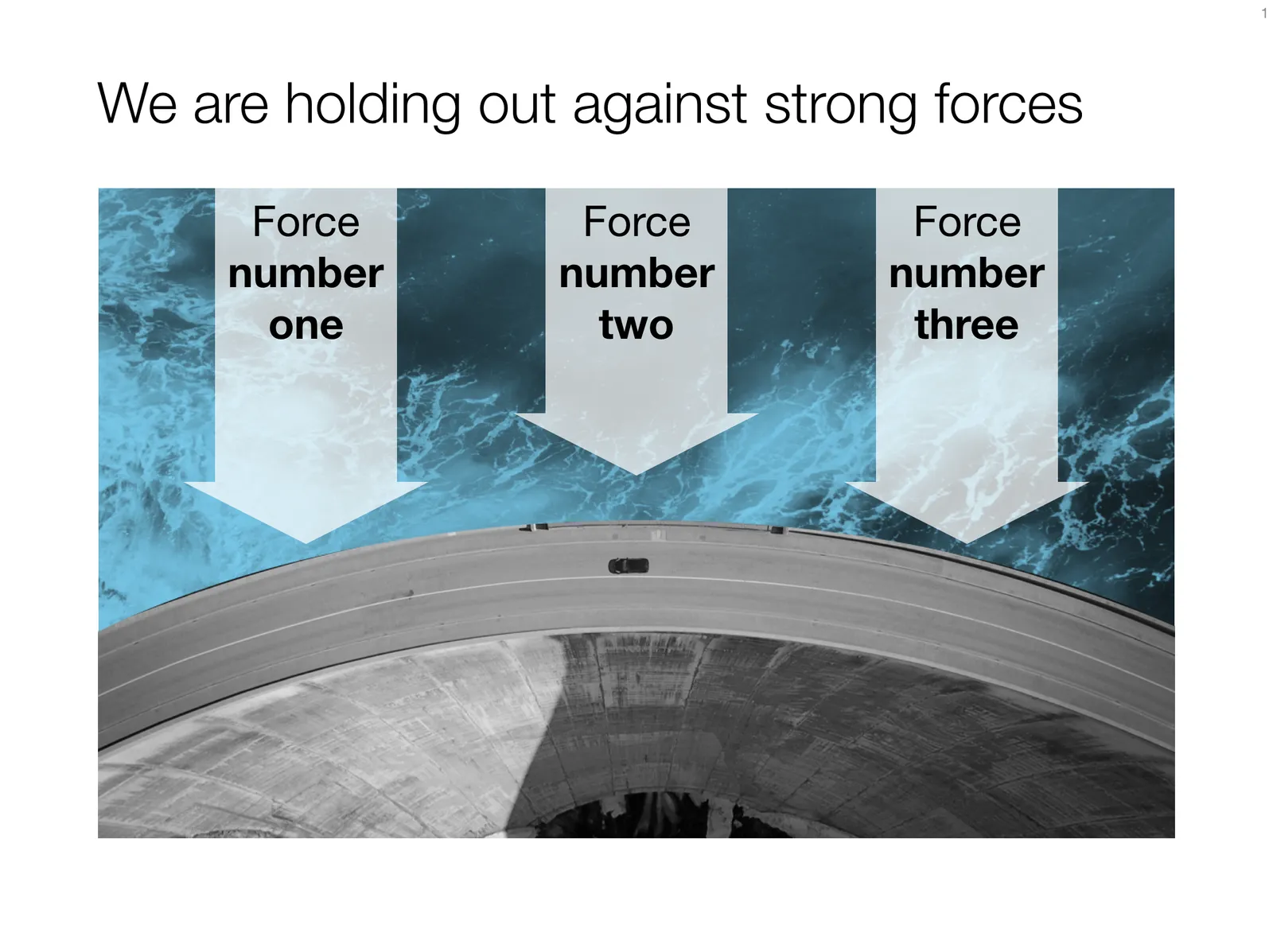
 Under pressure!

Under pressure!

The slide above is a layering of 2 images that visualizes a big dam that is under pressure from something. You can use it either to show that something is about to burst, or the opposite, that defenses are strong and holding out well. I love the massive architectural scale of these hydro power installations, especially when you can highlight it with this tiny car driving across it. You can download this dam template here.

Looking for other visual concepts that are similar? You can try and search the store for “forces”, “down”, or this search “downward” and see what slides come up. That is my longer-term vision: no more boring bullet point charts, and no more searching for “where is that slide that I made 2 years ago”, but rather have all the relevant designs ready at your finger tips. The search engine with design ideas is almost as important as the actual design itself.
Continue reading →

The SlideMagic "insert" templates

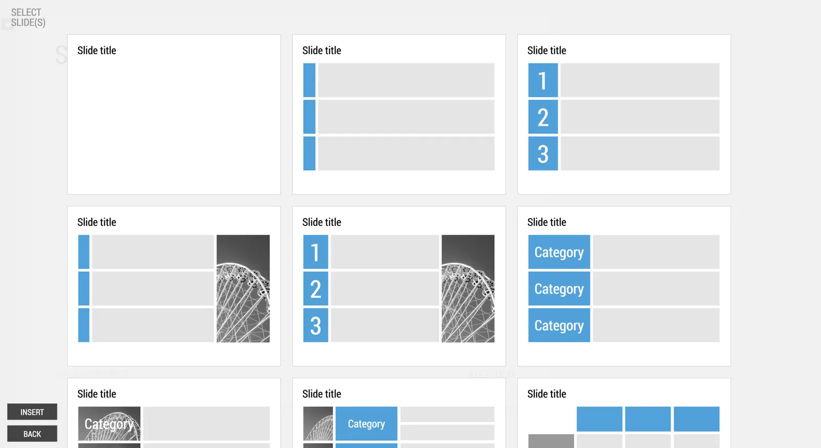
When you hit “insert slide” in my SlideMagic presentation design app, you get presented with a number of basic grid layouts for the slides.

 Here is the menu you are presented with when you select

Here is the menu you are presented with when you select “insert slide” in the SlideMagic presentation design app

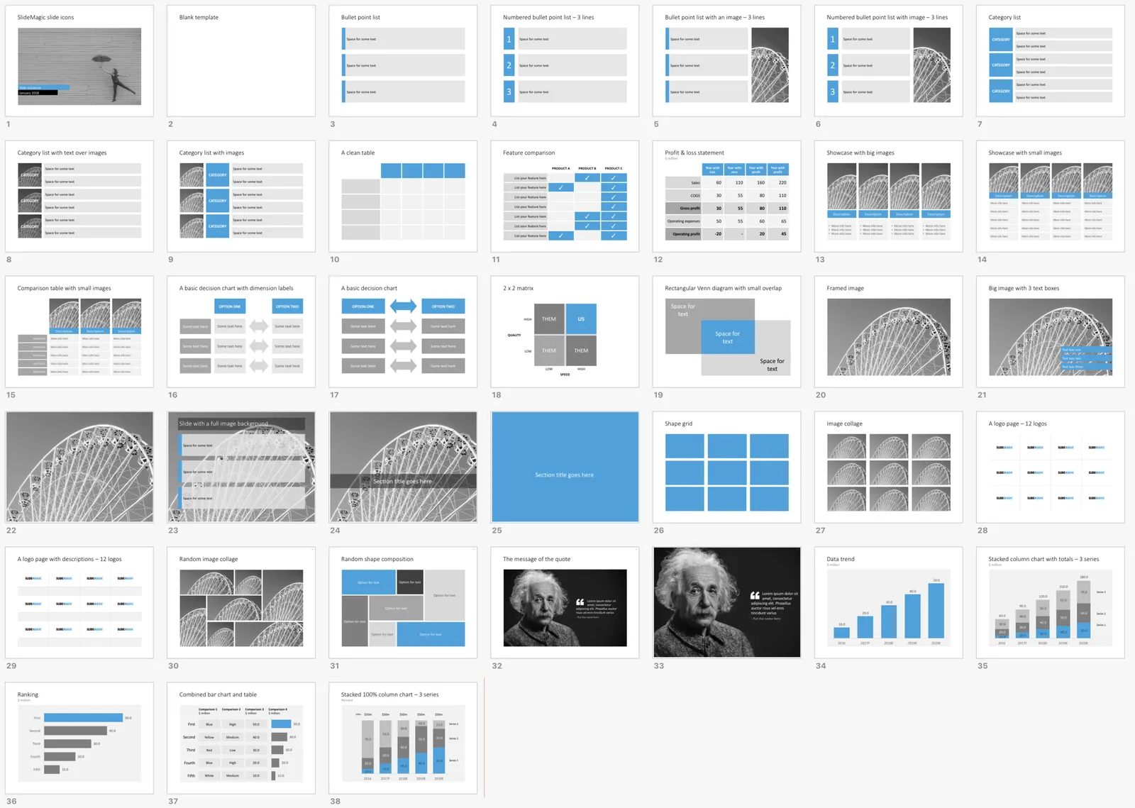
Many people have asked me for these layouts in PowerPoint, so I added them to the SlideMagic template store, you can download the template bundle here.

 Thumbnails of the slide layouts available in the PowerPoint template

Thumbnails of the slide layouts available in the PowerPoint template

I based the template mostly on slides that were already present in the store, so there are some deviations here and there. But, overall, these are the layouts I think should enable you to build almost any business presentation, that’s why I selected them for the app.

The file with PowerPoint templates comes with a health warning though: the reason I created the presentation design app is that it is very hard to customise template slide layouts in PowerPoint. Adding or deleting rows/columns to a grid requires some clean up and realign work that not very layman designer can do. In the template you can find more variants on the layouts of some of the slides presented here, but they probably never match your exact needs.

The app is easy to work with but integrates less well with PowerPoint, the PowerPoint templates fit right into your corporate PowerPoint template and/or colleague’s presentations, but are harder to customise. I am working hard to get rid of both these limitations.

·Concepts

Native waterfall charts in PowerPoint for Mac

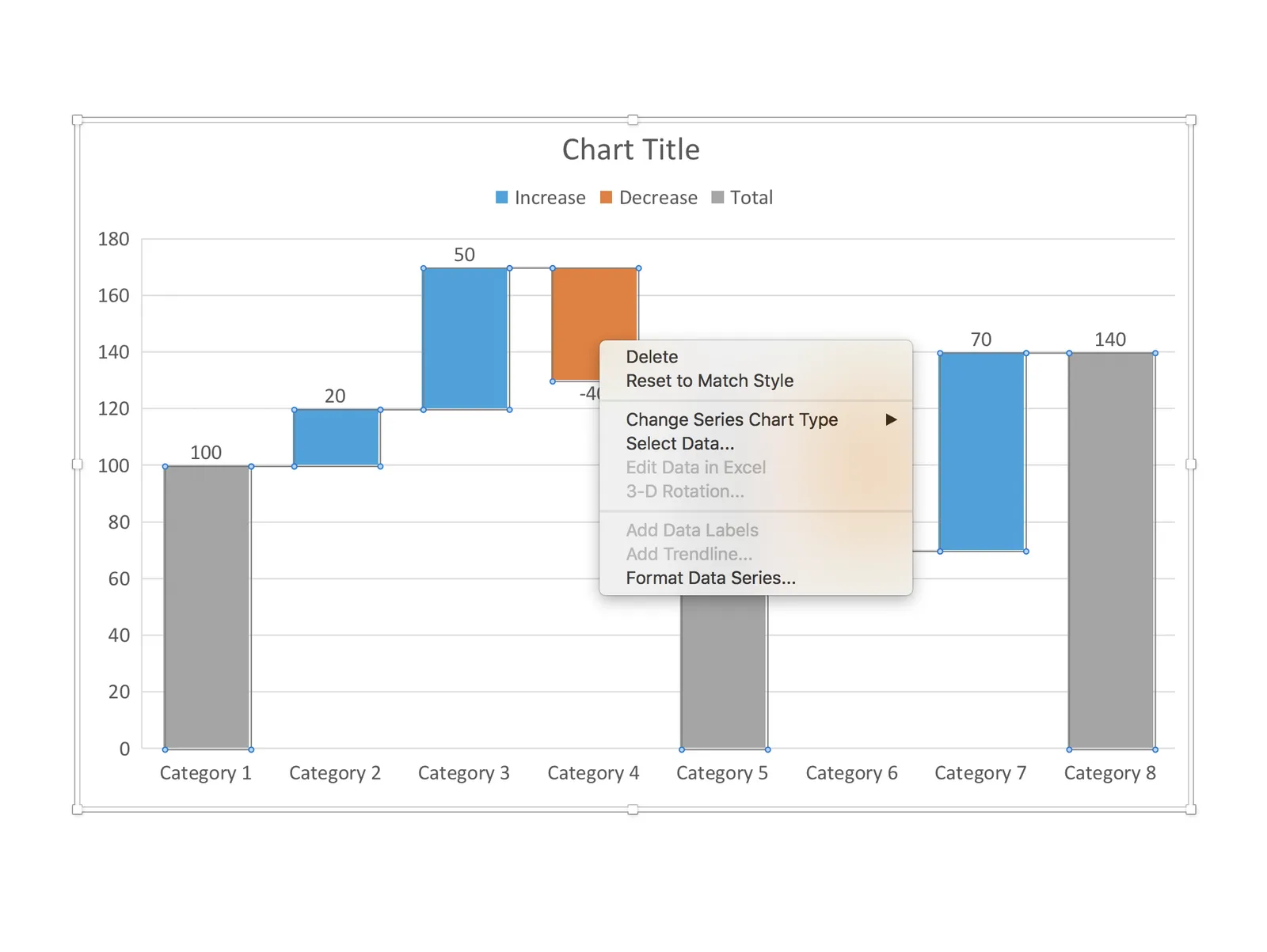
Waterfall charts have emerged in PowerPoint for Mac after a recent software update. This would be a major addition, since these types of charts are highly useful to summarise changes in data. I have shown in previous blog posts how it is possible to construct a waterfall chart starting from a regular stacked column chart, but it involves manual calculations and PowerPoint fiddling.

The new waterfall templates for PowerPoint for Mac are a step in the right direction, but things are not perfect (yet) though. For some reason, you cannot edit the data of the waterfall that gets inserted in PowerPoint, nor can you change the design of the chart. I figured out a work around:

 1. Data in the standard PowerPoint for Mac waterfall chart cannot be edited (

1. Data in the standard PowerPoint for Mac waterfall chart cannot be edited (“edit data in Excel” is grey out)

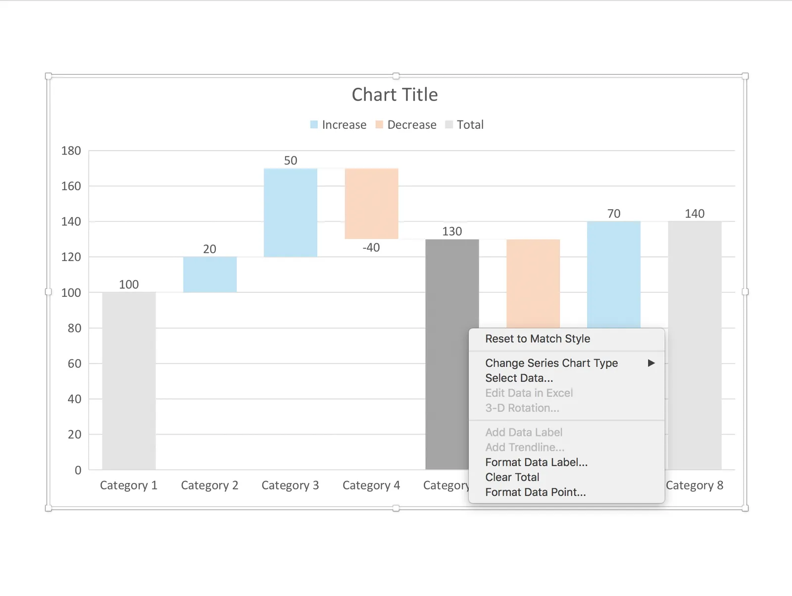
 2. The only adjustment you can make is selecting a cell, and then designating it to be a total column (or not)

2. The only adjustment you can make is selecting a cell, and then designating it to be a total column (or not)

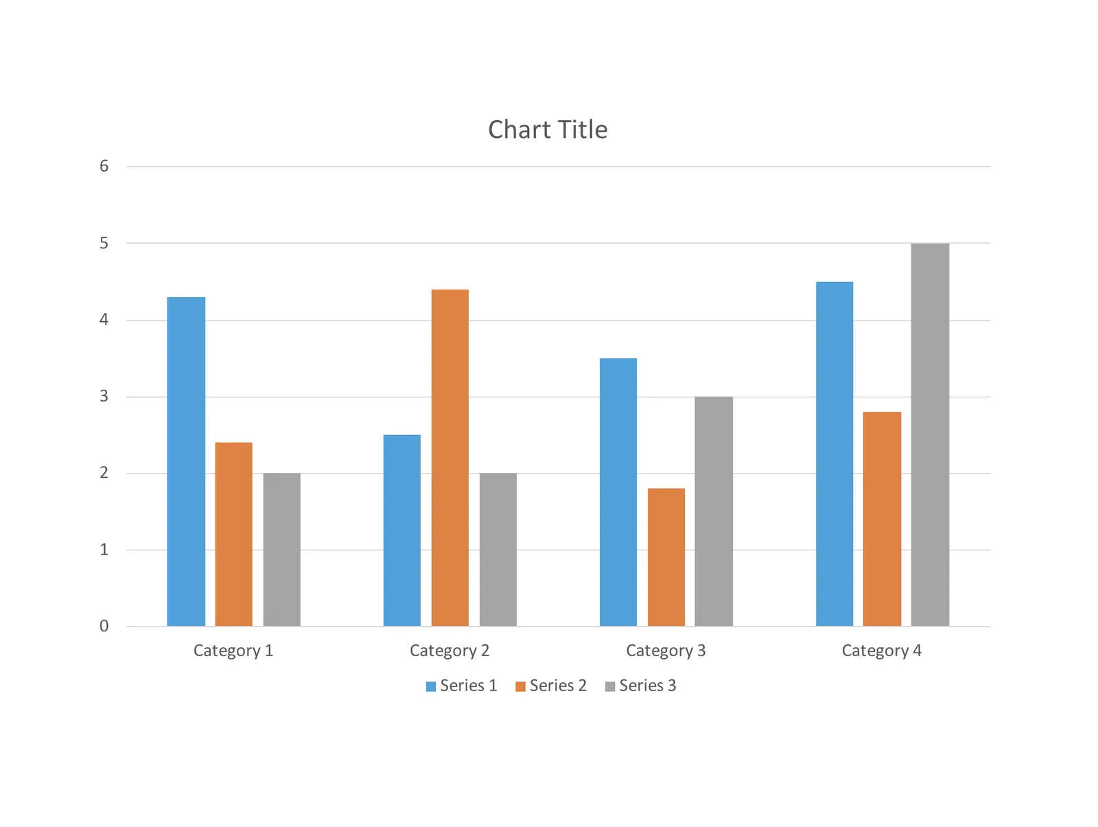
 3. Work around: add a regular column chart

3. Work around: add a regular column chart

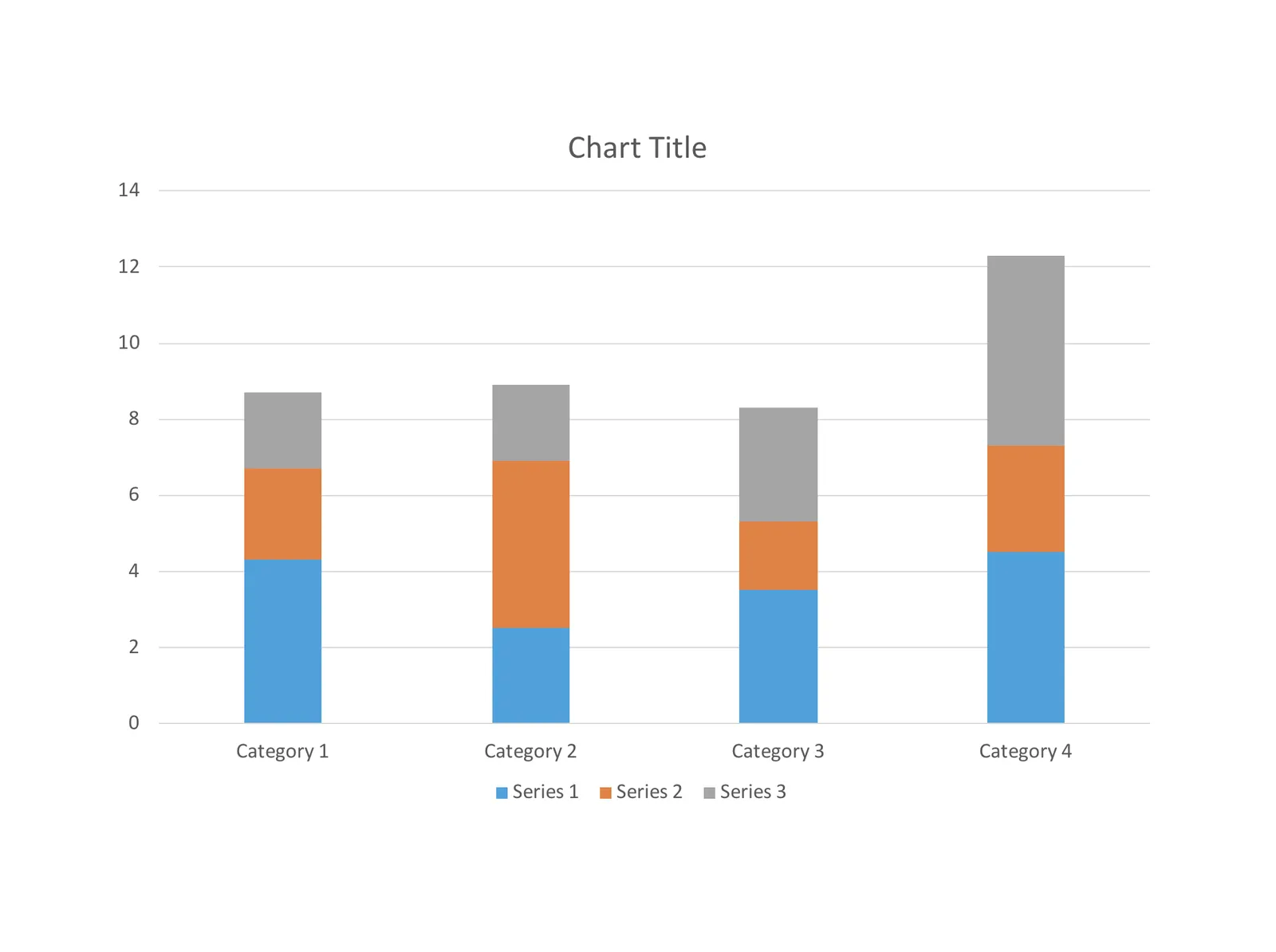
 4. Make it a stacked column

4. Make it a stacked column

 5. Delete data all but one data series

5. Delete data all but one data series

 6. Add the data you need

Continue reading →
·Templates

100+ new PowerPoint layouts

I am adding designs to the template store at a healthy pace now, so it is not possible to feature every new design as a blog post. Head over to the store and check them out, this link will bring you to the latest additions. This view is chronological, and does not represent the breadth and variety of templates that are available. I encourage you to use the search box and see what comes up, it works really well now.

My objective is to get to such a variety in the store that I can move to a subscription revenue model: you can find a starter slide for every business concept you possibly would want to present. I need to find the “sweet spot”: most PowerPoint template sites offer a huge amount of slides, but very few actual concepts, mostly permutations of images and text box layouts. Stock image sites have gone the the other way: millions and millions of similar compositions, but in the process they have diluted the quality and usability of the site. And of course, an image is in most cases not a finished presentation slide. The ideal is somewhere in the middle.

Photo by Alicia Steels on Unsplash

·Concepts

How to make organization charts in PowerPoint

I added the first organization chart to the template store. It is hard to design a generic template for organizations, there are so many different permutations possible. This is the reason they are still hard to create in my presentation design app, and this is probably also the reason that it is tricky to create beautiful organization diagrams from simply copying pasting a pre-fab template. Let’s give it a try.

Here is the process I usually go through when designing an org chart:

  1. Make a sketch on paper, and reshuffle, re-juggle existing PowerPoint organigrams. These are made by HR people, not by designers. Often you can rearrange objects in such a way that you get a much nicer composition without changing hierarchies and relationships between people and departments
  2. Find out the horizontal layer that has most boxes in it, this will determine the size of the horizontal grid. Find the person with the longest name / role title, which will give you a clue about the maximum font size you can use.
  3. Put this layer in, and add all organization elements relevant to this layer.
  4. Make sure every object is perfectly aligned, and start putting in the PowerPoint connectors. (You will immediately see when you made a small alignment glitch, the connectors will not fit nicely)
  5. Now that the whole structure is in in place it is time to put in names and roles, and if required the FTE count of the various units (the small black bubbles in my example).
  6. Take a step back and look at the whole structure to see whether there are opportunities to use color to make things clearer.
  7. You got your reference slide was all the info about all the people in the right places, the final step is to think what your specific slide actually really needs to say: our organization is big, or organization is flat, our organization mirrors our customer segmentation, everyone in the organization is over-stretched, our organization is basically 3 silos. Start deleting, adding, coloring things just to make that point.
Continue reading →
·Concepts

System dynamics in PowerPoint

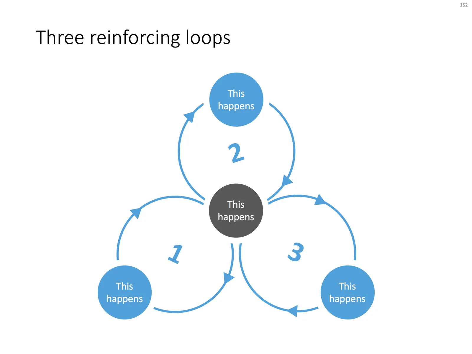
Loops are a powerful way to visualise reinforcing trends. Electrical engineers use them and refer to them as “system dynamics”. McKinsey consultants use them and call them “business dynamics”.

You can use them in a presentation to support your point, but make sure you don’t overcomplicate things like in the infamous US Army Spaghetti chart. Alternatively, you can use them as an analytical tool and add as much complexity as you want.

I often use some sort of loop diagram to scribble the basic story line of a presentation to make sure that I understand things myself.

When using a loop diagram in a presentation, go through different version on paper until you arrive at the most pleasing design, with the minimal amount of overlapping arrows in your spaghetti.

I have added a basic loop diagram to the template store. They are a bit tricky to make in PowerPoint, if you want all the circles and arrows to line up properly.

·Layout

The pillars and other PowerPoint cliches

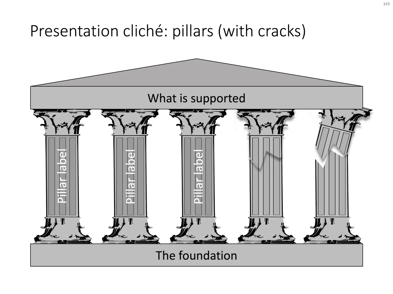
Some presentation slide layouts have been used so many times that they have become a cliche. You know it, when you see one. In very high profile presentations, it is a good idea to take them out and replace them with a different design, to prevent the audience from thinking “Oops, it’s going to be one of those decks again”.

I am pragmatic though, and I you need to stitch together a quick deck for tomorrow’s strategy meeting, and yes, you have a case that your strategy depends on 5 pillars, I will forgive you for digging up that temple slide from the archives.

For your convenience, I have created a downloadable pillar/temple slide in the template store. This version can also come in handy when you need to address not totally stable strategies. In case you  are curious, I  have labeled some other slides as “cliche” in the template store, you can a run a search for the keyword “cliche” and see what comes up. Do you agree?

·Concepts

How to create Harvey Balls in PowerPoint

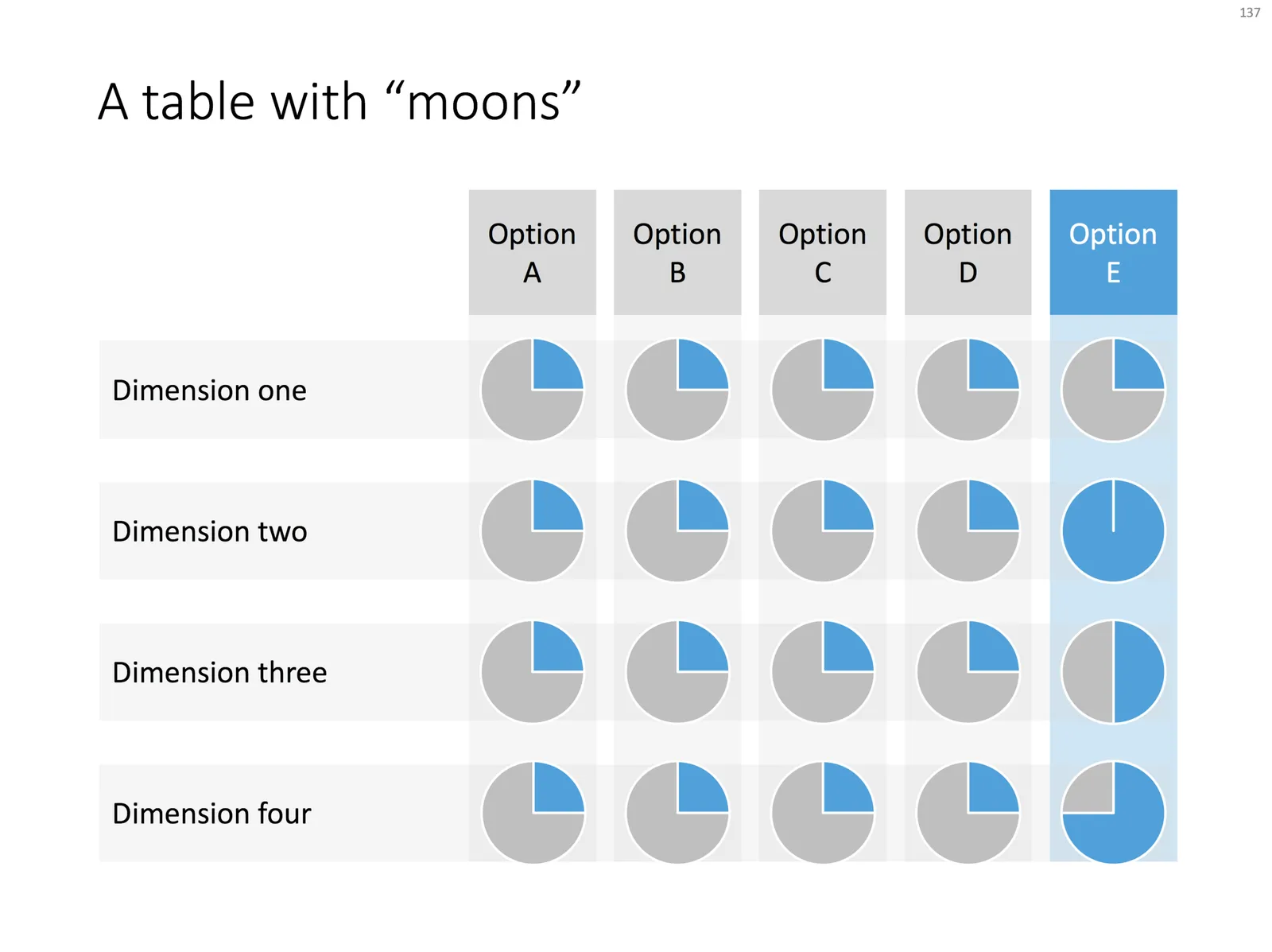
Harvey Balls are a repeating pattern of simple pie diagrams to score options among different access. Strategy consultants love them because it allows you to make qualitative assessments quickly. They work great on group discussion whiteboards as well: draw the empty circles and have the meeting participants colour them in.

Apparently they were invented at Booz Allen in the 1970s, which is probably why we at McKinsey referred to them as “moons”.

In PowerPoint they are a bit tricky to make, in the template below I tried to make an effort. To change the values, you need to open each pie diagram and change its value, make sure that you are not moving or re-scaling any of the pie diagrams in the process.

At McKinsey, I remember always keeping a “moon” diagram somewhere in my hard drive, so I could easily re-use the various shapes (these were not Excel pie diagrams, but graphic icons that came in the four stages).

Visually, I think they are not perfect. Maybe in the early 1990s, with primitive computer graphics, Harvey balls served a purpose, but now the same effect can equally be achieved by applying different colour shadings in the background colour of the cells in your table.

As always, feel free to copy the design, or download the ready-made slide from the template store.

·Layout

Pop out of the box

My slide layouts usually have a white frame around them, even big images I don not let “bleed” of the page. Why? My slide decks are usually a mix of these minimalist big image slides and more traditional, dense, consulting-type slides. The big pictures usually go in the front of the deck to sell the idea, but for financials, roadmaps, etc. I need a different format. Mixing two styles of presentations gives the deck an inconsistent look.

(The exception would be tracker pages, or section separators, which I usually stretch over a full page).

That “box” gives you some new design opportunities though; you can make things pop out by putting them outside the frame on purpose. This is technique that is often used on magazine covers. Below are some slides from the store where I used this technique (clicking them takes you to the store).

The tree

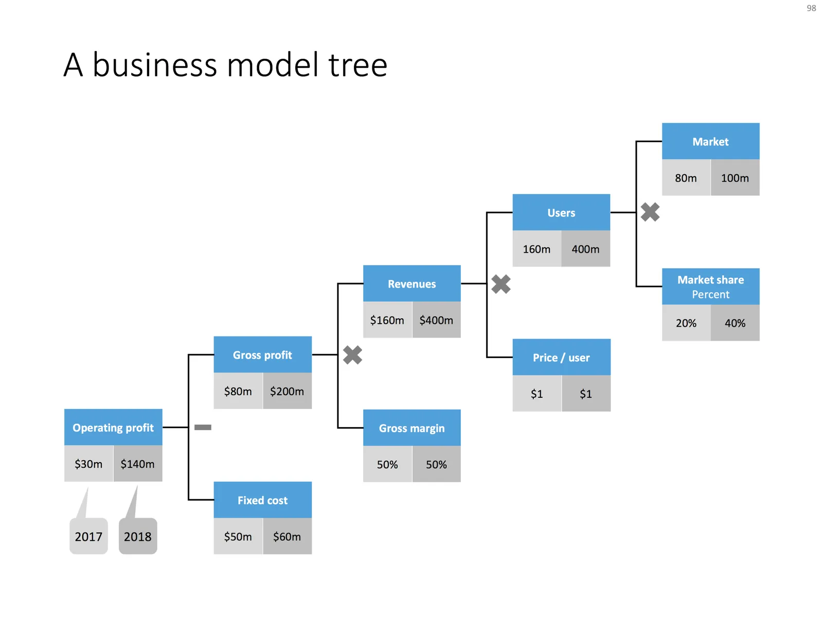
Trees like the one below are a great way to communicate a formula or a business model. It shows how factors are related. It forces you to “fill in the blanks”. For example, if you think you are going to get 200,000 customers in Luxembourg, you need to relate that to the overall population somehow. It makes assumptions very visible, and separates the ones which are relatively certain, from those which are wild guesses.

 Business model tree

Business model tree

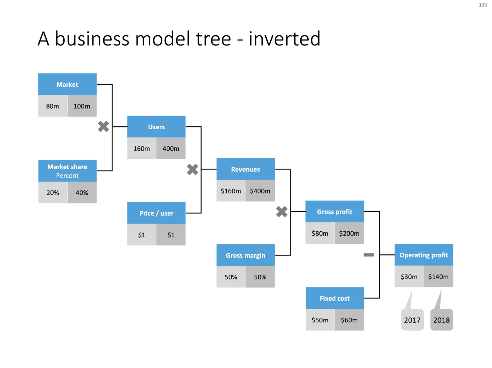
 A business model tree - inverted

A business model tree - inverted

Use the tree to triangulate your own view of a business model or forecast, then show it to your audience and convince them of the numbers.

I always make my trees left-to-right, McKinsey style, where you would take someone from the big picture to the smaller details. Some clients have a preference for doing it the other way around, going from inputs to the final result.

Feel free to borrow this design idea, or download the ready-made slide from the SlideMagic template store.

Photo by kazuend on Unsplash