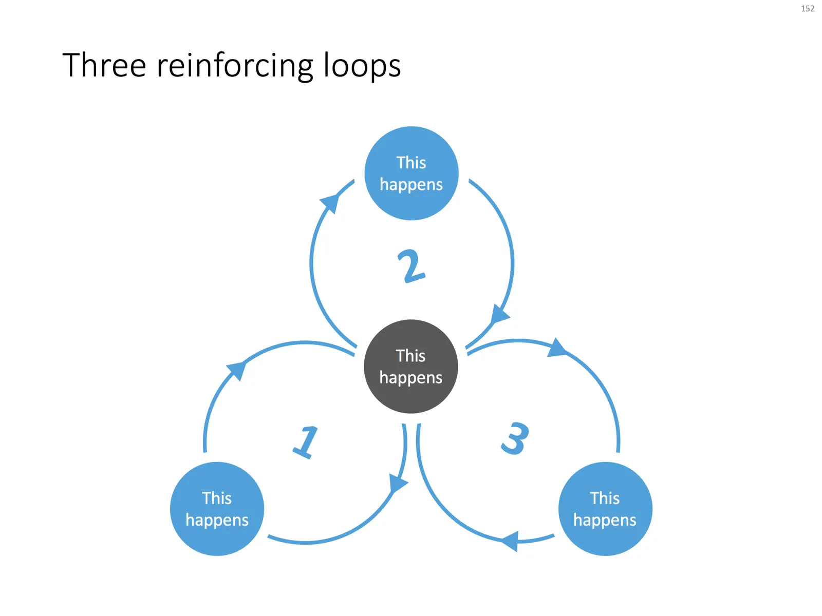
Loops are a powerful way to visualise reinforcing trends. Electrical engineers use them and refer to them as “system dynamics”. McKinsey consultants use them and call them “business dynamics”.
You can use them in a presentation to support your point, but make sure you don’t overcomplicate things like in the infamous US Army Spaghetti chart. Alternatively, you can use them as an analytical tool and add as much complexity as you want.
I often use some sort of loop diagram to scribble the basic story line of a presentation to make sure that I understand things myself.
When using a loop diagram in a presentation, go through different version on paper until you arrive at the most pleasing design, with the minimal amount of overlapping arrows in your spaghetti.
I have added a basic loop diagram to the template store. They are a bit tricky to make in PowerPoint, if you want all the circles and arrows to line up properly.