SlideMagic Blog

Frequent updates about all things presentations since 2008. Subscribe to never miss a post.

RSS
all posts

Search results for “web design”

·SlideMagic

Testing the first SlideMagic stories

I reshuffled the code on the server, so I can now stitch entire decks (I call them “stories”) together that you can download in one go. I think these stories can complement the offering of individual slides.

  • Slide templates are focussed on one particular design or image that cover a certain topic
  • Story templates are all about well, the story. I expect them to contain mainly very simple slide layouts, what matters is what is written in them, and in what sequence they are put together.

I am starting with a quick make-over of the YCombinator seed deck,you can download it for free here. See the original post on YC for the background.

It is available both as a .pptx and a .magic file, but it with these simple slide layouts where the power of SlideMagic comes in: quickly adding or deleting rows without messing up your slide layout. You know which I would pick :-)

There is still work to do, you can’t get to the stories easily from the top slide menu. Also, the user interface can be confusing now when as a user you are not sure whether you are browsing slides or stories. Also, in-app story downloads are not your implemented . Work in progress.

Pop out of the box

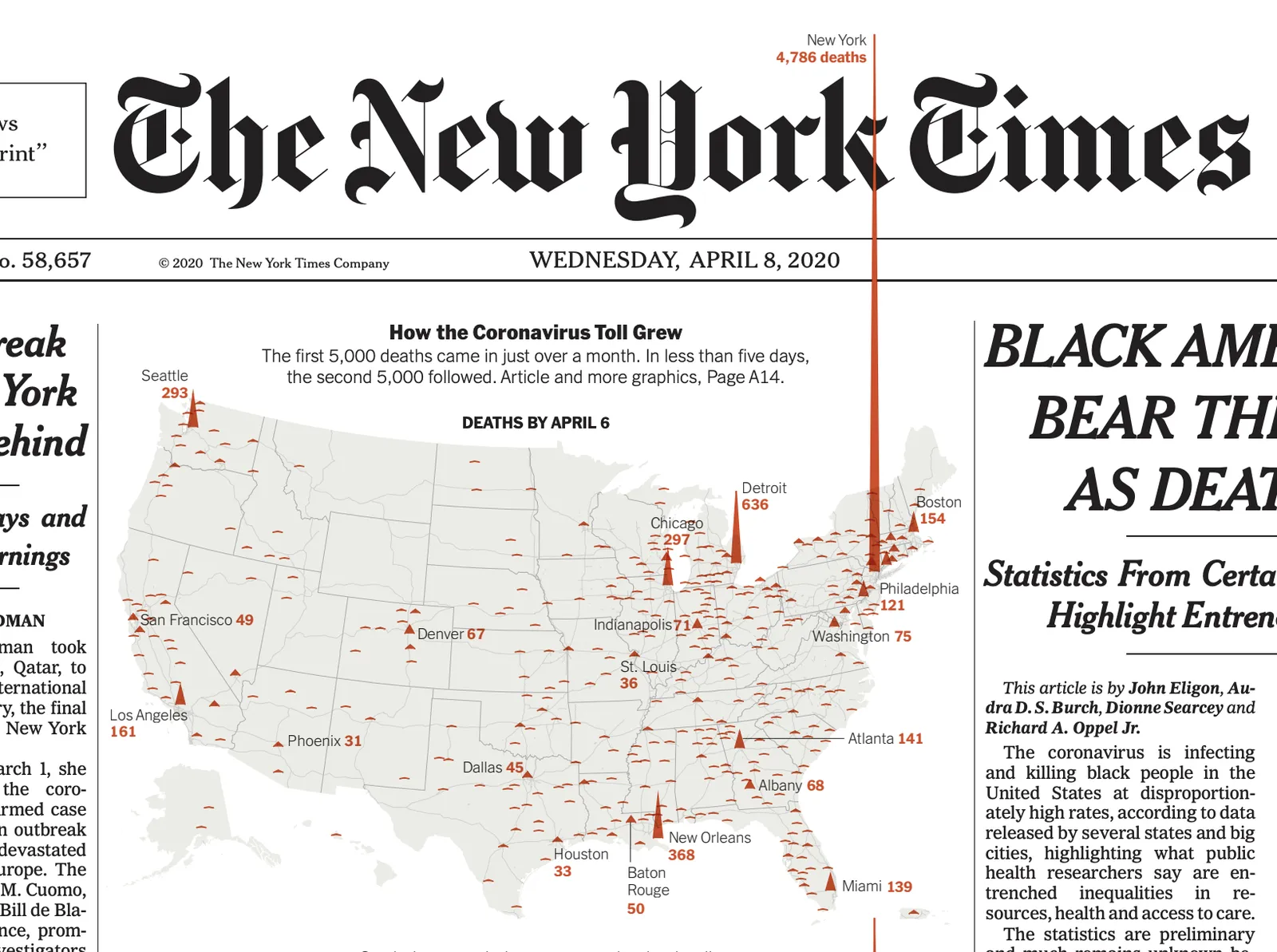
The NYT used this pop out technique as a data visualisation tool on the front page. The NY virus casualties literally spike outside the graph, even over the newspaper’s logo.

Similar to a graph about unemployment benefits from last week. You could use something like this in your presentations as well.

I have a few slides on SlideMagic (example here) that use this pop out effect. They are PowerPoint-only though, since the style police of the SlideMagic app protects you against yourself breaking the rules of good graphics design. In 99% of the cases, that is a good thing, this is an example of the other 1%.

·Software

PowePoint plug-in mechanism works

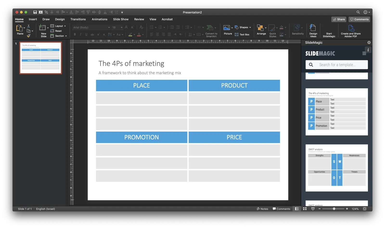
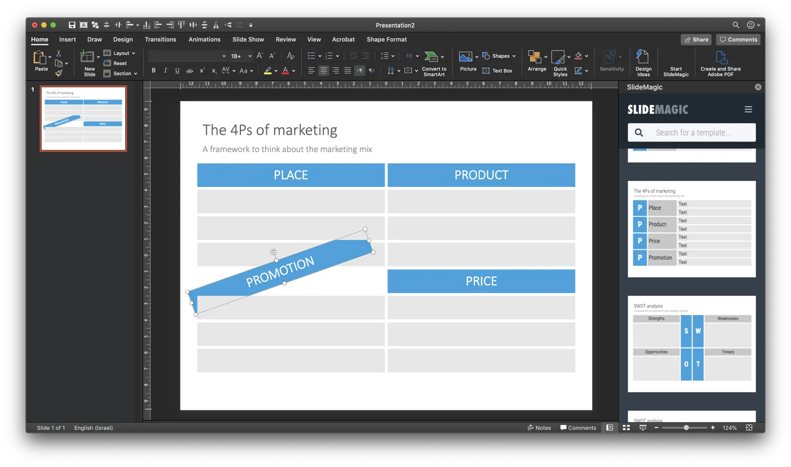
A follow up on yesterday’s post: the basic mechanism of the PowerPoint plug in works. I can side load the app in a task panel, let users log in, you can search for templates, to add a slide to your presentation I can only open it as a new presentation with 1 slide at the moment, you have to copy the slide across to your own file.

It is fascinating to see all the stages this slide goes through (automated mostly):

  • I design the slide in the SlideMagic app
  • Upload them to the template server
  • The server converts them to PowerPoint and create screenshots
  • The server updates the tags
  • PowerPoint connects to the server and loads the side panel
  • User logs in, and searches
  • PowerPoint loads the PPTX file from the SlideMagic server

As soon as you download the SlideMagic slides into PowerPoint you instantly see the strength of SlideMagic when it comes to adjusting templates. Try adding a row to the SWOT diagram, it is hard.

I am not expecting to unseat PowerPoint’s install base any time soon, and the optimal situation would be where both applications can work together nicely. A robust plug in can help users who are hesitant to make the full switch to SlideMagic (and included in these users are people that work for companies that have very tough security policies to run software from new vendors on corporate machines.)

The next step is to make the plugin robust and get it distributed properly in the Office app store. Work in progress

Size-based suggestions

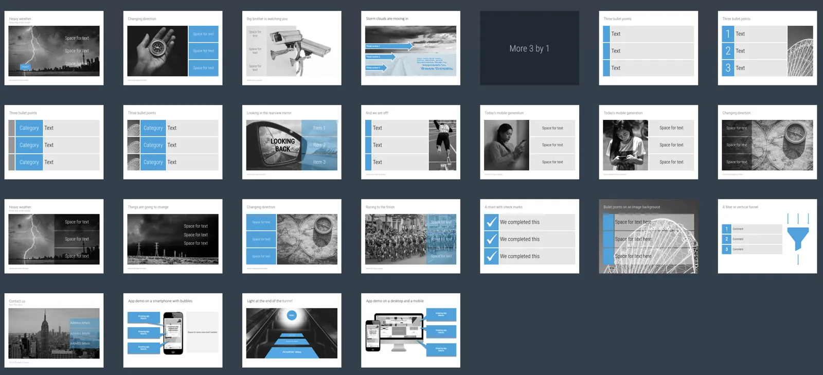
A key step in my slide design process is figuring out what sort of grid I need: 3 x 1, 1 x 5, 4 x 4? Almost every slide in a business presentation is some sort of table in disguise. Today I started adding a “more x by y” search suggestions on the web-based template browser of SlideMagic. I will add more automation to slide classification in the near future. One obvious extension is the same slide but then with 1 more column, etc.

·Colors

Why are all your images black and white?

Yes, almost all the images on my blog and in the SlideMagic template bank are in black and white. Why?

SlideMagic uses (and encourages you to use) a sober colour scheme: basically different levels of grey with one accent colour that should match the dominant colour in your logo. This is a pragmatic choice. SlideMagic is all about business presentations, not art. More colours require additional design skills to get it right. Too many colours can make a slide busy, can create inconsistencies between slides, make the brand identity of your slide weaker. Yes, a pro designer can get it right, and maybe the amateur as well, but - and that is a very important but - it just adds to the time it takes to create your deck. And SlideMagic is all about speed. One accent colour and greys always looks good.

Full colour images introduce colours to your slide that might not always match your colour scheme. Colour schemes of images can also vary wildly between images, creating inconsistent slides. You often see that professional-grade designs (ads, brochures, web sites) use images that have been selected based on their colour profile. The amateur slide designer does not have time for this. That’s why keeping things black and white solves this issue: images blend in, and images look consistent.

Should all images always be black and white? Absolutely not. Personally, I would go for anonymous images to be black and white, but depictions of real things in full colour; your product, your app screen, your prototype.

Continue reading →

Most of your slides should be tables in disguise

After more than 25 years of designing presentations, here is an important insight: most of your slides are tables. Not only the spreadsheet-type straight table with columns full of numbers, but a more generic 2 dimensional layout of any idea.

Writing text on paper, in a word processor or telling a story verbally, is one dimensional. You make a point one after the other. A good slide adds a second dimension to organise your thoughts.

  • Time to show a sequence of data
  • Steps in a process or a supply chain
  • Pros and cons
  • Sales, costs, capital

Dependent on this second dimension, different slide types come out: 2x2 matrices, categorised lists, column charts.
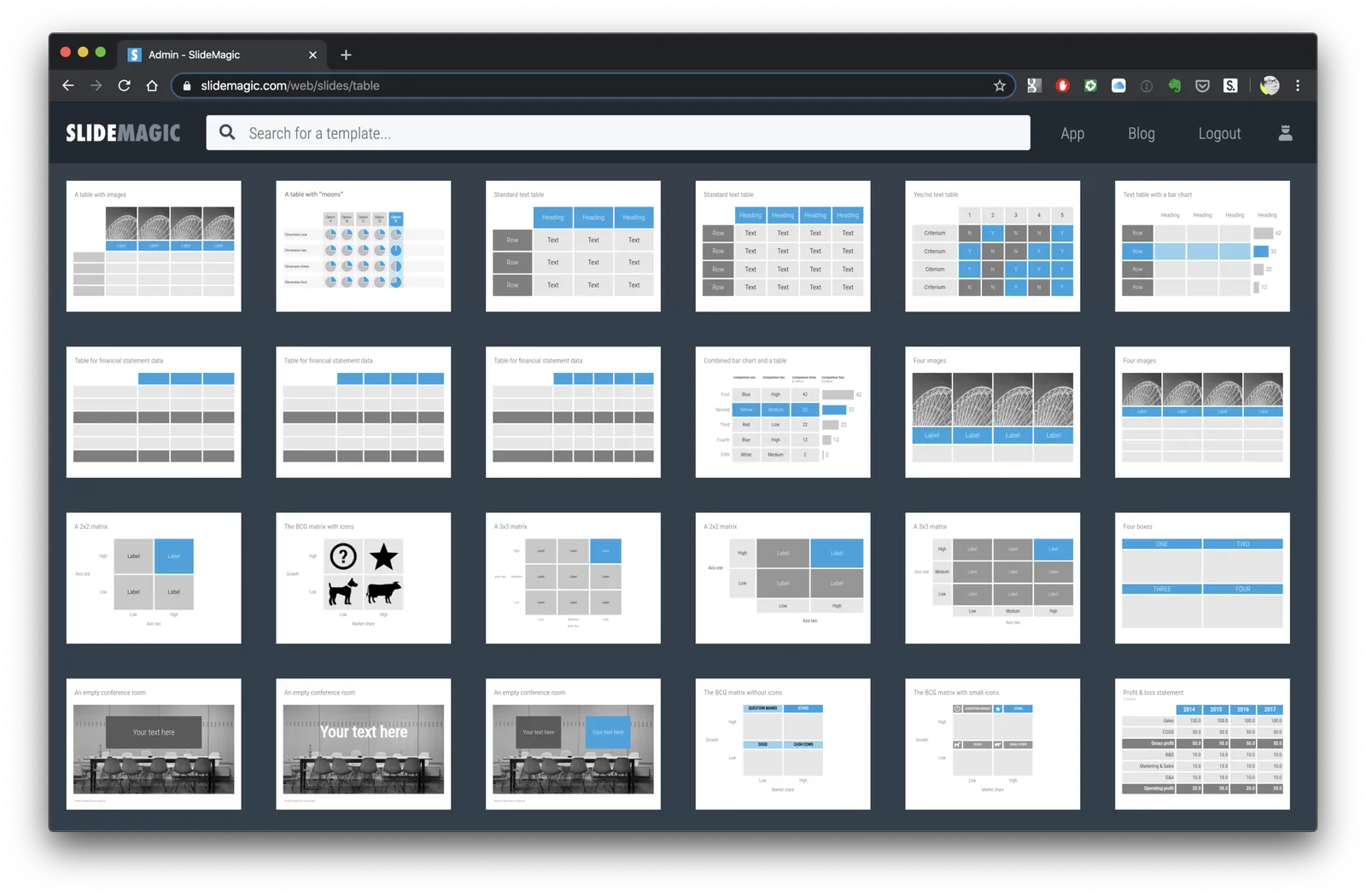
 The algorithm picks up some real tables as well…

The algorithm picks up some real tables as well…

Many of the classical management consulting frameworks were the result of someone trying to fit an idea across 2 axes. When it worked, you got a nice layout to discuss an issue, and often, you spotted missing scenarios that you did not consider before (“hey, what happens in the low-low box?”)

This also shows why bullet points are poor slides: they are 1-dimensional, you are missing that powerful second dimension to organise your idea.

Now you see why in SlideMagic the table is central to everything. It encourages you to think in 2 dimensions for every slide you try to design. Organising and lining up boxes is difficult in most presentation software. And when you got it to work finally, someone asks you to add another row and take out column 2. Piece of cake in SlideMagic.


Continue reading →

One slide, multiple views

SlideMagic can change the way a slide looks at the touch of a button:

  • Aspect ratio, going back and forth between 16:9 and 4:3
  • Background colour: between dark and light
  • Explanation panel: with or without a side box with space for text for when you are not there to explain the slide in person

In traditional presentation software, this can be cumbersome to do. The software is not to blame, it is by design. If you give the user full flexibility about how to place images, size shapes, and colours she can use, you cannot avoid stretching of image aspect ratios, mixing up slide layouts, and confusing colours when you apply changing to a slide layout. Yes, all can be fixed, but it always takes a bit of mopping up to get right.

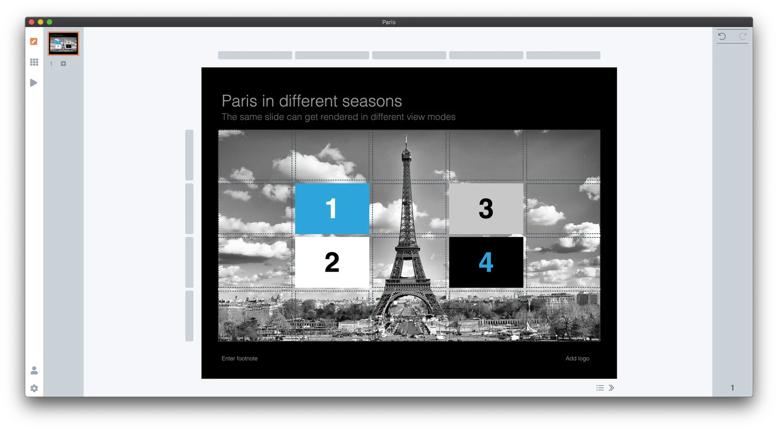
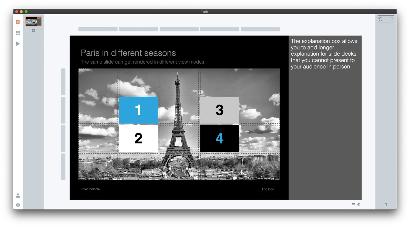
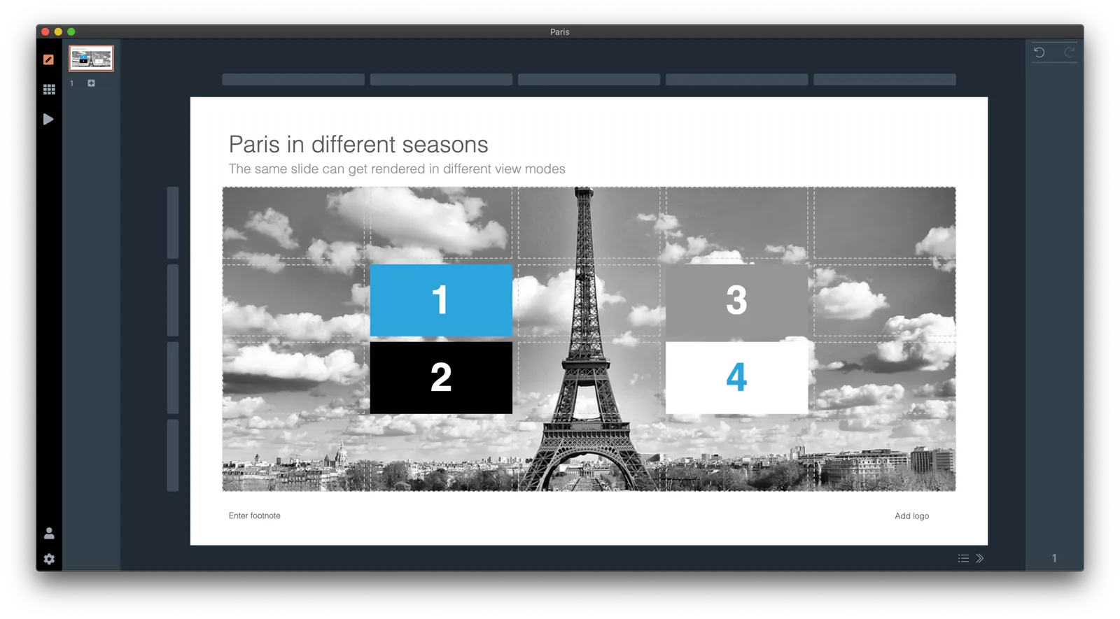
SlideMagic has a very rigid colour and slide layout regime, and it pays off, you can go back and forth between different slide layouts instantly. Here are six versions of the same slide, all generated with a single click without corrections:

 4:3, dark slide background (see how the app interface itself turns light to provide enough contrast)

4:3, dark slide background (see how the app interface itself turns light to provide enough contrast)

 Dark background, with the slide-out panel

Dark background, with the slide-out panel

 16:9, dark background

16:9, dark background

 Wide screen, with a light background, the app turns dark again

Wide screen, with a light background, the app turns dark again

Continue reading →

What it took

Building a product is slow, but steady going. I jotted down this list of the various hurdles and went through to get a useable product today:

  • Design the UI: most of this was done for version 1.0 five years ago
  • Understand the basics of Javascript (with 1990s Pascal to start from)
  • Understand post 1990s programming concepts: objects, methods
  • Get an environment up and running so that I actually could run a simple piece of code
  • Find a way to get access to the data (presentations) version 1.0 was producing.
  • Setup an environment that turns a program that says “Hello world” and turns it into a desktop app
  • Figure out a way to scale text in a browser environment, preserving the exact proportions of design elements (resize your web page, this is not what most web pages need).
  • Get github and multiple versions to work
  • Build the first rendering engine that actually displays a chart: text boxes are easy, scaling images a bit trickier, data charts get nastier even
  • Find a way to register clicks and make things editable: shapes, menus, in different context.
  • Copy the rendering engine to a generic format (for thumb nails in story mode for example)
  • Duplicate the app engine to enable multi-screen presenter mode (running 2 processes and a master process that talk to each other)
  • Enabling on-screen editing of text, graphs, image dragging, image cropping, flipping
  • Building the grid editing system (implementing my patent)
  • Build the PowerPoint conversion
  • Build the PDF conversion
  • Build the image export
  • Build the printing functionality
  • Add automatic 16:9 to 4:3 and back conversion
  • Add automatic dark/white background conversion (beyond simply changing the background color)
  • Enable multiple windows (each window is a full copy of the render process) and coordinate settings between them
  • Build user authentication: pro users get features others don’t have access to via a web server, involving password hashing and building a user database
  • Build the first version of the online template database: search slide layouts inside the app, but pull data from the central server
  • Hook up unsplash image search
  • Hook up noun project icon search
  • Create an auto-update mechanism that updates the desktop app in the background when new versions are released
  • Get the mac app to run on windows as well
  • Get certified with Microsoft and Apple so that people don’t receive scary warnings when installing the software
  • Build the full-scale slide template server, integrating the PowerPoint-only content from the old one
  • Get payments working
  • Build the front end of the marketing web site and the template store
  • Get PowerPoint conversion to work on the server as well
  • Build the management console to manage slides, users, and the search algorithms
Continue reading →

SlideMagic explained, well, in a slide

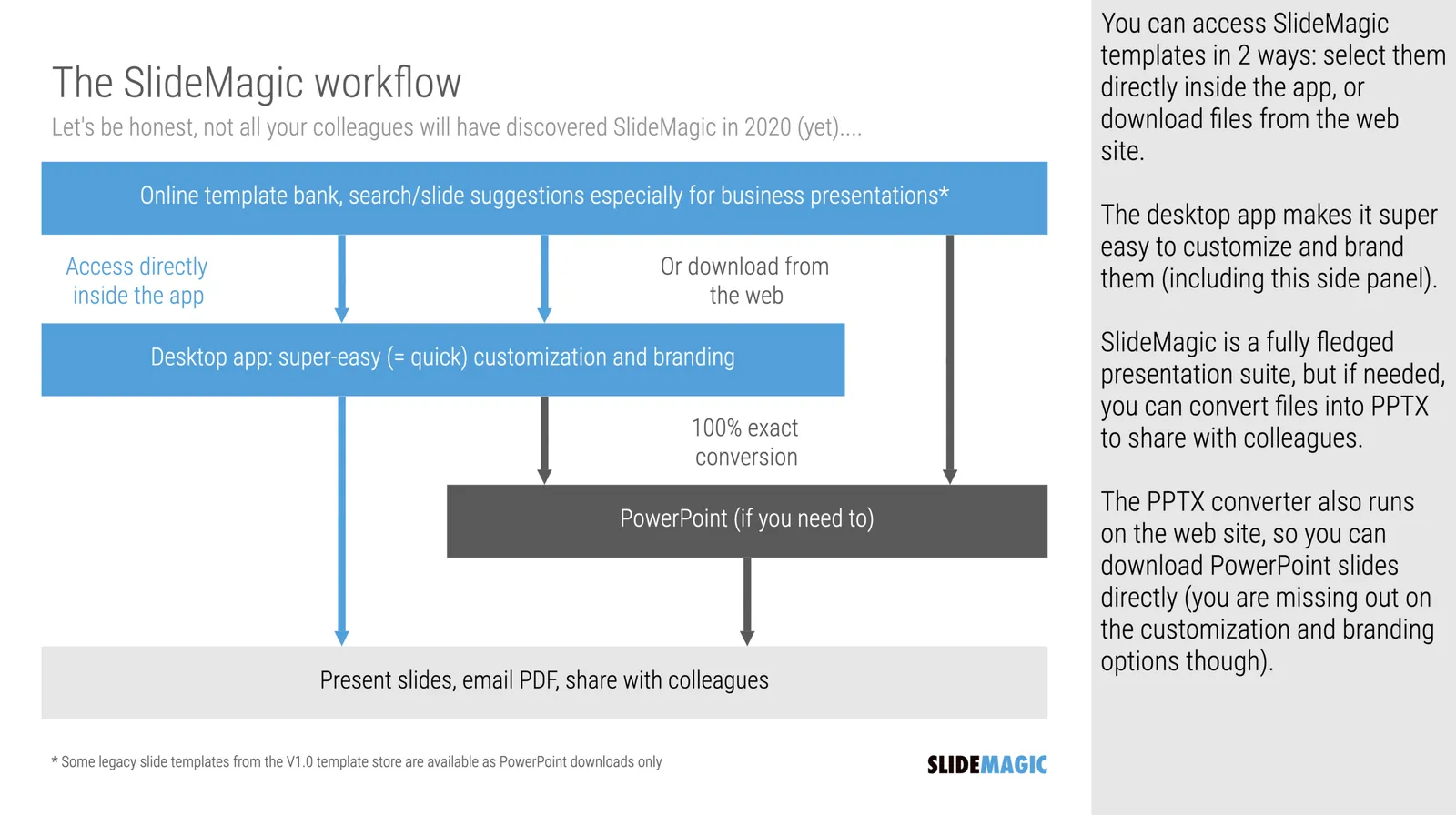
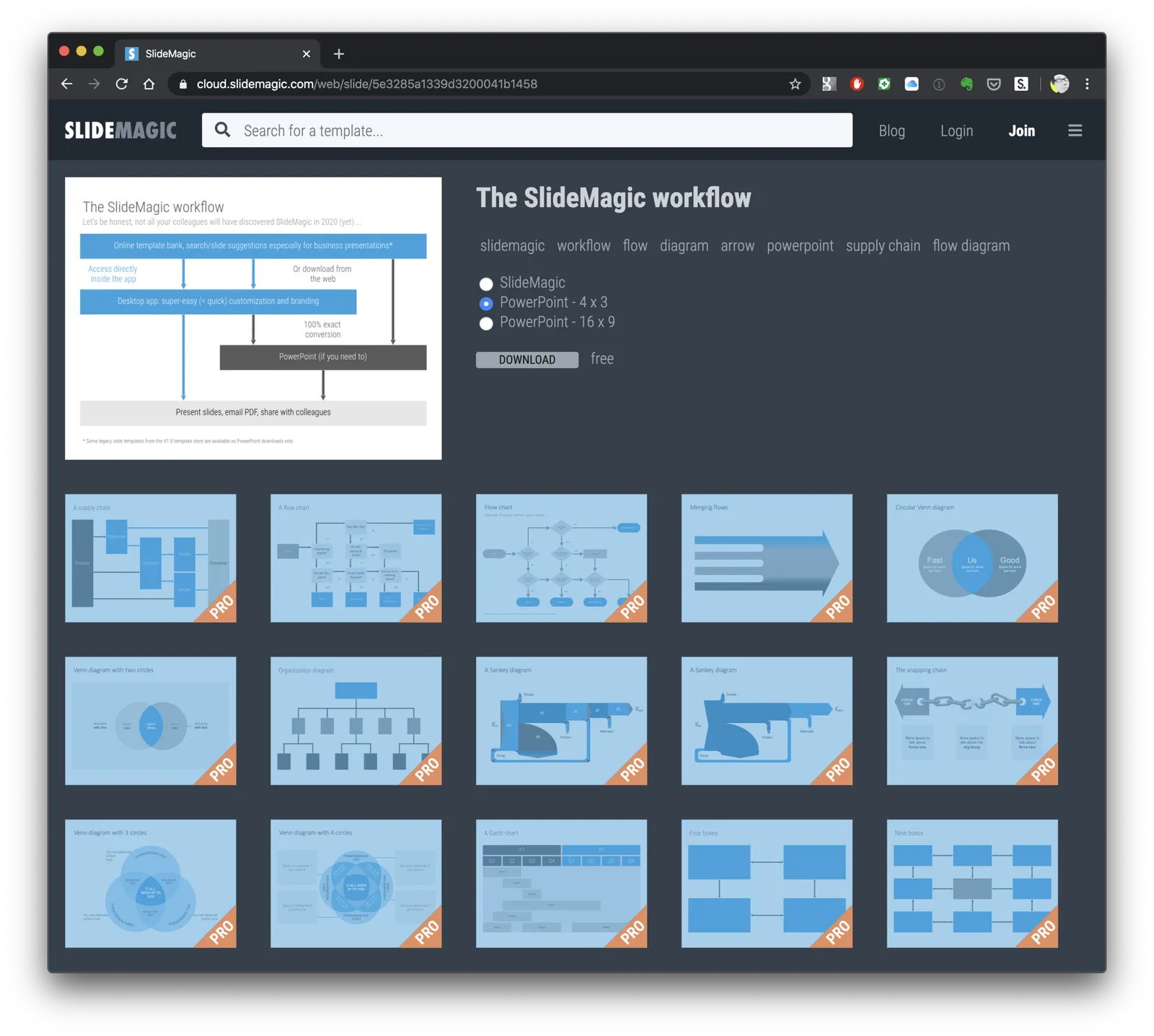
The diagram below is in typical SlideMagic style. While a professional designer can do better, the slide looks professional, everything lines up, has a clearly recognisable branding, and takes very little time to make.

I scribbled down this slide for myself, to see how to position the online template bank and the desktop app. This diagram is probably not the best way to start marketing SlideMagic, but it shows what I try to achieve for an “internal audience”. (And frequent blog readers probably fall in that category :-))

It took exactly 5 seconds to make the slide available in the template store and the app itself (you can find it here. I put it in the free tier for now, it is a good test case for the PowerPoint conversion quality, and the slides that the algorithm thinks that are related (still work in progress).

·Colors

Lighter variants of your presentation color

I ran into this slide (fragment) presented on an online course site the other day (I now digest tons of these to refresh my coding skills):

It shows a common problem in PowerPoint: you picked a nice theme colour (deep purple in this case) and you need variants of it. (This presenter figured out that too many colours makes your slide deck cluttered, hence SlideMagic only allows one :-) ).

The default model to make colour changes is to modify its brightness. It almost always work to make things darker, the other way around though can create a problem for very saturated colours. You don’t notice the saturation level at dark levels, but on brighter variants, that elegant purple becomes cute/bright pink.

The solution: change colour saturation as well as brightness. This post on my blog from 10 years ago (what?) describes it:

PowerPoint 2010 gives you the option of a spectrum of different shades of the same color. This is great to design charts with a consistent color scheme.

However, if your template contains colors that are highly saturated, the suggested lighter shades of your color will be too bright to use as neutral color nuances. Here is how you can fix it. (Click on the image for a larger picture.).

Create a new base color by reducing the saturation (in laymen’s speak: make it more grey). Open the color in your color template (format shape/fill/solid fill/color/more colors)Switch the color model from RGB (red, green, blue) to HSL (hue, saturation, luminance).Reduce the (S)aturation value, while keeping all other variables the same.Use a lighter shade of this new base color insteadand save this as a new color in your color template.

Continue reading →