SlideMagic Blog

Frequent updates about all things presentations since 2008. Subscribe to never miss a post.

RSS
all posts

Search results for “web design”

·SlideMagic

All the way back to 2008

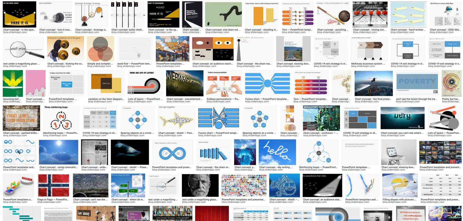
Now and then I dive back into the 12 year archive of my blog and see some or the early slide layouts I made. This Google image search pops up many of them.

While many of these layouts are now still available as templates in SlideMagic, some of them, especially the early ones are a bit different:

  • “Slides that stick” orange and brown
  • Lots of hand written fonts
  • Unusual visual analogies
  • Most of them are definitely not for the layman designer…

Yes, I made have been a bit more “daring” back then (and remember, most of these designs actually were taken from actual client work), but I still think that I am on the right track with my current sober, simple, easy-to-make layouts. Less artistic, but far less time wasted by smart people that can use their energy to do more useful things that creating presentation slides.

How to make an agenda presentation slide

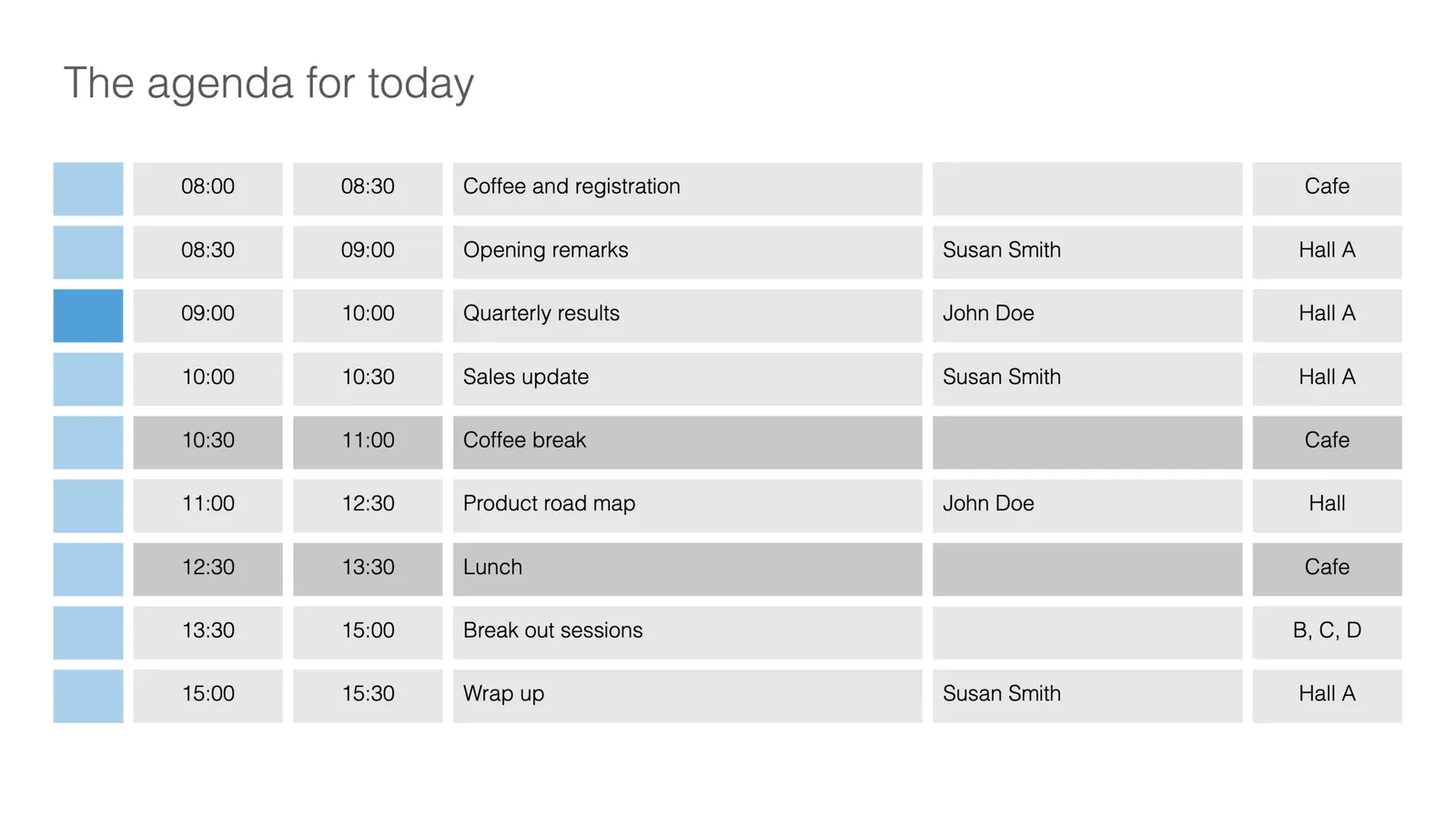
I just added a few more slides to the SlideMagic template database. This time an agenda slide that comes in a number of variants.

Agenda slides are very easy, and very tricky at the same time. Easy, because, well, it is a simple table that does not seem to require any eye for design and/or sophisticated graphics. But, in most design applications getting those boxes to line up properly is an absolute pain. And, agendas change all the time, right up to 5 minutes before the kick off. So you finally got your layout of boxes, when the request comes in to add another line…

This is where SlideMagic shines. The new agenda slide is here, or check out a generic search for agenda slides.

This slide variant is a slightly busy one, with all the information about times, topics, speakers, and locations. Still, I think it can work, people need to know these things in a conference. The SlideMagic library contains other, more minimalist, slides that are better suited as tracker pages to separate sections of a slide deck.

As an introduction offer, access to all slides is free from within the desktop app. Pro users can download or convert to PowerPoint slides. If you are interested in working with these type of layouts and save time, but your colleagues are not (yet) you can quickly make your slides in SlideMagic, and export the slides in order to copy-paste them into a traditional PowerPoint file.

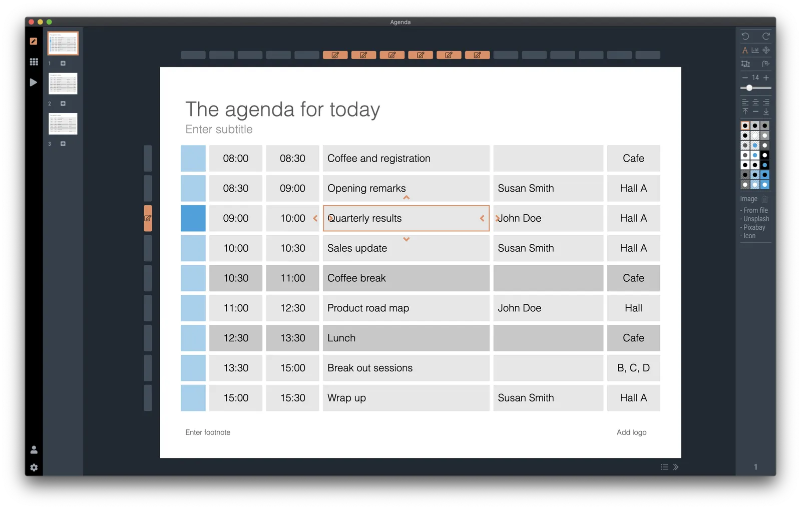
 It is easy to make adjustments to an agenda slide in SlideMagic: simply add or remove rows or columns, and the entire grid lines up properly

Continue reading →
·SlideMagic

How to make a CV slide

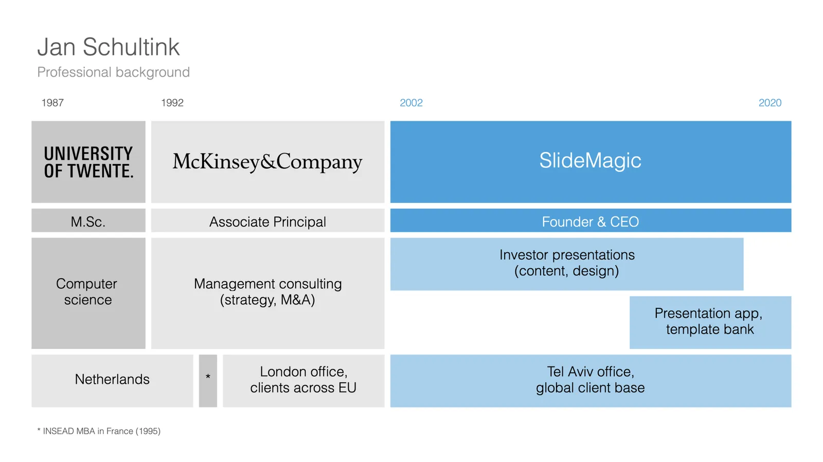
I am starting to work on a standard slide deck to present your CV, with me as the test subject. The first page is done. I like these type of time lines, because they communicate a lot of the basics about a person (years, employment, locations, education, etc.) in one slide, without making it too crowded. The rest of the presentation will cover more background.

They way to set the slide up is to start with a fine grid, create the major divisions based on your professional work history, then start refining. Notice how I left the consulting-style table labels (‘Employer’, ‘Role’, ‘Location’, etc.) out because it is very obvious from the chart what the rows mean, and these labels would take valuable space/destroy the balance of the layout.

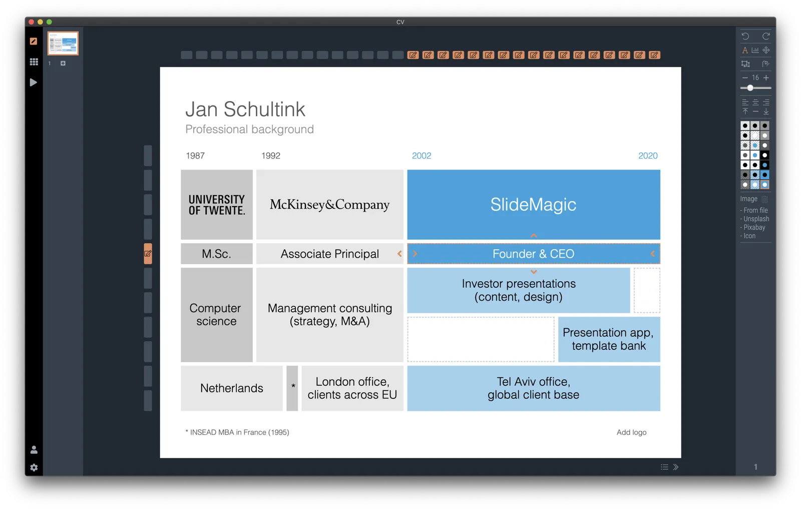
In general, I think 4x3 slides look better than 16x9 ones. 16x9 is made for movies, 4x3 has a more pleasing balance for graphic design. These type of timelines are an exception though, the amount of left-to-right information makes the 16x9 format very useful. SlideMagic switches back and forth at the press of a button.

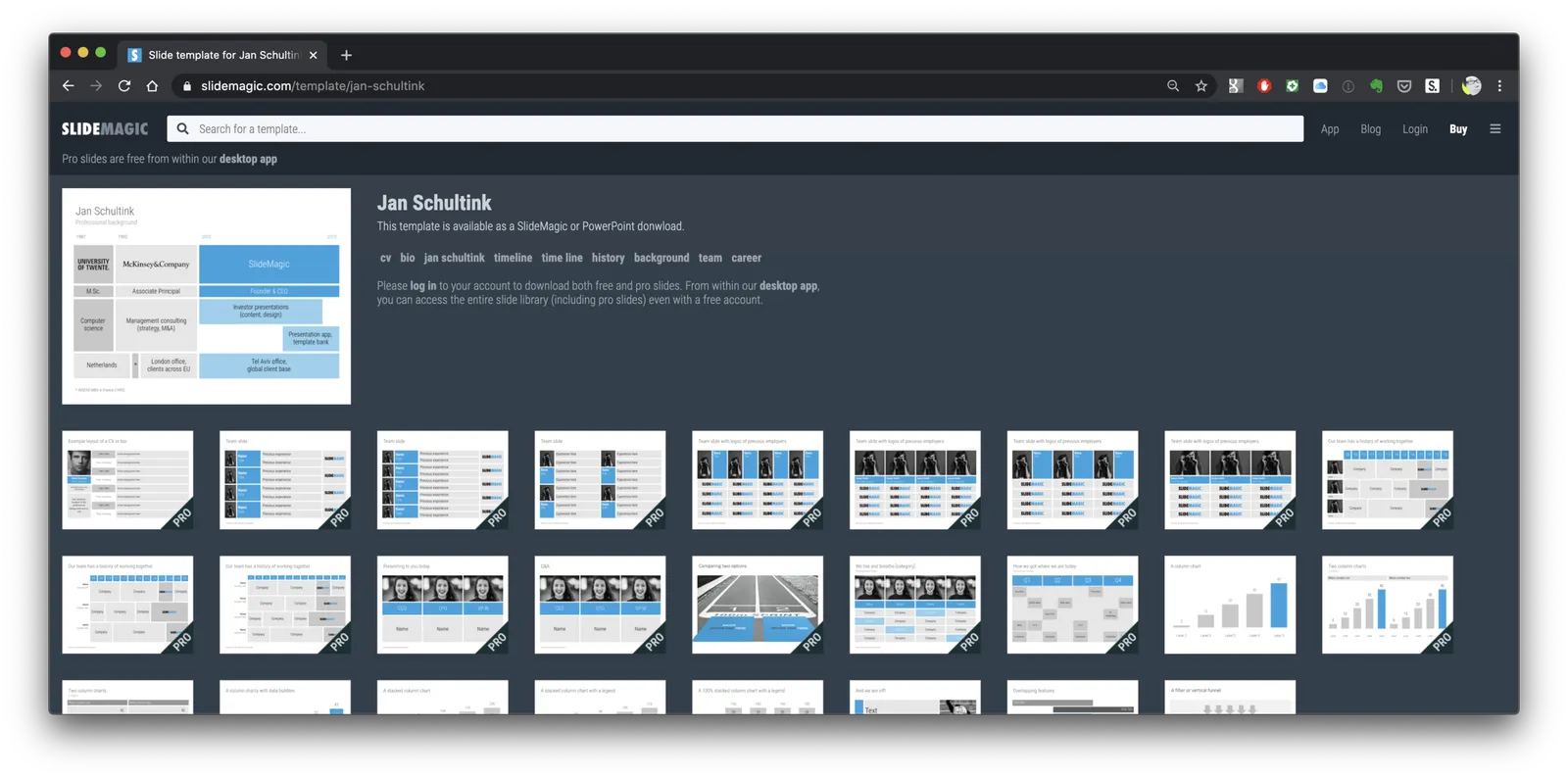
You can find the slide here in the template store, or simply search for “CV” in the desktop app.

You see how the search algorithm recommends other slides for highlighting career backgrounds and teams.

There is more work coming up on the CV slide deck, stay tuned.

·Images

Unlimited access to Unsplash images

SlideMagic was approved by Unsplash for full access to the API, no more hourly rate limits for searching images. Thank you!

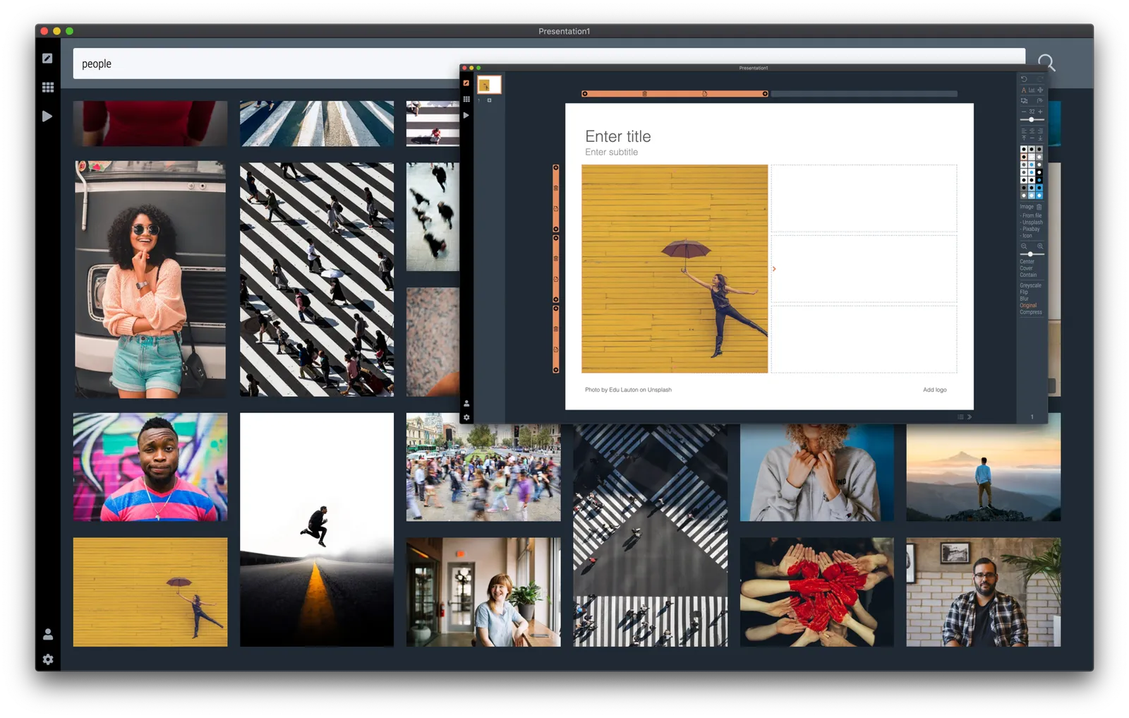
Version 2.3.9 of the SlideMagic desktop app also offers a more minimalist image search interface. The selected image gets put straight into your slide, in a proper grid so that it always lines up with the other elements on the page. In the app you can zoom in or out, and move the image (inside its container). The image credit also gets placed in the footnote of the slide (not required by Unsplash as it is a remixed image, but still nice to the photographer, the main obstacle for crediting images I think is not that people don’t want to, but it is a hassle to find the details and put them in your designs).

Hitting an empty search returns a set of random images (because I could :-)).

SlideMagic is a desktop app, and it isn't

“What, you are making a desktop app in 2020? Well, we (the U.S.) have moved totally into the cloud now, everyone is using Google Docs to collaborate. Maybe people in less developed countries might find your product interesting if it is offered at a low price (i.e., people who cannot afford Google Docs and/or are using pirated copies of PowerPoint. Your next challenge is to make your product available in non-English languages and get sales distribution in these markets (do you need some contacts?).”

OK.

I now start to feel first hand what entrepreneurs go through when talking to others (especially investors) with their product. I am not raising money at the moment, but here is a possible way of answering a question like this.

  • On the one hand SlideMagic is a desktop app, on purpose. Presentation design requires a super snappy interface, and deep access to the operating system (dragging things between 2 files open in a window for example).
  • On the other hand, SlideMagic is not a real desktop app. It is written in HTML and Javascript and runs on Google Chromium, the current web development setup, and the app is updated very frequently in the background (sometimes daily).
  • SlideMagic focuses on 1 (huge) issue in presentations: story clarity and design, not online collaboration, not enterprise security, not cloud file storage, not data analysis, not stunning animations, not knowledge storage and search, not intra-employee information sharing. All these are important issues that have great software products built for them, by billion dollar companies.
  • SlideMagic’s economic setup allows it to do this: a super lean cost base, and a former strategy consultant, presentation designer, computer scientist brain combined in one head to try and get product-market fit for what no one has managed to do: get people to make better presentations. Millions of dollars of VC money, huge teams of people with the objective of dethroning Microsoft or Google is not what were are doing here. SlideMagic needs very little to turn profitable, SlideMagic can afford to take its time with product iterations to get there. Only when the formula catches on, investing is growth is on the agenda.
Continue reading →

Warren Buffett's investor presentation slides

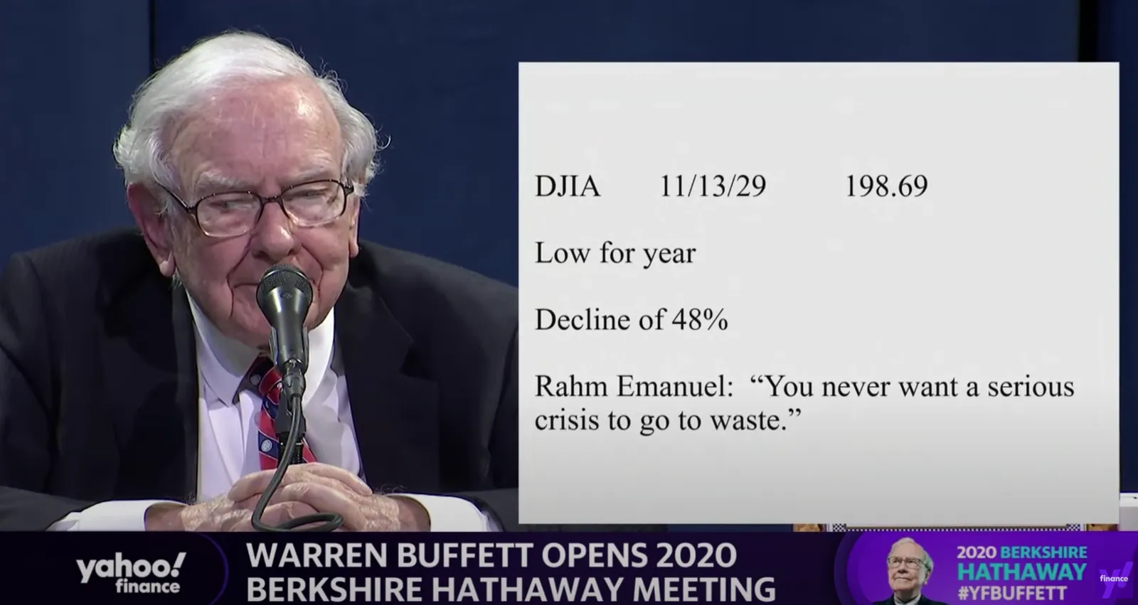
This tweet flew by about Warren Buffett’s slides during his annual investor meeting.

A sans serif font and centering the text would have made it look better, but overall, this slide is actually not that bad. One big message without distractions. (If Warren had used SlideMagic with this template, his slide would have looked like this)

Other slides are less crisp though, as seen in the example below:

But, Warren does not read out the bullet points, he tells a story starting with background about his father. People will read the slide for 2 seconds, wonder about the quote, and then focus all attention back on him.

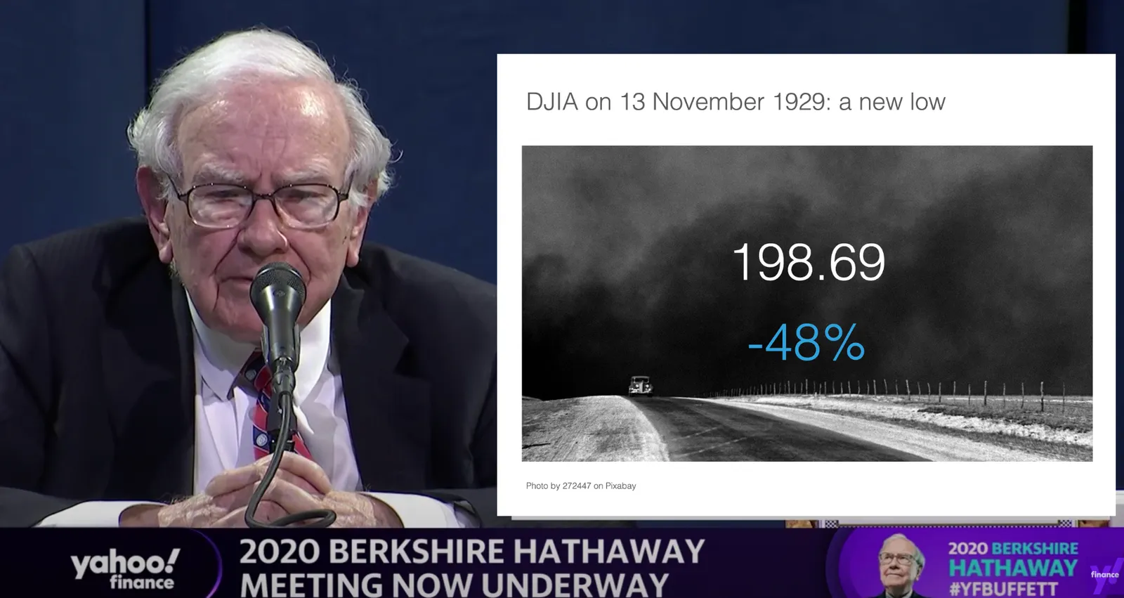
OK, I could not resist, SlideMagic would have produced the following slide (a quick search for “1930” in the built-in Pixabay image search delivers good results)

I would put the quote on a completely separate slide, if at all.

Coming back to the first tweet. If you are Warren Buffett, then you get away with pretty much any slide design. On the contrary, making it all too fancy is a direct contradiction to his modest life style. If you are not Warren Buffett, putting in 2 seconds worth of effort with SlideMagic will definitely make a difference.

I tagged these 2 slide examples with “buffet” in SlideMagic, you can use them in your own designs and find them in the presentation app, or download them here.

·SlideMagic

Integrated Pixabay image search

Pixabay offers a large database of free stock images. The site has become increasingly useful over the past years. In 2020, free images are now often better than paid stock photos, simply because the designer/photographer tries less hard to add effects and edits to the original photographs. (This is all written from the perspective of a corporate presentation designer, there are probably other people out there who value edited images).

Each free image site has its own profile. Unsplash has better aesthetics, more natural images. Pixabay has more functional images.

I have now added the ability to search Pixabay images in the desktop app. (Unsplash images, and the Noun Project icons were already present). All implementations are still beta features, as I finalise the approval for the API. (But I am confident I checked all the right boxes).

In-app image search is not just a “lazy” feature. It can greatly improve your presentation design workflow. Especially when it comes to copying, pasting, cropping and positioning images. In SlideMagic, this is just a few clicks. And, because of SldieMagic’s rigid slide grid, every image will always line up neatly with the other elements of your slide.

You can download the latest version of SlideMagic here (2.3.6). Integrated image search requires a pro subscription plan.

·Layout

"SlideMagic style"

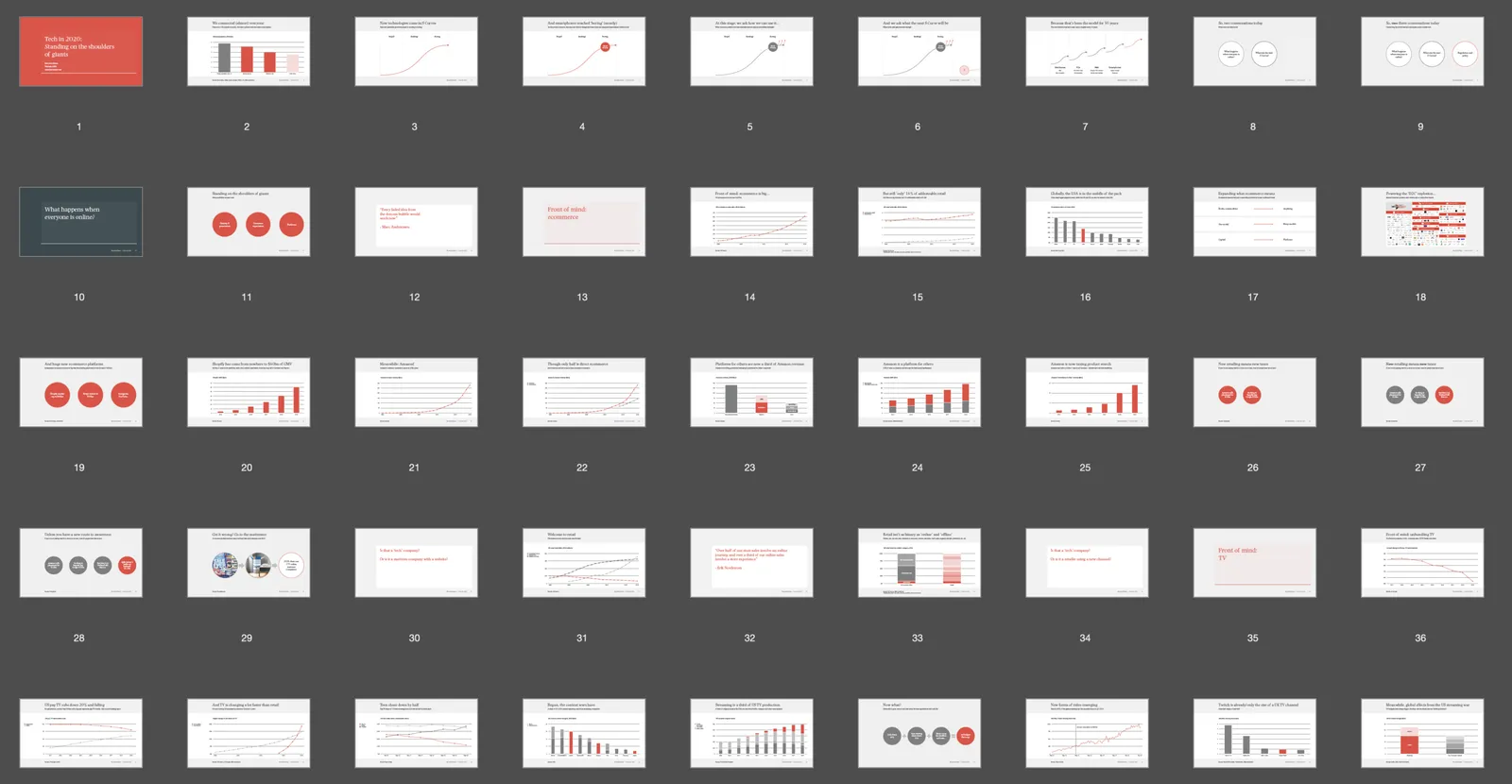
Even presentations not made in SlideMagic can look like one. Have a look at “Standing on the shoulders of giants” by analyst Ben Evans:

The design approach:

  • One strong accent colour
  • Lots of variations of grey
  • Calm slide layouts
  • Clear grid structure

SlideMagic does not like these circles (yet) though and makes you fit into that boxy look :-).

For your next presentation, put the slides in slide sorter view, and take a step back. Do things look consistent in terms of layout, colour, and the balance between white space vs used space? If you struggle to stick to the discipline, SlideMagic is here to help.

·SlideMagic

Better image search UI

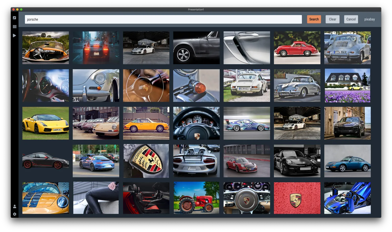
Version 2.3.5 of SlideMagic went up this morning. The interface for searching images from within the desktop application now looks a lot better in a grid layout that takes into account portrait or landscape aspect ratios of photos.

I will further improve the in-app image search soon, with a preview ability to test the image in your slide, and combining more than one image bank provider. A lot is changing in the world of online stock images at the moment, to the extend where I often find free images to be of better quality than paid ones.

Business presentations are different from ads or consumer graphics design projects: picking the right image and getting the credits right is what matters. More to come soon.

The image search API calls are still a beta feature with limits on the amount of searches per hour and/or the image resolution, as I need to make sure my (unusual desktop) app gets the back linking and credits done in agreement with the image bank provider.

One more feature was added: tool tips for the app icons after feedback from a user. Leave your mouse stationary for a second, and the app will suggest what you can do here. Most icons and actions are obvious, but while placing them, I realised that indeed a few things were hidden and/or unclear.

You can download the latest version of SlideMagic here.

Squeeze

Here is a sign that says “elevator 6” down in the parking lot of the building I live in. The designer took the functional approach: squeezing the words “elevator”, “6”, and an icon for an elevator and an arrow all in one line. That resulting graphic had an aspect ratio that did not match the sign. Solution: stretching and distorting the text so that now, it does fit all the available space.

Other solutions:

  • Use a sign with a longer aspect ratio
  • Leave white space above and below the text
  • Leave out information that is not required: the word “elevator” is not needed when you put a logo, the arrow does not add much if the sign is straight next to it.