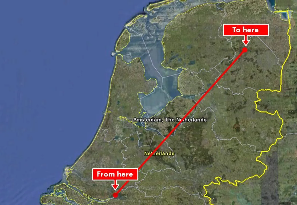
Google Earth is a wonderful tool to produce maps in your presentation. Select the area you want to cover, do a screen dump and crop your image in PowerPoint. Make sure to make the best use of the power of Google Earth. Tilting the map to a level that the horizon becomes visible adds a nice additional perspective to the chart. Especially when you visualize paths.
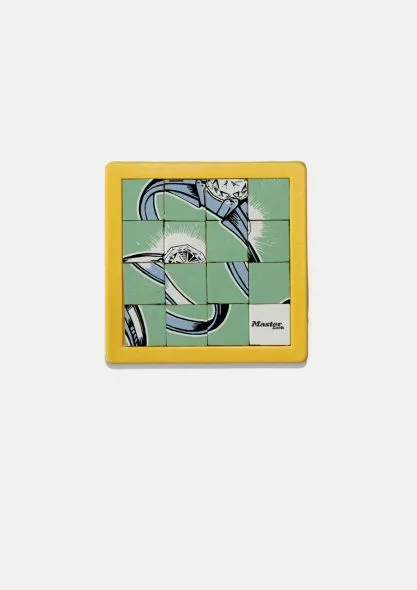
This ad uses a visual concept which I discussed in an earlier post. The easiest way to recreate it in PowerPoint is to stick to simple shapes with numbers, similar to the original puzzle with 15 pieces. You can go one level up and use an image (like in the ad). To do this, re-read an earlier post about slicing up PowerPoint shapes.
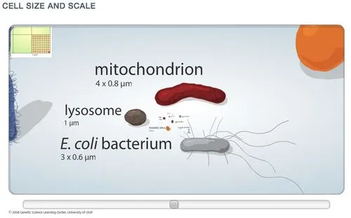
I really like zooming presentation formats such as Prezi, but I am still struggling to find useful application areas. Steve Johnson pointed me to one: to put proportions in perspective. Have a look at this amazing visualization of the relative size of biological cells.
McKinsey has been posting a number of classic consulting frameworks under the title “enduring ideas” on the McKinsey Quarterly site. I discussed before: consulting frameworks are great for solving problems, but often less good at communicating solutions.
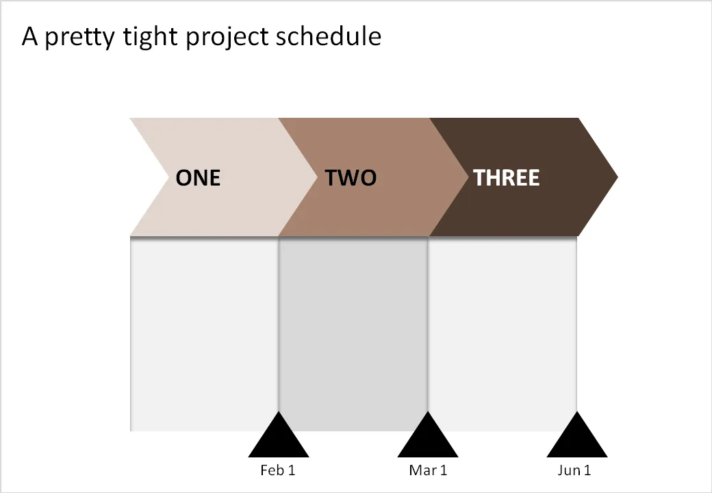
Recently, the business system was discussed. At McKinsey we used it to analyse the value chain of an industry (manufacturing, sales, distribution, etc.). The basic graphic concept of it (simple arrows) can also be used in another context: communicating a project schedule. See the example below.
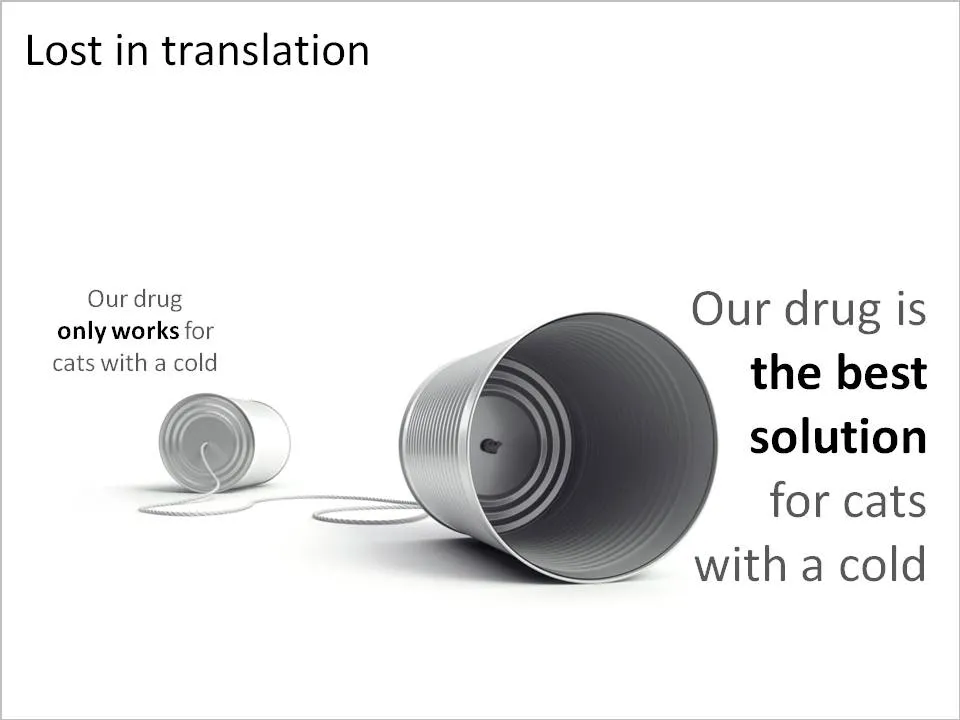
A client in the pharmaceutical industry had this problem: a competitor managed to turn a relatively weak clinical fact and turn it upside down into a forceful message that took over the market. The good old tins cans are great to visualize this. See the example below (sanitized to maintain client confidentiality)
Related reading: an earlier post about classic miscommunication in a project.
I finally managed to get to reading Blink: The Power of Thinking Without Thinking. Malcom Gladwell makes an engaging case for why snap judgement often turn out to be right, providing a constant flow of interesting case examples:
Firefighters deciding to leave a building seconds before it collapses
Art critiques “knowing” that a sculpture is a fake
Police agents making the wrong judgement call in a shooting
Autistic people unable to follow a pointing finger
The brain is very powerful, it can “thin slice” all memories of let’s say all the people we met in our entire life and stack these up against a new individual in front of us. These powers work best when we are well-rested and not under stress. The human brain is built that in case of stress (i.e., we are trying to shake off a tiger that is chasing us), all non-essential brain functions are shutting down to focus on the immediate task at hand.
This book is not directly related to the subject of presentations, but it is relevant for some issues:
The first-second audience judgement that every speaker has to deal with
“Thin slicing” of bullet point decks. “Uh oh, the guys starts reading his bullets”/[scan the slide]/[open email on the mobile phone]
Count to 10, when a heckler manages to get you upset, wait a bit before answering. In “upset mode” your brain is less effective.
Disclosure: the links to Amazon in this post are affiliate links, I earn a small commission when you purchase items through them.
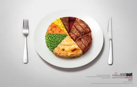
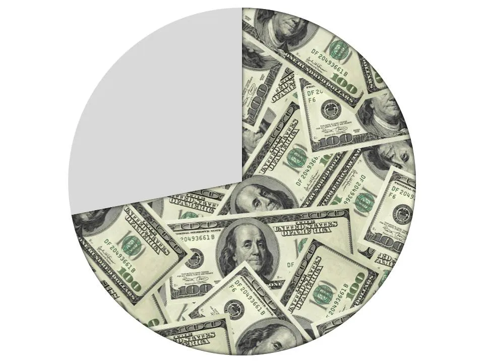
This ad on Ads of the World uses an effect that you can easily replicate in PowerPoint. Select a data point (or a data series), right click, fill, and select “image”.
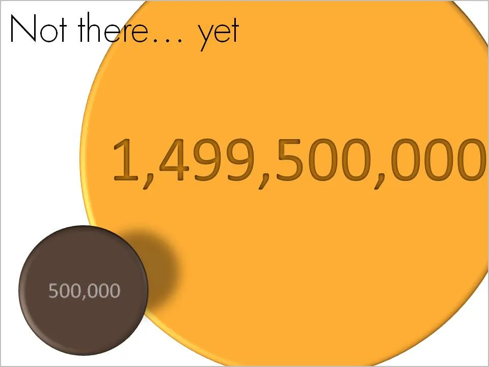
OK, we made some significant achievements, but we still have a loooong way to go. How to visualize this? Here is one solution inspired by a solar system constellation. Working with actual numbers can add a nice twist: take a bite of 0.5 million out of 1.5 billion can be visualized differently.
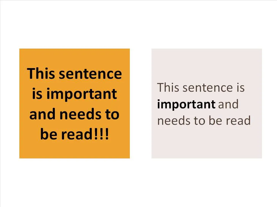
A follow-up on yesterday’s post about avoiding bold fonts whenever you can. Sometimes, reducing font sizes can actually help you increase the readability of a point. See the example below.
Why is it easier to read the box on the right? (At least I find it easier to read)
There is (empty) white space around the text, drawing my attention to the sentence that now sticks out. On the left side, the sentence blends into the very loud background noise of the slide. The text now looks like a coherent piece of information that can be interpreted by the brain in one snapshot, as opposed to the left side where we need to read out each word left to right, top to bottom to see what’s written there.
The proportion of the text block is more rectangular, close to the 16:9 aspect ratio of a wide screen TV, a shape that is more natural for the brain to absorb information
Removing the bold font except for one word makes the whole typography more calm and easier to read
Taking out screaming exclamation marks and left-aligning the paragraph improves readability further
Film directors can use powerful tools to throw us in the middle of a story right in the first seconds of a movie. Steven Spielberg’s opening of Saving Private Ryan is a gruesome but good example. Everyone in the audience thinks “Wow, I should be grateful to these guys that drew the short straw and had to come out of the boat first…”
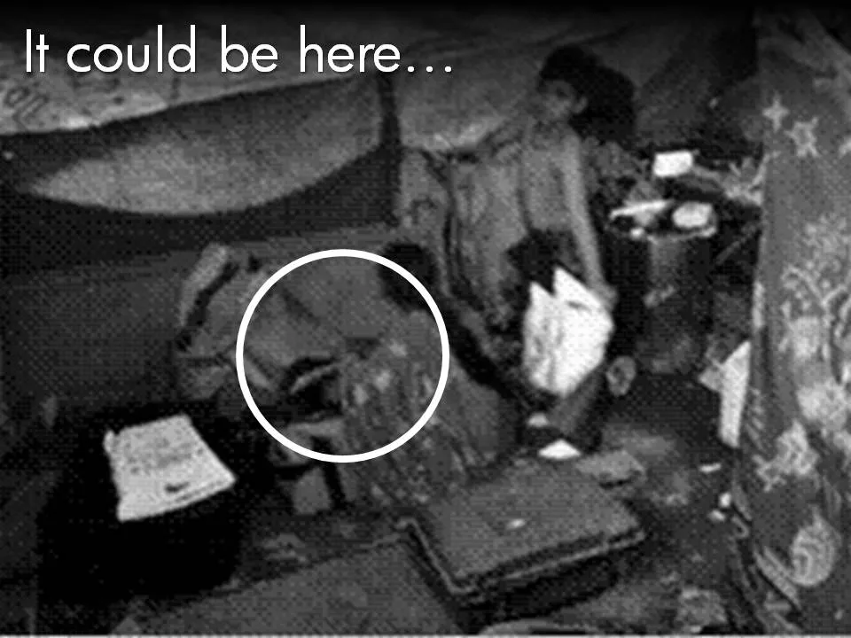
Presenters can use similar techniques. Try to find big images with a perspective as if they were taken from someone in the middle of the issue you are talking about. These images trigger an emotional response from the audience, especially (and maybe only) if they are “real”. Think of photographs that make it on the front page of a newspaper.
The following 2 images could lead into a presentation about the issue of maternal deaths due to poor living and health conditions in the slums of India:
Less powerful examples of images with a patient or victim perspective here and here.
Many of my investor pitch presentations use different styles of charts throughout the presentation:
Emotional opening (images) to connect the audience to the problem
Conceptual diagrams (arrows, boxes) to explain why my solution solves it
Data charts to show why this is a big deal
“Standard”, almost slideument, charts to give more background on the company
P.S. Read more about the great work that the Acumen Fund is doing to combat the issue of maternal deaths here.