SlideMagic Blog

Frequent updates about all things presentations since 2008. Subscribe to never miss a post.

RSS
all posts

Search results for “web design”

·Art

Christoph Niemann and LEGO presentations

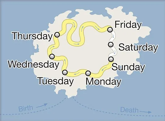
Christoph Niemann (web site) is a highly talented artist whose illustrations have appeared on magazine covers ranging from the New Yorker to Wired. He posts on a regular basis on his blog in the New York Times, where this set of cartoons based on Google maps caught my attention.
He recently published a new (board) book with snap shots of New York modeled in Lego bricks: I LEGO N.Y. (affiliate link). A sample image below.
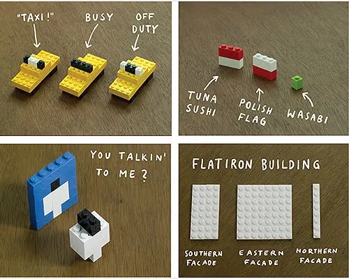
Now here is a presentation challenge: construct your entire presentation in tiny Lego scenes, photograph them and paste them into PowerPoint. Not as crazy as it might sound.

UPDATE. One of my readers, Daniel Cabrera, used LEGO images to construct a presentation for a university project. In this case, the images were sourced from the web.
391 city workforce

·Design

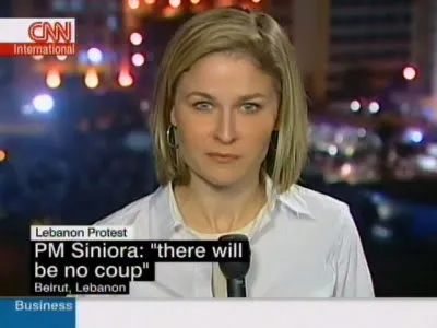
CNN-style lettering tape

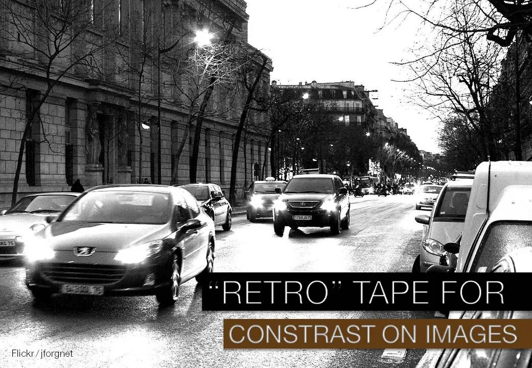
A semi transparent overly is one way to keep text readable over busy images (previous post). CNN uses a different one: black and colorful bars behind white text. The length of the bar varies with the length of the text that it covers.

It is easy to recreate this effect in PowerPoint. Here an example with an image from one of my favorite boulevards in Paris (image credit to jfgornet). You can go further and imitate the retro lettering tape using stock images like this one.

·Cartoons

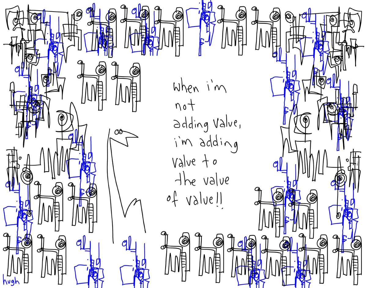
Adding value to the value

Presentations use too many buzz words and empty phrases. Hugh MacLeod (gaping void) made a great cartoon about the abuse of “adding value”, you can buy a print here (no commercial interest) or subscribe to his daily cartoons by email here.

·Art

Extreme close-up

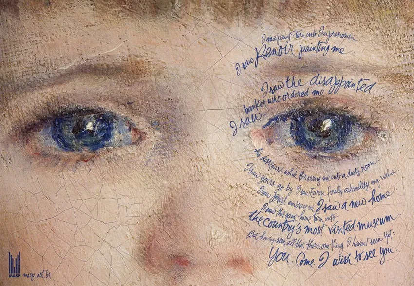
An extreme close-up of a face can have a dramatic effect in a presentation. I used photographs of animals and people before (Miles Davis for example), but never a painting. What a great ad based on a painting by Renoir.

The ad encourages people to come visit an art museum (MASP in Sao Paolo). In case you have difficulty reading the text:

I saw paint turn into Impressionism. I saw Renoir painting me. I saw the disappointed banker who ordered me. I saw his disregard while throwing me into a dusty room. I saw years go by. I saw Europe finally acknowledge my value. I saw Brazil embrace me. I saw a new home. I saw that same home turn into the country’s most visited museum. But, having seen all that, there’s one thing I haven’t seen yet: you. Come. I wish to see you.

Two more examples on Ads of the World. If you are interested in art, try this book.

·Design

Un-stretch those images

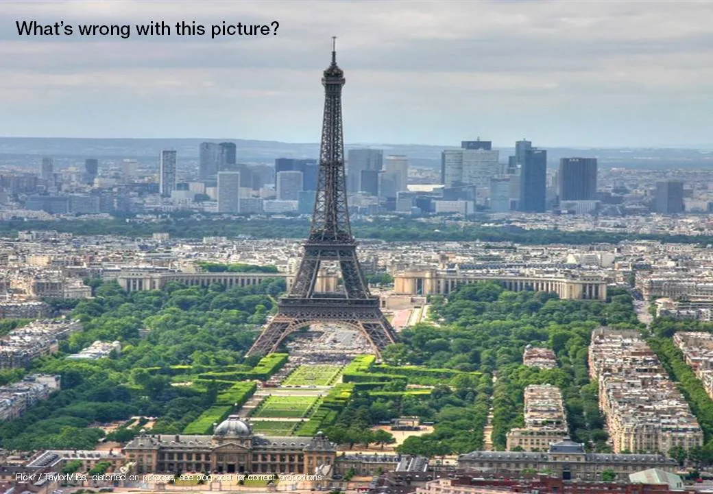
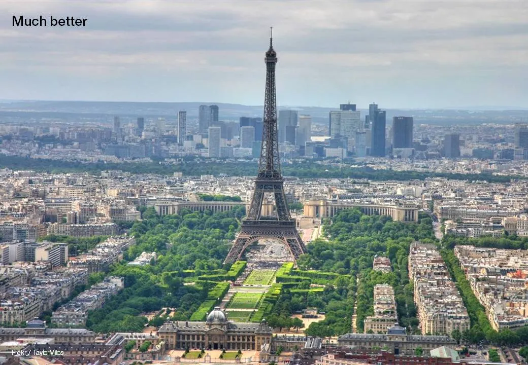
Many presentation images are distorted: the proportion between height and width got confused somewhere along the way. It is easy to correct this. In PowerPoint 2007: right click the image, format picture, reset picture, and you got your original image back. Now hold the shift key while resizing your image and the proportions will be preserved.

Here is an earlier post with a more advantaged tutorial how to scale images to a full page without distortion.

·Cartoons

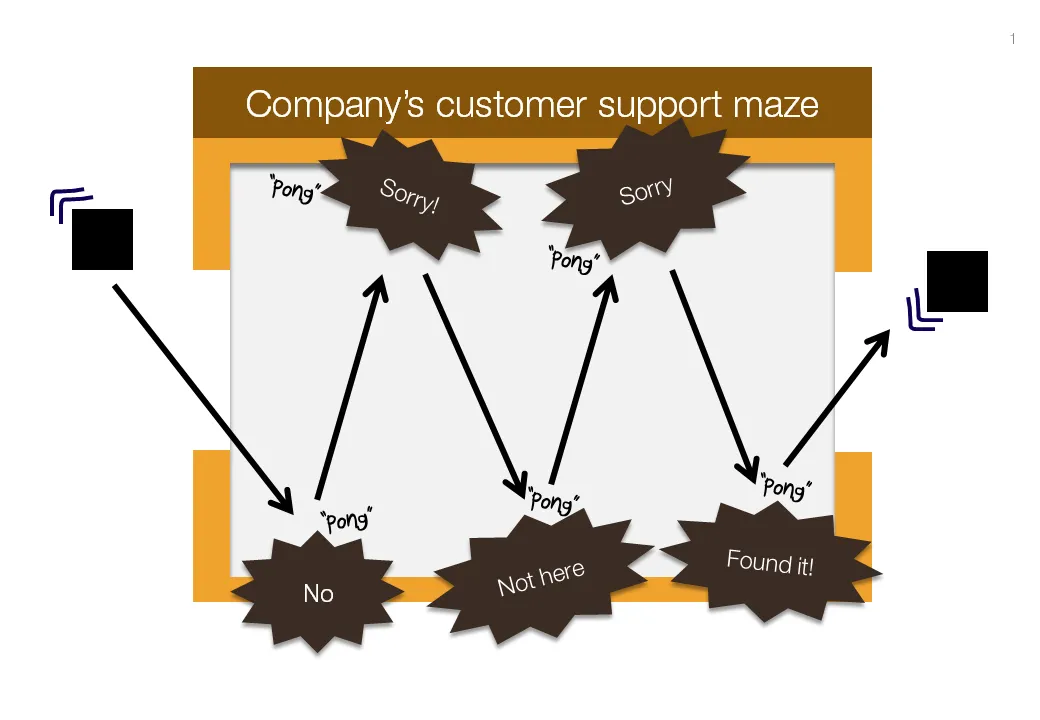
Chart concept: "Pong", "Pong", Pong"

Cartoons have a great way of adding movement to an image. Images can be static and without animations (easier to share online). All you need to do is use an informal font such as Boopee and add some arrows and loosely drawn lines.

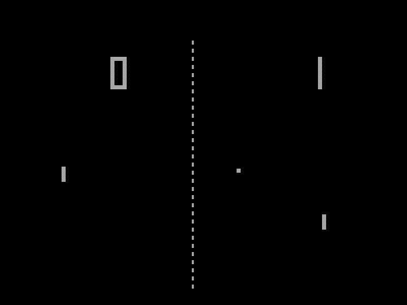
The following chart example was inspired by the first “pong” video games that came out in the 80s.

While the style of the slide is informal, the content is serious enough that I would not hesitate to include it in presentation to the Board. I took out the specific customer example to maintain client confidentiality.

I am a big supporter of the global “ban comic sans movement”, try not to use that font.

·Art

I am jealous of this artist

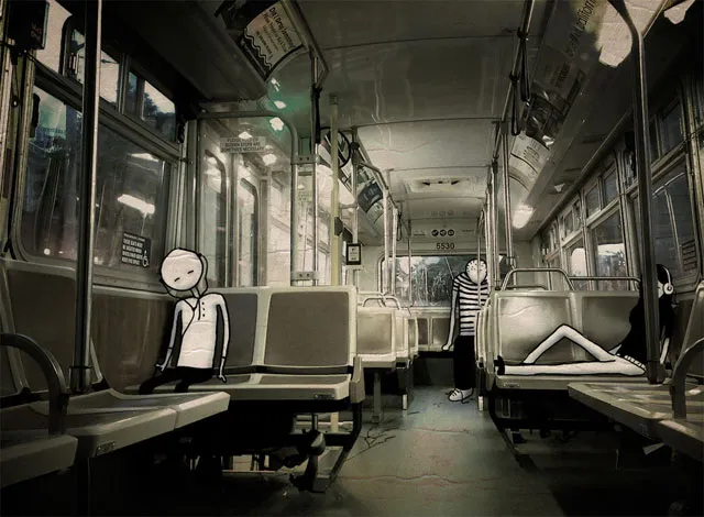
Images are hardly ever exactly right. Changing reality, even with the most powerful software, is very hard (previous post). Artists and/or cartoonists can use their skill to their advantage. Adding contrasting characters to images. One example is Johan Thornqvist (more images on his site). I am jealous not to have these drawing abilities.

Found via unstage.

·Design

Slideshows: also in investigative journalism

The biggest worry of a presenter is to bore her audience. The biggest worry of the journalist is for readers to skip her article. Interesting visuals can be a solution for both challenges.

Investigative journalists are a special breed of news writers, they rely on their own original research (time consuming) and the end result is often a story with nuances that requires more words than the average newspaper article. There is pressure to summarize the article into something that does not do justice to the effort that was put in: news media budgets are under pressure, and the attention span of readers gets shorter and shorter.

Journalist Bill Dedman tried a slideshow on msnbc.com (here), read an interview about the project here on PoynterOnline. The text in his slideshow is 2,788 words, a typical article like this would get 600,000 readers for page one and 10% for the following pages. This report got almost 80m online views.

The use of slideware is no longer limited to supporting live presentations. It is a powerful and under-utilized alternative for web content/blog posts as well.

Thanks to communication consultant Surekha Pillai for pointing me to this.

·Design

You are better at line wrapping than PowerPoint

When you starting using fewer and fewer words on a slide (keep up the good work!), line wrapping becomes more important. Make sure that words that should be connected, stay connected, and enter a manual SHIFT+ENTER if you need to deviate with the automatic option.

·Design

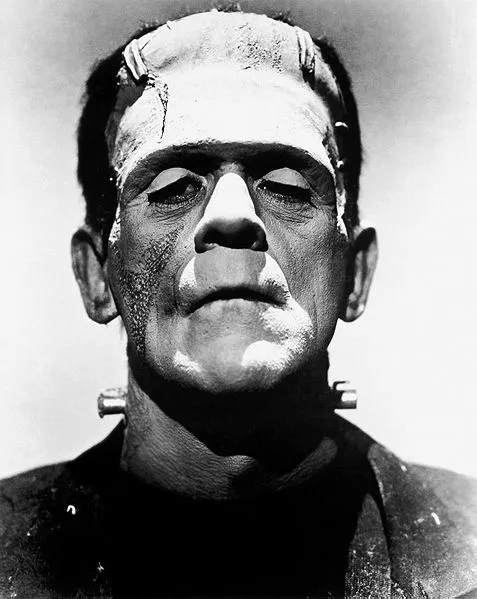
Frankensteining a slide deck

Frankensteining”, what a brilliant verb! Most people have been tempted to stitch together a slide deck quickly by yanking slides from old and/or other people’s PowerPoint presentations.

  1. Open all presentations, go to slide sorter mode
  2. Copy and paste any slide that looks vaguely relevant into a new file. It is even cooler when you know this little trick on how to preserve formats when copying slides across.
  3. Re-shuffle the order of the slides and add agenda tracker pages
  4. Skip the bit about practicing
  5. Done in 1 hour and 34 minutes

It will not be surprising that the end result is not a good presentation. It is not your story, you do not completely understand it, and if you do not understand it, the audience won’t either.

The better way to Frankenstein:

  1. Sketch your story on a piece of paper
  2. Add simple slides to support the key elements of the story
  3. Go back to the graveyard of old slides to add backup slides where you need them (“here is the full architecture of our global CRM system, as you can see it is really complex” [* click next slide *])