Presentations are everywhere
I never saw this before: infographics on food packaging. Nice work by Audree Lapierre.



Frequent updates about all things presentations since 2008. Subscribe to never miss a post.
I never saw this before: infographics on food packaging. Nice work by Audree Lapierre.
Many presentations are about ambition: “we want to double in size in 5 years”. That’s basically creating another company exactly as the one you have now. You can use the concept of a biological cell division to visualize this.
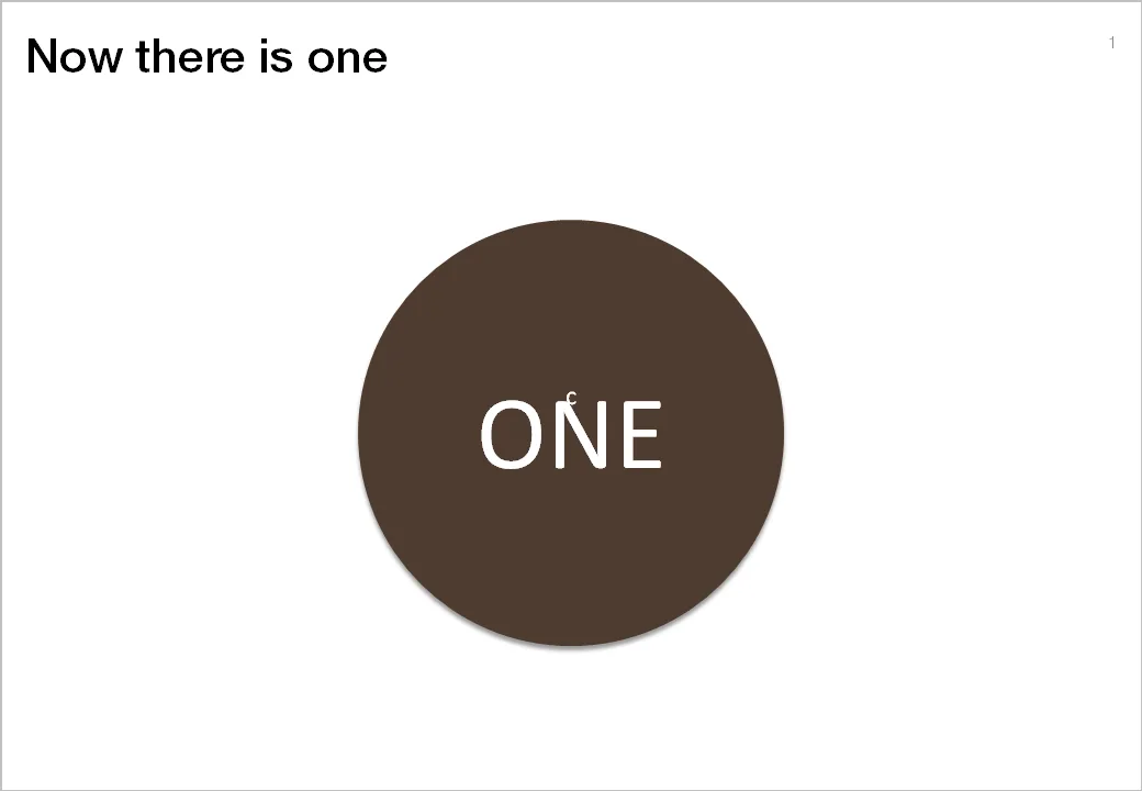

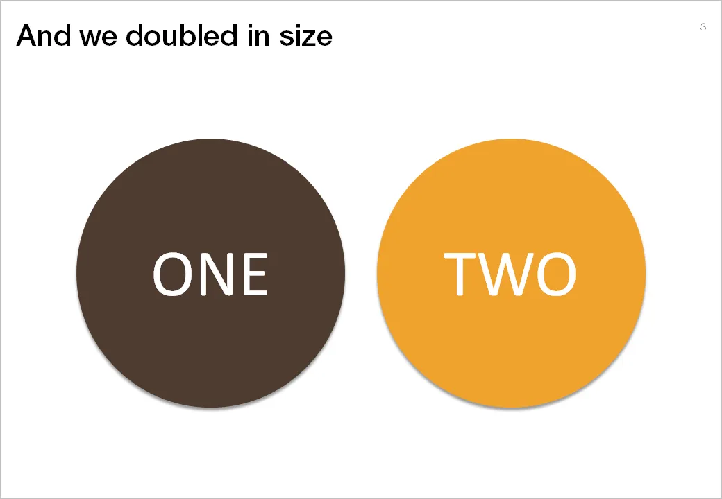
The stretching of the circle is done using the edit points function in PowerPoint. The text is stretched using the function “text effects” in the format ribbon of PowerPoint.
It is very hard to capture the sensation of a wide panoramic view in a photograph. Making a picture of that stunning view will look boring when you view it later. Not when you capture an object nearby as well.
Impressionist painters use this technique in the composition of their works. See this painting by Alfred Sisley (Village On The Banks Of The Seine at Villeneuve La Garenne). Unusually, the background of the scene is actually lighter than the foreground.

I used this lone tree in one of my own photographs of a recent visit to the ruins of the Masada fortress near the Dead Sea here in Israel.

Think about this when your pick your next stock image in your presentation.
This ad about safe driving uses an interesting concept: the eye test. You can use it in a PowerPoint presentation exactly as it is used here: one variable is declining/increasing and visibility of another goes down.
Another use could be some sort of health check: “how well protected is your business?”, using a different image that repeats and gets smaller all the time.
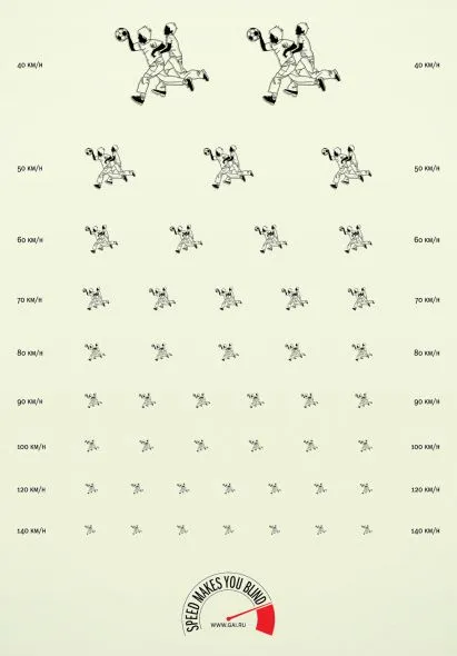
Via Ads of the world.
Tel Aviv uses a very dominant street painting scheme: red-white and you cannot park, blue-white and you can park but have to pay. The colors are so bright that the city looks like one big Formula One circuit. Why not use more modest colors? Grey blue and olive green? The picture below gives an example, freshly painted pavements (you have to re-paint often in the sunny climate here).

The same is true for PowerPoint shapes. Whenever I can, I omit the lines around shapes (shape outlines). It makes your chart a lot calmer.
Image credit: Flickmor
“Low-hanging fruit” is a term that is over-used in corporate meeting rooms. Recently I used a nice giraffe image to create a tongue in cheek slide explaining that all the easy opportunities have been picked away. (Yes I now giraffes eat leaves and not fruit…). Image found on iStockPhoto.

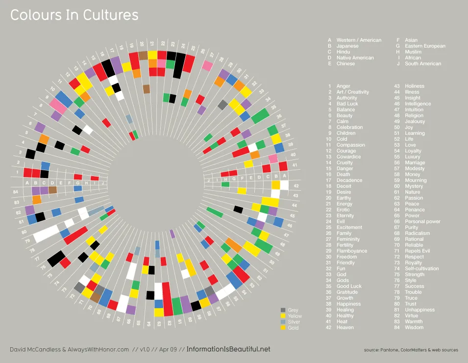
A nice diagram on the blog Information is Beautiful (original post). Something to take into account when picking your next color template. click the image for a larger picture.
This PowerPoint slide by the U.S. Army is making the rounds on the Internet to ridicule ineffective presentations that stifle creativity and decision making.
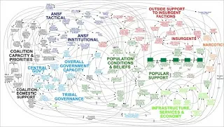
does not actually talk about this busy slide specifically, it attacks the use of bullets points and the fact that the majority of time spent by staff in corporate/army headquarters is wasted on producing PowerPoint slides. Seth Godin is repeating today once more why bullet points are bad for you.
The spaghetti slide itself is not that bad, at least that is my opinion.
It makes the point that things are complex, that issues are related, all contributing to a highly unpredictable cause and effect sequence. Almost like the myth of chaos theory, and the butterfly in China that can cause a hurricane on the other side of the planet. Pretty good slide to visualize that.
I guess the source of the slide must have been some management consulting report that applied the technique of Business Dynamics to a complex problem (I recognize the many loops having used the tool in my previous life as a McKinsey consultant).
What is Business Dynamics? Business Dynamics tries to apply the physics of systems theory (electronic circuits, weather, ocean waves, etc.) to business. Complex problems consist of a number of forces. Forces influence each other. Forces can be good and bad, some cancel each other out, some reinforce each other. Everything is related to everything.
In some cases it is possible to model all these forces in a computer program and you get your hands on a very powerful tool: software can make simulations of what happens if you give the system 1 shock by studying the 2nd, 3rd, 4th, 7th order effect of your action.
We have all been in meetings that went on and on about the exact wording of a phrase: legal contracts, mission statements, press releases, UN Security Council resolutions, and yes, also presentations. I am not arguing to be less precise when writing a presentation, but word smithing bullet points is not going to make your message clearer, the opposite is probably true.
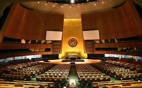
Photo by Flickr/gruban.