SlideMagic Blog

Frequent updates about all things presentations since 2008. Subscribe to never miss a post.

RSS
all posts

Search results for “web design”

·Images

Visuals are emotional shortcuts

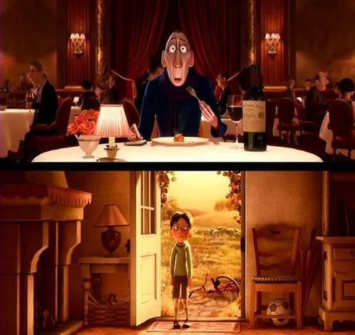
Visual slides are emotional shortcuts. A powerful image or visual concept unlocks something that was already (at least partially) stored in our memory. This scene from the movie Ratatouille (affiliate link)is perfect example: a taste sensation that unlocks a childhood flashback.

·PowerPoint

Bullet points in a Steve Jobs presentation

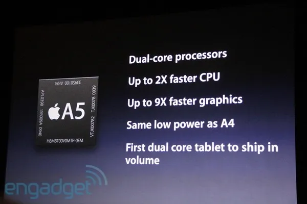
Bullet points happen to the best, even Steve Jobs uses them. See the slide below from the iPad 2 launch presentation (thank you Engadget).

The good:

  • They are short
  • They do not have a bullet in front of them
  • He has them pop up as he speaks, so you can’t read ahead (good here, but not recommended for all presentations though)

The bad:

  • The “volume” orphan at the bottom
  • All those “dual core”, “2x”, “9x”, “CPU” makes it a bit hard to read
  • You can see Steve Jobs looking down, pausing to read them off a screen

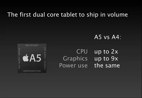
What do you think of this alternative?

·PowerPoint

The invisible structure

The structure of your presentation sets the flow of the story. There is no one fits all structure though. I am discussing three different types of structure here, the names are invented by me and do not refer to well established definitions.

Analytical structure. A rigorous and organized framework that cuts up the material in all the components required to solve a problem or run an analysis. Management consultants use issue trees, university text books have section headings going down three levels. It makes sure you covered everything, that there are no overlaps, and that it is very easy to find a piece of information without having to read through the entire text. Despite that this structure is too boring, and too exhaustive for a presentation, it is often used.

Logical structure. The sequence of facts that provides a rock solid proof of your point, every aspect is dealt with, the logical deductions and implications cannot be disputed. Not as exhaustive as the analytical structure,  it still usually uses some sort of agenda or summary page that prepares people for the logical drill that is about to follow. Market is big, competitors s**ck, etc. Better, but lacking emotion.

Implicit structure. My preferred one for a presentation. You tell a story, the audience is captivated without a rigorous agenda page, your listeners are not aware of an underlying structure of the story. It’s there, it’s just hidden.

I use the analytical structure to solve the problem, the logical structure to develop the check list of points I need to cover, and then construct my story free of these rigorous frameworks. When I am done, I go back to the first two to see whether I covered everything.


Continue reading →
·PowerPoint

PowerPoint 2011 for Mac review

I have been working for a few days with Microsoft Office for Mac 2011 now (affiliate link), having upgraded from the earlier version PowerPoint 2008. For me, the Mac is still a secondary machine, and testing this software is one of the key determinants whether I can move across all together to a Mac environment. All my clients use PC-based Microsoft Office software, so Keynote cannot replace office.

Initially I was a bit wary of Office 2011, having read some poor reviews on Amazon and by columnists such as David Pogue. Maybe it was because of this that I wrote this impulse post about stability issues of PowerPoint 2011.

I managed to solve the problem (after a lot of searching online). Somehow, PowerPoint 2011 can crash every time you enter slideshow mode after you have done some heavy toolbar customization. It happened to me a few times in a row. All fine, customize toolbars, crash, reset toolbars, all fine, customize toolbars, crash. At the moment I stopped the poker game (do I have the courage to add another toolbar customization or not, at the risk of having to reset all previous modifications?) at a level that I am happy with my current toolbars. So the issue remains.

For the rest, I must say that I actually like PowerPoint 2011. The differences with the PC version are minimal, someone with experience with PowerPoint on a PC can switch over instantly. The previous version (PowerPoint 2008) had a user interface that was different from the PC, and also lacked some functionality. Now there is a level playing field. (Well almost, for some reason you cannot change the spacing of the grid in PowerPoint 2011, making it hard to set a grid line exactly at 0 of your slide).

Continue reading →
·Images

Small scenes showing big opportunities

Most startups pitching for VC money would pound the audience with billion dollar market forecasts produced by market research firms such as IDC or Gartner. They are important, but they do not touch the gut feel of an investor. Often, showing a small street scene without a single number in it, does the trick.

As an example, take online gambling, and let’s go to Spain. Anyone who spend some time there has seen the numerous lottery stands scattered across the cities. What if all these people could get the same thrill of purchasing a lottery ticket on their mobile device, rather than standing (visibly annoyed) in a long line? The opportunity is staring you in the face, right in front of you. The VC is reminded of it every time he drives to the office, every day of the week.

If you are interested, a recent blog post by Seth Godin about why these people are not buying the ticket to win the big prize. Image credit to Paul and Jill.

·Delivery

Notice how you skip the introduction?

Have you noticed how, whenever you start reading an article with a promise in the headline “The 18 secrets to [x]”, “Why is it that [y]”, you usually skip the introduction and/or skim the text to find the answer the headline promised? Introductions usually repeat the headline and contain background information such as the bio of the speaker that we do not have time for. Not the interesting stuff the reader is looking for.

Your audience wants to do the same with your presentation, except, they cannot. Taking the clicker, fast forwarding and asking you to get to the point would be rude. Instead, they start checking email on their mobile device until it gets really interesting.

Detail of an image claimed by John McNab.

·PowerPoint

Slide idea - global expansion!

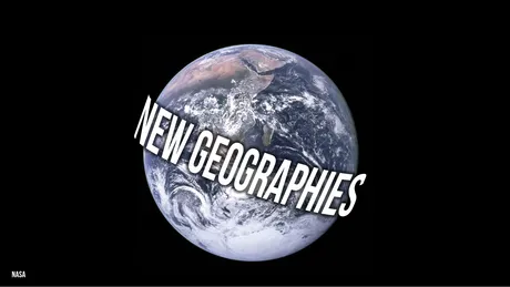
A startup has the master plan to spread out across the globe. A variant on the Universal globe

How to create this text effect in PowerPoint: select the text (in a narrow font if your text is long), go to format, text effect, “can down” (somewhere in the middle right). Go back to format, select glow, glow options and set a color (I picked black).

·Images

What a great crowd image

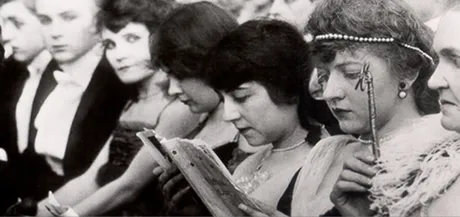
Flickr is an unbelievable source of images. I came across this photo by Alex Kess. The texture and colors are amazing (the original on Flickr is much clearer than the image below).

·Books

New French presentation Bible

Recently, I received a review copy of  L’art des présentations Powerpoint, by Bernard Lebelle, a frequent commenter here on the blog. A very interesting book (obviously for those who can read French).

L’art des presentations PowerPoint

My first impressions:

  • Besides the big presentation and speaking insights (often covered in many other books on the subject), this book is a treasure of smaller insights, many of them illustrated with a little diagram or a quick scribble. Almost like reading a constant flow of interesting blog posts. My French is probably not good enough to read this book from page 1 to 386, but the layout with the bite-size illustrated tips and tricks enables me to digest much of the content.
  • It covers a broad range of subjects, all the way from speaking suggestions down to the basics of typography and detailed suggestions on how to use the PowerPoint software
  • Bernard integrates concepts and ideas from many sources (books, web sites) with clear references to them for further reading.

Congratulations Bernard.

·PowerPoint

Sticky Slides becomes Idea Transplant

OK, I have re-branded. One more time the first blog header that I used back in the summer of 2008. (the details: Verdana font, and the standard Microsoft “Trek” color scheme). All the best Sticky Slides…

All links and RSS feeds should continue to work: http://blog.ideatransplant.com http://www.stickyslides.com http://www.stickyslides.blogspot.com http://feeds.feedburner.com/stickyslides